2 Visual Analysis 2: The Principles of Composition
Visual Analysis 2: The Principles of Composition
Now that you know some of the basic visual elements, we can look at how they are put together in compositions. Composition is the way all of the visual elements are arranged to make the whole work of art.
Balance and Symmetry: An even use of elements throughout a work, and a mirroring of two halves
Emphasis: Drawing attention to one or more points in a work
Movement: A sense of motion as the eye is guided through a work
Pattern and Repetition: Repeating an object throughout a work or a part of a work
Rhythm: A visual tempo set by repeating elements in a work
Proportion and Scale: The relation in size of parts of a work to the whole
Variety and Unity: Use of different visual elements throughout a work, and the use of similar elements so that all the parts of a work fit together well
Balance and Symmetry
Balance is an even use of elements throughout a work. Symmetry is a very formal type of balance consisting of a mirroring of portions of an image. Bilateral symmetry, that is, two-sided symmetry, is the most common, in which two halves of a work of art mirror each other, as in Perugino’s painting in the previous chapter. Drawing a line down the center of the image helps emphasize the symmetry of the background and the plaza in which the figures are placed.

The symmetry gives the painting not only a sense of balance, but also a sense of calm, of stability and formality. Notice in particular the way that the buildings in the background are painted to make the work symmetrical. Not all elements of the painting, though, are perfectly symmetrical. The trees, clouds, and figures are not quite symmetrical, but they still are balanced in that they more or less equate to their counterparts on the other side of the image.
Just as the buildings themselves are symmetrical in Perugino’s painting, symmetry is also common in major works of architecture, where it lends buildings a tone of stability and power. Classical Greek Temples like the Temple of Artemis, Corfu, Greece, ca. 600-580 BCE are rigidly symmetrical.
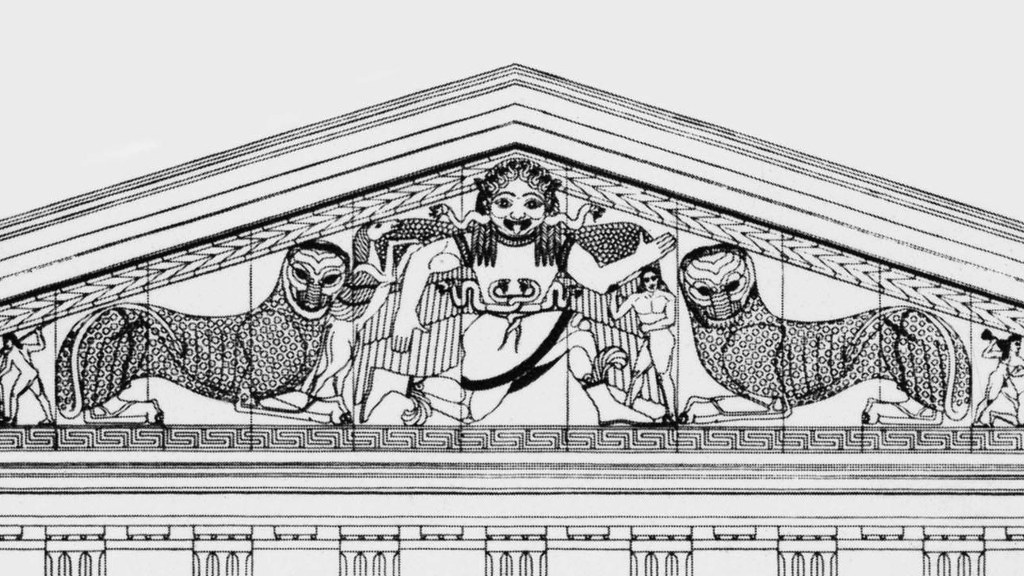
In this reconstruction (the original is now a ruin), even the sculpture on the façade – the front of face of a building – is nearly perfectly symmetrical. At the outer corners (not visible in this drawing) are a mirrored pair of fallen warriors, then two pairs (one now fragmentary) of fighting figures, then two mirrored panthers, and then, in the center, Medusa (a monstrous gorgon with snakes for hair), with two of her children beside her (the winged horse Pegasus and the human-shaped Chrysaor). Even the fearsome gorgon in the center is presented facing directly outward at us, so that her face can be presented in hideous symmetry, with her great, bulging eyes, grimacing mouth, plaited hair, and even the snakes that emerge from the back of her head carved in perfect symmetry. This work should serve to counter the frequently made statement that symmetry makes works beautiful. While many cultures associate symmetry with beauty, and this temple as a whole might be described as such, a grotesque figure remains grotesque even when perfectly symmetrical.
Radial symmetry is created when an image is symmetrical around a central point or axis, like a sunflower viewed head-on. Radial symmetry creates a strong sense of unity in a work of art (to be discussed below), and is common in sacred images. In a 9th-century Buddhist Womb Realm mandala, all points seem to radiate outward from the central figure of the Buddha.
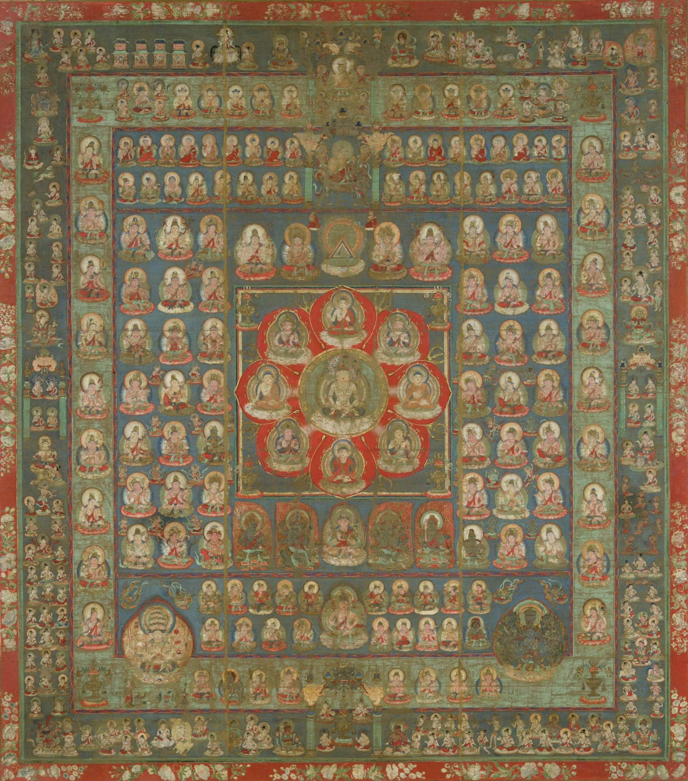
Tō-ji, Kyōto, Japan, 9th century. Image: https://commons.wikimedia.org/wiki/File:Taizokai.jpg, public domain.
The numerous figures around the Buddha are bodhisattvas, individuals who have chosen out of compassion to delay their entry into nirvana in order to help others who are suffering. It is fitting that they are shown as if emanating out of the Buddha, himself, as his enlightenment and compassion are the source and model for theirs. The image also gives a sense that the universe itself is highly ordered.

However, perfect symmetry is not necessary to create a sense of balance in an image. Asymmetrical balance is created when two sides of an image do not mirror each other, but still have approximately the same visual weight, the same amount of detail or shapes or color, and so on. The Classical Greek sculpture Doryphoros (The Spearbearer) by Polykleitos (ca. 450-440 BCE) provides a clear example of asymmetrical balance. The figure does not stand in a symmetrical way, but overall seems even, calm, and balanced. In this case, the figure has his weight on his right leg, so this leg is tensed. The left leg is relaxed and bent. Balancing this out, the right arm hangs loosely, but the left arm is tensed. In this way, the body – which itself is symmetrical, or would be if he were posed with his feet side by side, looking straight ahead, with his arms hanging down – is balanced. This pose is called contrapposto, and is often used to give standing human figures a sense of life and animation.
Emphasis
Emphasis consists of drawing attention to one or more points in a work. This can be accomplished through any of the visual elements. In the Buddhist Womb Mandala above, the Buddha is emphasized through location (he is centered in the image), color (the vivid red petals around him draw the eye, and the contrast with the green circle around him further highlight him), line (all of the rows of figures essentially guide the eye inward to the center through implied lines, and the lines dividing the red petals direct us inward, as well), symmetry (the radial symmetry focuses us inward to the center), and so on. In essence, we cannot help but return, again and again, to the Buddha, the focus of the image and also the focus of Buddhist devotion.
Movement
Movement refers to a sense of motion as the eye is guided through a work. This can be accomplished by showing figures in motion, or simply through the visual elements. An Indian illumination – that is, a painting in a hand-made book – from the Akbarnama showing Akbar Hunting in an Enclosure (ca. 1590 CE) demonstrates both types.
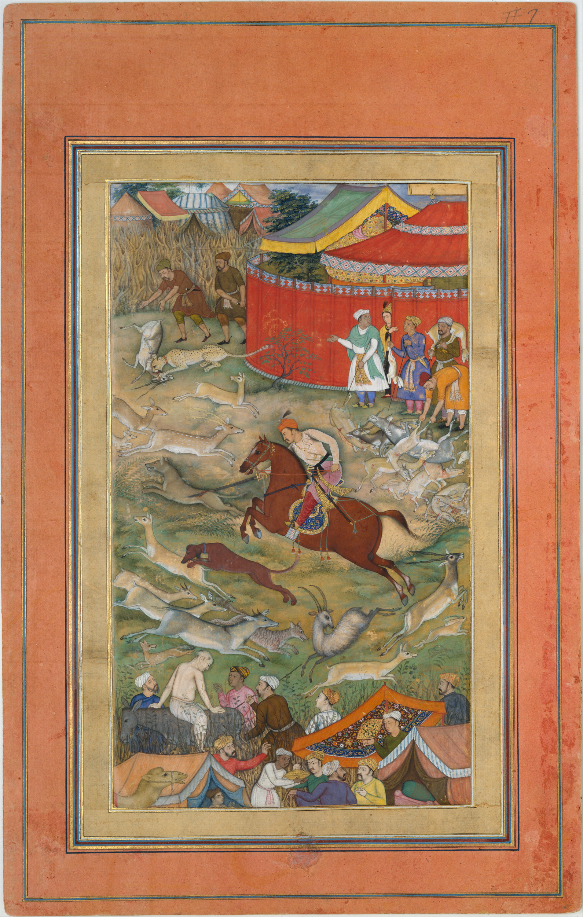
As with the Dürer woodcut of the Four Horsemen of the Apocalypse discussed in the previous chapter, the rider on his horse charges rapidly across the image. The smaller animals scatter, darting in all directions and also hunting one another. Their movements create a strong sense of movement throughout the image. However, there are formal elements that intensify this.
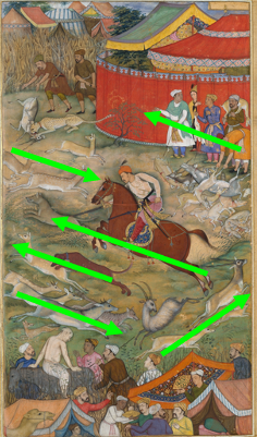
Just as the horizontal lines behind the riders in the Dürer suggested their movement forward, so here, lines and colors help convey the motion of the people and animals, here. Many of the people and animals in the image are in vigorous motion, racing this way and that. Emperor Akbar rides a horse leaping from right to left as he hunts a wolf, and he is accompanied by a hunting dog taking down a gazelle. Their motion is echoed by the group of attendants watching the hunt and gathering the slaughtered animals. Akbar and his dog are confronted by the counter-motion of two groups of animals that seem to be running in panic from left to right. A pair of these animals changes the angle of this left-to-right motion by moving upward rather than downward, and in so doing places Akbar, grandly dressed and powerfully posed on his horse, in the center of a whirlwind of movement.
Pattern and Repetition
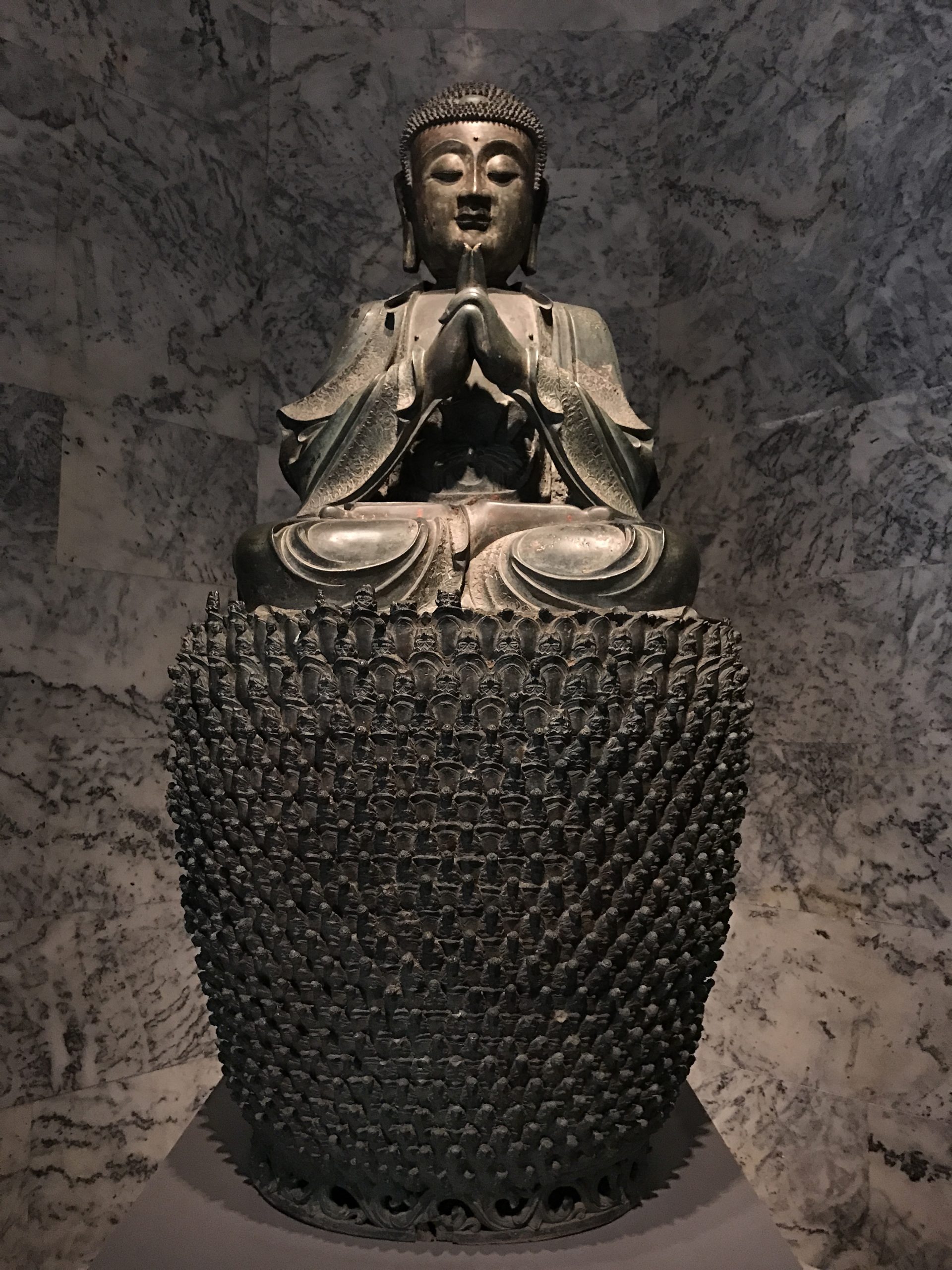
When an image or object is repeated throughout a work of art, or a part of a work, this is called either pattern or repetition. Repetition can be less structured than pattern, which is more regular. Both can work to create a sense of rhythm, as discussed below. The large base of a bronze Chinese statue of Vairochana Buddha (sixteenth-seventeenth century) is composed of literally thousands of tiny bodhisattvas, which therefore seem to serve to support Buddha figuratively, as well as visually. Their repetition is very regular, establishing a clear pattern. This is also the case in the Buddhist Womb Realm mandala discussed above. The pattern in both cases emphasizes the unity of purpose shared by all these figures, each an embodiment of the ideal of compassion.
Rhythm
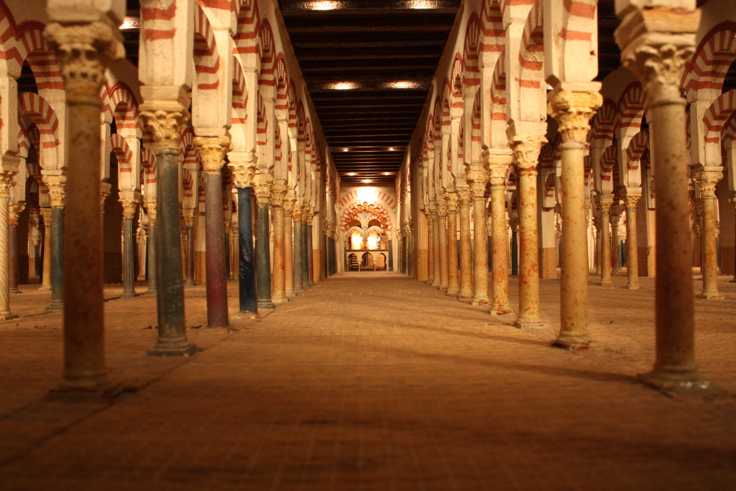
Rhythm is the visual tempo set by repeating elements in a work of art or architecture. The arches and columns of the Great Mosque of Cordoba provide a good example. They are spaced very evenly, setting up an even tone to the building. This is then enlivened by the rhythm created by the striped pattern on the arches.
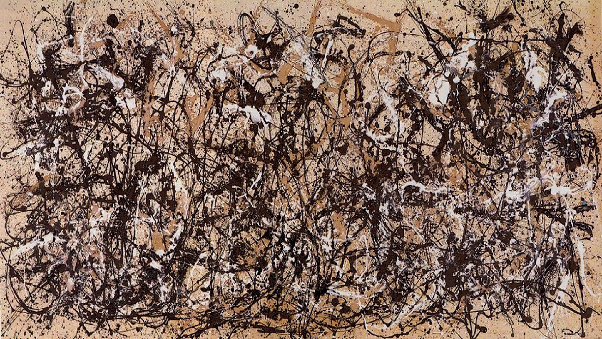
For contrast, we could look at Jackson Pollock’s Autumn Rhythm (# 30) (1950). Pollock was a fan of jazz music, and tried to capture something of its loose, syncopated rhythms. The resulting drip-paintings (they were made with the large canvases on the floor of his studio) have similarly loose, improvisational compositions. Despite its lack of formal structure, there is a clear rhythm running horizontally across the painting, and Pollock uses the title of the work to draw our attention to it.
Proportion and Scale
Proportion refers to the relationship of parts of a body or form to one another and of the parts to the whole, for example, the size of the head of a figure in relation to the entire body. Scale is the relationship of parts of an image to the image as a whole, or to something in the world outside of the image, for example, the size of the figure of a king in an image as compared to the size of the figure of his servant in the same image, or the size of a statue of the king as compared to the size of an actual person. Beginning with proportion, we can look again at Doryphoros.

Compare his proportions to those of an Altar Group from Benin with Oba (King) Ewuake flanked by two enslaved men (nineteenth century CE). Doryphoros’s proportions were laid out according to mathematical formulas in order to create an image that the sculptor believed presented the “ideal man.” Doryphoros is about seven “heads” tall, so to speak, whereas Ewuake is approximately three “heads” tall. Doryphoros’s limbs fit within the range of average human proportion, whereas Ewuake’s legs are considerably shorter than his torso. While their proportions are quite different, both works present figures considered ideal by their cultures. Doryphoros embodies quite literally the focus on external beauty – according to Greek tastes of the day – whereas the image of Ewuake shows, with the intentional enlargement of the head, the greater importance of the intellect in the culture.
Scale can refer to any relationship of parts to the whole, but one particular type is of great significance in many periods: Hieratic scale is scale based on relative importance. That is, the more important a figure, the larger they are in relation to the figures around them. This is quite different from the naturalistic scale found in works organized by linear perspective, like the Perugino painting in the previous chapter. Ewuake, for example, is considerably larger than the figures that flank him. These are not children, but adult men who were enslaved by Ewuake. We are not supposed to assume that Ewuake is a giant, but rather, that he is far more important than the other two men. Also note that the other two have rather different proportions: their heads are much smaller in relation to their bodies, and their arms and legs longer. This reminds us that Ewuake’s proportions are absolutely deliberate, not the result of incompetence but of a conscious effort to convey a cultural meaning. Before leaving this work, though, two more details should be mentioned. Around the base of the work, there are the bodies of fallen men, bound with their hands behind them, decapitated. These defeated enemies are represented as far smaller than the enslaved men. The symbolism of decapitation as the ultimate, dehumanizing death highlights the importance of the scale of the head of the king who towers over them.
Variety and Unity
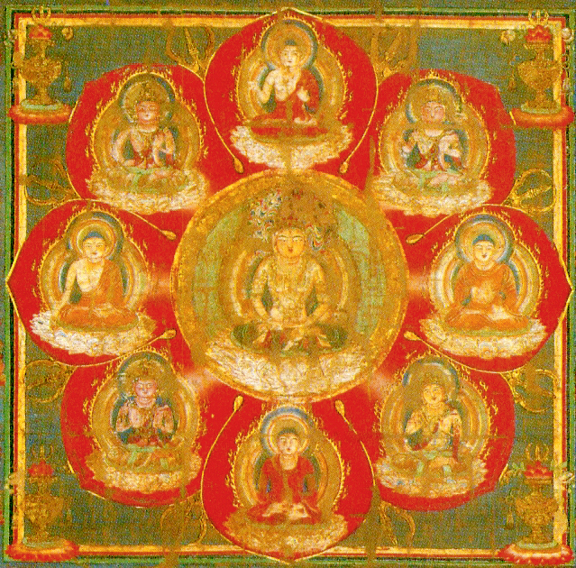
Variety is the use of different visual elements throughout a work, whereas unity is a feeling that all the parts of a work fit together well. These do not have to be opposites, as a work filled with variety might also have unity. The Womb Realm Mandala above is an excellent example. Unlike the bronze statue of Buddha discussed above, where all of the bodhisattvas are more or less identical, the many bodhisattvas on the World Womb Mandala are each individualized. At a distance, they all become one, expressing great unity, but taken one at a time, each as an object of devotional contemplation, they contain more variety than it would at first appear.
Naturalism
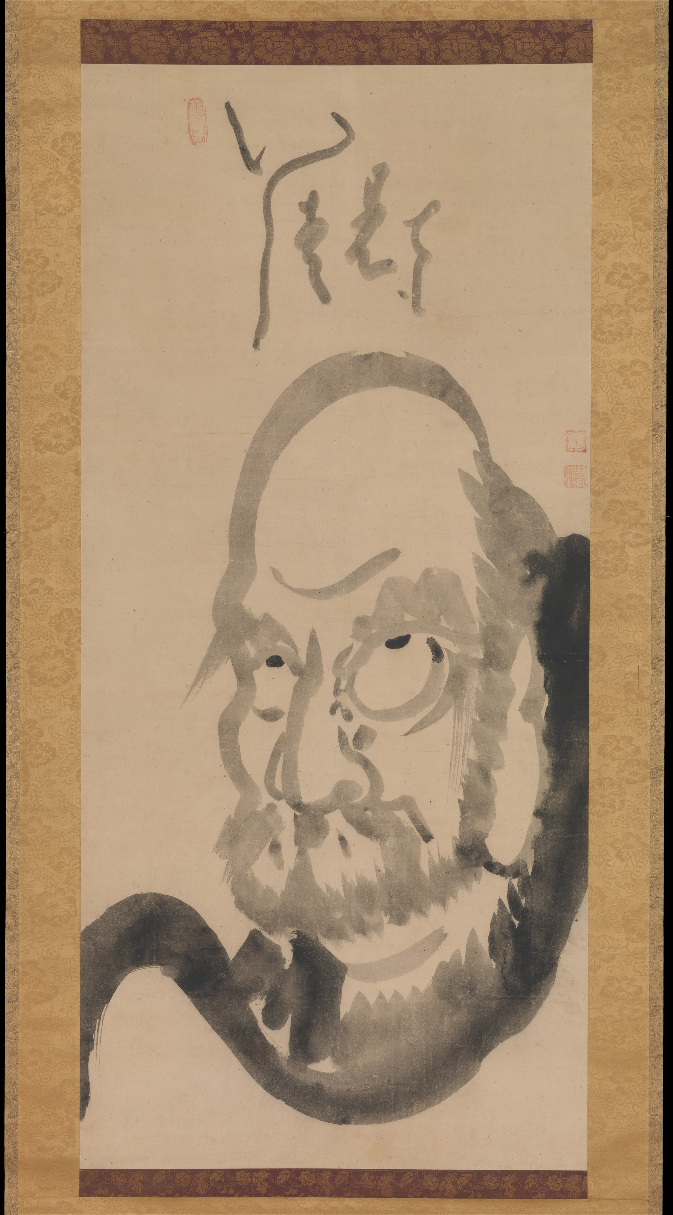
One more subject requires brief commentary. The issue of naturalism has been raised several times in this discussion of the visual elements of art and principles of composition, and will be mentioned many times in the chapters that follow. Naturalism is the resemblance of a work of art to the “real world,” as we see it around us. The more naturalistic a work, the more it looks like our world, and the less naturalistic, the less so. For extremes, we will compare a work by the Italian Baroque painter Caravaggio with a work by Hakuin Ekaku, a Japanese Zen Buddhist monk.
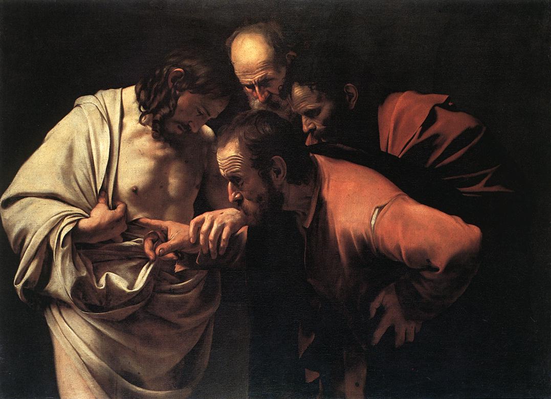
Caravaggio’s The Incredulity of Saint Thomas is highly naturalistic, whereas Hakuin’s portrait of Bodhidharma (Daruma) rejects naturalism. Both paintings are representational, which means that they both depict something, as opposed to non-representational works like the Jackson Pollock discussed above, where there is no visual picture hidden in the lines.
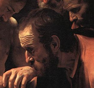
In Caravaggio’s image, the face of Thomas, who leans down to look directly at the wound in Jesus’ side, is rendered in minute, realistic detail. His hairs are individually rendered, his features distinct and recognizable, his skin browned from the sun and with dirt.
Caravaggio found his models for holy figures in the streets, and their humble conditions are carefully depicted in his paintings. All this adds up to naturalism, and perhaps even to the highest degree of naturalism, referred to as verism.
Ekaku’s portrait of Daruma, on the other hand, is recognizable as a human face, but all the elements have all been rendered somewhat abstractly – that is, in some way deviating or ignoring the appearance of the natural world, simplifying or altering it for effect. We might also say that Ekaku’s image is stylized – designed according to the principles of a particular style rather than being beholden to the way things look in “the real world.” This does not make it less “good” as a work of art, and also does not mean that the artist was less skilled. Rather, it is simply a different, less naturalistic style, designed to suit different goals. Here, the emphasis is not on the great Buddhist sage’s literal appearance (he died over a millennium before this work was made), but on his wisdom, embodied in his giant, upturned eyes and vast forehead.

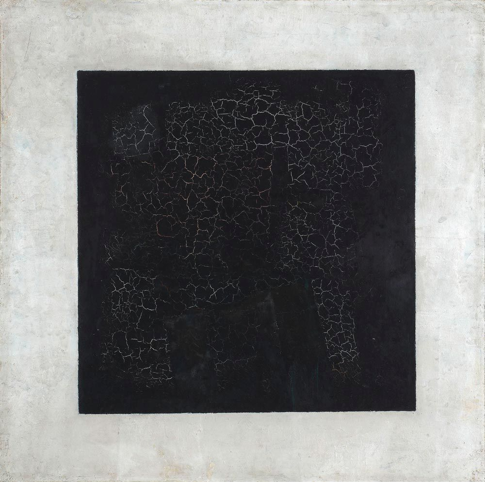
The farthest extent of abstraction is non-representational or non-objective art, in which the subject is not merely abstract, but wholly absent. This type of art, which many viewers find highly challenging, makes little or no reference to the natural world, such as Kazimir Malevich’s geometric paintings like his ironically titled Painterly Realism (1915), Mondrian’s Composition with Yellow, Blue and Red in the previous chapter, or Pollock’s Autumn Rhythm (above). In such works, we are in a purely formal world, with no subject in the work but the work, itself, and where the tools of visual analysis are the prime method of entry into the work.
There is one other way, though, that we can speak of naturalism. Instead of contrasting it with abstraction, we can contrast it with realism. We would have to determine that Doryphoros discussed above is highly naturalistic, in that he looks very much like a living person. On the other hand, he presents an image of the Ancient Greek physical ideal of symmetry, youth, fitness, and, indeed, relaxation. If we are being honest, we would have to admit that while a person could look like this, rather few of us do. This is true in so far as few of us are as muscular and athletic as Doryphoros, but is also the case in that he is shown as a European man, reflecting Greek arguments about racial superiority. Ancient Greeks were in contact with many surrounding cultures, from India to Africa, and held the ethnocentric notion that Greeks were the most beautiful, balanced people in the world. When works like Doryphoros are uncritically described as having “ideal bodies,” modern art historians perpetuate this ancient racist outlook, so it is important to always note that these figures are not actually the only human ideals, but reflect their creators’ ideologies.
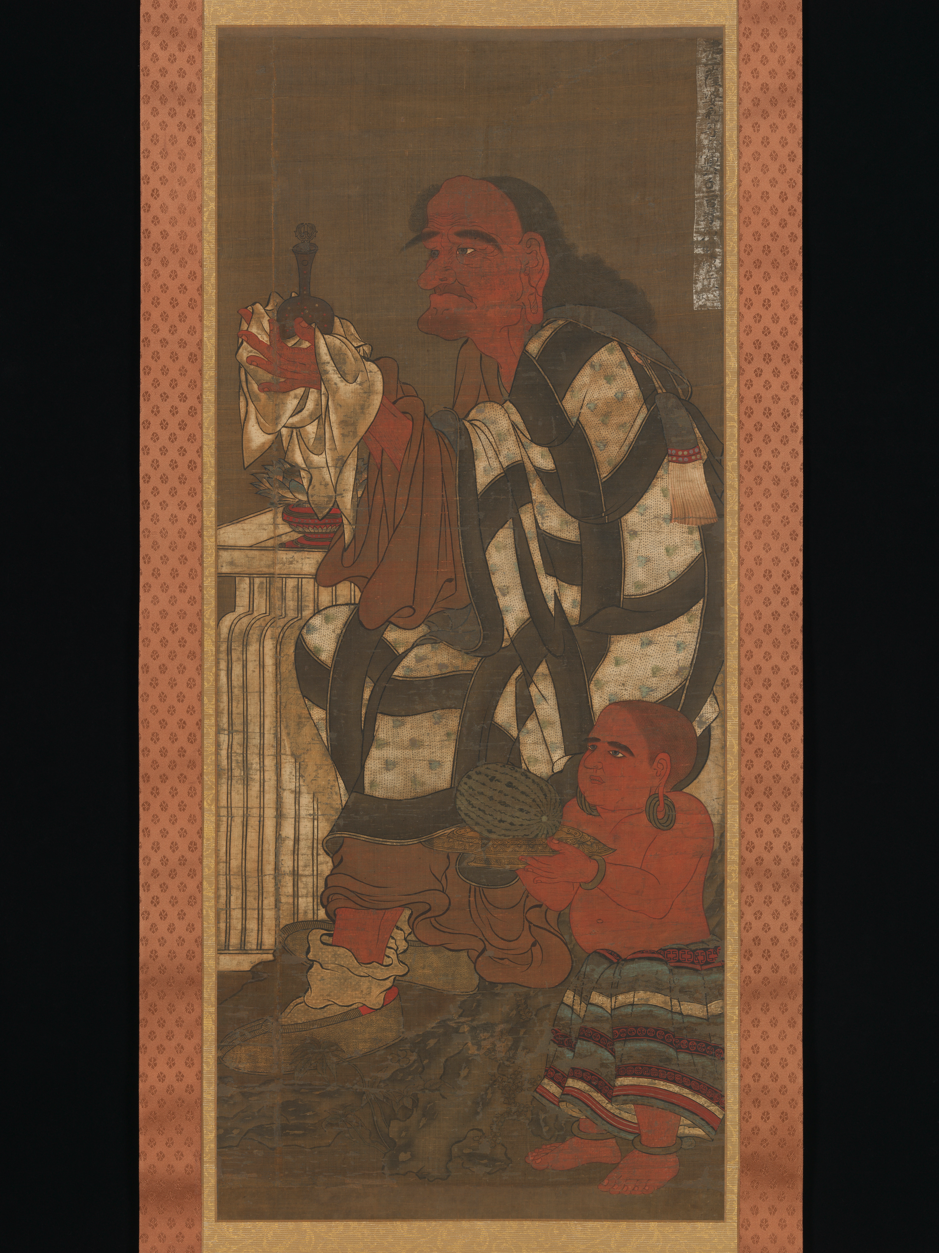
Doryphoros is indeed highly idealized, according to the Ancient Greek worldview. However, the work lacks realism, the property of images that represent the gritty or harsh realities of the world. For example, a fourteenth-century Japanese painting of Satsubari, The Second of the Sixteen Rakan – figures in Buddhism who protect Buddhist law and bless donors – is not painted with naturalism, in that the work is clearly a painting, with a loose style and exaggeration of features. On the other hand, the work is highly realistic, in that the artist has presented us with a figure that is ordinary or even slightly grotesque, rather than idealized. He is old, wrinkled and bent, his earlobe hanging low (stretched out by having worn large gold earrings) as a marker of his past wealth. His clothes are rumpled, his socks slipping downward. While the image is not very naturalistic, it is still highly realistic.
Disentangling naturalism from realism is tricky, and the terms are sometimes used interchangeably, despite their important differences. Naturalism and realism might or might not appear in the same work. An image might be naturalistic and realistic, like The Doubting of Thomas, or naturalistic and idealized, as is Doryphoros. Alternately, a work might be abstracted and realistic, like the Second Rakan, or abstracted and idealized, like John in the Book of the Gospels in the previous chapter. This diagram presents the nexus of these terms, and we might plot just about every work of art in this book somewhere within it.

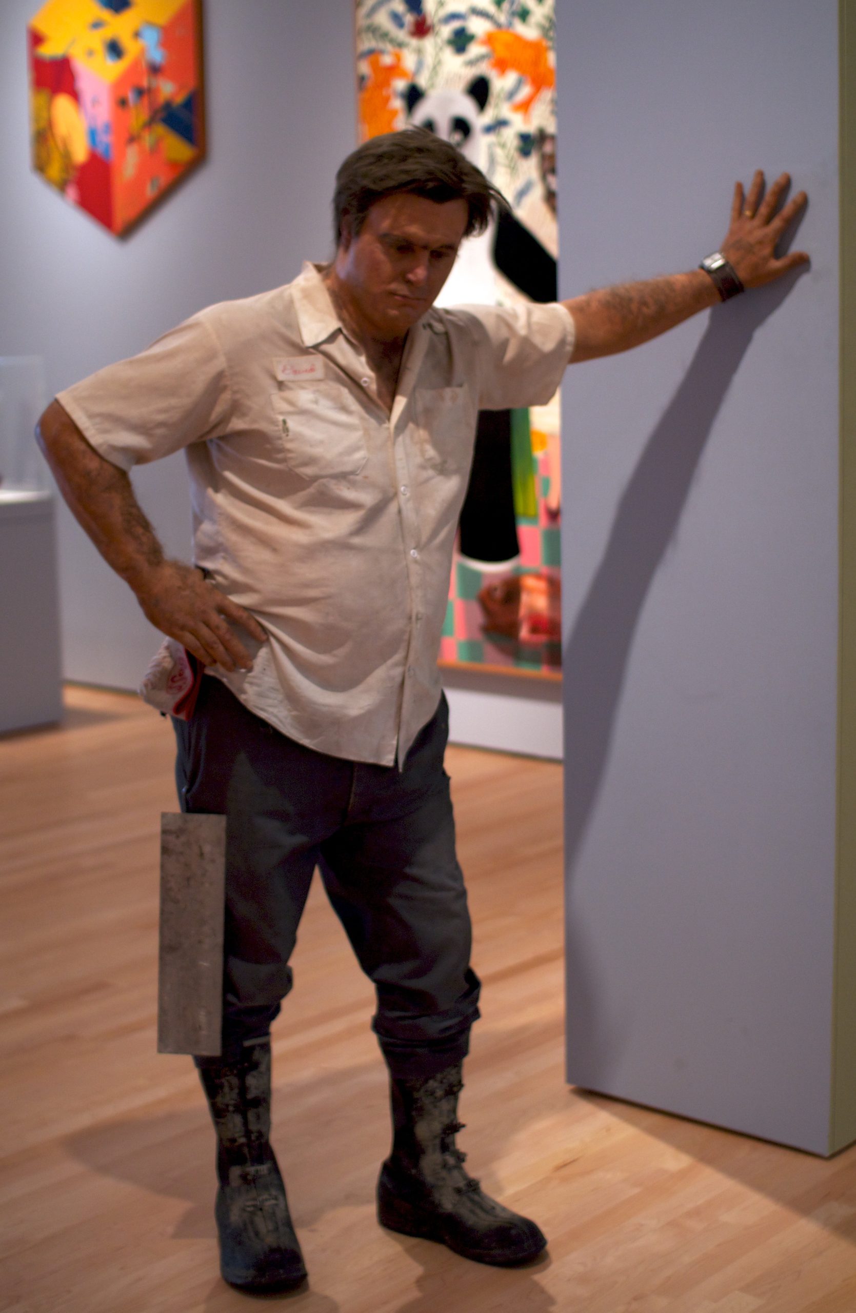
Some works, of course, like those by Duane Hanson, have both forms of naturalism. His life-size sculptures of people revel in their ordinary nature, and are also startlingly lifelike – veristic – so much so that they are frequently mistaken for real people when on display in museum exhibitions. I have been fooled by two of them, over the years. One was dressed as a museum guard and another as a workman. Even though I had seen Slab Man (1976) dozens of times, when his gallery was under construction and he was surrounded by carts of equipment and tools, I was fooled anew.
You can now identify all of the visual and compositional elements in any work of art! Take a look at the following pairs, and try to determine how the artists have used line, shape, color, space, form and texture, combined to create balance and symmetry, emphasis, movement, pattern and repetition, rhythm, proportion and scale, variety and unity, and convey degrees of naturalism and abstraction, realism and idealism, to create effective works of art. While this is quite a long list of individual and paired elements, once you have mastered them, you will be well-prepared to take on any works of art you encounter.
I have set up these three pairs of images, so that you can conduct the most classic of all art historical activities: the Compare and Contrast Exercise. The purpose of this, as already demonstrated in many of the sections above, is to allow the similarities and differences between works highlight their relative qualities.
Comparison 1
Comparison 2
Comparison 3
Media Attributions
- Symmetry, Pietro Perugino, Christ Giving the Keys of the Kingdom to St. Peter.
- Reconstruction of the West Façade of the Temple of Artemis at Corfu, Greece, c. 580 BCE.
- Buddhist Womb Realm mandala
- Polykleitos, Doryphoros
- Manohar, Hamid Bhakari Punished by Akbar, ink, watercolor, and gold on paper, ca. 1604 (Metropolitan Museum of Art, New York). Photo: Public Domain.
- Manohar diagrammed
- Vairochana, bronze
- Cordoba – 39
- Jackson Pollock, Autumn Rhythm
- Nigeria Benin Group
- Buddha in lotus
- Caravaggio, The Incredulity of Saint Thomas
- Hakuin Ekaku, Portrait of Bodhidharma, hanging scroll, ink on paper, mid-eighteenth century (Metropolitan Museum of Art, New York). Photo: Public Domain.Portrait of Daruma, Japan, Edo period (1615–1868) Hanging scroll; ink on paper; Image: 45 7/8 x 21 1/4 in. (116.5 x 54 cm) The Metropolitan Museum of Art, New York, Gift of Florence and Herbert Irving, 2015 (2015.500.9.3) http://www.metmuseum.org/Collections/search-the-collections/78145
- Caravaggio, Saint Thomas
- Kazimir Malevich, Painterly Realism
- Satsubari, the Second of the Sixteen Arhats, hanging scroll, ink and color on silk, fourteenth century (Metropolitan Museum of Art, New York). Photo: Public Domain.
- Diagram of Abstraction, Naturalism, Realism, and Idealized Images. Image: Mari H.
- Duane Hanson, Slab Man, 1976 (Cantor Center for Visual Arts, Stanford). Photo: CC BY-NC-SA 2.0.
- Asher Durand, Kindred Spirits, oil on canvas, 1849 (Metropolitan Museum of Art, New York). Photo: CC BY-NC-ND 2.0.
- Dong Qichang, Landscapes After Old Masters, ink on paper, 1630 (Metropolitan Museum of Art, New York). Photo: Public Domain.
- Wassily Kandinsky
- Kazimir Malevich
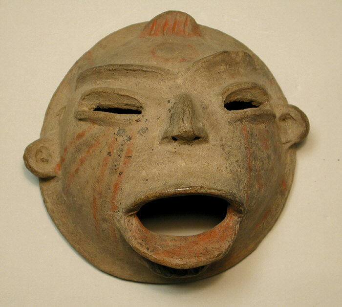
- Tlatilco, Mask, ceramic, twelfth century-ninth century B.C.E. (Metropolitan Museum of Art, New York). Photo: Public Domain.
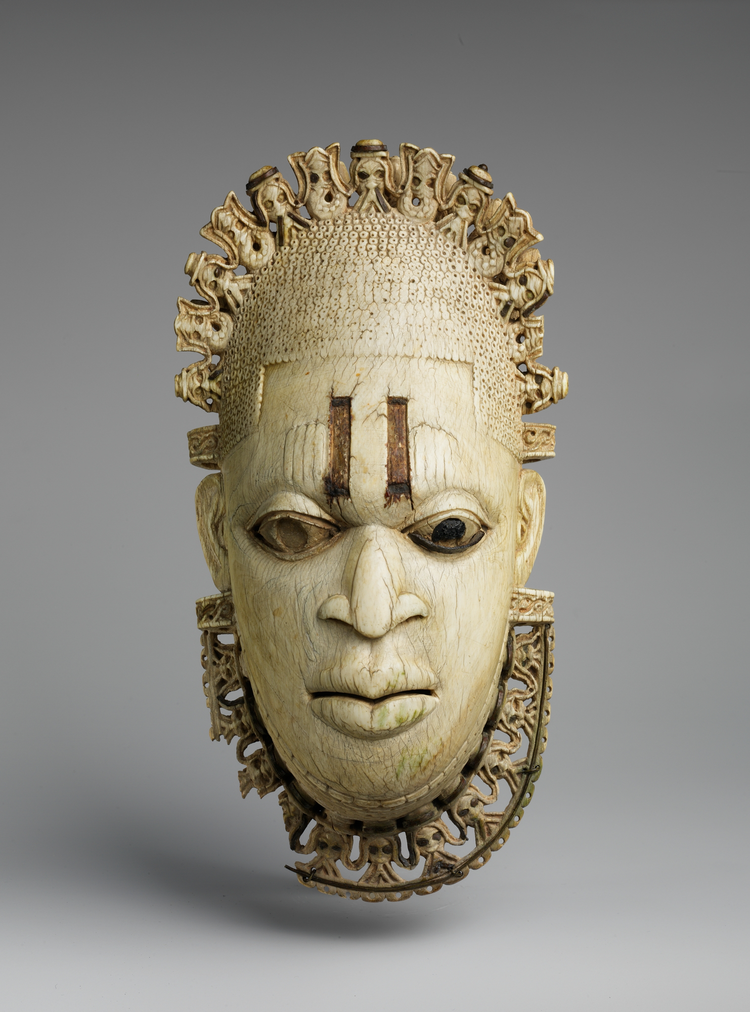
- Queen Mother Pendant Mask: Iyoba, ivory, iron, copper, sixteenth century (Metropolitan Museum of Art, New York). Photo: Public Domain.
How the visual elements of a work of art relate to each other
An even use of elements throughout a work
Usually used to describe bilateral symmetry, which is a mirroring of two halves of a work, or radial symmetry, where an image is symmetrical around a central point or axis, like a sunflower viewed head-on
Techniques used to draw attention to one or more points in a work
A sense of motion as the eye is guided through a work
Repeating an object or element evenly throughout a work or a part of a work
Similar to pattern, repeating an object or element throughout a work or a part of a work, but generally less precise or formal than a pattern
A visual tempo set by repeating elements in a work
The relationship of parts of a body or form to one another and of the parts to the whole, for example, the size of the head of a figure in relation to the entire body
The relationship of parts of an image to the image as a whole, or to something in the world outside of the image, for example, the size of the figure of a king in an image as compared to the size of the figure of his servant in the same image, or the size of a statue of the king as compared to the size of an actual person
The use of different visual elements throughout a work
The use of similar elements so that all the parts of a work fit together well
An image, model, or full-scale replica of a damaged or lost work of art or architecture
A substantially damaged work of architecture, usually unable to continue to serve its original purpose
The front face of a building
The property of an image that is symmetrical around a central point or axis, like a sunflower viewed head-on
An image using geometrical layout to represent the universe, especially in Buddhism and Hinduism
In Buddhism, the end of cycles of reincarnation and a release from all desires and the resulting suffering
The property of an image where its two sides do not mirror each other, but still have approximately the same visual weight, the same amount of detail or shapes or color, and so on
Literally, "counter-balanced," a pose used in for human figures, developed in Ancient Greece, where the figure's weight is supported by one leg, while the other is loosely bent, resulting in an S-curve throughout the body
A type of scale based on relative importance, in which more important figures are represented as larger than less important figures around them
Making an image look like the “real world”
Art containing an image of something, as opposed to pure abstraction
A work of art with no depiction of anything, also called total abstraction
The highest degree of naturalism
In some way or ways deviating from or ignoring the appearance of the natural world, simplifying or altering it for effect
Designed according to the principles of a particular style rather than being beholden to the way things look in “the real world.”
The property of images that represent the gritty or harsh realities of the world
represented not as is, but according to a culture's belief about what the ideal form would be, eg. the form of the human body. Ideals change over time, and vary from culture to culture.
