10 Copies
Can Copies be Original(s)?
Many modern museum visitors value originality above all other qualities in an artist. Viewers tend to like to see works that seem dramatically new and fresh, and when a work does not seem wholly original, it is often criticized as “unoriginal” or “derivative,” or as “just a copy.” However, for much of the history of art making, dramatic originality was not viewed as being all that important; indeed, in some times and places, it was seen as a negative trait. Regardless of the value judgments we might personally make about works of art, we should acknowledge that all art has a history, that all images and objects are, in some way or another, based on the art that preceded and surrounds them. The vast majority of “Ancient Greek” sculptures praised by art historians and adored by museum visitors, for example are actually Roman marble copies of lost Greek bronze originals, like the famous Doryphoros discussed in the introduction.
This chapter examines the work of artists who make creative and imaginative use of copied styles, subjects, themes, and images, artists who celebrate the nature of their works as, in some way and to some degree, copied. We see works by artists who copy works from the recent or distant past, who borrow from neighbors, from neighboring cultures, and from cultures across the globe. In all cases, we focus on the ways that copying can itself be a creative and “original” act. Because the subject here is copying, the first Spotlight in this chapter is a series of works rather than a single image
SPOTLIGHT IMAGES I:
OUR LADY HODEGETRIA ICONS
AND:
Christabel Helena Anderson, The Theotokos of the Don, egg tempera panel icon with natural pigments (including ochres from the Forest of Dean in England and Lapis lazuli from Afghanistan) and 24 carat gold, 2011: See here for an image.
VIEWING QUESTIONS
- In what ways are these icons similar? What elements of art and principles of composition are copied from one to the next?
- The icons are similar, but not identical. How do the works differ?
- What is emphasized in each icon, and how?
- How does each work present the relationship between the mother and her son?
- How do they differ in mood, and how is this accomplished
INTRODUCTION: A Timeless Image (?)
In the early fourth century, the Roman Emperor Constantine legalized Christianity and began funding churches and works of art. He also moved the capital of the Empire from the city of Rome to Byzantium, a wealthy city in modern-day Turkey, which he then renamed Constantinople after himself. While at the time, its inhabitants still called their empire Rome, we now refer to it as the Byzantine Empire, which lasted about a thousand years, ending in the 15th century, when the army of the powerful Ottoman Empire conquered Constantinople.
The Byzantine period was one of tremendous wealth and power for the imperial rulers, and artists produced lavish works of art. The most characteristic creation of the Byzantine period is the icon – an image of a saint or other holy figure from Christian mythology, usually presented against a gold background and thereby separated from any specific contexts or moments from their lives. One of the most common subjects for such icons is the Virgin Hodegetria; literally “She Who Shows the Way” in Greek, these are images in which the Virgin Mary holds her son Jesus and gestures toward him, guiding the viewer to him and therefore, according to Christian belief, to salvation. Because of its common appearance from the Early Christian period to the present, Hodegetria icons are useful examples of the remarkable continuity of copies of icons throughout time. In this Spotlight, we will look at a series of Hodegetria icons, spanning about 1500 years.
VISUAL ELEMENTS: Copying Across Millennia
At a glance, Byzantine icons strike many viewers as repetitive, as all being more or less the same. Their similarity, though, is by careful design. Their makers sought to preserve information about the appearances of their subjects, and traditions of their representations, and thereby to produce images that were not merely accurate but also magically or divinely powerful. To be clear, the icons discussed here are a few examples out of thousands of this same subject, and there is no evidence that they were directly copied from one another. Rather, they were part of a large network of icons, all based on related models.
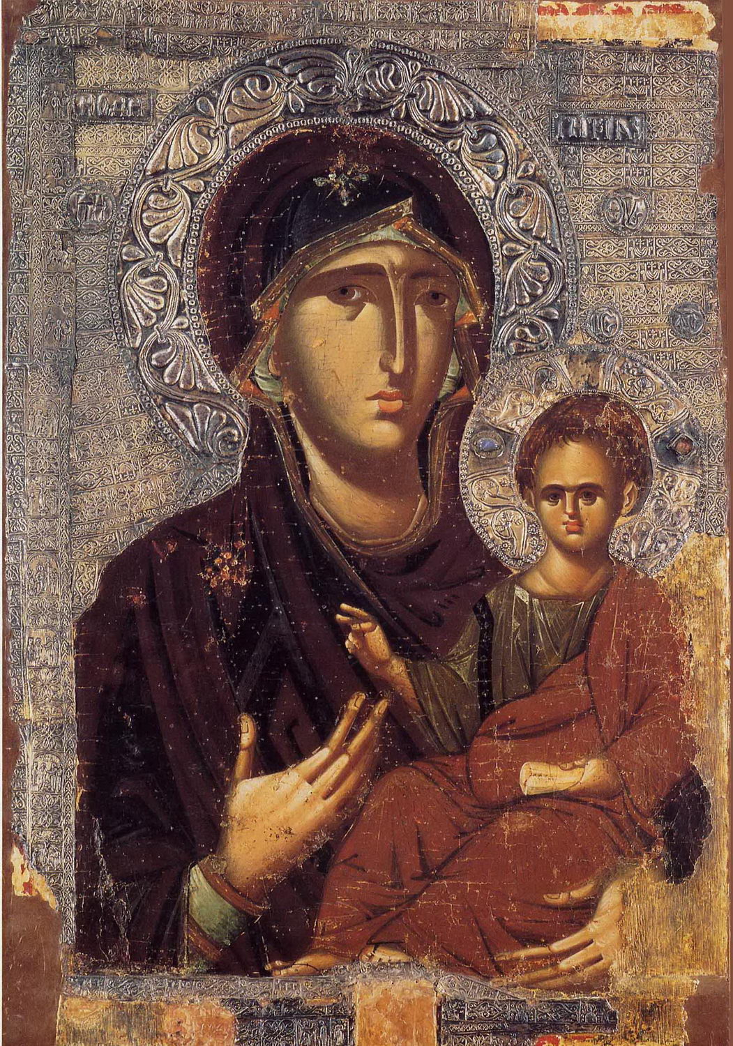
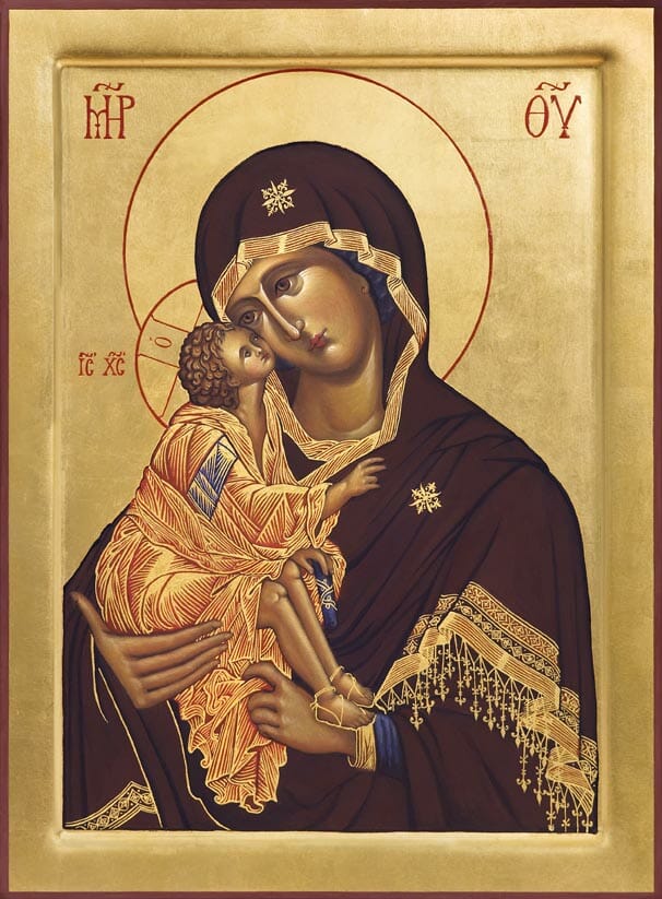
Among the earliest known versions is a Byzantine Hodegetria, possibly made in the Roman province of Palestine or in the Roman capital city of Constantinople in the fifth or sixth centuries, and now housed in Santa Francesca Romana (Santa Maria Nova), Rome, Italy. This work has been altered more than once, and has been extensively restored, so its details do not accurately reflect its original state, but do record some of the ways it changed over the centuries.
The two faces are the icon’s oldest parts, painted in encaustic – pigment suspended in hot wax, a technique common in the late Roman Empire – on canvas. Sometime in the Middle Ages, these heads were cut out and inserted into a new painting, which is why the faces may seem somewhat out of place. They are different in technique – the medieval icon is tempera on wooden panel – but also in color and scale. Jesus’s face seems far too small for his head. Mary’s seems too large for hers, and is much paler than her hands. It is also likely set at the wrong angle. Her neck meets her body at an angle, suggesting that in the original work, her head was inclined toward Jesus.
What we see is quite typical of Hodegetria icons: a bust-length image of Mary holding Jesus with one hand and gesturing toward him with the other, hence her title as “She Who Shows the Way.” She wears a very dark blue robe, as does Jesus. He holds a scroll in one hand and raises the other toward Mary in a two-fingered gesture of blessing. Her face is quite pale and, surrounded by her dark clothing and the gold background, draws our eyes. In this case, she looks out at us, while he looks up at her. Her eyes are dramatically enlarged, and their irises are very dark against their whites, so that they become the focal point for the work. We are compelled to make eye contact with Mary, as she then encourages us to look to Jesus. Behind the pair, on the restored golden background, we see two haloes, with Mary’s radiating waves of light that again guide our eyes back to her face.
Almost a millennium later, little has changed. An icon of the Hodegetria from the thirteenth century preserves many of the features of the earlier icon. Again, there were changes made to the icon over time, including the addition of the embossed silver covering the original gold background, which now shows through at the edges where the sliver has been lost. The changes made to these icons over time indicates both their usage, which results in wear and tear, and their importance – damaged works can always be replaced rather than repaired if they are not seen as particularly worthy of preservation. The whole image has been reversed so that Jesus is now to Mary’s left, which will remain more common.
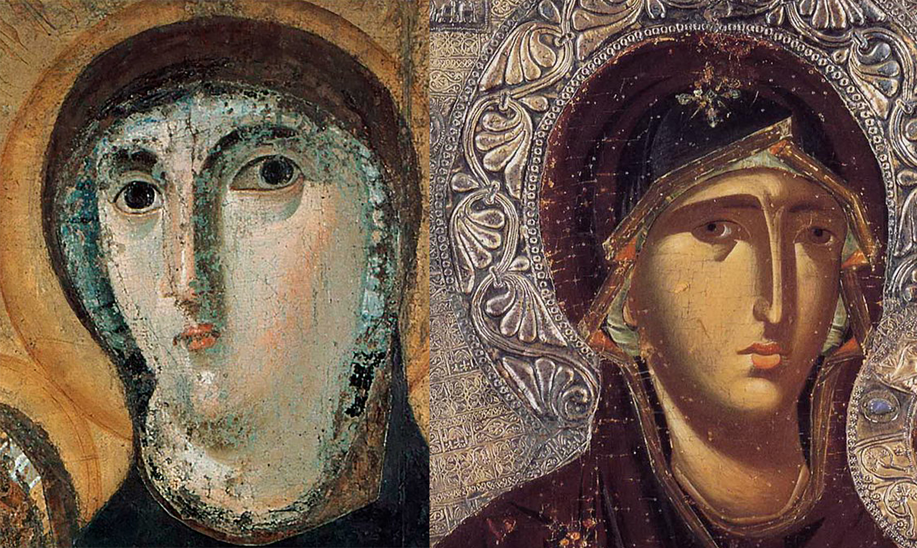
Some features of the two icons are strikingly similar: in addition to their basic gestures and poses, Mary’s very long nose, sharply cut brows, and tiny mouth are quite similar. In the thirteenth-century icon, she again looks out at us, though her eyes are no longer so dramatically oversized.
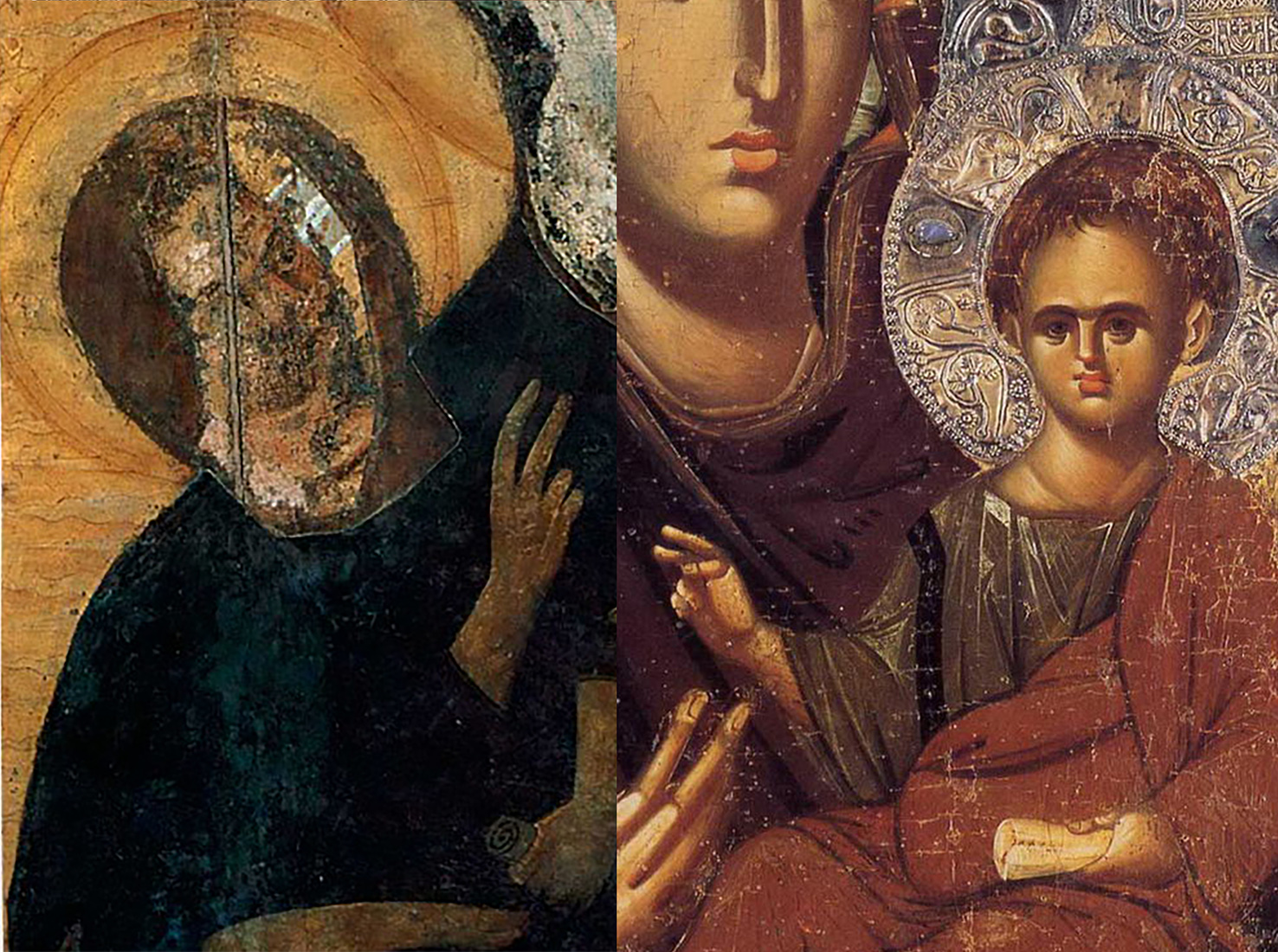
Jesus still holds a scroll in his left hand and raises his right in blessing. Jesus’ attention, though, has been shifted quite significantly from Mary to the viewer. He looks out as us, and his hand, with the same gesture as in the earlier icon, is now turned toward us. The impact for a devout Byzantine Christian would be quite different, now that they are the object of Jesus’s blessing.
There is something peculiar about the size and shape of Jesus’ head. It may be intended to suggest that, though he is here a baby, he already bore adult (and divine) wisdom. On the other hand, it may be an echo of the strange medieval reconstruction of the earlier icon from Santa Francesca Romana, where the original, smaller face of Jesus was set into the larger head of the later work.
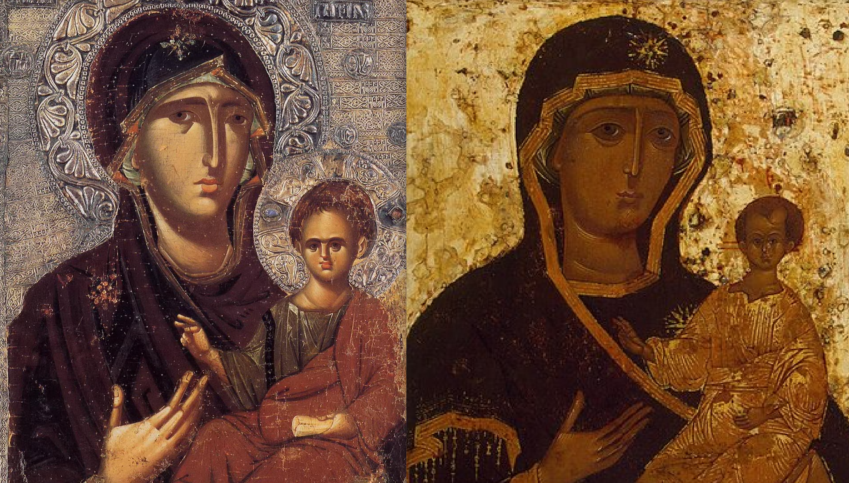
Moving forward another three hundred years to a sixteenth-century Russian Hodegetria icon, so much is again the same, so much copied from earlier models. Again, the two figures are posed as before, again with Mary in her blue robes, again against shimmering, precious backdrop, removing the pair from our ordinary world and placing them in a divine space. Mary’s features are again quite similar – her long, narrow nose, her sharp brows, her small mouth – and again Jesus bears the curiously enlarged forehead. He is yet smaller, though, and more doll-like in her arms, and his proportions are less child-like. He is proportionally taller and thinner, more like an adult. This effect furthers the implications that he has adult wisdom. The figures also seem more cheerful – their lips curve up ever so slightly at the corners. The thirteenth-century pair is so dour, in comparison.
From one work to the next, we see something of a shift toward abstraction that contradicts the old idea that all artists want to make their work as naturalistic as possible, and that art therefore becomes increasingly naturalistic over time. Instead, these works become more stylized as they become copies of copies of copies of copies. In the earliest of our examples, Mary’s face is shaded as if by natural light striking it from the left. This helps create an illusion of depth and volume. Her nose casts a shadow on her right cheek, and so on. In the sixteenth-century icon, while some of this naturalism is retained, some of the highlights on Mary’s face and neck, as well as on Jesus – particularly his robes – are lines of gold. These reflect light. Rather than presenting the illusion of light hitting a surface, they actually shine. However, they do not look natural, at all. They make the figures more magnificent, literally more radiant, and otherworldly.
The Byzantine icon tradition carries on in the present, especially in Greece, Russia, and eastern Europe. Contemporary icon painter Christabel Helena Anderson created her The Theotokos of the Don (see here for an image) in 2011. Its connection to the 1500-year tradition that preceded its creation is clear. The figures are posed more or less as they have been since the fifth or sixth century example. Indeed, Anderson has returned Jesus to Mary’s right, where he was in the earliest example here. Again, Mary bears her long nose and sharp brows. Again, Jesus’ head is oversized and bulbous. The sixteenth-century icon seems to have been a direct inspiration for her, as Mary’s features and robes are quite similar. Anderson has, though, made her own alterations. Most importantly, she has changed Jesus’s position so that he is snuggling right up to Mary’s cheek. His body is still more like that of a lanky adult than a that of a baby, but his action is much more that of a young child nuzzling up to their mother.
Each artist who turns to this subject has a challenge: how does one preserve the accuracy and authority of the image, while creating a work that is new, fresh, and effective? The goal is not “originality,” since a genuinely original work would break the connection with the works of the past, from which the new icons draw their power. But a work of simple, mechanical copying is likely to be less effective than one that finds a way to bring nuance to an old theme.
CULTURAL CONTEXT: Byzantine Icons
Hodegetria icons have been considered particularly important and authoritative, since it was believed that the first version was painted by St. Luke from life, that is, with Mary and Jesus sitting as live models before him while he painted. Luke was the author of one of the four Gospels – the core texts of Christianity. This version was therefore considered accurate and authoritative; artists strove – and still strive – to copy it as exactly as possible, in order to preserve its record of what they believe to have been an actual, historical moment when Luke painted Mary and Jesus from life. There is debate over what happened to this first image. Some believe it was destroyed when the Ottomans conquered the Constantinople in 1453. Others believe it was smuggled out of Constantinople, and survives in Western Europe, though this camp has not reached consensus on which of several possible icons is the one painted by Luke. Most art historians, though, believe that the form of the Hodegetria developed in the Early Christian period, perhaps in the fifth or sixth century.
Icons were quite controversial in the Byzantine period. At the time, Christianity was still working to demonstrate its difference from Roman polytheism – the worship of many gods, in this case Jupiter, Juno, Mars, Venus, and the rest of the Roman pantheon of deities. One of the main differences that early Christians sought to emphasize was their rejection of polytheistic worship of idols, that is, of statues that have been inhabited by the deities they represent. Some Christians, following the Second Commandment, which prohibits idol worship, saw any images as problematic, but the vast majority embraced images. However, the ways that icons were actually used by Byzantine Christians did not help their critics to feel any more at ease. Numerous records survive that indicate that Christians were treating the physical objects – rather than the figures they present – as powerful, magical, or divine. Icons were dipped into poisoned wells to purify them. Sick people would shave off bits of icons to make medical drinks. Icons were carried as protective talismans before armies heading into battle. All of these practices indicate that, whatever highly educated Christian writers thought about the difference between worship of idols and veneration – great respect – of icons, many people clearly confused the two, and treated Christian icons in much the same ways their families had treated polytheistic idols only a few generations earlier.
When the Byzantine Empire was threatened by the spread of new powers and religions, particularly by the rise of Islam and the attendant Muslim conquests of territory, images were placed at the center of internal debates. Tensions between iconophiles – those who loved icons – and iconoclasts – those who destroyed icons – led to the Iconoclast Controversy, which raged from around 730 CE to 843 CE. This was probably the longest sustained debate on the use of art in the world’s history. Many people were killed over the issue, and most early icons were destroyed. Only a handful survives from before the Controversy, including the earliest example here. The debate centered on the use of the images. Did the veneration of icons violate the Second Commandment?:
You shall not make for yourself an idol in the form of anything in heaven above or on the earth beneath or in the waters below. You shall not bow down to them or worship them; for I, the Lord your God, am a jealous God, punishing the children for the sin of the fathers to the third and fourth generation of those who hate me, but showing love to a thousand of those who love me and keep my commandments.[1]
To make their case, iconoclasts simply pointed to this fairly strict regulation of images. The inconophiles made much more complicated and subtle arguments, but ultimately, it seems unlikely that the arguments are what really decided the matter. The iconophiles, literally “image-lovers,” won simply because, on the whole, people love images. The Byzantines resumed creating and venerating icons in 843 CE, and Byzantine Christians – modern day Orthodox Christians – have been copying their earliest surviving models, ever since.
Comparisons and Connections I: Copying as Innovation and Resistance
While Byzantine icon painters are unusually consistent in their copying of earlier works over long periods of time, all artists are influenced by the styles and media of others, even those who stridently claim otherwise. Early Greek art influences later Greek art. Early Chinese painting influences later Chinese painting. Early Indian Buddhist art influences Chinese Buddhist art, which influences Japanese Buddhist art, and so on. The most influential works of art and artists make up what is called the “canon” of art history. These are the objects and artists that appear in all the major survey textbooks – Michelangelo, Leonardo, Matisse, Monet, and so on. We will look at some straightforward examples of these sorts of borrowings, but will also look at more unexpected moments of influence, where artists – like Zacharie Vincent, in the Selves chapter – look to unusual or unexpected sources as inspiration for their work, or manipulate their sources in interesting and nuanced ways.
Copying Great Masters
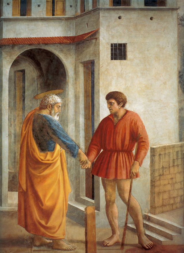
In Europe, at least since the Renaissance, there has been an active tradition of artists learning and improving by copying the works of so-called great masters. Surely, the most famous master artist of the European tradition is Michelangelo Buonarroti, but when he was a young artist, Michelangelo looked to an earlier master for inspiration. In the Sex chapter, we see how Michelangelo’s fresco from the Sistine Chapel was based on Masaccio’s fresco from the Brancacci Chapel. Here, we will look at one more example of Michelangelo’s use of Masaccio, this time a sketch he drew, based on another fresco from the Brancacci Chapel.
In Masaccio’s image, we see St. Peter paying a tax collector. Masaccio was celebrated in his own day for his ability to create lifelike figures that seem to move through convincing, illusionistic spaces. Peter, in gold and blue robes, seems to have volume, to occupy real three-dimensional space, to stand firmly on the ground, over which he casts a soft shadow. This is conveyed through the use of light and shading. The light pours over the figure from the right, striking his face and the front of his robes, and leaving his back in shadow. The deep folds of his robes are also darkened with shadow.

Michelangelo spent months in the Brancacci Chapel studying and copying Masaccio’s work. Only a single sketch, based on this figure of Peter, is thought to survive from this period. Here, we can see Michelangelo not only copying, but also adapting his model. The figures, wearing the same robes and lit from the same angle, stand in nearly identical poses. The differences between the figures, though subtle, are important.
Where Masaccio’s figure stands on his back foot, and seems immobile, Michelangelo’s figure is stepping forward, and his weight seems convincingly shifted to his front foot as he leans forward to pay the tax collector. Michelangelo also dips Peter’s right shoulder down and forward. This helps render Peter’s arm less stiff and more graceful, and the larger cuff Michelangelo adds exaggerates the gesture. Michelangelo draws Peter’s robes falling more naturally, as if following the motion of the figure. Finally, whereas Masaccio’s figure is nearly expressionless, Michelangelo adds – through the addition of only a few quick strokes of ink to Peter’s face – a note of sorrow to the image. The pose and expression together make the figure more emotionally compelling, even though it is merely a quick sketch.
What is most remarkable about these changes is that they were not made from a new model, posed as Masaccio’s presumably was. Instead, they were based on the original fresco, altered and augmented by Michelangelo’s imagination. This is a case of an artist not merely copying a prior master’s model, but actively reworking it to make it his own. These images were not considered sacred or magical, like Byzantine icons, so their artists and viewers would not have found the changes to be problematic.
Of course, Michelangelo would eventually become a master in his own right, and would become one of the most frequently copied of artists in Europe. Indeed, there is a whole period of art called Mannerism (ca. 1520-1600) that is, in essence, “art in the manner of Michelangelo.” However, his influence did not end in the seventeenth century. Among a great many others, the nineteenth-century Post-Impressionist painter Paul Cézanne produced copies of works by Michelangelo. He made many drawings based on Michelangelo’s two sculptures of enslaved people in the Louvre Museum in Paris.
As Michelangelo reinterpreted Masaccio’s work for his own ends, so Cézanne in turn reinterpreted Michelangelo. Many artists who have copied Michelangelo’s works have focused on his heightened naturalism, on his way of capturing and elevating the human body, or on studies of light and shadow – much as Michelangelo used Masaccio’s work. Cézanne, though, presents us with a curiously simple sketch. It seems washed out, like a photograph taken with too much light. Only the deepest shadows are represented, at all. The facial features are only just sketched in and the muscles are more implied than represented. This approach, which breaks up the soft and curving body of the figure into more generalized geometric forms, is typical of Cézanne’s work.

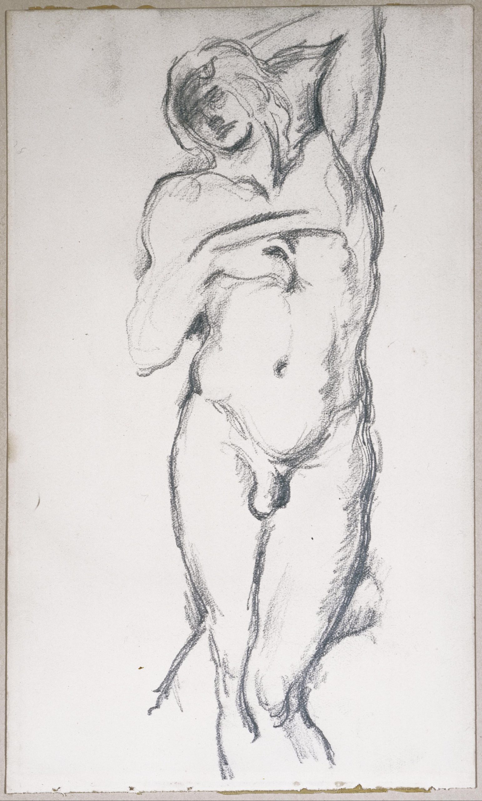
What is the point, then, in starting with such a complex image as this sculpture? Perhaps it presented a challenge: How can an artist reduce this twisting, writhing, bulging figure to a simple set of geometric planes and shapes? There may, though, have been another motivation behind Cézanne’s choice of model. In making a drawing from a sculpture, an artist must choose the angle from which to make the image. Most modern photographs are taken from a bit further to the left or right, but Cézanne has chosen to present the twisting figure from a somewhat awkward position that, instead of emphasizing the figure’s musculature or motion, freezes him in space, with his legs open toward us and a curl of cloth drawing our eye inward to his groin. Rather than am image of masculine strength and muscular power, the image seems one of soft, sexual vulnerability.
Copying the Othered
While many artists copy the works of artists from within their own culture – contemporary or historical – some look to other cultures for models. The meeting of two cultures often results in conflict and violence, but also in trade and exchange of ideas. This section examines a series of works depicting borrowed themes or using borrowed styles, beginning with a work that relies heavily on ancient Greek models. Naturalistic Greek sculpture has proved to be extremely influential on European art, but also had an impact on the arts of Asia.
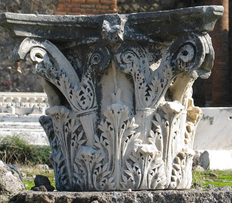
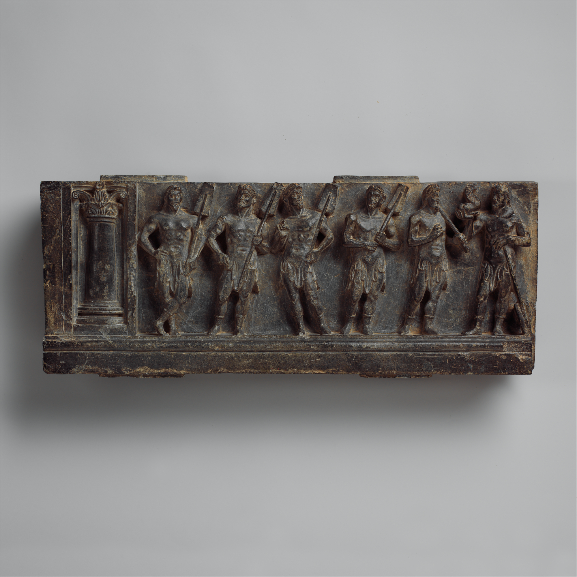
Alexander the Great conquered much of the Mediterranean basin, including parts of what are now Iran, Afghanistan and Pakistan, and in these regions established Greek-style cities, complete with Greek-style architecture and art. These works came to influence local representations of local deities. A relief panel of Buddhist marine deities from the Gandhara province of Northern Pakistan, for example, shows a series of highly naturalistic, idealized, muscular male figures. They stand casually, in Greek-style contrapposto – with their weight on one leg and a gentle S-curve to their bodies. The column at the left is topped with a capital in the Greek Corinthian style, like the example here from a temple in Pompeii. If the panel with the marine deities was not part of a Buddhist stupa (like that discussed in the Religion chapter), we would have a hard time telling it from Greek originals. Since many people learn how to imagine their gods through works of art, the influence of Greek prototypes goes beyond art, into the imaginations of Buddhist devotees.
A millennium and a half later, we find a South Asian work that also borrows from a European prototype, though this time the subject and composition are borrowed, while the style remains more characteristically local. Akbar the Great, who expanded the Mughal Empire to include what is now Afghanistan, Pakistan and northern India, was a Muslim, and curious about other religions, so he invited to his court Hindus, Christians, Zoroastrians, and others. He housed a group of Jesuit Christian missionaries in his palace, and ordered his court painters to produce hundreds of images of Christian subjects based on the extensive collection of European paintings and prints the missionaries had brought with them. He had these works included in many media and locations, from books to jewelry to wall decorations for his throne room (as well as his harems). Akbar was not, though, interested in conversion to Christianity. He practiced religious toleration and encouraged cross-cultural borrowings, and saw in Christian art support for his own interest in figural art, generally avoided in Muslim contexts.
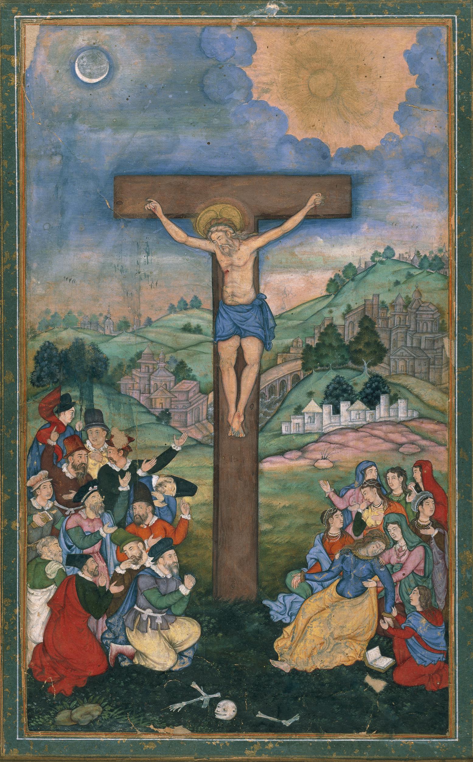
A crucifixion painting produced for Akbar’s courts and attributed to Kesu Dás (ca. 1590) was probably based on a Flemish print, probably of about a decade earlier. It follows European convention in its design and layout: Jesus appears elevated at the center, and below him to the sides are groups of his followers. To the right, Mary (in blue and yellow) faints as Saint John (in red) kneels by her side. We see the sun and moon above, a reference to the belief that at the moment of Jesus’s death, there were total eclipses of both, as well as an earthquake. The figures around Mary and John, though, appear in traditional Mughal dress, with elaborate robes and jewelry. However, the men to the left are depicted as Europeans, presumably as the Jesuits who lived at the Mughal court.
The landscape is depicted in a European style, with layers of hills receding into a deep distance, and with the horizon line – where the sky meets the land – just about above the vertical center of the painting, whereas Mughal paintings usually have the horizon line almost at the top of the image. The bright color pallet, though, is typical of Mughal painting. The buildings, like the women’s clothing, are Mughal in design, which has the effect of setting the crucifixion in India. This is, in a way, typical rather than radical; European scenes traditionally set the scenes of the Bible into European landscapes, rather than Middle Eastern ones. In the backs of Dutch and Flemish crucifixions, for example, we often find windmills. In German examples, we see the pointed spires of Gothic cathedrals. The Mughal crucifixion is work, then, that brings together styles, traditions, and cultures. It is clearly based on European prototypes, an in its inventive interpretation of the scene, copies its European model by bringing the scene into the local context of its patron.
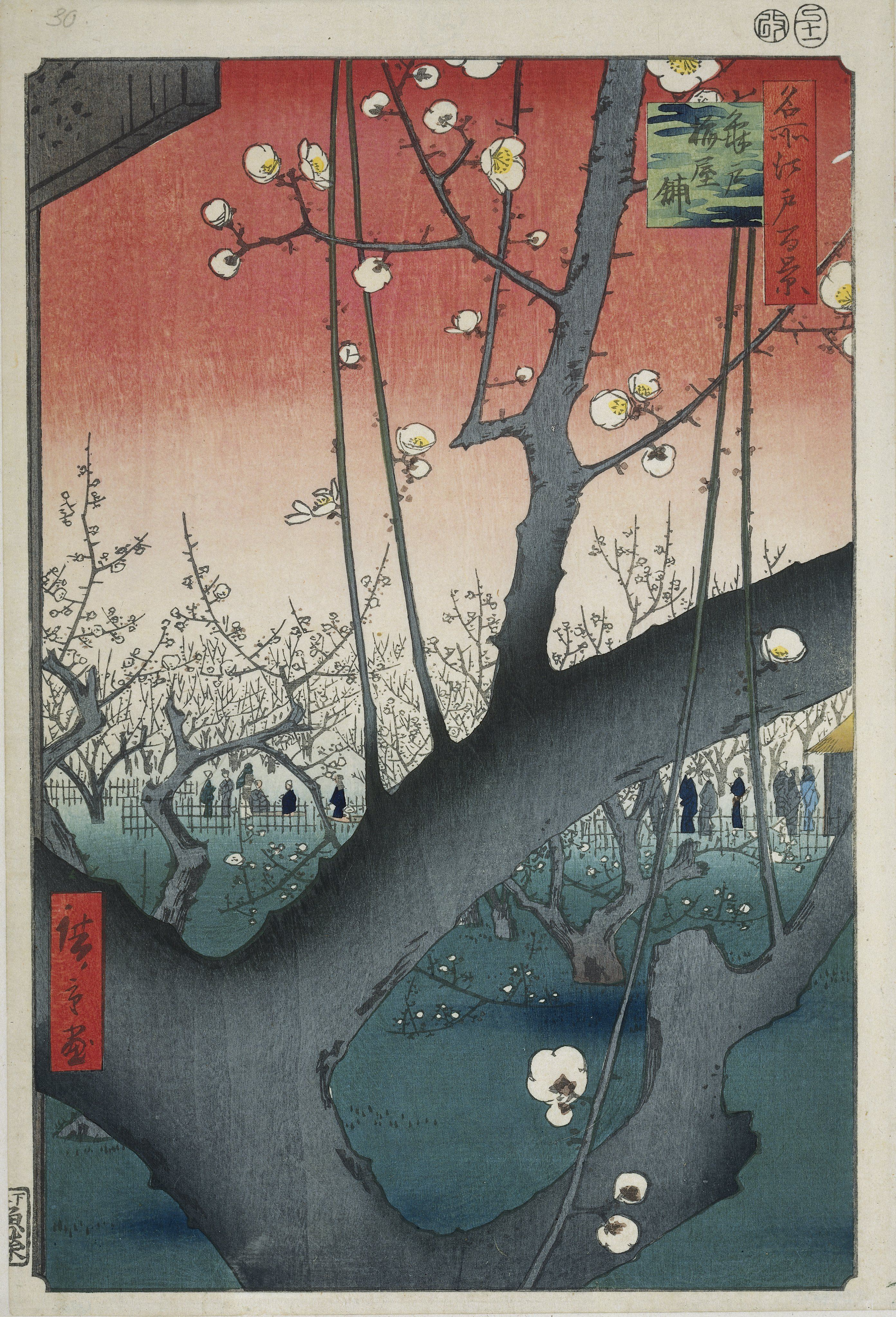
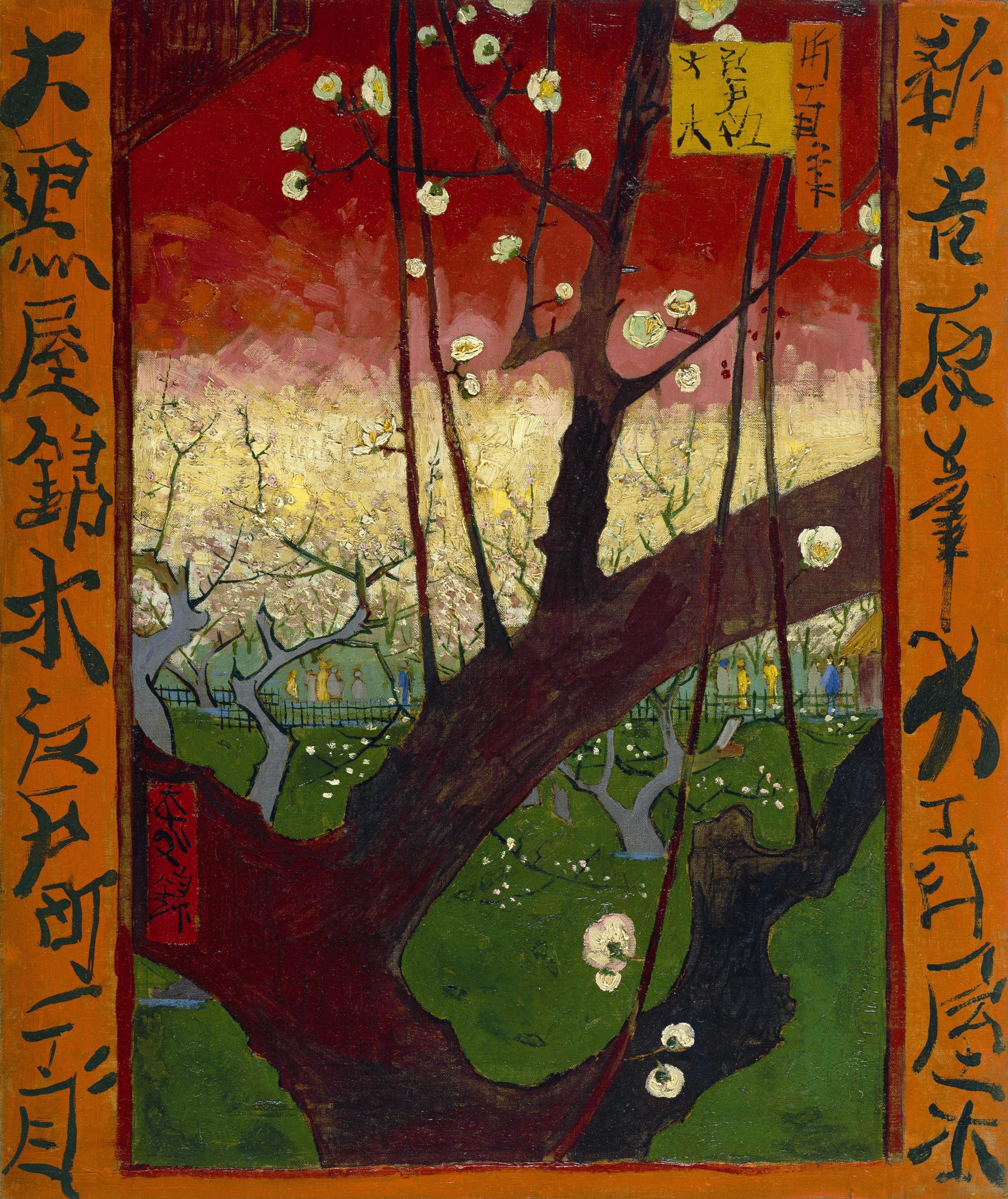
Perhaps the most well-known example of cross-cultural borrowing is that between Japan and Europe in the late 19th century. The impact of Japanese art, especially woodblock printing, on European art and design was so strong that a term was coined to describe this large-scale borrowing: Japonisme. French, English and Dutch artists, in particular, sought to adopt elements of Japanese style, including flat, outlined forms filled in with unmixed colors, and they also copied traditional elements of Japanese imagery, such as plum blossoms. Vincent Van Gogh was a collector of Japanese woodblock prints, and made copies of a few of them, including Ando Hiroshige’s Kameido Ume (Japanese Apricot) Garden, from his popular One Hundred Famous Views of Edo series (1857). Van Gogh then painted his version as Flowering Plum Tree (1887).
These works are strikingly similar, though Van Gogh’s colors are a bit warmer and more muddled together. Van Gogh copied the entire composition, including the red inscription panels, though he did not read Japanese. Like his contemporaries, Van Gogh was struck by what were, to them, daring compositions, such as the placement of the main tree at the very front of the illusionistic space, blocking much of the scene behind it and running off the edge of the image without any clear framing or rationale for doing so. The many practitioners of Japonisme not only copied specific works, but also copied such techniques. These would then spill over into other works by Van Gogh and his contemporaries.
It bears mention that Van Gogh titled his work Flowering Plum Tree, rather than Japanese Apricot. He was apparently unable to tell one Japanese fruit tree from the other, and assumed that Hiroshige had presented the more stereotypical plum blossoms. Even in his very careful copying of this image, then, Van Gogh also reproduced European cultural stereotypes about Japanese art.
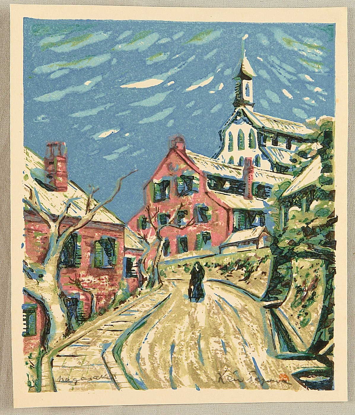
Cultural impacts generally flow in two directions. Just as their work was influenced European artists, Japanese artists were influenced by European art, borrowing linear perspective and other elements. In an interesting reversal of the usual discussions of Japonisme, Tagawa Ken produced woodblock prints that not only borrow some elements from European images, but seem to bear the direct influence of Van Gogh. His Western Buildings in Nagasaki (ca. 1930-40s) (see here for an image) is much looser and more flowing than is typical of traditional Japanese woodblock prints. The colors are more muted, as well. Tagawa’s print is not a copy of a European work, as Van Gogh’s was a copy of a Japanese work, but it strongly recalls works by Van Gogh, such as his The Church in Auvers-sur-Oise (1890).

Western Buildings in Nagasaki and The Church of Auvers-sur-Oise essentially begin at their lower edges, where winding beige paths guides us into the works and then curve uphill toward a church. Both have figures facing away from us, trudging upward and functioning as surrogates for the viewer. Both depict the church against a blue sky marked by curving lines. Where traditional woodblock prints would have filled the sky with a single tone of blue or, in the more daring work of Hiroshige, with a gently blended blue proceeding from dark at the top to light at the bottom, Tagawa’s is more splotchy and varied. Some of his marks seem to present clouds, but others, like Van Gogh’s marks, seem to merely suggest variations in the tone of the blue sky. The strongest resemblance, though, is in the soft, swaying outlines of all the forms, so typical of Van Gogh’s style.
Tagawa’s choice of subject also suggests his interest in European art. For this work, he chose a district in Nagasaki that contained a number of Western-style buildings. There is nothing within the image to suggest that this is a Japanese city. This image – in a traditional Japanese medium, imitates the work of a European artist, who had been copying a Japanese style – in order to represent Japanese copies of European buildings!
Challenging the Canon
While some artists use copying to reinforce the canon, like Michelangelo copying Masaccio or Cézanne copying Michelangelo, and others, like Zacharie Vincent (see the Selves chapter), manipulate its traditions to their own ends, and yet others, like Van Gogh and Tagawa, import styles and ideas that eventually transform the canon from within, there are artists who use copying to work actively against the artistic canon. In particular, feminist artists have worked to break down the canon, which traditionally excluded all female artists, though now a few have made it into most survey textbooks.
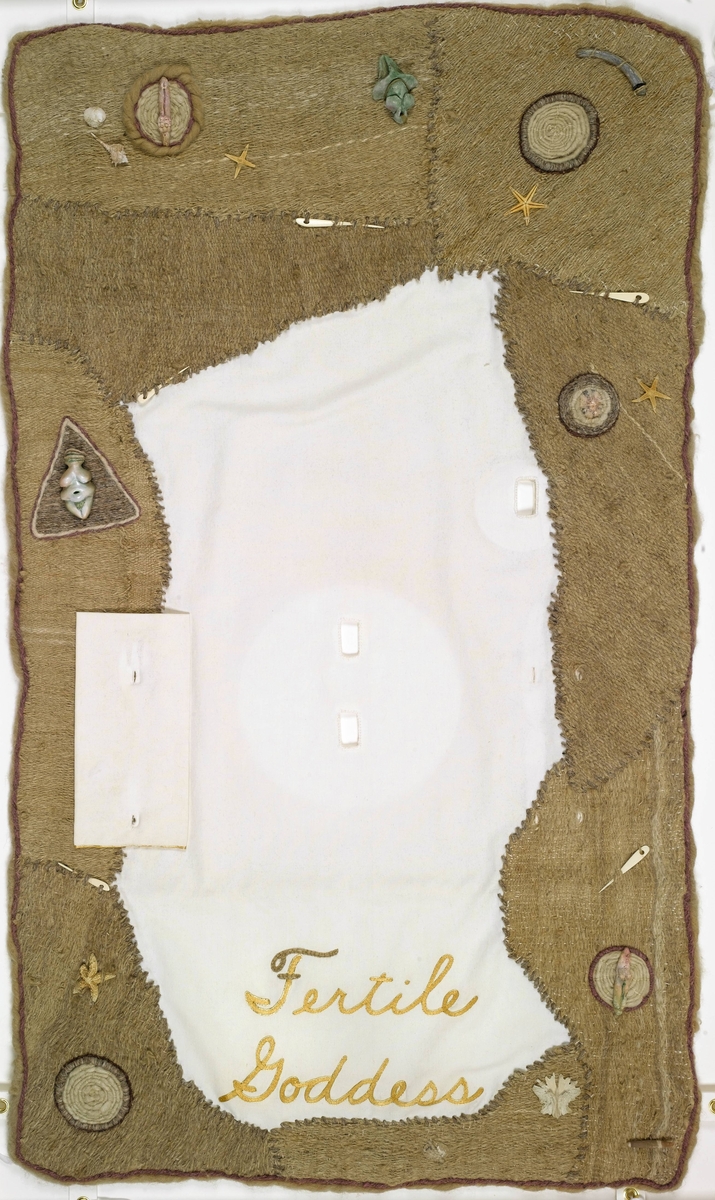
Judy Chicago’s landmark work, The Dinner Party (1979) was an early and bold challenge to the canon of “important” (and inevitably male) artists (see here for images). The work, permanently installed in the Brooklyn Museum of Art, consists of a large triangular table almost 50 feet long on each side, set with elaborate place settings for 39 women with prominent but then-underapreciated roles in the history of art. The women included are artists, mythical characters, and historical figures depicted in famous works. They include, for example, the prehistoric Fertile Goddess, Hatshepsut (a female Egyptian pharaoh), Sappho (an ancient Greek lesbian poet), Artemisia Gentileschi (Baroque painter, see the Selves chapter), Sojourner Truth (African-American abolitionist and advocate for women’s rights) and Georgia O’Keeffe (American painter).
Each place setting features a plate with imagery copied – sometimes loosely, sometimes more directly – from earlier works. The imagery on the plates is frequently suggestive of female reproductive power, and the placemats are embroidered with the sitter’s name and decorated with related imagery. Through her choice of subjects and models for her copies, Chicago creates a new canon of previously-excluded female figures.
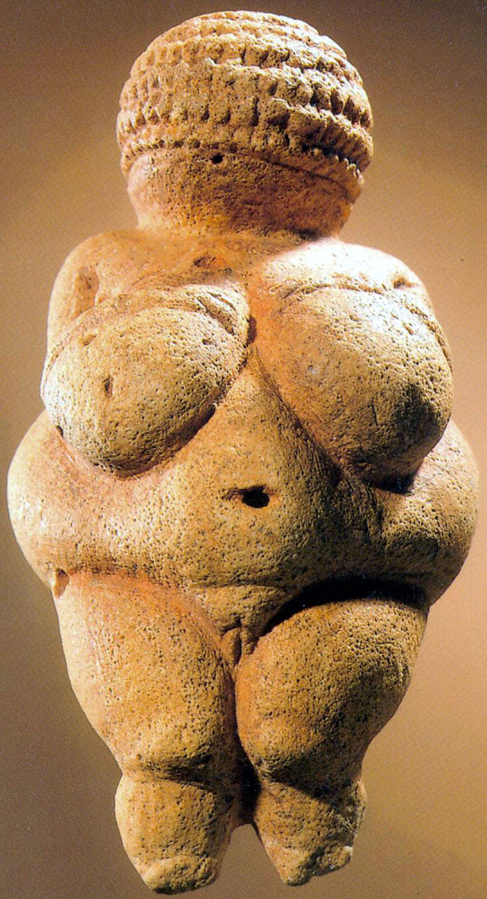
The Fertile Goddess (see here for images) place setting relies of copies of some of the earliest sculptures produced by humanity – small pebbles sculpted to represent fertile women, usually with highly exaggerated breasts and pubic triangles, as in the famous Woman of Willendorf. In this prehistoric sculpture from ca. 23,000 BCE, the female figure’s reproductive capacity is celebrated through the emphasis on her very large breasts, wide hips, full abdomen, and clearly denoted genitals, as well as her navel, the location of the umbilical cord that connects a fetus to its mother and thereby refers to cycles of human generations.
Other major features – her face, hands, and feet – are obscured or ignored. This has led archeologists and art historians to conclude that such images represent a goddess of fertility. This goddess is one of the first in the chronological list of invitees to Chicago’s theoretical dinner party. The placemat is roughly sewn from coarse fabric to evoke the prehistoric context of the goddess. There are small reproductions of typical prehistoric fertility goddess sculptures attached to it, including one clearly inspired by the Woman from Willendorf (see here for an image). The plate at the center is decorated – as are many others in the work – with imagery reminiscent of flowers, which are the reproductive parts of their plants. The images, though, also evoke female genitals, celebrated throughout this work as humanity’s great generative force. Similarly, the unusual triangular shape of the entire table echoes the form of the pubic triangle, as we can see emphasized on the Woman of Willendorf.
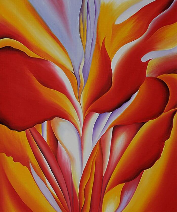
The final place setting is prepared for Georgia O’Keeffe, an American painter famous for her dramatic, vivid watercolors of flowers. Her Red Canna is a typical work, showing a close-up view of the center of a flower. The soft, organic shapes and rich, warm colors, in roughly symmetrical arrangement, are highly suggestive of the folds of the female vulva. In this way, O’Keeffe was surely a strong influence on Chicago, whose imagery on the plates of The Dinner Party is often at once floral and yonic. Not surprisingly, the place setting for O’Keeffe also features a soft, vaginal flower, now rendered three-dimensional (see here for images). In this way, Chicago has not directly copied O’Keeffe’s work. She might have painted a copy of Red Canna right onto the plate, but instead she has taken inspiration from O’Keeffe’s oeuvre – from all the works she produced throughout her career – rather than looking to a single painting as a model. Then, Chicago translated it into her own terms, from two to three dimensions, from paint to sculpted pottery.
Through O’Keeffe’s placement as the final guest at the dinner party, Chicago at once acknowledges her source, and further celebrates the power of female fertility, which appears as a dominant theme in art from the prehistoric Woman of Willendorf to the present. Throughout The Dinner Table (which also includes the names of hundreds of other women on the floor beneath the table and on the walls of a corridor leading to it), Chicago acknowledges the powerful sources not only of her own art, but also of the traditional canon. She does not so much invent a new canon as demonstrate the potent, unacknowledged role of women in the current artistic and cultural canon.
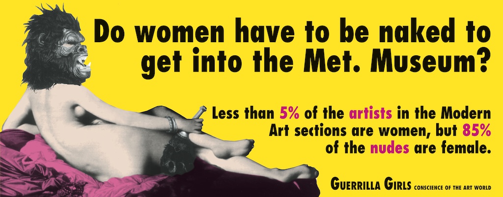
The Guerrilla Girls, an anonymous collective of female artists, uses reproductions of canonical works of art to attack the canon more directly. Among their most famous works is a poster originally produced in 1989 and updated in 2005 and 2012, titled Do Women Have to be Naked to Get Into the Met. Museum? The title references the Metropolitan Museum of Art in New York City, the largest, most well funded and most prominent art museum in the United States. The bright image was created in response to a request to create a billboard for the Public Art Fund of New York. The resulting work is a collage of images and texts.
The female figure is a black-and-white reproduction of Jean-Auguste Dominique Ingres’s Grand Odalisque, from 1814 (see the Sex chapter). The Guerrilla Girls chose this very famous image not in order to celebrate it but to critique its objectification of the nude female body. They then placed their own emblem over her face. This is a pun – gorilla (the animal) in place of guerrilla (freedom fighter) – but also a challenge to representations of women. It is aggressive and hyper-masculine, with its heavy brow, angry expression, bared teeth and, of course, considerable facial hair. The mask denies the male viewer his usual role as sexual voyeur, and thereby disempowers both male viewer and male artist. Through the use of collage – combining pieces of two-dimensional works to make a new work – the Guerrilla Girls fundamentally transform the meaning of the work they copy.
The text also works to transform our reception of the image, in essence asking us to be offended by this famous and well-respected work. The bold text, written in a heavy black typeface for clarity and assertiveness, declares their intent. It reads, “Do women have to be naked to get into the Met. Museum? Less that 5% of the artists in the Modern Art section are women, but 85% of the nudes are female.” The objection, then, is to two elements of the canon: first, that female artists are all but excluded from it; second, female nudes form a central and seemingly natural part of the canon, whereas male nudes are a minor element. As art historians have argued, an artistic canon is not made up of actual works, but of their reproductions in textbooks, postcards, posters, and art history classroom slides. The Guerrilla Girls use a reproduction of a canonical work, here on a massive billboard, to strip it of its previously unquestioned place in the canon.
Interestingly (and problematically), as the Guerrilla Girls reproduced and updated their poster 23 years after its original publication, the numbers had not improved – indeed, while the percentage of female nudes declined a bit (from 85% to 76%), the percentage of female artists also declined (from 5% to 4%). In 1989, the Guerrilla Girls used a copy of a famous work of art to make a strong statement about the state of the art world and the artistic canon, actively engaging with history in their own production in 2012, it remained stubbornly relevant. A study in 2018 demonstrated that while the statistics are a bit improved, the problematic dynamic continues to today.[2]
SPOTLIGHT IMAGE II:
KEHINDE WILEY, ICE T, 2005
Kehinde Wiley, Ice T, 2005, Oil on canvas 243.8 x 182.9 cm (96 x 72 in) Private collection, courtesy Rhona Hoffman Gallery (see here for an image)
VIEWING QUESTIONS
- What elements of Ingres’ composition does Wiley copy?
- What elements of Ingres’ composition does Wiley change?
- What elements of Ingres’ style does Wiley copy?
- What elements of Ingres’ style does Wiley copy?
- How do shifts in the figure’s pose change the tone of the work?
- Besides replacing Napoleon with Ice T, what else is different in Wiley’s painting?
- How does Wiley’s use of an image of Napoleon as a model effect our viewing of his image of Ice T?
INTRODUCTION: New Master Portraits
“Old Master” portraits – those produced during the sisteenth, seventeenth, and eighteenth centuries – are often celebrated for their beauty, grandeur, and ability to convey the character of their subjects, in addition to their outward appearances. Few artists still produce works in the traditional styles used by these old masters. Kehinde Wiley, though, relies on them as models for some of his striking portraits, usually of young, fashionable African-American men (and, more recently, Senegalese men and women. For his style and compositions, he often copies famous European portraits by Diego Velázquez (see the Selves chapter), Jacques-Louis David, and others. Some of his models are famous celebrities, and others are average people, but all are elevated to new heights through Wiley’s dramatic images.
VISUAL ELEMENTS: Imperial Bling
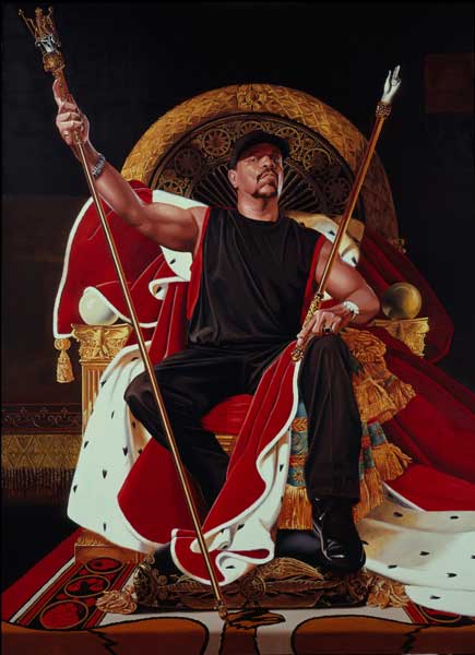
Wiley’s painting of Ice T – a rap musician and, later, television star – is bold and dramatic. It is also borrowed. Like the Guerrilla Girls, Wile based this image on a work by Jean-Auguste Dominique Ingres: Napoleon on his Imperial Throne, 1806 (see the Power chapter). Unlike the Guerrilla Girls, though, Wiley copied Ingres’ painting by hand. Wiley’s choice of his model greatly influenced the new version of this painting. The image of Napoleon is designed to be imposing. We are supposed to literally look up to the newly-crowned French “emperor” – his throne is elevated and the painting was certainly hung (and still is) so that Napoleon’s head was above that of the viewer. Wiley’s image borrows and even intensifies many of the elements of Ingres’ portrait.

Institutnationaldhistoiredelart, CC BY 2.0.
The painting of Ice T uses deep, rich colors, particularly the regal, royal red of the robes the figure sits upon and the gold of the throne, scepters, and other details. These colors stand out against the very dark background and the figure’s black clothing. The composition is largely symmetrical, with the throne centered vertically. The staff and scepter are posed at nearly identical angles, and frame the figure between them. In both images, the round back of the throne becomes a sort of halo, suggesting not merely earthly power but divinity.
Still, both artists made their images just a bit less static by introducing slight asymmetries. Both figures raise one arm and lower the other (though the scepters they hold match the raised arms and even end in small hands). Both also have their robes slung out to their lefts. Wiley also tilts his model’s head back and to his left, and splays his legs at a casual angle that contrasts with the grand and formal tone of the painting.
There are other important differences between model and copy, in addition to the obvious substitution of one sitter for another and the small – but important – differences in pose. Wiley has also cropped his image slightly tighter, which brings his sitter a bit closer to us, while also compressing the space within the image. This makes for a more confrontational work. Napoleon is protected from our approach, and so sits bolt-upright. His head is perhaps tipped ever so slightly downward, emphasizing his position above us, raised up on a platform and then on his elevated throne. Ice T leans back a bit. His posture is certainly less formal, but it is not quite relaxed. His torso seems tilted away from us, as if to give himself a bit more personal space, and he raises his chin toward us in a gesture that might be either wary or confrontational – or perhaps both. By painting Ice T in a sleeveless shirt, Wiley also emphasizes his biceps, and therefore his physical strength.
The light source in both paintings is in front of the figures and to their right, as indicated by highlights and shadows, but Wiley intensifies its sharpness, picking out bright highlights on Ice T’s arms, but veiling his eyes in the shadow of his ball cap. Lighting and pose seem to reveal Napoleon to us, but to partially conceal Ice T. The bright lighting also, though, serves to emphasize the gold and jewels of the throne, scepter, and staff. In Ingres’s work, they seem to merely be part of the general opulence of the image. In Wiley’s image, in contrast, they pop out of the canvas. Ice T’s watch is yet brighter, flashing in the light and reflecting it back at us.
The use of the opulent red robes is another important point of contrast between the two images. The robes are Napoleon’s, not Ice T’s, and the French emperor wears them with authority. The semicircle of rich ermine fur – recognizable because of the black points of the animals’ tails throughout the white fur – draped over his chest completes the circle begun by the arcing back of the chair, framing Napoleon’s face in dramatic fashion. Wiley has placed the robe as if in quite the same place, relative to the chair, but now it is behind the figure, like a backdrop. This creates a tension: why doesn’t Ice T put on the robe? Is it because he is not really an emperor, not really a ruler and not worthy to wear it? Or is he too grand to wear such an affectation, instead merely sitting on it as if it were an old jacket?
CULTURAL CONTEXT: A New Ruling Class?
Although they are presented in the guise of European aristocrats, kings, and emperors, many of Wiley’s models are poor, disenfranchised young men. Most are not music or television stars, like Ice T. Most are mere fans. All of his models, though, are elevated, presented as grand, dignified, and idealized in a manner befitting royalty. Some of his titles indicate their sources, such as After Titian’s “The Penitent Mary Magdalen” (2009, see here for an image) and others, such as Ice T, rely on the viewer’s background knowledge of the artistic canon. In both cases, though, we are supposed to recognize the references being made, since our awareness of the sources draws attention not only to issues of class – even Ice T is no emperor, wealthy though he surely is – but also to gender and race. Wiley places male models in the roles of female figures, like Mary Magdalene or the Three Graces.
More consistently, though, he replaces European figures with figures of African descent. The original subjects of the Old Master portraits, like Napoleon, were frequently imperialists and colonialists, conquering and oppressing the peoples of Africa, Asia and the Americas. Indeed, Napoleon’s army stole vast quantities of art while on military campaign in Egypt, including the very famous Rosetta Stone (later moved to the British Museum after England’s defeat of the French army). By replacing these imperialists with African-American figures, Wiley is making a comment – perhaps obscure or unfixed – on the relative statuses of communities. Is he arguing that, under other circumstances, his sitters might have been kings? That they ought to be kings? Or, particularly in the cases of his wealthy and famous subjects like Ice T, that they are today’s royalty?

It is worth noting that Ingres’ portrait was, itself, somewhat derivative of earlier models. In order to create an image of Napoleon as the emperor of France, Ingres turned to portraits from the Middle Ages – the last time that France had “emperors.” In the Middle Ages, France was part of the “Holy Roman Empire,” and rulers such as Charlemagne and his descendants claimed the title of emperor. Images of these rulers, like the portrait of Emperor Lothair (great-great-great-great grandson of Charlemagne) from the Lothair Gospels have much in common with Ingres’ painting (and therefore with Wiley’s). Like Ingres’s portrait of Napoleon (and therefore like Wiley’s portrait of Ice T), Lothair is centered and seated on an elevated throne with a curved back. All three wear elaborate robes and hold scepters of authority. The red of Napoleon’s robes is a reference to the “imperial purple” draped behind Lothair.
Still, in a sense, all three are pretenders to their thrones. Ice T is not a political ruler, Napoleon was briefly a powerful conqueror, but did not control an empire, and Lothair was, in essence, king of a small band of territory running along what is now the boundary between France and Germany, and slightly into northern Italy. And yet they are all presented as if they are Roman emperors, rulers of one of the most powerful empires in the world’s history.
Wiley’s fidelity to Ingres’ Napoleon on his Imperial Throne is striking. Most of the composition is extremely similar, though the substitution of modern celebrity for earlier ruler completely transforms the image. Ingres was working for Napoleon and there is nothing intentionally ironic or amusing about his portrait (nor about Lothair’s, for that matter). Napoleon was tremendously (if briefly) powerful, and took power by military force. The power he wielded was enforced through violence. Of course, hip-hop culture has its own history of violence and its glorification in lyrics and in life. The substitution, then, is not merely a joke mocking the trappings of Napoleon’s authority, nor of Ice T’s celebrity.
Wiley’s work has been criticized for using hip-hop as mere fashion in his glitzy paintings, and not engaging with its more subversive or counterculture messages, but by laying hip-hop over old master, by recasting royal scepters as bling, Wiley calls into question the values placed on both. Of course, an expensive watch cannot connote the sort of real power and authority of Napoleon’s staff and sword (both said to have originally belonged to Charlemagne himself). On the other hand, though, the modern accessories that shine out of his canvases invite us to question the role of the gold and jewels so liberally displayed in the ruler portraits he copies. The power of the emperor does not really derive from his scepter. The scepter is nothing but a symbol, and in that sense, how different is it from the bling worn by Wiley’s subjects?
Comparisons and Connections II: Copies and Appropriations
Repeated, Repeated, Repeated Images
Andy Warhol pushed the notion of copying further than any artist had, before him. Warhol began in advertising design, like Barbara Kruger (see the Power chapter) and, like Kruger, brought this training and approach to his art. He was a founder of the Pop Art movement, in which he celebrated (and critiqued) copying, mass production, and American consumerist culture. He even went so far as to establish The Factory in New York City (which occupied three locations from 1962 to 1984), where he and a group of assistants worked like workers in a factory to produce a series of silkscreens – prints made using fine mesh stencils – and other prints. An early work from The Factory is Marilyn Monroe Diptych (1962, see here for an image). The print is based on a photograph of Monroe, who was then the most famous Hollywood star, and had very recently died of a drug overdose. Her image was reproduced endlessly in the popular media of the day – newspapers, magazines, television, film, posters, and on.
Warhol pressed this idea further by copying her image over and over within one work. The Diptych contains fifty copies of the same photograph of Monroe. The silkscreen technique reduced the original gradually shifting tones of the photograph to flat blocks of color, flatting out the face. Warhol chose garish colors and high contrast for the left panel, but only black and white for the right. By repeating her image over and over, Warhol was commenting on the media obsession with celebrity. But there is something more subtle at play, as well. Moving from left to right, as we would read a page, we see that Marilyn first appears lush and glamorous, then grey, smudged, and finally, as we approach the right edge, she starts to fade away. These copies are not identical. The slight variations in each image give a sense of something shifting within Monroe, beneath her perfect public image. The work, then, both celebrates and mourns the lost star, and celebrates and condemns the media culture of celebrity worship.
Appropriation Art
While artists have been copying one another’s work for as long as people have been making art – all the way back to the prehistoric caves – it was only in the 1960s that “appropriation art” became a strategy and movement. Sturtevant (who generally only uses her surname) is usually credited as the first of the appropriation artists. Beginning in the 1960s, she produced hand-made copies of the works of her contemporaries. Her goal was to make the copies as close to the original as she could, mimicking the original techniques and media as well as the compositions.
In 1973, Sturtevant produced Warhol Diptych, a nearly identical copy of Warhol’s Marilyn Monroe Diptych (see here for an image). Again, we see fifty Monroes, gradually fading from garish colors on the left to black and white on the right. There are, though, notable differences. Sturtevant’s orange background is more uniform, whereas Warhol’s shifts in tone. The faces are a more vibrant purple, the hair a brighter yellow. The colors are more heavily applied over the black and white silkscreen prints, so that fewer details show through. This renders the faces even flatter than they were in the Warhol. This copy of a copy, though produced by hand and therefore more of a re-creation than a mechanical copy, still produced something of the effect of a photocopier copy of a copy: each version is less detailed and more schematic than its predecessor.
How is this even a work of art, though? The conception and design were Warhol’s. Sturtevant is not trying to hide her borrowing. She signals her sources with her titles, so that what was Marilyn Monroe Diptych becomes Warhol Diptych. She is trying, in this work and many others like it, to question the value we place on authenticity and originality, by producing works that are authentic – they are exactly what they claim to be – but also unoriginal. Her work, then, is not about Marilyn Monroe, whose name is removed from the title. For Warhol, the icon was Monroe. For Sturtevant, the icon is Warhol. As one author writes, “Warhol holds a mirror up to the world to enable it to recognize what it is – Sturtevant, in contrast, holds a mirror up to the interior of art.”[3]
Copying Copies (of Copies)
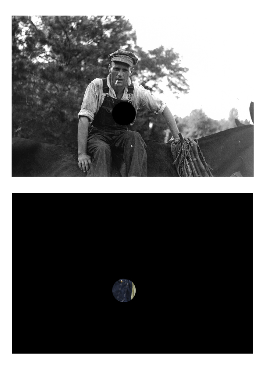
This section concludes with a series of photographs that are self-consciously based on earlier works. The original, in this case, is an iconic photograph by Walker Evans, titled Alabama Tenant Farmer’s Wife, taken in 1936 (see here for an image) and included in a book entitled Now Let Us Praise Famous Men, with photographs by Walker and text by James Agee. This image has become one of the most memorable photographs from the Great Depression, a massive economic crises in the US that began with a stock market crash in 1929. We see Allie Mae Burroughs, the wife of a sharecropper – a farmer who does not own the farm or tools, and works for a landlord, often making little or no profit (and, in the case of Burroughs and her husband, ending the year in debt to their landlord).
Evans took several photographs of Burroughs posing against the outer wall of her rustic cabin. In some, she is smiling and appears welcoming (see here for an image), but for his book, Evans chose one where she seems wary, tense, reticent. This is all conveyed through subtleties of her expression and pose. The tilt of her shoulders, the furrowing of her brows, the tension in her weather-beaten cheeks beneath her eyes, the way she bites her lower lip. The rough texture of the raw wooden planks implies the harsh life she leads. There is very little depth in the image, so we are pressed up against her, and she does not seem to welcome our presence there.
The figure is posed almost like the sitter for a traditional Old Master portrait – nearly centered, roughly symmetrical, isolated against a neutral background, like the portraits of Rembrandt discussed in the Selves chapter. However, instead of a prosperous, “important” subject, the subject here is a poor woman, one of millions left destitute by the Great Depression. Walker’s choice to name the photograph Alabama Tenant Farmer’s Wife, when he knew the Burroughs well, turns the individual into a representative of a larger group. Instead of this being a portrait of Allie Mae Burroughs, it becomes an image of all of the suffering rural poor of the Depression.
This photograph has had a very curious afterlife. In 1981, American photographer Sherrie Levine shot a photograph of a reproduction of Walker’s Alabama Tenant Farmer’s Wife from an exhibition catalog called First and Last. She called her photograph After Walker Evans: 4 (see here for an image). This photograph of Walker’s photograph is more or less indistinguishable from the original, and therefore calls into question the nature of Levine’s work as an artist, as well as the nature of photography, which is a medium based on reproduction.
Unlike paintings or drawings, where originals are produced by the hands of artists, all photographs are mechanically produced, though planned, designed, selected, and edited by the photographer. Levine’s photograph has upset many viewers since it was first displayed, since it seems to be nothing but a mechanically produced copy of the work of another artist. How is “her” photograph any different from the published reproduction of Walker’s photograph from the First and Last catalog that Levine actually used to make her copy? How is her work any different from that of the anonymous photographer who made the copy of Walker’s photograph that appears in the publication where Levine found it? It is very hard to find a distinction, here, in the work itself. If there is a distinction, it lies in the artist’s intent. Levine’s work is not a fraud. The title of her work, After Walker Evans: 4, directly identifies its source.
Levine is not the only artist to appropriate Evans’s iconic photographs. Several other artists have also used them as source material for their own work. Lisa Oppenheim’s photographs of Killed Negatives: After Walker Evans are among the more creative (see here for images). Of course, Evans took many more photographs than he ultimately printed and published. When he rejected a negative, he “killed” it by punching a hole through it. This would, he thought, make them impossible for others to print against his wishes, since the hole would appear as a black circle in any prints from these killed negatives.
However, Walker did not destroy these photos, and Oppenheim found them in the archives of the National Library of Congress. Oppenheim produced pairs of photographs, such as Osh Kosh (see here for an image) and Boys (see here for an image), both from her Killed Negatives series (2007), juxtaposing Evans’ killed image (with a black circle where he punched the hole in the negative) with her own photograph, blacked out but for a circle in the same location as that in the original photograph. In this circle, Oppenheim attempts to recreate what was lost when Evans killed the negative. She tried to take her photographs at or near the site of the original photograph, and used color photography, whereas Evans used black and white (color photography was available, but uncommon, in the 1930s).
How does Oppenheim know what was missing? In most cases, the missing portion is not perplexing. The the denim of the man’s overalls, and a bit of his shirt; top of a child’s knee, covered in denim, against the bare wood plank of the wall. Still, Oppenheim must take liberties. What color was the man’s shirt? How pale were the child’s overalls? These photographs do not question the status of the authentic work, as Levine’s do. Instead, they ask us to consider what we know and what we do not, what information photographs from the past convey to us, and what must always remain unknown and unknowable. Would the addition of the information lost in the circle really tell us more than the killed photographs, as they stand? Would color make the photographs more meaningful, or less striking? Oppenheim does not really provide more information by working to fill in the empty circles. Instead, she calls into question our interaction with and understanding of the rest of the photographs, including those that Evans did not “kill.”
Levine’s work comments on the nature of photography, which undermines concepts of artistic originality. Oppenheim questions the ability of photography to convey information across time. While Evans took the original photographs, the “work of art” we view is not the negative produced mechanically and chemically within his camera, but instead, all of the positive prints that he produced from it, or perhaps the reproductions contained in Now Let Us Praise Famous Men.
In the digital age, these issues are all heightened. With digital photography, there is no “original” negative, just a first version of a computer file that will be identical to any copy made of it. The Internet has made copying and dissemination of images so easy and inexpensive that issues of copyright are in the process of breaking down. I have respected modern and contemporary artists and the copyright they hold to their work throughout this book by providing links to images of these works, rather than “borrowing” the images without obtaining – by paying for! – the permission to use them. Still, while I have done this, it is nonetheless clear that such laws are becoming functionally irrelevant. Most of the images I provide links for are already all over the internet in ways that defy the artists’ copyrights.
Playing with Levine’s ideas, and with the then-new possibilities of the Internet, in 2001, Michael Mandiberg made scans of the photographs by Evans and Levine, and put them online on two websites he created, AfterWalkerEvans.com and AfterSherrieLevine.com. Following the model set by Levine, Mandiberg titled his works Untitled (AfterWalkerEvans.com/2.jpg) and Untitled (AfterSherrieLevine.com/2.jpg). Mandiberg’s two sites are nearly identical, like the two photographs, Evans’s original and Levine’s copy. Mandiberg’s stated goal is, “to facilitate their dissemination as a comment on how we come to know information in this burgeoning digital age.”[4] Mandiberg supplies very high-resolution images (better than those I linked to above!), suitable for large format printouts on high-end photographic printers. He also supplies a “Certificate of Authenticity” that reads, in part, “This certificate guarantees that the accompanying digital image printout, Untitled (AfterWalkerEvans.com/2.jpg), is an authentic work of art by Michael Mandiberg.”[5] He includes printing and framing directions to be followed precisely, so that the user of his website can produce a precise version of “his” work.
Slyly, there is actually only one copy of the image – call it Alabama Tenant Farmer’s Wife, Untitled (after Walker Evans), (Untitled (AfterWalkerEvans.com/2.jpg) or Untitled (AfterSherrieLevine.com/2.jpg), as you wish – online at Mandiberg’s sites, simply called “2.jpg.” Regardless of whether you start at AfterWalkerEvans.com or AfterSherrieLevine.com, you get the same scan, drawing attention to the indistinguishably of Levine’s photograph from Evans’ photograph.
Would Evans himself object to all of these copies of his work? Perhaps not, as he himself photographed photographs. His Family Snapshots on the Wall of Frank Tengle’s Home (1936) presents two photographs, tacked to a bare wooden wall (see here for an image). This work is not as direct a copy of the family snapshots as some of the copies of Evans’s works, of course, and his choice to call them “snapshots” suggests a hierarchy in which his “photograph” is more artistic than the “snapshots” it contains. Who is the “producer” of any of these works? If you go to Mandiberg’s site and make your own printout to his specifications, is the artist Evans, Levine, Mandiberg, or, perhaps, you?
CONCLUSION
Art viewers – casual and professional – tend the value originality very highly. However, the history of art is filled with examples of works that press us to redefine what it means for a work to be “original,” and also to reconsider our basic assumption that more original works are more valuable and interesting than less original works. We might, though, think about the ways that some cultures, like Byzantium, valued close and careful copies, and about ways that artists have manipulated their source material to make new arguments about old subjects. For our purpose here, which is to appreciate art, we can choose to value original designs, but we might also consider the ideas behind a work, and the ideas works inspire in us. Any work of art – “original,” derivative, or painstakingly copied – that causes us to think interesting thoughts or feel interesting feeling is surely is worth our appreciation.
SPOTLIGHT IMAGE III:
OUR LADY OF CHINA, DONGLU, CHINA, CA. 1904
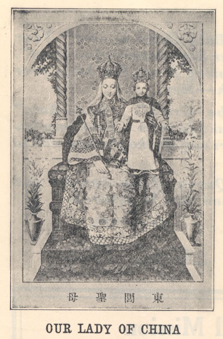
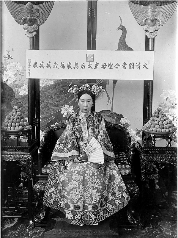
VIEWING QUESTIONS
- This painting of Mary and Jesus was based on a then-popular photograph of the Dowager Empress Tz’u-his. Why use this photograph as the model for these figures?
- What elements are borrowed?
- What elements did the painter change?
- How does the painter present these figures?
- How does their clothing influence our perception of the figures?
Media Attributions
- Virgin and Child (Hodegetria), Byzantine, possibly Palestine or Constantinople, 5th or 6th century, tempera and gold on panel, Santa Francesca Romana (Santa Maria Nova), Rome, Italy (heavily restored). Image: Public Domain.
- Icon of the Virgin Hodegetria, embossed silver, 13th century. Image: Public Domain
- Our Lady Hodegetria, tempera on panel and gilding, 34.5×29 cm, Russia, Late 16th century CE, the Hermitage. Image: Public Domain.
- Icons of the Virgin Hodegetria (Details)
- Icons of the Virgin Hodegetria (Details)
- Icons of the Virgin Hodegetria (Details)
- Masaccio, Tribute Money, fresco, 1427 (Brancacci Chapel, Florence). Photo: Public Domain.
- Michelangelo, Male Figure after Masaccio, red chalk, pen and brown ink, 1492-93 (Staatliche Gaphische Sammlung, Munich). Photo: Public Domain.
- Michelangelo, The Dying Slave, marble, 1513-15 (Musée de Louvre, Paris). Photo by Spencer Means, CC BY-SA 2.0.
- Paul Cézanne, Dying Slave, graphite on wove paper, 1885-1900 (Philadelphia Museum of Art, Philadelphia). Photo: Public Domain.
- Stair Riser with Marine Deities or Boatmen, serpentinite, ca. first century (Metropolitan Museum of Art, New York). Photo: Public Domain.
- Corinthian Capital, Temple of Fortuna Augusta, Pompeii. Photo: Roger Ulrich, CC BY-NC-ND 2.0
- Attributed to Kesu Dás, Crucifixion, ink and color on paper, ca. 1590 (British Museum, London). Photo by the British Museum, CC BY-NC-SA 4.0.
- Utagawa Hiroshige, Kameido Ume Garden, color woodblock print, 1857 (British Museum, London). Photo: Public Domain.
- Vincent van Gogh, Flowering Plum Tree, oil on canvas, 1887 (Van Gogh Museum, Amsterdam). Photo Lluís Ribes Mateu, CC BY-NC 2.0.
- Vincent van Gogh, The Church of Auvers-sur-Oise, oil on canvas, 1890 (Musée d’Orsay, Paris). Photo by Stefano Brivio, CC BY 2.0.
- Venus of Willendorf, limestone, ca. 24,000-22,000 B.C.E., (Naturhistorisches Museum, Vienna). Photo by A. Currell, CC BY-NC 2.0.
- Georgia O’Keeffe, Red Canna, 1924 (oil on canvas). Photo: Public Domain.
- Guerilla Girls, Do Women Have To Be Naked To Get Into The Met. Museum?, lithograph, 1989 (Metropolitan Museum of Art, New York). Photo by St. Lawrence University Art Gallery, CC BY-NC-ND 2.0.
- Jean-Auguste Dominique Ingres, Napoleon on his Imperial Throne, oil on canvas, 1806 (Musée de l’Armée, Paris). Photo by Institutnationaldhistoiredelart, CC BY 2.0.
- Portrait of Emperor Lothair, Lothair Gospels, ink and color on paper, 849-51 (Bibliothèque nationale de France, Paris). Photo: Public Domain.
- Anonymous French painter, Our Lady of China, ca. 1904 (Donglu, China). Photo: Public Domain.
- Dowager Empress Tz’u-hsi of China, late-nineteenth century. Photo: Public Domain.
- The Bible, Exodus 20:5-6, New International Version. ↵
- Hettie Judah, "In 2018 a woman is still more likely to feature in a gallery as a painted nude than as a painter," Evening Standard (October 4, 2018). https://www.standard.co.uk/esmagazine/in-2018-a-woman-is-still-more-likely-to-feature-in-a-gallery-as-a-painted-nude-than-as-a-painter-a3951406.html ↵
- Sturtevant Catalogue Raisonné 1964-2004, ed. Lena Maculan (Frankfurt am Main: Museum für Moderne Kunst, 2005), 41. ↵
- Michael Mandiberg, AfterWalkerEvans.com, 2001: https://afterwalkerevans.com/ and AfterhSherrieLevine.com, 2001: https://aftersherrielevine.com/ ↵
- Michael Mandiberg, "Certificate of Authority," AfterSherrieLevine.com: http://www.aftersherrielevine.com/cert/2.pdf and "Certificate of Authority," AfterWalkerEvans.com: http://www.afterwalkerevans.com/cert/1.pdf ↵
an image of a saint or other holy figure from Christian mythology, usually presented against a gold background and thereby separated from any specific contexts or moments from their lives
pigment suspended in hot wax and used as paint
pigment suspended in egg yolk and then used as paint
Deviations from the appearance of the natural world, simplifications or alterations of it for effect
Of works of art, to display naturalism, that is, to look like the actual world
Designed according to the principles of a particular style rather than being beholden to the way things look in “the real world.”
the four fundamental Christian texts, attributed to Saints Matthew, Mark, Luke, and John, telling overlapping (and at times conflicting) accounts of the background, life, death, and teachings of Jesus
believing in multiple gods
all the deities of a people or religion; literally "all gods"
definition
literally, "image lovers," used in Byzantine art history to describe people who fought to continue the use of religious icons
literally, "image breakers," used in Byzantine art history to describe people who wanted to eliminate all religious icons in order to follow the Second Commandment.
a set of works (art, literature, music, theater, film, etc) considered by experts or the general public to be classic, major, influential, etc. These are the works that generally appear in introductory textbooks, though throughout this book, I have tried to move beyond the standard canonical works.
three-dimensional space or shape
definition
Literally, "counter-balanced," a pose used in for human figures, developed in Ancient Greece, where the figure's weight is supported by one leg, while the other is loosely bent, resulting in an S-curve throughout the body
An ancient Roman method of execution by being hung or nailed to a large wooden cross and left exposed to the elements to die of thirst and hunger, or via suffocation caused by weakness that prevents the drawing of breath; most famously, the method of execution used on Jesus, the founder of Christianity, though many accounts say that while hung on a cross, he was stabbed in the side before dying of crucifixion, itself
From Flanders, a country that once occupied territory centered on what is now Belgium
The divide in an image between sky and land or sea
a person commissioning a work of art to be made and paying for it
A technique used to create the illusion of three-dimensional space on a two-dimensional image, achieved by drawing or implying a series of lines that all converge on one or more vanishing points
the area on a body containing pubic hair and external genitals
Resembling a vulva
all the works an artist produces throughout their career
a work composed out of pieces cut out from preexisting works or materials
Well-known premodern European artists, especially those living in the sixteenth, seventeenth, and eighteenth centuries
