1 Visual Analysis 1: The Elements of Art
Visual Analysis 1: The Elements of Art
Visual Analysis is the backbone of art appreciation. It takes a bit of practice, but once you have mastered the skills, it can help you to analyze any works of art you come across. It will even help you to understand why things you see every day – ads in magazines, billboards, television shows, movies, really all things visual – are (or are not) effective.
In order to perform a visual analysis, you need to realize that in every visual image there are multiple things at work that affect our response to it: the visual elements (also called formal elements) that compose the image; the way these elements relate to one another, called composition; and the cultural context in which the image is made and viewed. Visual analysis only deals with the first two. This introduction will first provide a definition of each visual element, accompanied by examples, and then will define the principles of composition, also with examples. There will be a number of terms introduced here, but the point is not to overwhelm you with jargon. Once you know the terms for things, you see them more clearly. These terms are helpful not only to describe works of art but also to see them. It is important to note that these categories all blend into one another – textured forms existing in space can be made of colored shapes defined by lines!
The Elements of Art
Line: A path either represented or implied
Shape: The property of a two-dimensional form, usually defined by a line around it
Color: The light reflecting off objects, divided into hue, value and intensity
Space: Depth, real or represented, as well as the general area within a work
Form: The property of a three-dimensional object
Texture: The feeling of a surface, real or represented[1]
Line
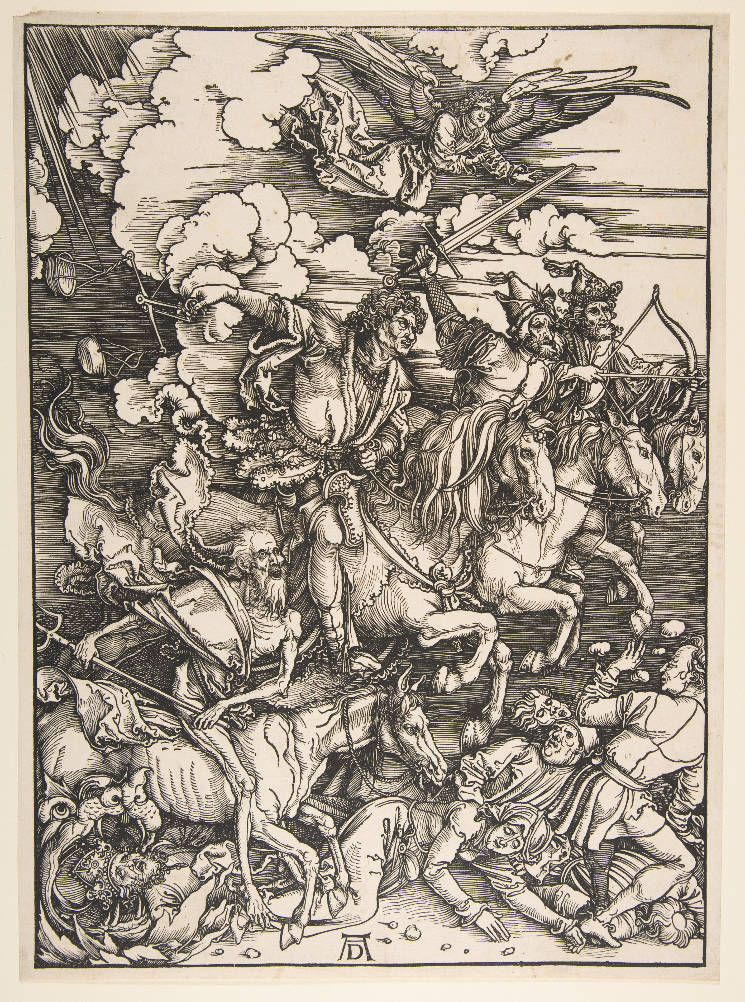
Line is the most basic visual element. Lines can be used to define shapes and figures, but also to indicate motion, emotion and other elements. In a woodblock print of the Four Horsemen of the Apocalypse by Albrecht Dürer (ca. 1497–98), contour lines – lines that define shapes – are used to mark the outside of all of the elements of the image. The outline of the hat on one of the horsemen, for example, is clearly made by a few black contour lines. This simple device is so effective that it is hard to remember that there is no hat here, only a few black marks on a creamy white page.
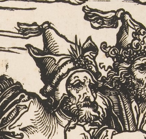
Note, though, that lines are also used to show shading – the representation of shadows caused when light hits one side of an object, leaving the other in shadow. On the hat, for example, the closely spaced lines, called hatching, show that the left side of his hat is in a shadow. This also helps the hat to look more three-dimensional, giving it a sense of form.
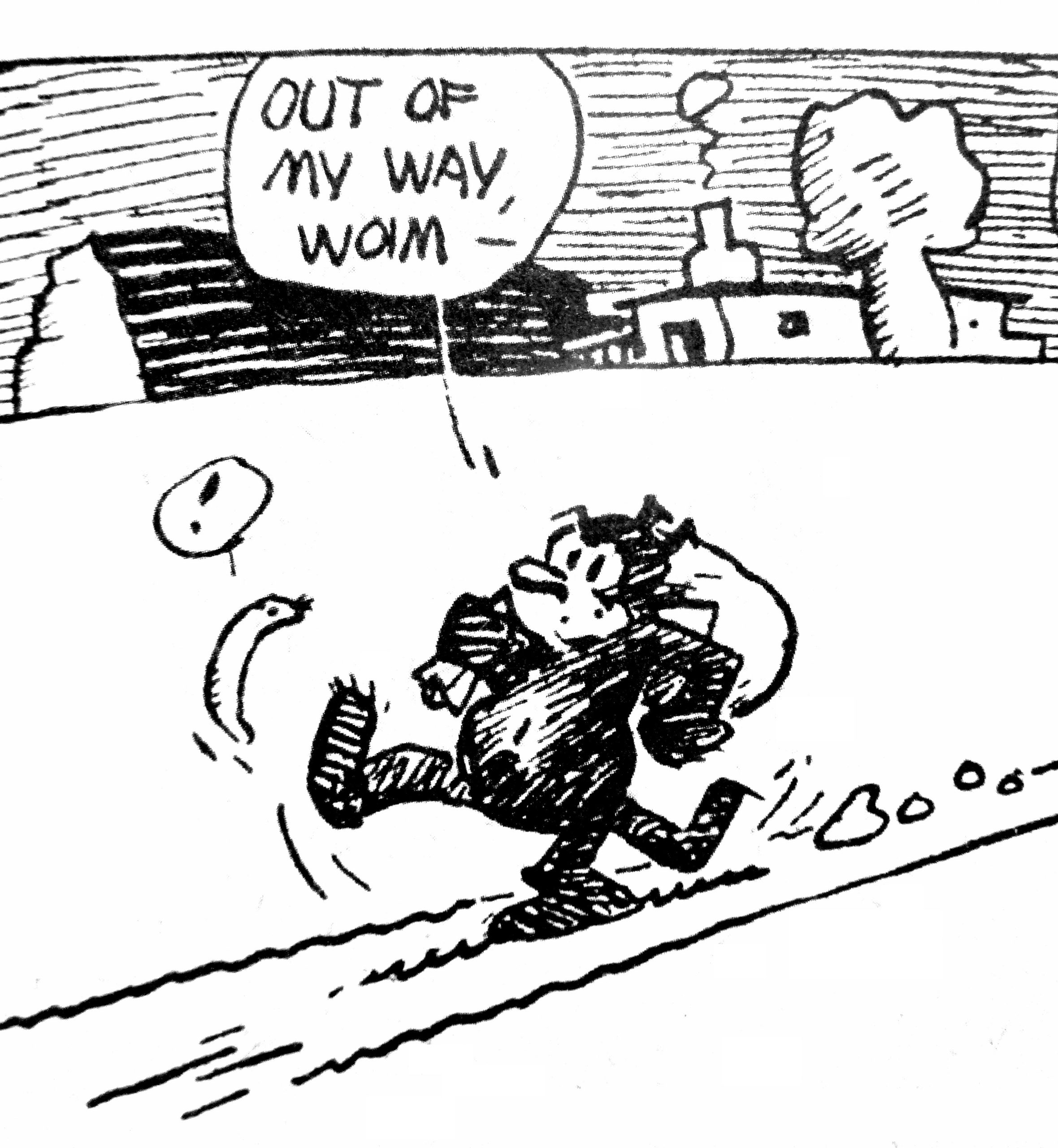
Contour lines outline all the figures and forms in the image, creating the illusion of shading and form. In addition, there are horizontal lines in the background. While these do create shading, they also help create the sense that the riders are moving rapidly from left to right. Motion lines may be familiar to you from comic strips, like in the Krazy Kat image below, but they appear in all sorts of work.
In the Dürer print, we can also divide the lines into organic lines and inorganic or geometric lines (See the section on shape below for more on organic and inorganic). Organic lines are loose, curving, irregular lines like those found in nature. In the Dürer woodcut, the lines of the horses’ manes and tails, the figures’ hair, and the ruffled clouds are all organic. Inorganic lines are generally straight or perfectly curving lines, like those found in geometry. In Dürer’s image, most of the lines are organic, but the horizontal hatching lines in the background are inorganic.
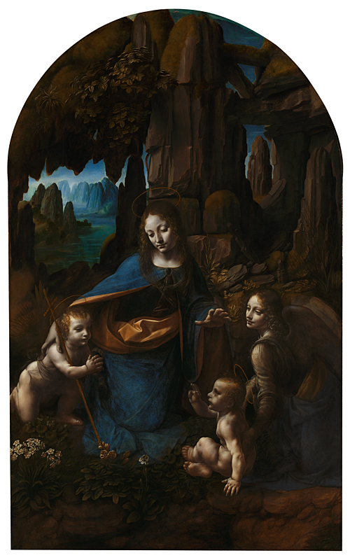
We can also look for implied lines. These are not actually drawn, but we can connect the dots (literally or figuratively) to create the lines in our minds. Leonardo da Vinci’s Virgin of the Rocks (1483-1486) contains wonderful examples. Here, the implied lines are sight lines, which guide us throughout the image. These help us know where to look, and show us what is important in the painting. Follow the gazes of the figures as they look at and gesture toward one another.
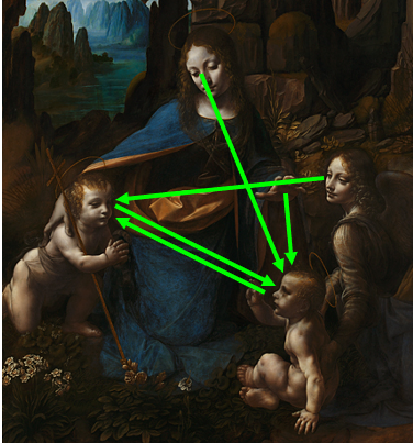
The angel at the right looks at the infant John the Baptist, at the left. He looks at the infant Jesus, who in turn looks back again at him. Above, Mary looks down at Jesus, and also gestures toward him with her hand. Basically, once we make it into the space of the painting, we become locked in a cycle of movement between the holy figures, guided by their sight lines.
Color
Artists can use colors for many reasons other than to simply duplicate reality (naturalism, discussed below) including setting moods and highlighting importance. The colors of the world can be divided on a few scales. When we use the term “color” casually, what we usually mean is hue. The hues appear on the visual spectrum:
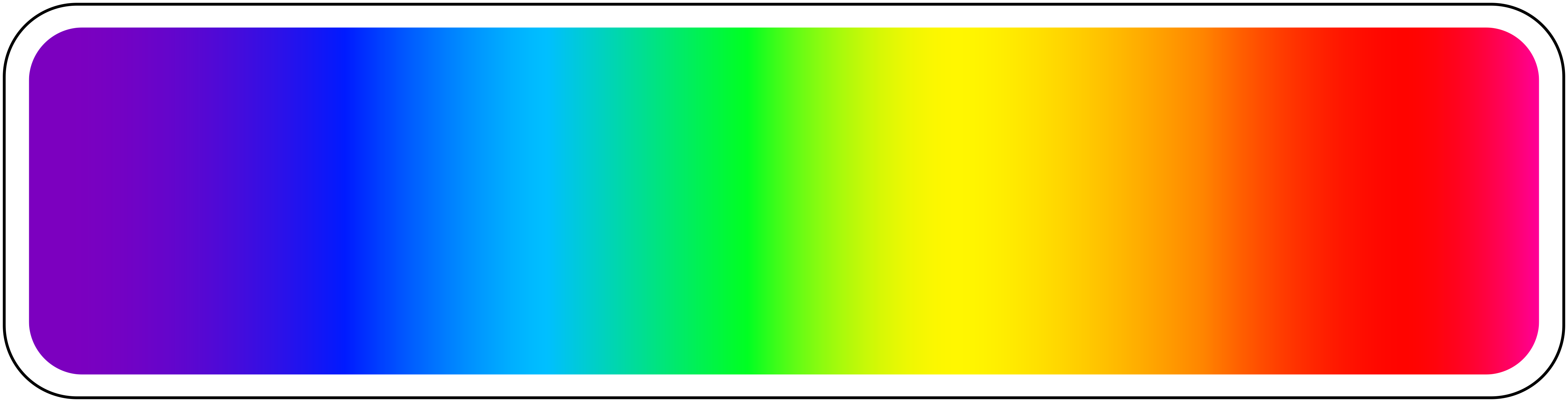
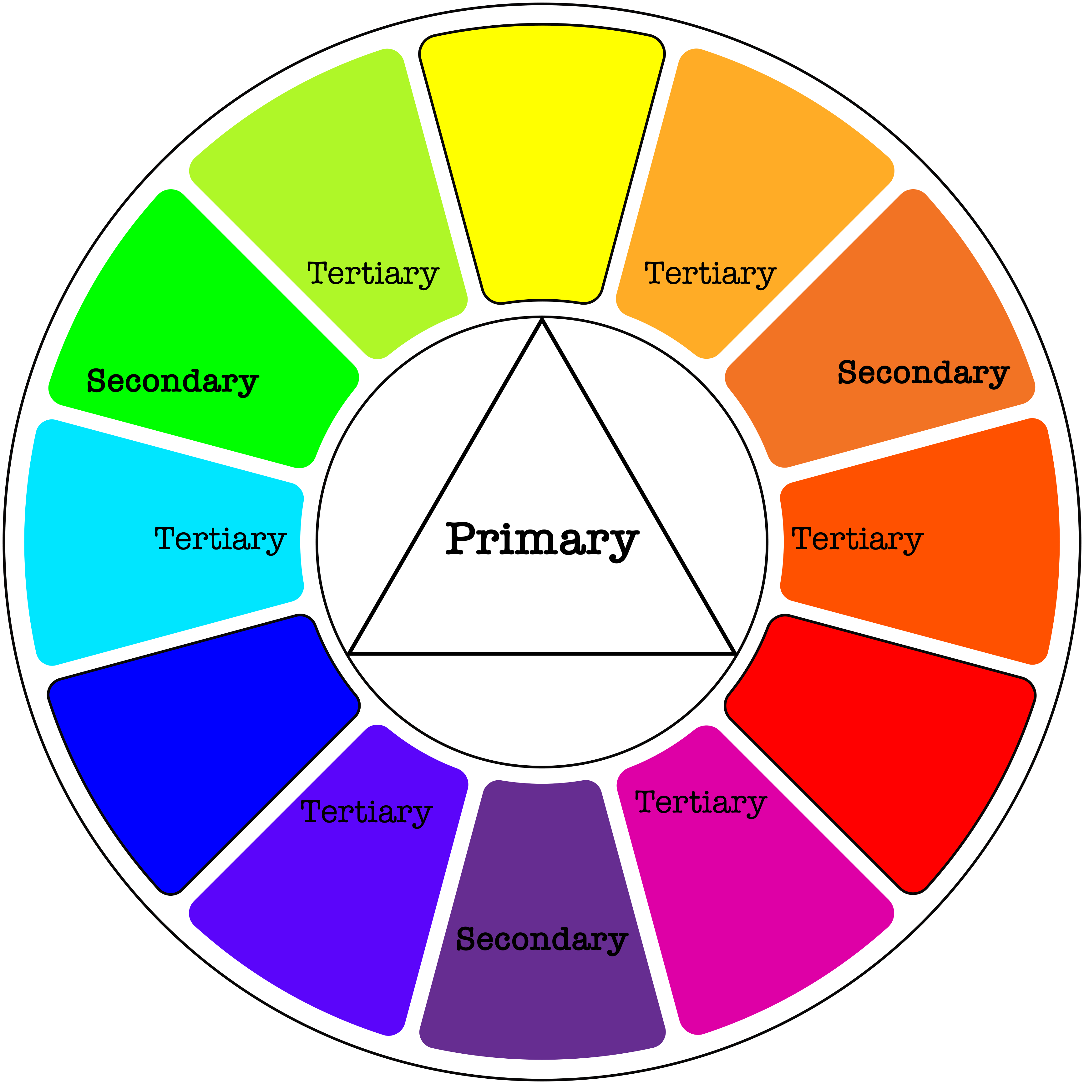
On the spectrum, we see the pure hues. These can be divided into primary colors, secondary colors and tertiary colors, as on this color wheel. Primary colors are, for most art media, red, yellow, and blue (the exception is the additive color system, which is used in computer screens, theater lighting and the like, and has red, green, and blue as its primary colors).
All the rest of the colors can be made from these. Secondary colors are made by mixing two primary colors: Red and yellow make orange, and so on. Tertiary colors are made by mixing a primary color with a secondary color. The colors opposite one another (like red and green or blue and orange) are complementary colors, which tend to stand out boldly next to one another. These are therefore often used for university colors and sports team logos. Colors next to one another (like red and orange or blue and green) are analogous colors, and these tend to blend together more smoothly.
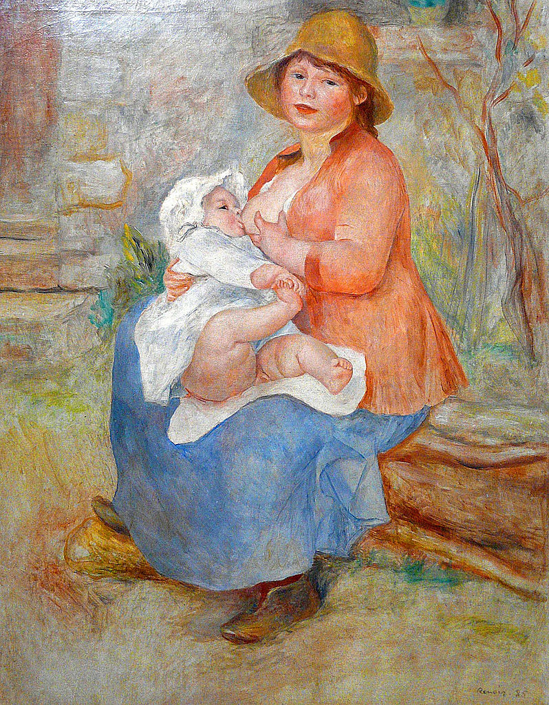
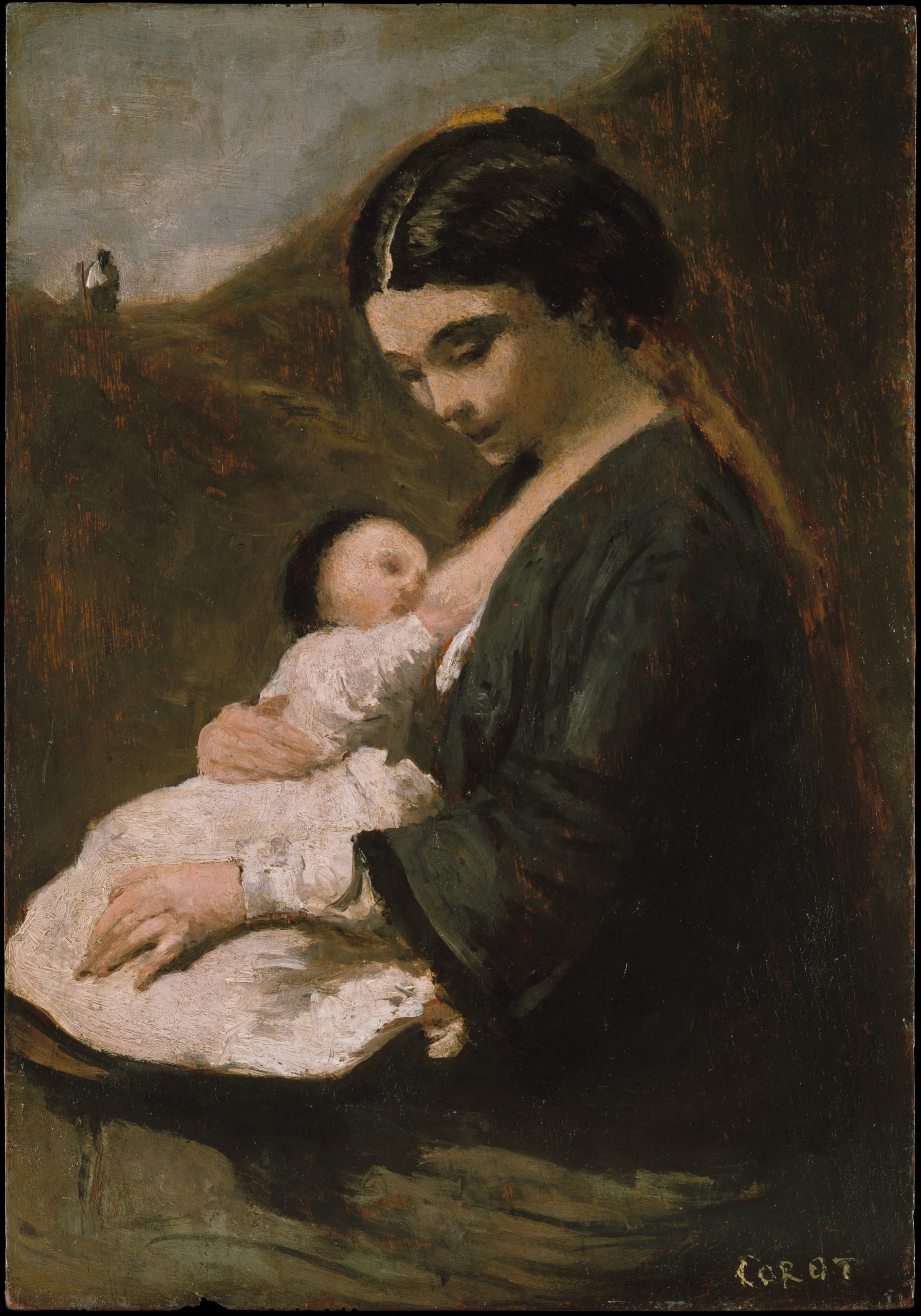
The colors on the left of this wheel are called cool colors and those to the right are warm colors. Using cool or warm colors in an image can create moods. Pierre Auguste Renoir used warm colors for his Mother and Child (1886), creating a warm, cheerful, inviting scene. The oranges, pinks and yellows dominate the image. Jean-Baptiste-Camille Corot presents a similar subject in his Mother and Child (ca. 1860), but through the use of cool colors, instead creates a sad, cold scene dominated by blues and greens. Neither of these artists was worried about portraying the world as it really looked. Instead, they used color to inspire feelings in the viewer.
Color can also be considered in terms of value, which is the degree of lightness or darkness of a color. If we add white to a hue, we get a tint. If we add black, we get a shade.
There are many tints in the Renoir’s Mother and Child, and many shades in Corot’s Mother and Child. Tints tend to be more cheerful – pastel colors are all tints. Shades tend to be gloomier. Indeed, some terms for moods are based on these properties. Some speakers of English might say that a cheerful person is “lighthearted,” or that an angry person is “in a dark temper.” It is important to note that the associations that cultures make with colors are somewhat arbitrary, and are not universal. Some cultures see black as the color of death, perhaps inspired by thoughts of the darkness of a grave, while others see white as the color of death, perhaps inspired by the whiteness of bones. Associating white and black with qualities that have nothing to do with appearance is particularly dangerous. For example, we are used to thinking of white as the color of goodness and black as the color of evil, but this arbitrary association reinforces racist modes of thought – think, for example, of “a white knight,” or of someone “going over to the dark side.” These sorts of expressions are extremely common, and most people use them unthinkingly, but they should be reconsidered. The same is true of interpretations of colors in works of art. Such things are rarely – if ever – neutral.
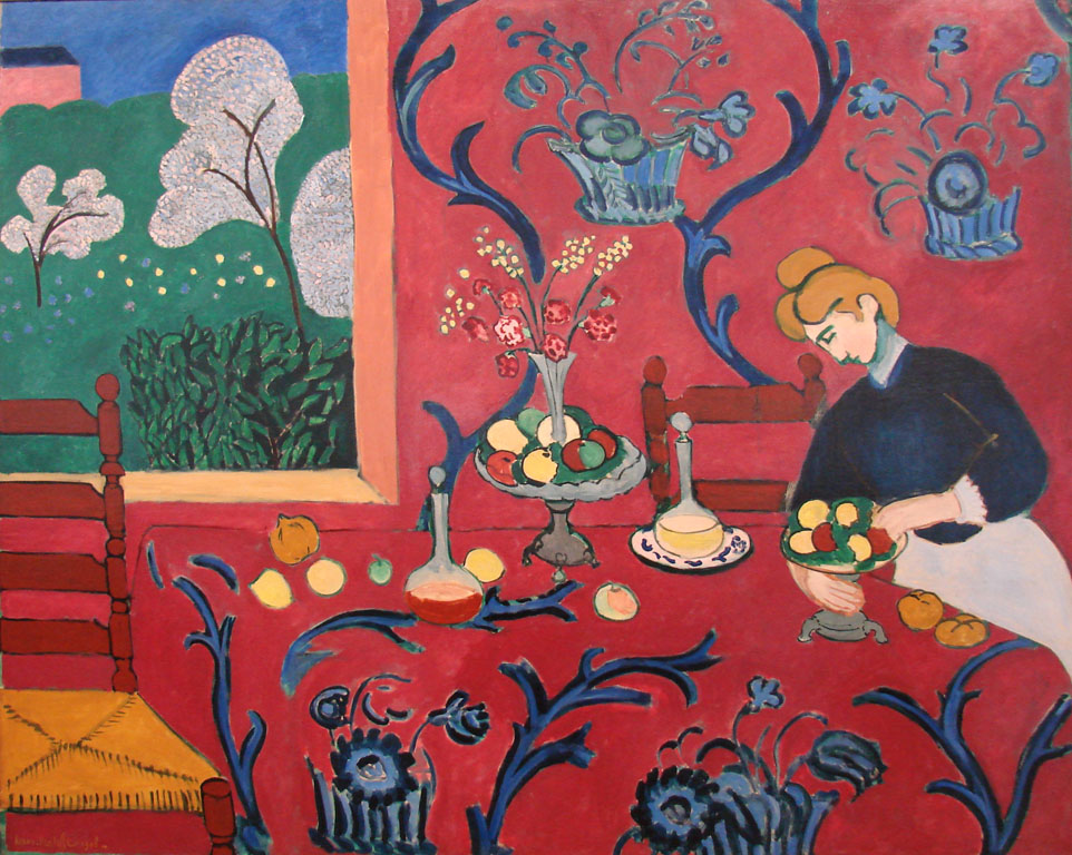
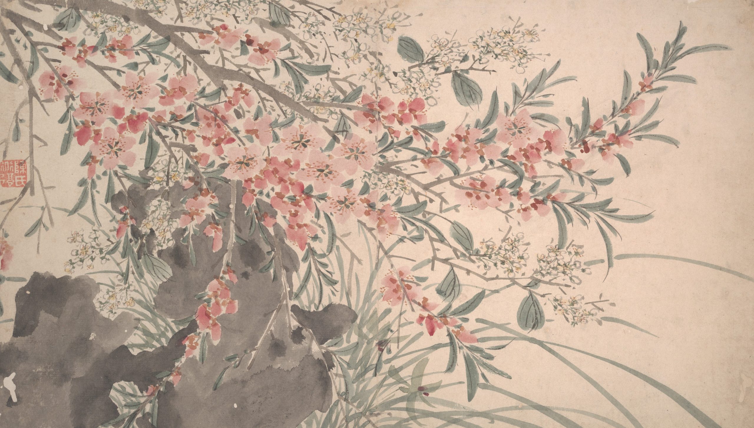
Finally, intensity or saturation is how bright or dull a color is. Henri Matisse tended to use very saturated colors, as in his La Chambre Rouge (1908), whereas in Garden Flowers (1540), painted by a follower of the artist Chen Chun, we see a much more muted palette with very little saturation of colors. The colors in Garden Flowers are mostly washed out. The grey-green of the trees and pinks of the blossoms are low in saturation, and do not stand out sharply from the beige paper on which they were painted. The Matisse painting, on the other hand, is a blaze of colors. The vibrant reds of the wall and tablecloth dominate the image, in sharp contrast with the green grass showing through the window and the blues curving throughout the image.

Contrast is the amount of variation between the highest and lowest values in a work of art. This is perhaps most commonly used to talk about photography, but can be applied to any works. Kazimir Malevich’s Suprematist Composition: White on White (1918) has very low contrast. There are no dark blacks, no stark whites; everything is in very similar shades of pale gray. The low contrast conveys the soft and gentle feeling of a heavy mist over quiet water.
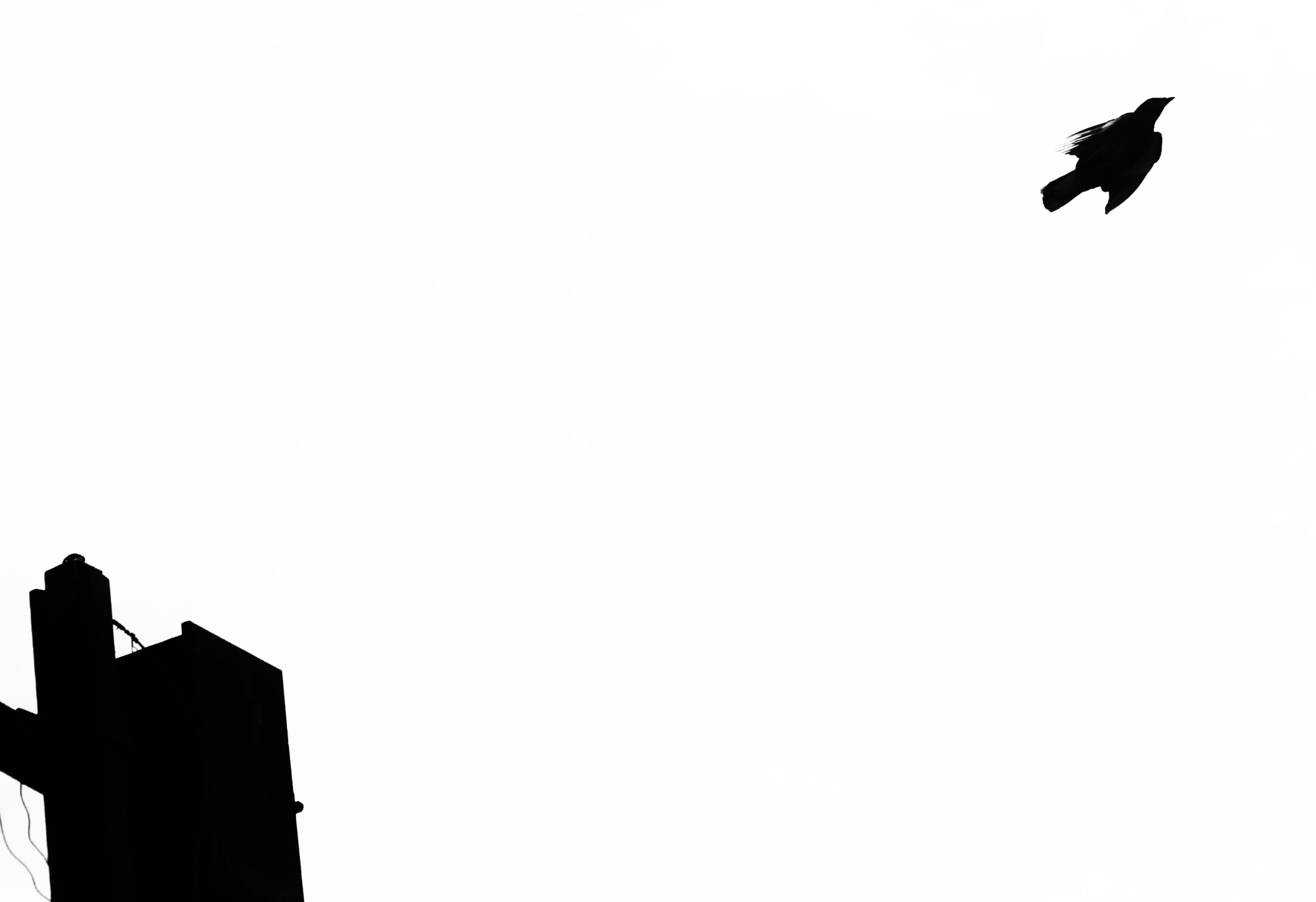
On the other hand, Nagesh Jayaraman’s Freedom is to break free from all shackles……. (2012) has extremely high contrast, meaning that the difference in the whites and blacks is much greater. Indeed, the images is almost entirely black and white. The effect is much sharper and crisper, making an ordinary scene feel weightier. Similarly, Kara Walker’s silhouette image Before the Battle (Chickin’ Dumplin’) (1995), the contrast is absolute.
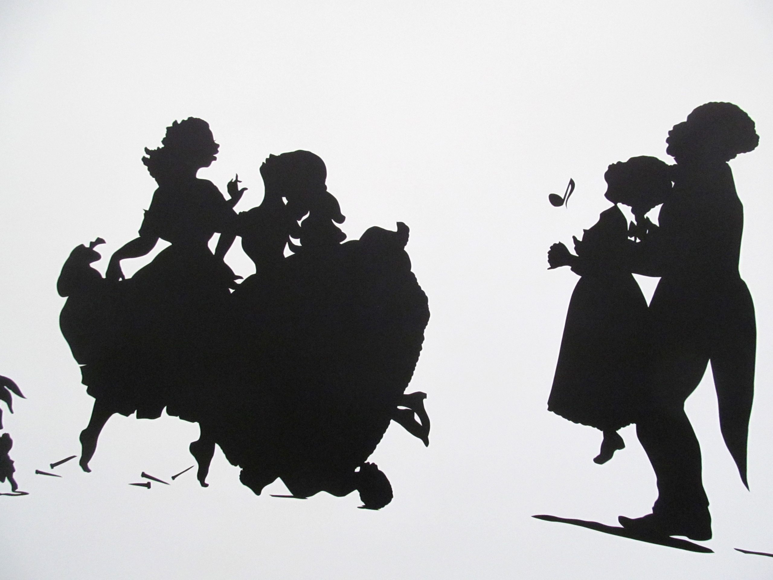
We see only black and white. In this case, the artist is using the power of this contrast to draw the viewer’s attention to some of the problems in US race relations, and their origins in the institution of chattel slavery, in which people and their children are bought and sold as property. This system of the dehumanization and abuse of human beings was justified by arguments that the world was, in a sense, black and white, that these two colors, when thought of as racial categories, were absolute and absolutely different. Seeing Walker’s images in only black and white, and reduced to two-dimensional cut-outs, is a reminder of the falseness of the racist claims on which the system of enslavement was built. Therefore, while visual elements produce visual effects, it is important to remember that their implications can extend well beyond the purely visual.
Shape and Form
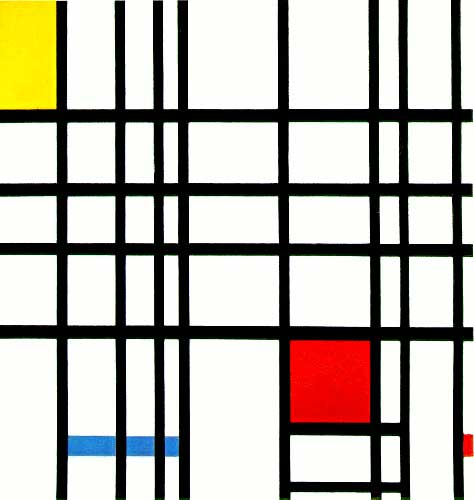
Shape builds on line and color, as it has to be made of one or both of these. Shape is the property of a two-dimensional form, usually defined by a line around it or by a change in color. Like line, there are two main types of shapes, geometric and organic. While most works of art contain both geometric and organic shapes, looking at those that are more completely divided can serve to clarify the qualities. Piet Mondrian is an excellent example of an artist who used geometric shapes almost exclusively. In his Composition with Yellow, Blue and Red (1937-42), Mondrian uses straight, vertical and horizontal black lines to divide his canvas into rectangles of primary colors. Nothing here gives the impression of the natural world. On the other hand, Maori facial tattooing, known as moko, uses primarily organic shapes.
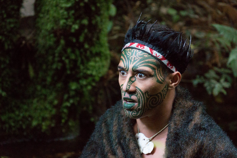
They are still, like Mondrian’s shapes, generally abstract – they do not depict any clear images – but the shapes are like those found in nature, curving, twisting and spiraling across their bearers’ faces. The edges of the lines and shapes are crisp, but the forms are curving fluid.
Form is actual, three-dimensional shape, though it is often used to describe the illusion of three-dimensionality, as well. Like shape, form can be geometric or organic.
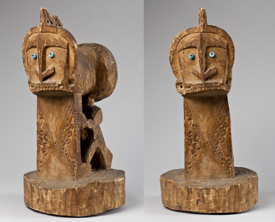
A small korvar – a representation of an ancestor – from Indonesia mixes these form types well. While the figure is predominantly geometric, with the squared-off face and the nose shaped like an arrow pointing downward, the curving organic shapes on the panel below the face soften this effect.
Space
Space is used to refer both to depth, real or represented, and also to the general surface area within a work of art. Some periods of art history show a great deal of interest in creating convincing illusions of three-dimensional space in two-dimensional media. Perhaps the most iconic (though certainly not the only) example of this is the Italian Renaissance (ca. 1400-1600), when artists very deliberately worked to create convincing illusions of depth. Look at how Raphael creates an illusion of three-dimensional form in his La Donna Velata (ca. 1515). Through careful variations in value, particularly in shading – the use of darker colors to create the illusion of shadows – Raphael convinces us that the woman in the painting is really there in three dimensions. This is the same effect we saw in the Dürer woodcut print discussed above, but the medium – oil paint – allows for much smoother and finer variations in hue, value, shades and tints, creating a much more convincing illusion of three-dimensional forms.
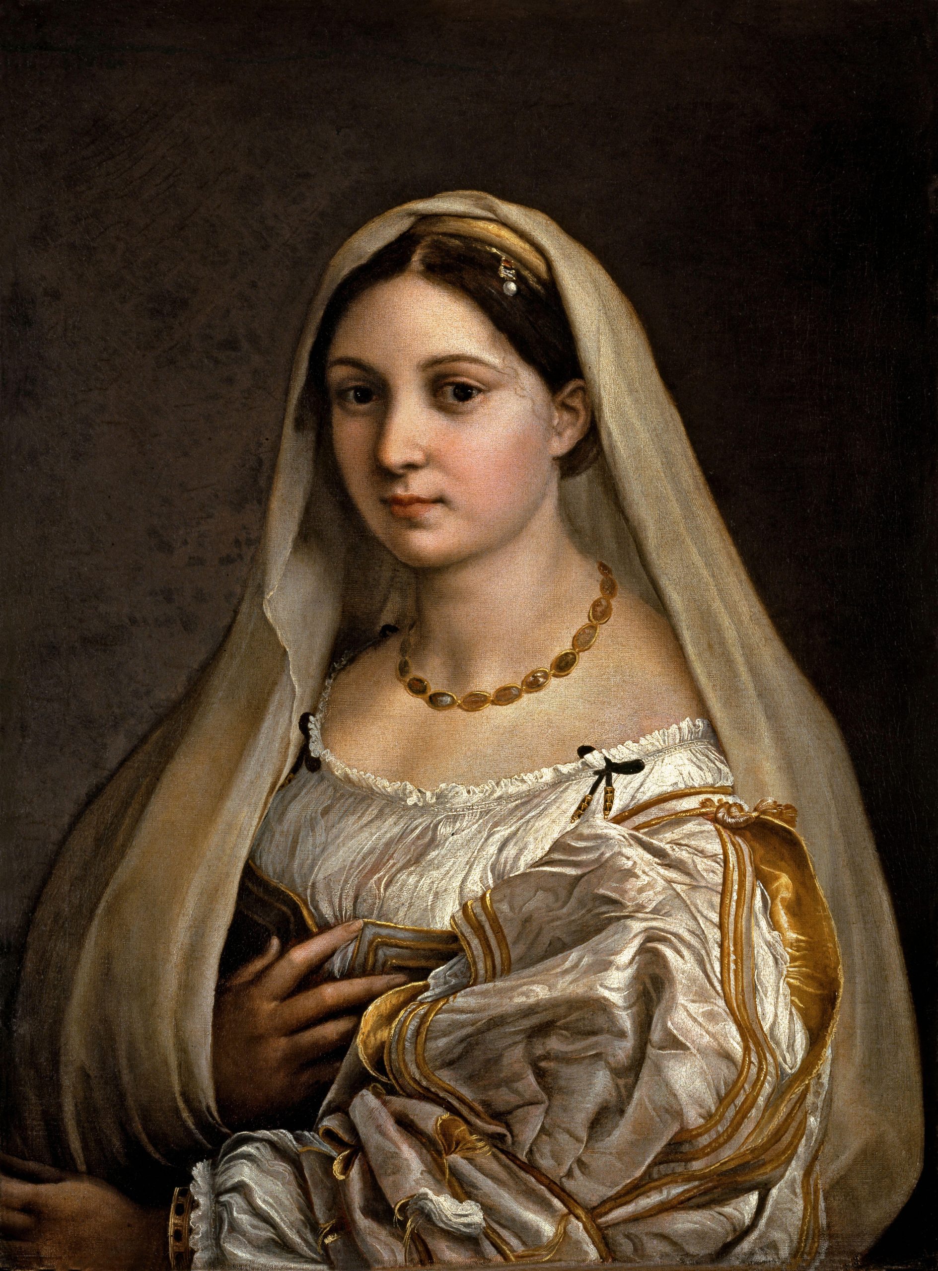
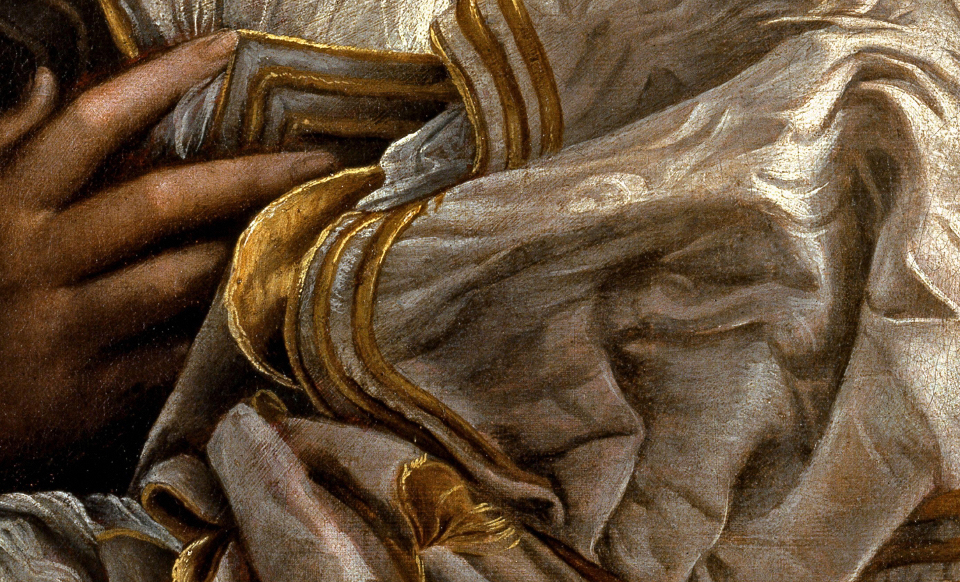
Light seems to strike the woman from her left, casting her right side in shadow. The folds of her voluminous sleeve are a particularly splendid example of the illusion of space. Even examining a small detail of it, it is hard to believe that there is no depth, at all, just thin layers of paint sitting on flat canvas.
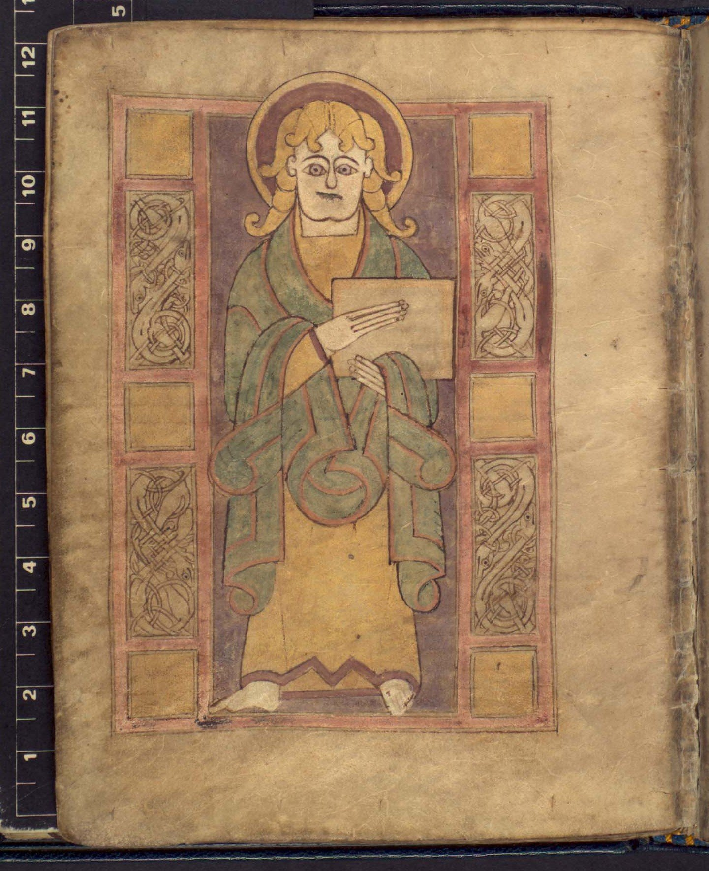
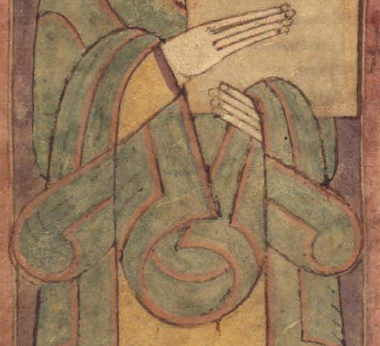
For sharp contrast, we can examine a detail of a page of a medieval Irish Book of the Gospels, ca. 750. Both images show a person in voluminous robes, looking out at us, but this is where the similarities end. Raphael’s figure is lit softly, creating highlights and shadows that create a sense of roundness and weight to her body and clothes. The figure of John the Evangelist from the Irish Gospels, on the other hand, is almost totally flat. There is virtually no shading to his body and the folds on his clothes are purely schematic patterns. If we isolate a small detail of John’s clothing, as we did with La Donna Velata’s, it is difficult to even recall that this series of lines and colors is intended to be seen as a three-dimensional form, at all.
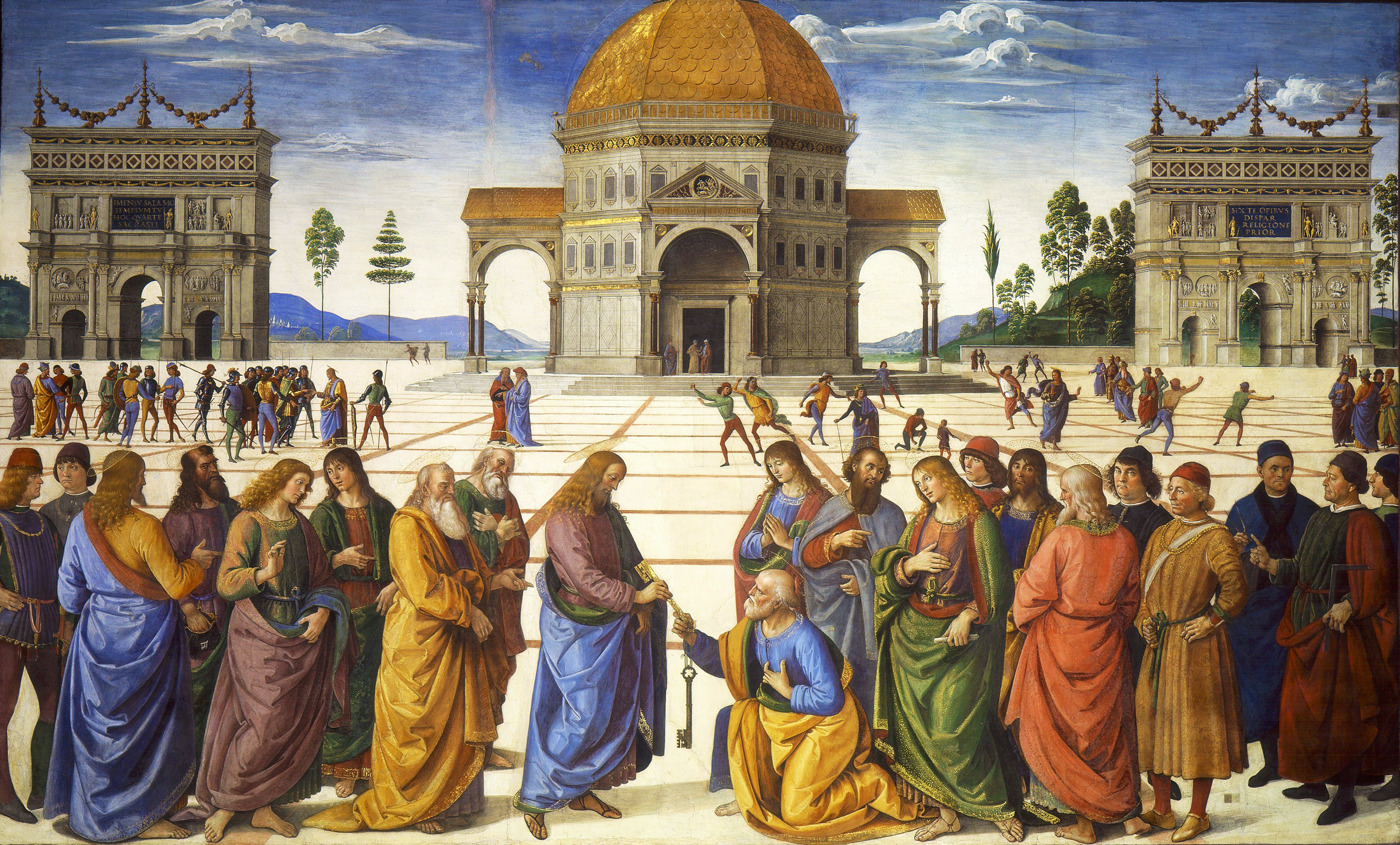
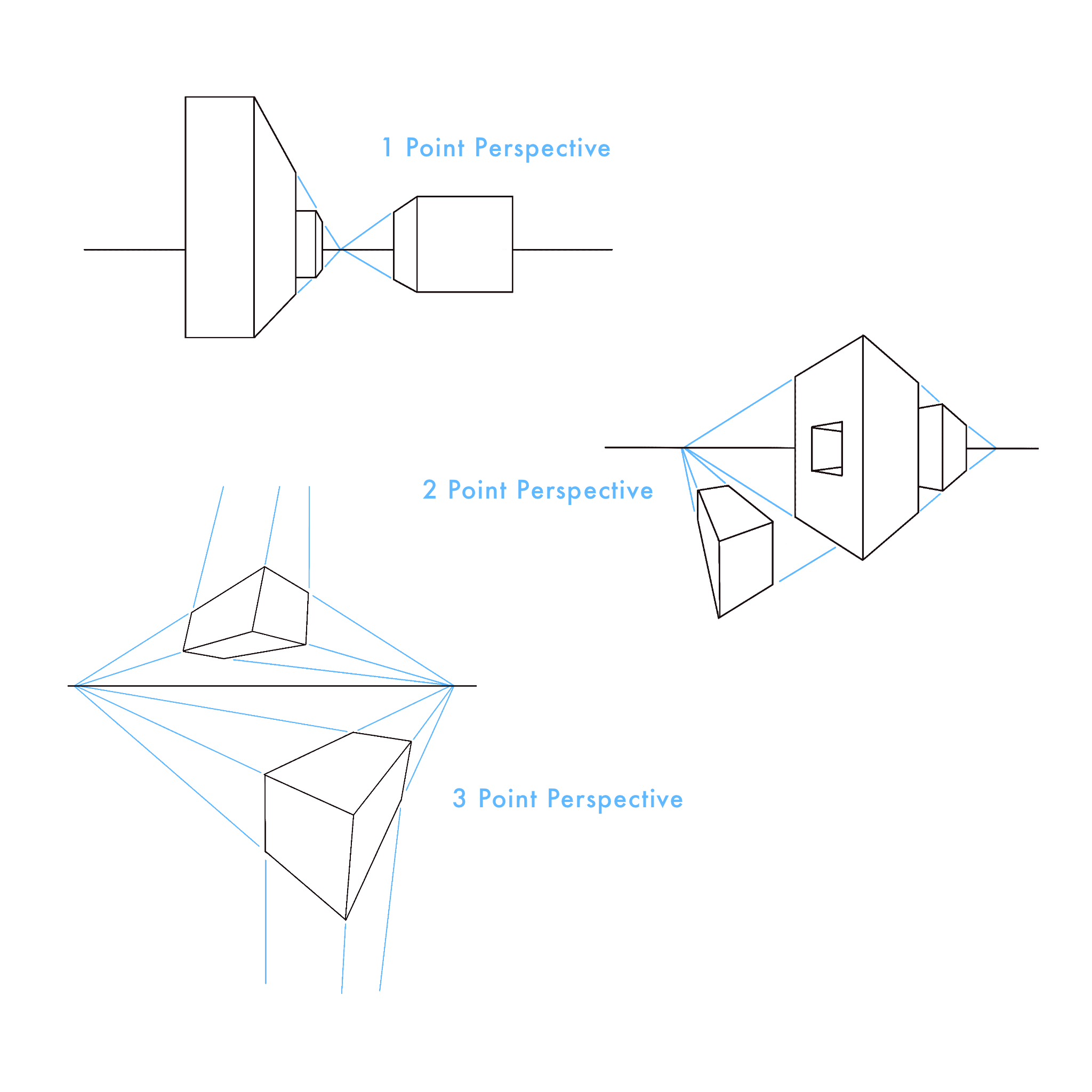
There are various methods used by artists to create the illusion that their figures exist in three-dimensional space. Among the more effective are linear perspective and atmospheric perspective. Another work from the Italian Renaissance will serve to demonstrate both. Pietro Perugino’s Christ Handing the Keys to St. Peter (1481-82), uses both linear and atmospheric perspective to create the very convincing illusion of depth.
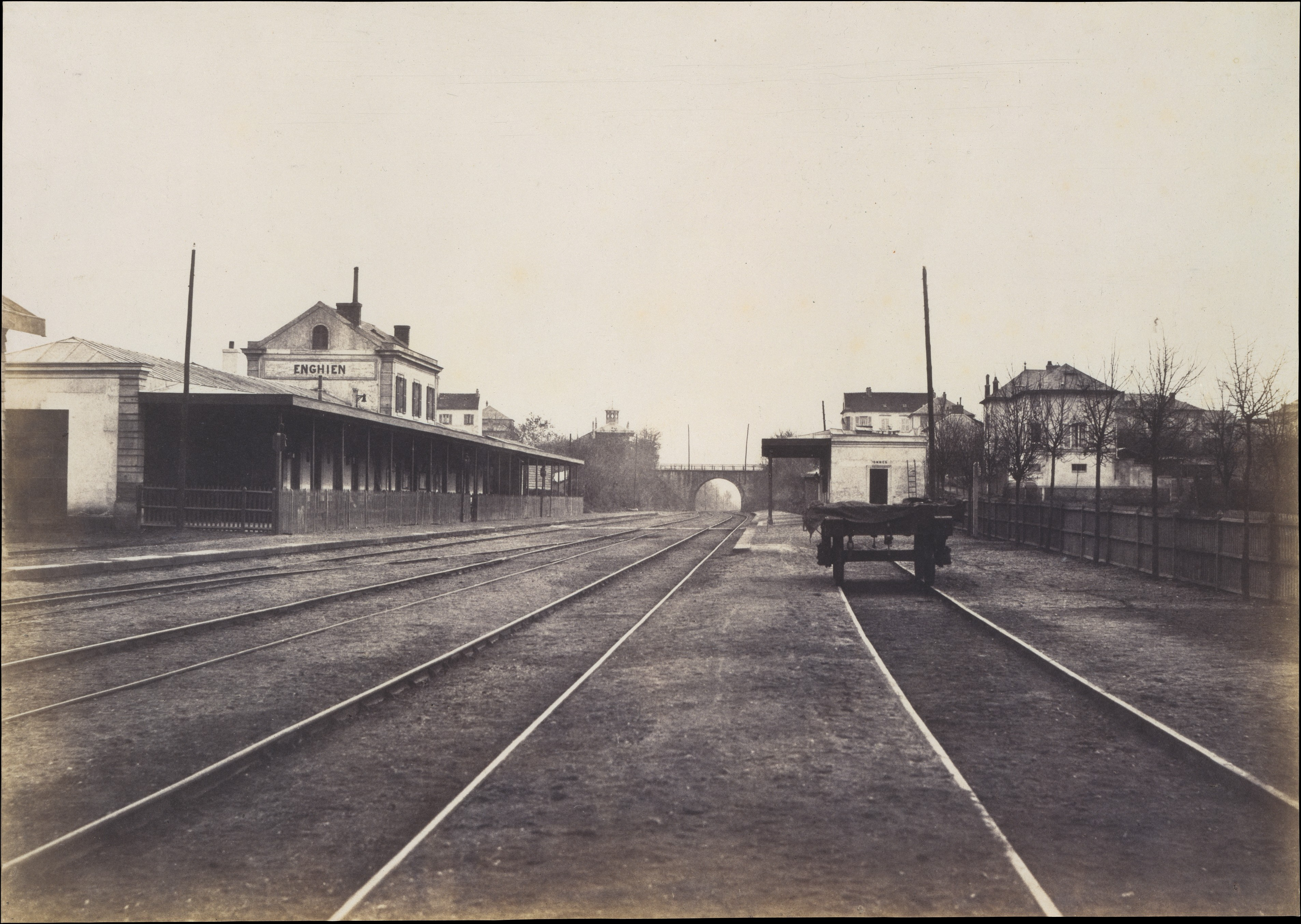
Linear perspective is based on the optical illusion that parallel lines seem to converge as they recede into the distance. Railroad tracks are the classic example, as in Edouard Baldus’s Gare d’Enghein (1855).
If we overlay the lines used on Perugino’s painting, we can see how he used this effect.
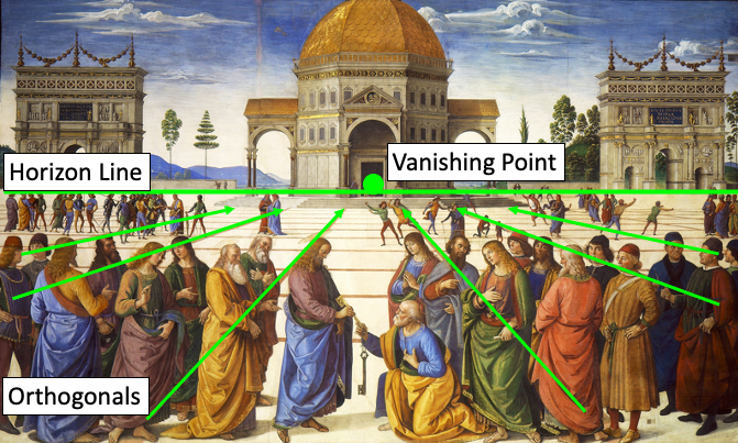
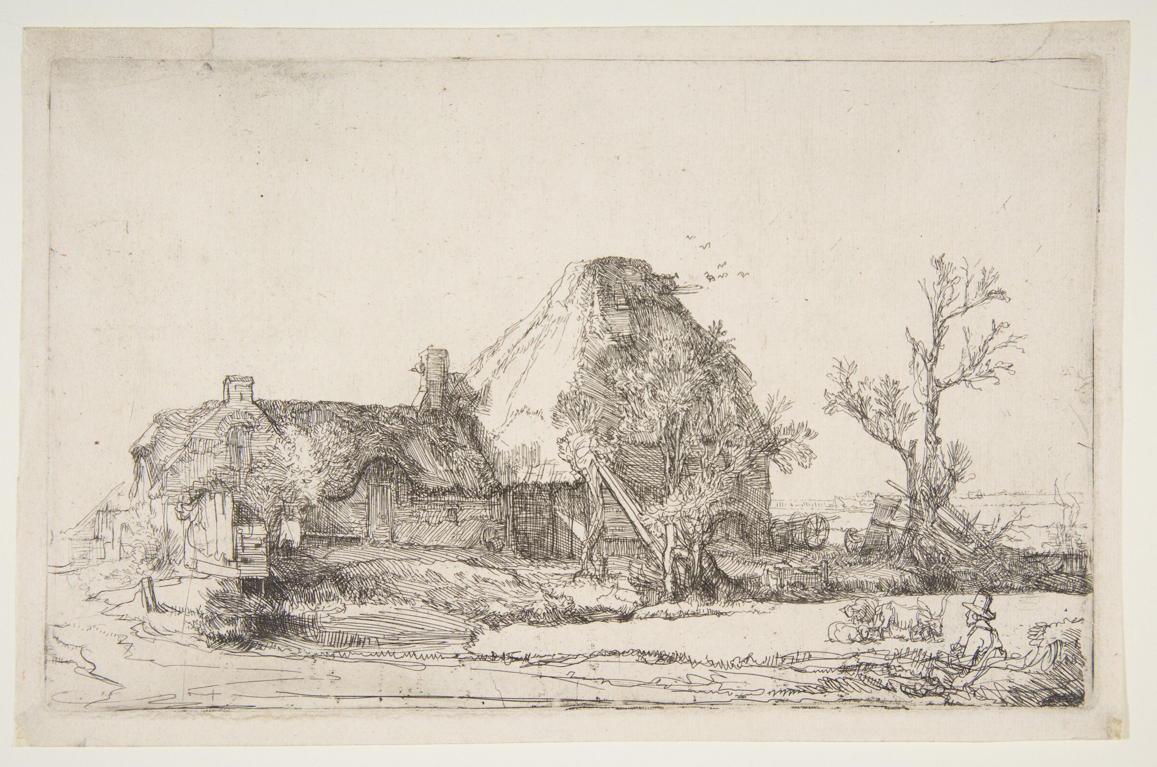
The lines are called orthogonal lines or orthogonals and they meet on the horizon line, at the vanishing point. Note that as all the orthogonals converge, the forms also get smaller. The tool of one-point linear perspective is very simple, and artists can use it to create a convincing illusion of depth with only a few pencil strokes and without the careful measuring and use of a ruler, as in Rembrandt van Rijn’s etching of Cottages and Farm Buildings with a Man Sketching (ca. 1645).
Two- and three-point linear perspective are slightly more complicated, but operate on the same general principles and produce similar results.
Perugino also uses atmospheric perspective. This is based on the optical effect that makes objects in the distance appear paler, bluer, and less detailed than objects that are close to us. This effect is perhaps most striking when we look at images of mountains in the distance, as in Claude Lorrain’s Landscape with the Trip into Egypt (ca. 1647). Note how the color of the figures in the foreground – the portion of the image that appears to be closest to the viewer – are more vibrant than the colors in the background.
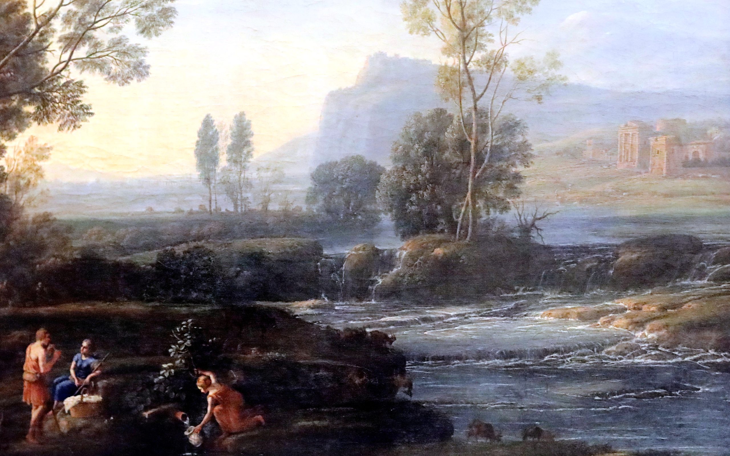
Returning to Perugino’s painting, we can see that he has also relied on this effect, carefully making the figures in the foreground bolder in color and the smaller figures in the middle ground paler, while the hills in the background seem to fade away into pale blues.
It is important to note, though, that the use of various techniques to create a convincing illusion of depth does not make Raphael or Perugino “better” artists than the anonymous medieval monk who painted the page of the Book of the Gospels, nor does it make their works any “better” or more sophisticated. The illusion of depth is one of the many tools in the artist’s toolbox, and it serves some purposes very well, but it not always the most powerful or effective way to convey an idea. Indeed, sometimes it can be in direct conflict with the intentions of an artist.
Texture
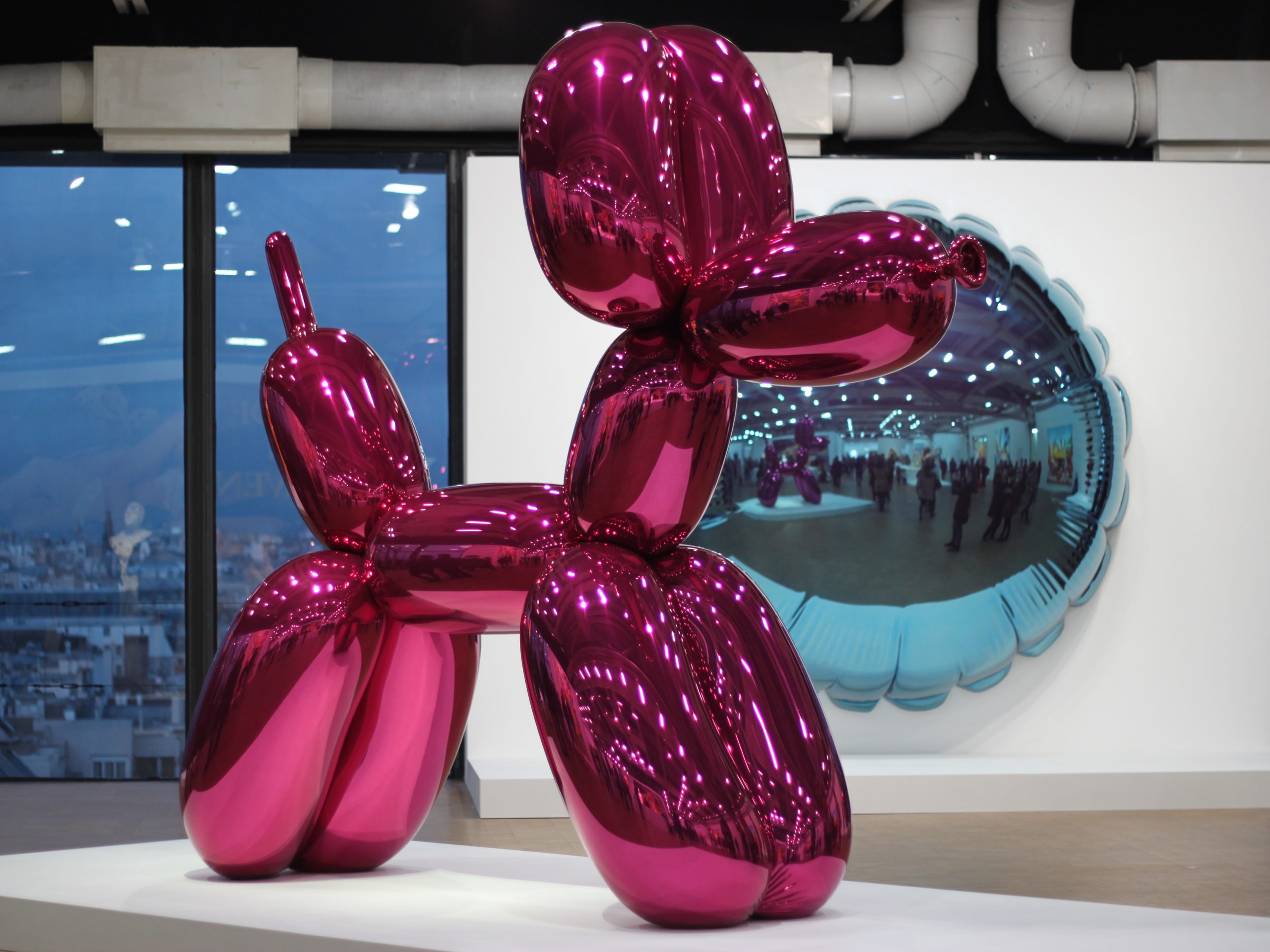
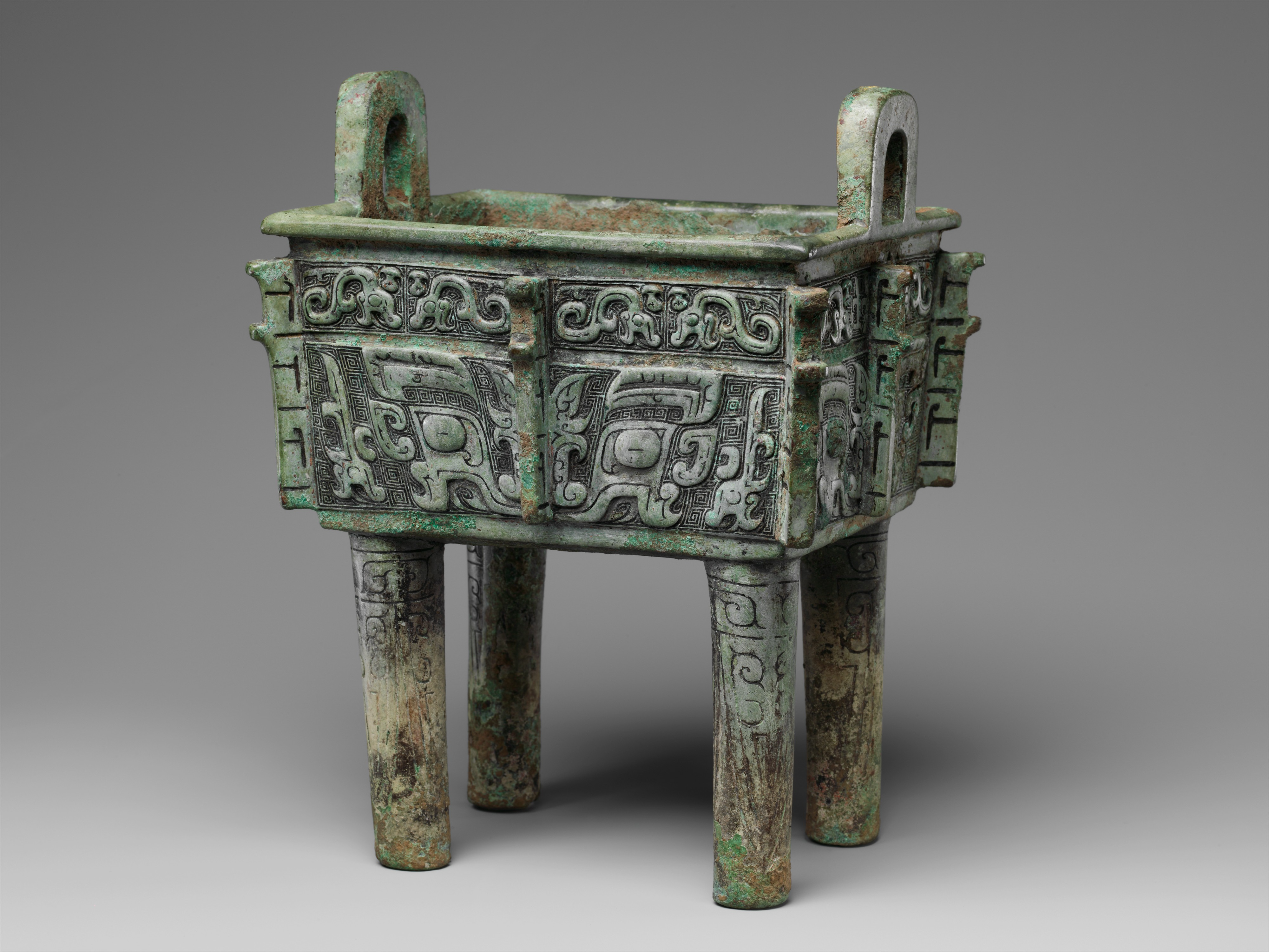
Texture is the feeling of a surface, real or represented. This might refer to the roughness or smoothness of actual objects and art media, or to the illusion of these properties. Jeff Koons’ Balloon Dog (1994) has a perfectly smooth, mirrored surface it is difficult to resist touching it, though, of course, please don’t touch the art! It is this surface texture that turns these replicas of commonplace, short-lived, disposable items into precious objects. In contrast, the coarse, bristly surface of an ancient Shang Dynasty Fang-Ding – a ritual vessel used in worshipping dead ancestors – grants the work a vibrant energy, but does not invite our touch.
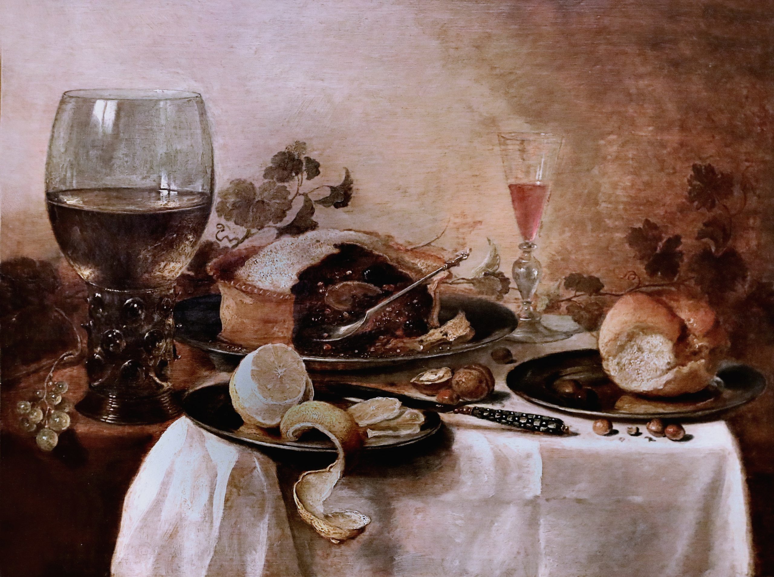
The illusion of texture is no less important to our experience of works of art. Dutch still lifes are justly famous for their careful, illusionistic replication of objects. The smooth silver plates and glass goblet of Pieter Claesz’s Still Life (ca. 1623) seem to tease us, as do the rougher nuts and breads, and the flaky pie. The lemon peel appears to dangle out of the image itself, just beyond our grasp, and therefore makes this magnificent spread all the more tantalizing.
Media Attributions
- Albrecht Dürer, Four Hoursemen of the Apocalypse, woodcut print, ca. 1497/1498 (Metropolitan Museum of Art, New York). Photo: Public Domain.
- Detail of hat, Albrecht Dürer, Four Hoursemen of the Apocalypse, woodcut print, ca. 1497/1498 (Metropolitan Museum of Art, New York). Photo: Public Domain.
- George Herriman, Krazy Kat – Out of My Way Woim, ink on paper, ca. 1920, Photo CC BY-NC-ND 2.0
- Leonardo da Vinci, The Virgin and the Rocks, oil on poplar, thinned and cradled, ca. 1491 (National Gallery, London). Photo: CC BY-NC-ND 4.0.
- Sight Lines in Leonardo da Vinci, The Virgin and the Rocks
- Visible Light Spectrum. Image: Mari H.
- Color Wheel. Image: Mari H.
- Pierre-Auguste Renoir, Maternité, oil on canvas, 1885 (Musée d’Orsay, Paris). Photo: CC BY-NC 2.0.
- Jean-Baptiste-Camille Corot, Mother and Child, oil on wood, ca. 1860 (Metropolitan Museum of Art, New York). Photo: Public Domain.
- Henri Matisse, La Chambre Rouge, oil on canvas, 1908 (State Hermitage Museum, Saint Petersburg). Photo: CC BY-NC-SA 2.0.
- After Chen Chun, Garden Flowers, ink and color on paper, 1540 (Metropolitan Museum of Art, New York). Photo: Public Domain.
- Kazimir Malevich, Suprematist Composition: White on White, oil on canvas, 1918 (Museum of Modern Art, New York). Photo: Public Domain.
- Nagesh Jayaraman, Freedom is to break free from all shackles……. 2012, (CC BY 2.0) https://creativecommons.org/licenses/by/2.0/
- Kara Walker, African’t (detail), cut paper on wall, 1996 (The Broad, Los Angeles). Photo CC BY-NC 2.0
- Piet Mondrian, Composition with Yellow, Blue and Red, oil on canvas, 1937-1942 (Tate Modern, London). Photo: CC BY-SA 2.0.
- Maori, Australasia, 2013 -35
- Korvar
- Raphael, La Donna Velata, oil on canvas, ca. 1512-1515 (Pitti Palace, Florence). Photo: CC BY-NC 2.0.
- Raphael, La Donna Velata, sleeve
- Portrait of Luke, Gospel Book, London, British Library, MS Additional 40618, f. 21v, Ireland, 750-850. Creative Commons CC0 1.0 Universal Public Domain Dedication.
- Detail of clothing, Portrait of Luke, Gospel Book.
- Pietro Perugino, Christ Giving the Keys of the Kingdom to St. Peter, fresco, ca. 1481-1483 (Sistine Chapel, Vatican City). Photo: Public Domain.
- Edouard Baldus, Gare d’Enghein, salted paper print from printed negative, 1855 (Metropolitan Museum of Art, New York). Photo: Public Domain.
- Perugino Diagrammed
- Rembrant van Rijn, Cottages and Farm Buildings with a Man Sketching, etching, ca. 1645 (Metropolitan Museum of Art, New York). Photo: Public Domain.
- Perspectives
- Claude Lorrain, Landscape with the Trip into Egypt, oil on cavnas, ca. 1647 (Gemäldegalerie Alte Meister, Dresden). Photo: CC BY-NC-SA 2.0.
- Jeff Koons, Balloon Dog, mirror-polished stainless steel with transparent color coating, 2014 (Exhibition Center Pompidou, Paris). Photo: Public Domain.
- Fang-ding, bronze, 12th-11th century B.C.E. (Metropolitan Museum of Art, New York). Photo: Public Domain.
- Pieter Claesz, Still Life with Meat Pie, oil on panel, 1640 (Guildhall Art Gallery, London). Photo: CC BY-NC-SA 2.0.
- The Elements of Art and Principles of Composition are here adapted from the J. Paul Getty Museum’s “Understanding Formal Analysis,” (accessed 4/29/2011) http://www.getty.edu/education/teachers/building_lessons/formal_analysis.html (no date). ↵
The process of breaking down works of art into their parts (such as line, color, balance, and symmetry), figuring out how they relate to one another, and considering their effects of viewers.
Line, Shape, Color, Space, Form, Texture
see: visual elements
How the visual elements of a work of art relate to each other
A path either represented or implied
The property of a two-dimensional form, usually defined by a line around it
The light reflecting off objects, divided into hue, value and intensity
Depth, real or represented, as well as the general area within a work
The property of a three-dimensional object; also used to describe the illusion of three-dimensionality
The feeling of a surface, real or represented
a form of printmaking where a wooden block is carved in reverse, inked, and then pressed into paper to create an image
lines that define shapes
The use of darker colors or lines to create the illusion of shadows
closely spaced lines used to create an illusion of shadow
lines used to create a sense of movement in an image
straight or smoothly, evenly curving lines found in geometric diagrams, and not common in nature
loose, curving, irregular lines like those found in nature
lines that are not actually drawn in an image, but can be inferred, such as the sight lines of figures in a work
lines that follow the direction of a figure's gaze
Making an image look like the “real world”
Colors from which all other colors can be made
Colors made by mixing two primary colors
Colors made by mixing a primary color with an adjacent secondary color
the materials used to make works of art, such as oil paint, marble, and steel
Colors opposite one another on the color wheel
Colors next to one another on the color wheel
Colors from green to purple on the color wheel
Colors from yellow to violet on the color wheel
The degree of lightness or darkness of a color
Value produced by adding white to a hue
Value produced by adding black to a hue
How bright or dull a color is
How bright or dull a color is
The amount of variation between the highest and lowest values in a work of art
Bright elements of an image that often draw the viewer's attention
A technique used to create the illusion of three-dimensional space on a two-dimensional image, achieved by drawing or implying a series of lines that all converge on one or more vanishing points
The simulation in a work of art of the optical effect that makes objects in the distance appear paler, bluer, and less detailed than objects that are close to us
Lines that meet at the vanishing point in linear perspective
The divide in an image between sky and land or sea
Point on the horizon line where orthogonal lines meet in linear perspective
The portion of the image that appears to be closest to the viewer
The portion of the image that appears to be furthest from the viewer
Images of objects, generally without human or animal figures
