9 Selves
Why Do Artists Present Themselves? And How Do They Capture Others?
The face has always held a central role in art. We find images of the human face particularly compelling. Our eyes are drawn to faces in art, and we also find images of faces where they are not – electric sockets present two eyes and mouth, buttons seems to smile out at us, and so on. Even before humans were yet modern humans, while we were still evolving, representations of the face were seen as important enough to become part of early burial rituals. Among the earliest “works of art” to survive from anywhere in the world is an object found in a grave in South Africa. It is a small pebble, buried with a body as part of a funeral ritual of some sort, and it bears a simplified image of a face.

The face was not carved by hand, but was a natural feature of the pebble. Still, it seems to have been recognized, since it was transported a long way before being included in the burial, and therefore transformed into a form of “found art.” The pebble, though, was not buried with a human, a Homo sapiens, but with an Australopithecus africanus, an early hominid ancestor of modern humans, nearly three million years ago. Now, just as then, we seek out such images everywhere we go.
This chapter examines a series of images that strive to get beneath the skin of their subjects – that work to convey more than physical appearance. Many of the works are portraits, though not all. Some of them are self-portraits – images of the artists who made them – and some are portraits of other people. Some are known figures, and others are anonymous. We also look at a few works that manage to present the artist’s personality or body, without an actual image. In some media, the artist’s body directly manipulates the surface of the work, but even when working in less manual media, like photography or digital art, artists make the vital decisions that shape the outcome of their works, which therefore reflect them. All of these works – like so many throughout this book – convey something essential about the identity of their creators and subjects.
SPOTLIGHT IMAGE I:
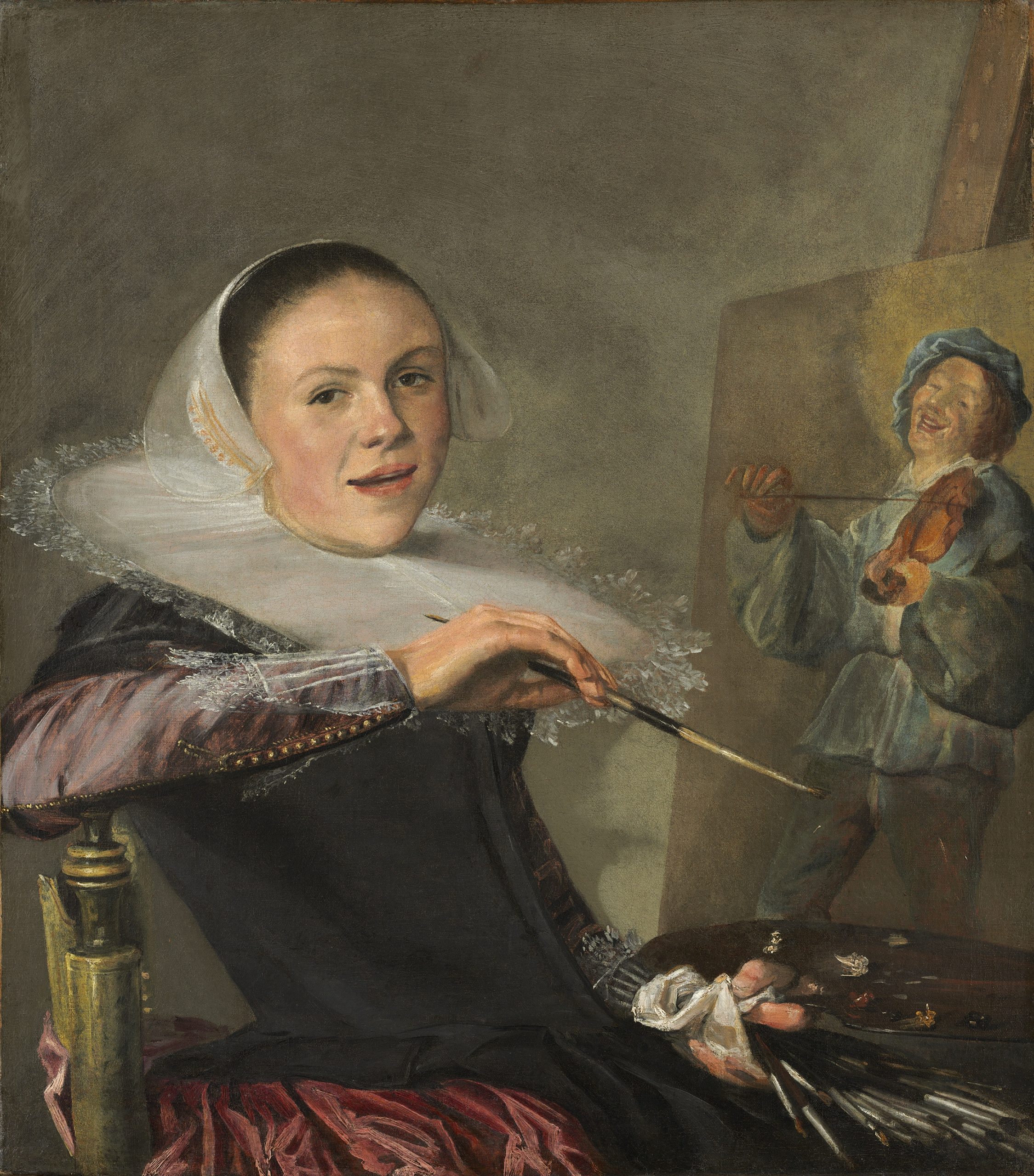
JUDITH LEYSTER, SELF-PORTRAIT, HOLLAND, 1635 CE
VIEWING QUESTIONS
- What are the effects of the visible brushstrokes?
- What sort of a moment does the painting seem to capture?
- How do the colors impact our reception of the image, and its elements?
- How does the artist manipulate the balance of the image?
- How does the artist create points of focus?
- How does the painting within the painting differ from the rest of the painting?
INTRODUCTION: A Star in a World of Painters
Judith Leyster was one of the most successful painters of seventeenth-century Holland, which was a bustling center of painting. Portraits (images of people that are based on actual people rather than fictional or mythical people), still lifes (images of inanimate objects) and genre scenes (scenes of everyday life) were the most popular subjects, and Leyster produced all three. In a period when women were rarely afforded status equal to their male contemporaries, she was celebrated and successful, even taking on male students, though after marrying Jan Miense Molenaer, also a painter (though now of much less renown than Leyster), she had five children and seems to have largely stopped painting.

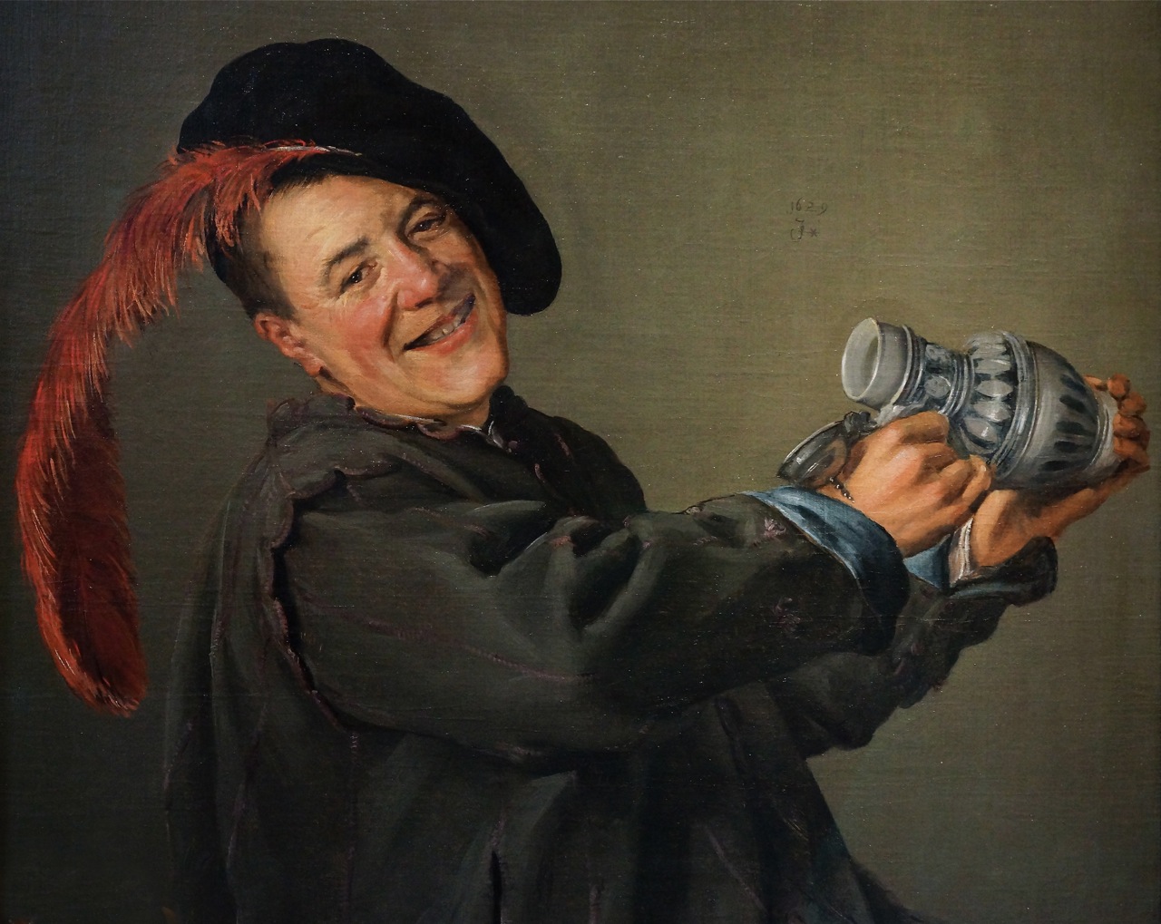
Leyster was long written off as a follower of Frans Hals, the most prominent painter of her era, based on mistaken assumptions about the role of women in the arts of the period. She is now thought to have been a competitor of his, and records show that they fought over the best assistants. Leyster means “Lode Star” – a term that literally refers to the North Star, used by seventeenth-century sailors to navigate, but also used to refer to anything, or anyone, who serves to lead those around them. Punning on her name, she signed many of her works, such as the cheerful Jolly Toper (that is, the “Jolly Drinker,” ca. 1629), with a monogram that ends in a shooting star, a sign of her confidence in her own status as painter.
VISUAL ELEMENTS: Casual Composition
Judith Leyster’s self-portrait (ca. 1635) is a wonderfully complex work, despite its apparent simplicity. Through a variety of techniques, elements of art, and principles of composition, Leyster manipulated her presentation of herself and of her role as a producer of art. At first glance, the portrait seems so casual and relaxed. We seem to have interrupted her at her work, but she seems to welcome our visit, turning to face us with a crooked grin. Her parted lips and teeth suggest that she is greeting us, and her smile and raised eyebrows suggest that her greeting is warm.
Leyster’s pose gives her a relaxed air, as if her work as an artist is not a great and weighty labor as some artists present the task, but a joy. Her body is positioned such that it recedes into the canvas at an angle. This makes the image seem more naturalistic and relaxed than more traditionally posed, frontal portraits. The image looks like a snapshot taken by a friend, but of course, all of these details are the result of Leyster’s careful planning.
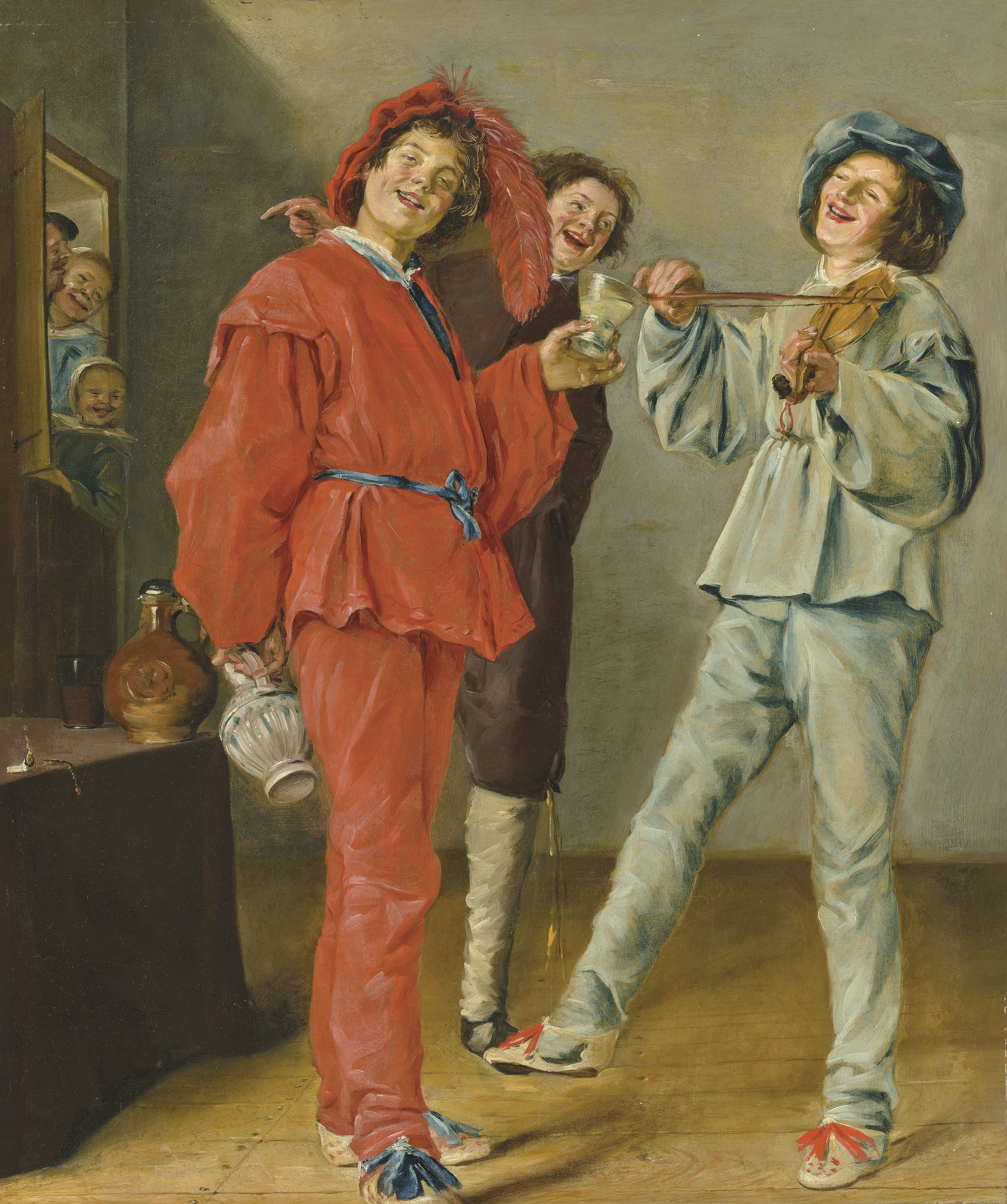
Leyster’s lighthearted presentation of her approach to painting suits her work, which is generally filled with cheerful figures, happily practicing their own crafts. For example, she painted several images of cheerful musicians, often surrounded by drinkers and other revelers, such as Merry Company (ca. 1630-1631). Painted only a few years before her self-portrait, this was one of her most well-known works within her lifetime. Here, brightly dressed figures laugh, drink, and play music. The young figure in red seems to invite us to join the party, looking out of the canvas directly at us, and raising his glass as if to offer us a drink.
In her self-portrait, the Leyster almost seems to be one of this crowd. Indeed, the fiddler on the painting within the self-portrait is borrowed from Merry Company, which places Leyster in the position of the figure in red, looking out at us and inviting us to join the fun. This is a rather different model of the life and role of the artist than we often see. Leyster does not wish to appear as a tortured genius, toiling in obscurity, or a wealthy master, seriously engaged in the creation of masterpieces, but rather, as a cheerful member of a joyous society.

Leyster’s work has an informal, casual appearance to it that is not merely the result of subject matter and composition. Her painting technique is loose and brushy – a style that is sometimes called “painterly” – so that we see each brushstroke. This was a relatively new style in her period, pioneered by Hals. A close look at her sleeve, for example, shows how she created the illusion of velvet and lace through quick, energetic layers of paint. Unlike Northern European painters of previous generations, who worked to hide their craft within perfectly smooth, illusionistic surfaces, or their more traditional contemporaries, Leyster and Hals loosened their style, resulting in images that have more movement, that seem more lively, spontaneous and active.
Comparing Leyster’s painting of herself to her painting of the fiddler within the self-portrait, we see that they are very much of the same world. There is a rough symmetry, here, as each leans back from the center at an angle, though they are quite different in scale. The similarity of the figures invites us to compare them. Both appear against the loosely-painted neutral backgrounds that replaced the more formal backgrounds common to portraits from earlier periods. In each, the artist manipulates the shade of that background for contrast with the figure, in order to create emphasis. Since Leyster depicts herself wearing a bright white lace cap, she darkens the area just around her head for contrast. Similarly, she lightens the background around the fiddler’s blue hat. In both cases, this helps draw attention to the figures’ heads. This is also accomplished in the painting – as perhaps it was in life – by the very broad, starched lace collar, on which Leyster has painted a number of bright white stripes, pointing inward toward her open, accessible face. It is her right hand, though, that is closest to us. She holds her brush much as the fiddler holds his bow, and with her left hand, grips her palate much as he grips the neck of his fiddle. Both seem amply able to use their tools – perhaps effortlessly – to entertain us.
There is, though, one subtle difference in technique between Leyster’s image of herself and her image of the fiddler she shows herself in the act of producing: the fiddler is painted in an even looser, brushier style, more characteristic of her other works. With this unusual use of variety of style within a single painting – since, really, there are not two paintings here, but one painting that has an illusion of a painting in it – Leyster is therefore displaying her ability to render images in the two more common styles of her day, but also differentiating between the supposed reality of the image of herself, and the painting she is here at work upon.
CULTURAL CONTEXT: A Period for Portraits
In Holland and Flanders, the Baroque period (ca. 1600-1750 CE) was one of crisis and conflict. It was filled with great religious tensions, including the 30 Years War, which raged between Catholics and Protestants from 1618-1648, originating in Austria and eventually spreading all throughout Europe. For 40 years, the Netherlands had been under Catholic Spain’s repressive rule. The Protestants, with the help of the French, finally overthrew the Spanish. The Netherlands then split into Catholic Flanders (which is roughly modern Belgium) in the South and Protestant Holland in North. This was a period of absolute rule, with monarchs like Louis XIV claiming divine right – authority derived from God – but there was a corresponding backlash. Rebels agreed with the philosopher John Locke (1632-1704 CE), who argued that governments draw their authority from the governed, rather than from themselves or God.
After the 30 Years War, Holland developed a Free Trade Economy and became the leading trade nation in Europe, fostering a powerful new bourgeoisie – an upper middle class. The bourgeoisie was much larger than the old nobility, and became a powerful new source of patronage of art. Prior to this period, most art was commissioned by religious groups and governments. The severe, new Protestant Church rejected most art as too luxurious, and so religious commissions began to dry up. Instead, the middle class began buying art for enjoyment and investment. According to seventeenth-century diaries, letters, records, and other documents, a large portion of the populace began collecting art. Even farmers left records of their art collections, which would have been unheard of in any previous generation.
The new art-buying public desired different subjects than the Church and Crown had. Religious scenes and royal portraits fell out of popularity, in favor of still lifes, landscape paintings, genre scenes, and more modest portraits of families and guilds. Most of these paintings were small, modest works, and many of them are quite light-hearted and entertaining. They are not generally moralistic or didactic – they do not aim to teach the viewer important lessons. Instead, they entertain and delight. Leyster’s self-portrait is both an example of this tone – it is, itself, delightful – and a demonstration of the attitude of the painter toward the working process that would result is such paintings. She presents herself as a cheerful member of the bourgeois class to which she belonged.
Leyster was born in Haarlem, an important Dutch city, and worked in Amsterdam and Utrecht before ultimately settling back in Haarlem. There, she joined the painters’ guild, which was a rare accomplishment for a seventeenth-century woman. The guilds were powerful organizations of merchants and craftspeople that both supported members and controlled production within their regions. They were something like modern day unions, with dues to be paid and collective power to wield. There were cloth makers’ guilds, dyers’ guilds, booksellers’ guilds, and so on, and membership in them was essential for a successful career in any of these fields. Leyster’s membership was therefore both a strong indication of her success as a painter, and also a great help in furthering that success. Once a member of the guild, she opened her own studio, took on assistants and students, and clearly enjoyed considerable success.
Leyster seems to wear this success lightly in her self-portrait, where she presents herself as quite comfortable with her role. She is richly and meticulously dressed in the latest bourgeois fashion. She stresses her proficiency as an artist and her friendliness, rather than presenting herself as an idealized beauty by the standards of her day. Leyster might have presented herself with a long, swanlike neck, or overflowing bodice, as women of the period are often presented, or alternately, as a serious and sober matron. Instead, she presents herself as a confident member of the new art-producing and art-buying class that was just forming around her. Indeed, her cheeks and nose are a bit ruddy; perhaps, like so many of the figures in her paintings, she has had a glass or two of wine. The section that follows continues to consider how artists use their art to explore their own creative processes and practices.
Comparisons and Connections I: Self-Portraits
Judith Leyster’s self-portrait raises several elements vital to a discussion of the production of art: artists, patronage, styles, guilds, genres, personal expression, idealization, and so on. This section of comparisons and connections will consider works produced in a variety of contexts and bearing traces of their circumstances of production.
The (Old) Master of Self-Portraits
We will begin with one of Leyster’s contemporaries, Rembrandt van Rijn, who was without any doubt the most significant painter of the Dutch Baroque period. He was born in Leiden, Holland, and moved to Amsterdam after gaining early success. Unlike most painters, for the most part he ran his studio as he wished. Rather than working on commissions from patrons, he was one of the first artists in the Europe to produce works that could be valued as “Rembrandts,” and therefore sought after regardless of subject matter.
Joachim von Sandrart published an early history of Dutch Painting in 1675, in which he tells us that Rembrandt had “countless distinguished children for instruction and learning, of whom every single one paid him 100 gilders annually,” an enormous sum for the time.[1] Having students was common, but Rembrandt seems to have had many more than was usual, or even allowable under the rules of the Guild of St. Luke, patron saint of painters. Consequently, he had an outsized impact on the following generation of artists.
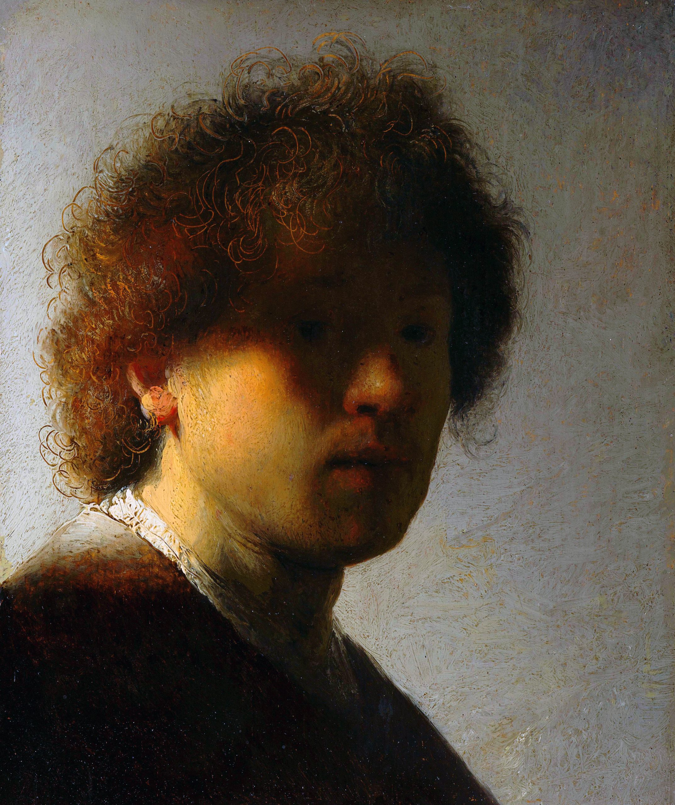
In his first fifty months in Amsterdam, starting in 1641, Rembrandt painted fifty portraits. Most of these were of the more expensive, full-length type, rather than the cheaper head or bust. His most characteristic works are his self-portraits. Indeed, Rembrandt the artist, Rembrandt the gentleman, Rembrandt the youth, Rembrandt in all his incarnations was Rembrandt’s most absorbing and powerful artistic subject. Self-portraits, like that of Judith Leyster, were common in the period, but Rembrandt adopted the subject of his own face as a life-long project, producing at least seventy-five self-portraits between 1628 and 1669.
One of Rembrandt’s earliest self-portraits, painted in 1628 when he was 23 years old, shows a dynamic young man, filled with energy. His remarkable manipulation of light and shadow is already evident in the curious image. Most painters use light and shadow to define forms and create a sense of depth and weight. Rembrandt does this, to a degree, but more vital is his use of light and shadow to create moods and emotions. Most of the figure’s face is shrouded in shadow. Even in this very early work, the painter conveys a mixture of optimism and wary concern. Rembrandt is presenting himself to us, and yet concealing more than he reveals. The light falls most sharply on his white collar, the side of his neck, and the edge of his jaw. These are all less expressive features than those he cloaks in shadow – the eyes, eyebrows, and mouth.
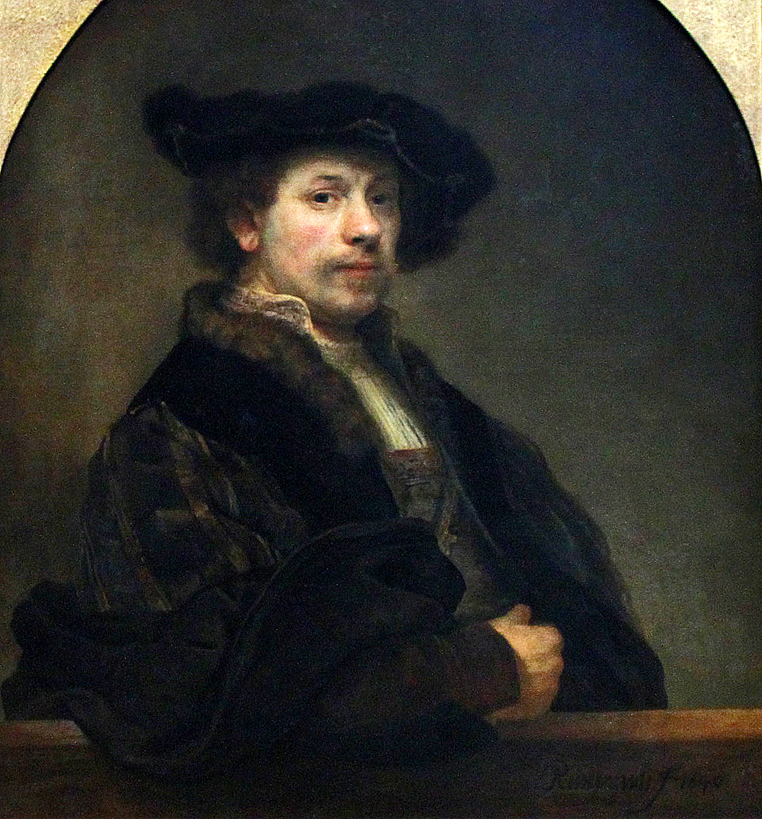
By studying the portraits Rembrandt produced over the following four decades, we can watch him grow up, age, shift and change, but certain qualities seem to remain through them all. In his Self-Portrait Leaning on a Sill (age 34, ca. 1640), Rembrandt is richly dressed, optimistic as he looks out to world. We see him here, at the height of his fame and success, and the image is a clear display of his wealth.
Rembrandt’s modulation of light and shadow still conveys more than mere shape and weight; instead it suggests a mood. Here, the lighting is more traditional, falling on his face and illuminating him warmly. The image, like many of Rembrandt’s works, seems to glow from within. This effect was achieved by building up many layers of translucent glazes – oil paints with little pigment in them, which subtly change the underlying colors and allow actual light to penetrate the surface of an image and shine back out from the paint. Unlike Leyster, he does not here show himself in the act of painting. Rather, as a very successful businessman, he presents what his painting has granted to him: status as a prosperous gentleman.
As he aged, Rembrandt’s brushwork became looser, more “painterly.” The result is that, even in works that are not self-portraits, the artist presents himself in every brushstroke. He also increasingly abandoned the high drama, the intense action and florid emotion that filled his earlier work in favor of more intense psychological content, more inner emotion. In a letter to Constantijn Huygens, a contemporary Dutch humanist and poet, Rembrandt wrote that he wished to convey “the greatest inward emotion.”[2]
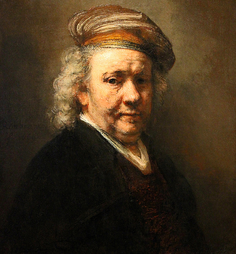
In his final self-portrait (age 63, 1669), he painted himself as a tired man, worn down with cares. Though he saw meteoric success as a young man, he lost a great deal over the decades. The youthful self-portrait of 1628 is a whirl of self-confidence, of promise and bold exploration of new techniques to render not only three-dimensional form but also light, and the moods it can convey. The late work of 1669 is heart-rending not because Rembrandt’s powers of representation are diminished. Quite to the contrary, it is because they are so clearly in evidence. By this point in his life, Rembrandt had lost everything – his parents, his brothers, two wives, three of his children, and also his great wealth, culminating in the auction of his home and furnishings. He had lost everything, that is, except for that which made him great, in the first place: his ability to render, though subtle manipulations of tone, not only form, light, and shadow, but a tremendous, almost overpowering sense of individual character and emotion.
Hidden Self-Portraits
While many artists make themselves the centerpieces of their art, others slyly slip themselves into works. Italian Renaissance artist Michelangelo Buonarroti painted and sculpted his own face throughout his works, and his contemporary, Raphael Sanzio da Urbino, modestly added himself peering out from a work celebrating all the greatest thinkers from history.
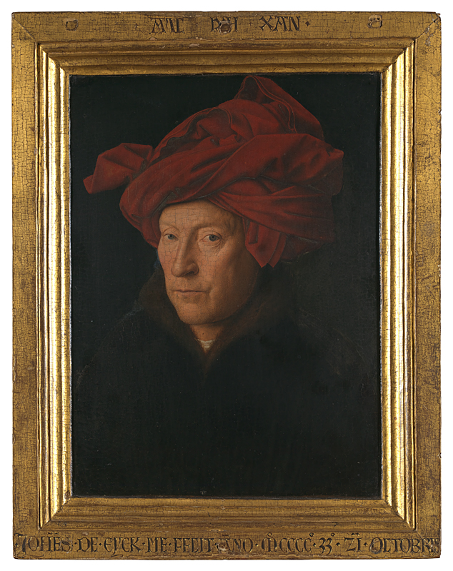
Perhaps the artist most famous for his hidden self-portraits, though, is the fifteenth-century Flemish painter Jan van Eyck. He left us one work that is believed to be a self-portrait, though since this is not certain, it is usually called The Man in the Red Turban (1433 CE). It is a highly compelling work, with rich, luminous colors. Van Eyck was a pioneer of oil paints, which allow for bolder colors than were possible previously. They also allow for the use of glazes – thin coats of paint with little or no pigment – which van Eyck used, for example, to created the layers of glossy shine over the figures eyes.
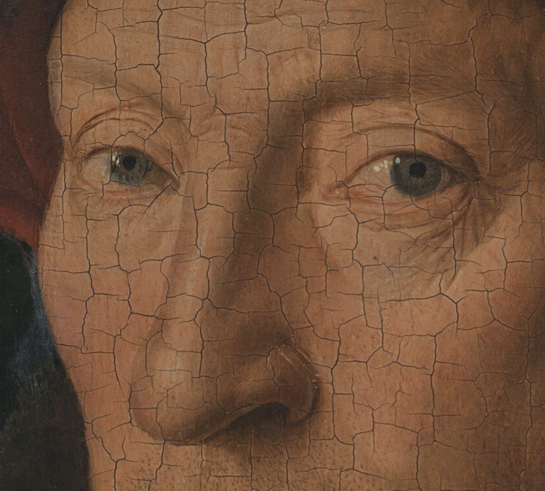
The portrait is painted with remarkable precision. Every piece of stubble on the man’s unshaven face is individually painted, and not as a single stroke, but with shading and highlights to suggest light striking glossy hair. The eyes, though, are the most arresting feature, pale blue and piercing, and ever so slightly pulled into a taught squint at the outer corners, where the skin is a bit dry and papery, suggesting concentration and age.
Why do many art historians assume this to be a self-portrait? Van Eyck painted many portraits by commission, so this could just be another wealthy patron. However, there are a few clues that suggest otherwise. First, most of his other portraits give us the name of the sitter. This one, though, only gives van Eyck’s name (on the lower frame, where it is written in an abbreviated form of the Latin version of his name, “Johannes de Eyck”). The inscription at the top of the frame, in Flemish, reads “All I can,” which we might take to mean, “The best I can manage.” Is this genuine humility or false modesty? The work, especially when viewed up close and in person, is astonishing, dramatically more precise and detailed than the paintings of his contemporaries. The face that stares out at us is so sharp, so keen, and the eyes sparkle with a cold and clear intelligence that seems in perfect accord with van Eyck’s paintings.
There is, though, another reason to suspect that this is a self-portrait. Curiously, in the backgrounds of many other works by van Eyck, we can often just make out a figure in a red turban. In one portrait, we can see him through a window, strolling across a bridge with a companion. More remarkably, in a large portrait of a priest surrounded by a group of saints, he appears reflected in the shining shield of St. George!
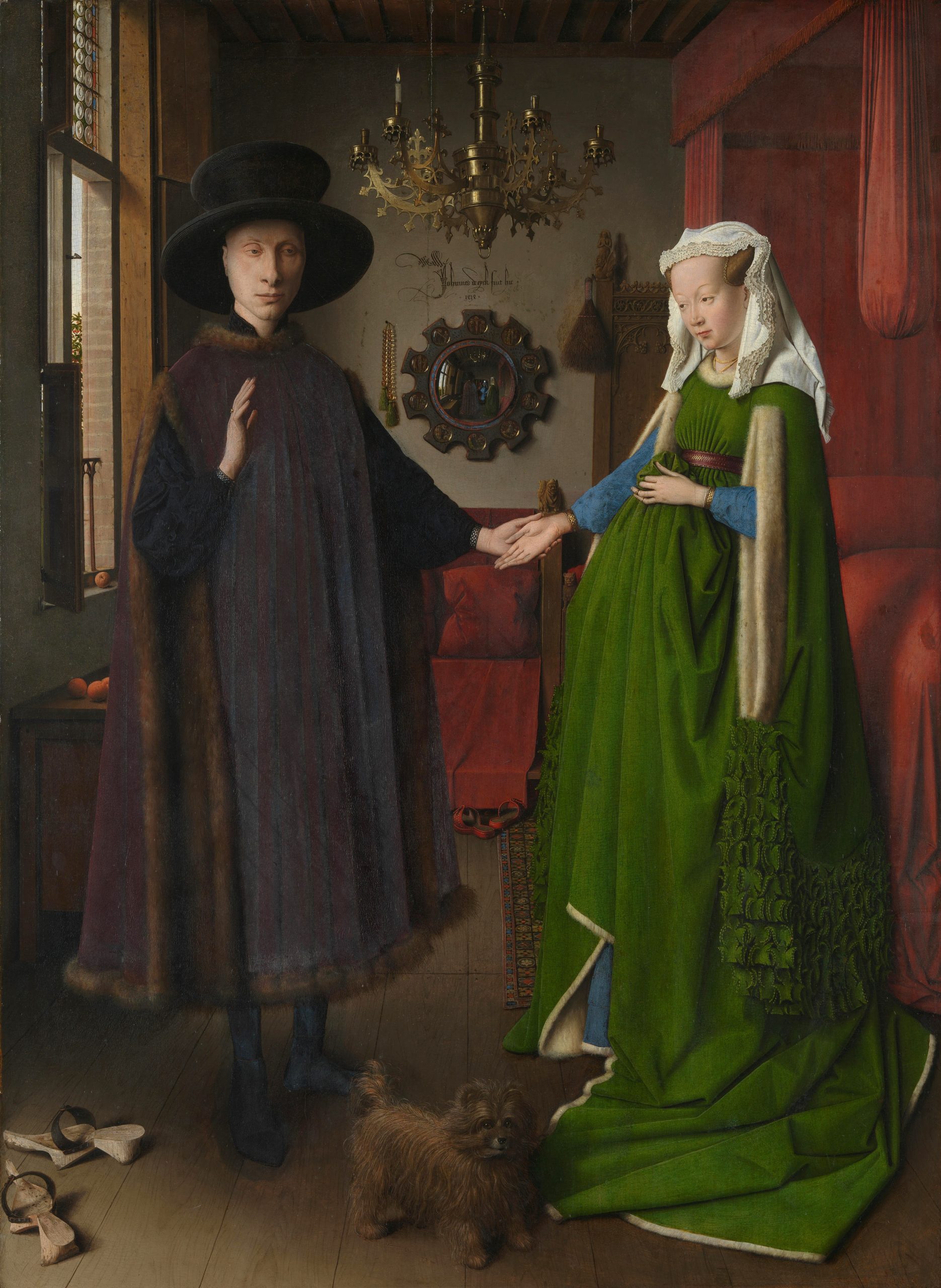
Here, though, we look at his appearance in the background of the Arnolfini Portrait (1434). This work presents Giovanni di Nicolao Arnolfini and his eventual wife, Giovanna, though it was painted several years before their marriage, and may perhaps be intended to document their betrothal – their promise to marry. Arnolfini, an Italian merchant with connections to very powerful banking families, lived in Bruges, Flanders, and sought out the most prominent painter in the area for this image.
Again, the work is painted in beautiful, saturated colors, with incredibly fine detail and precision. The couple is presented as serious, even dour, but also as very wealthy – their robes are lined with fur, their furnishings are ornate, and even their affenpinscher dog would have been more costly than most other dog breeds, at the time.
Where, though, is the man in the red turban? If we look closely – very closely! – at the convex mirror hanging on the back wall, we see in its distorted surface first the Arnolfinis’ backs and then, beyond them, two tiny figures, one in blue and the other in a red turban.
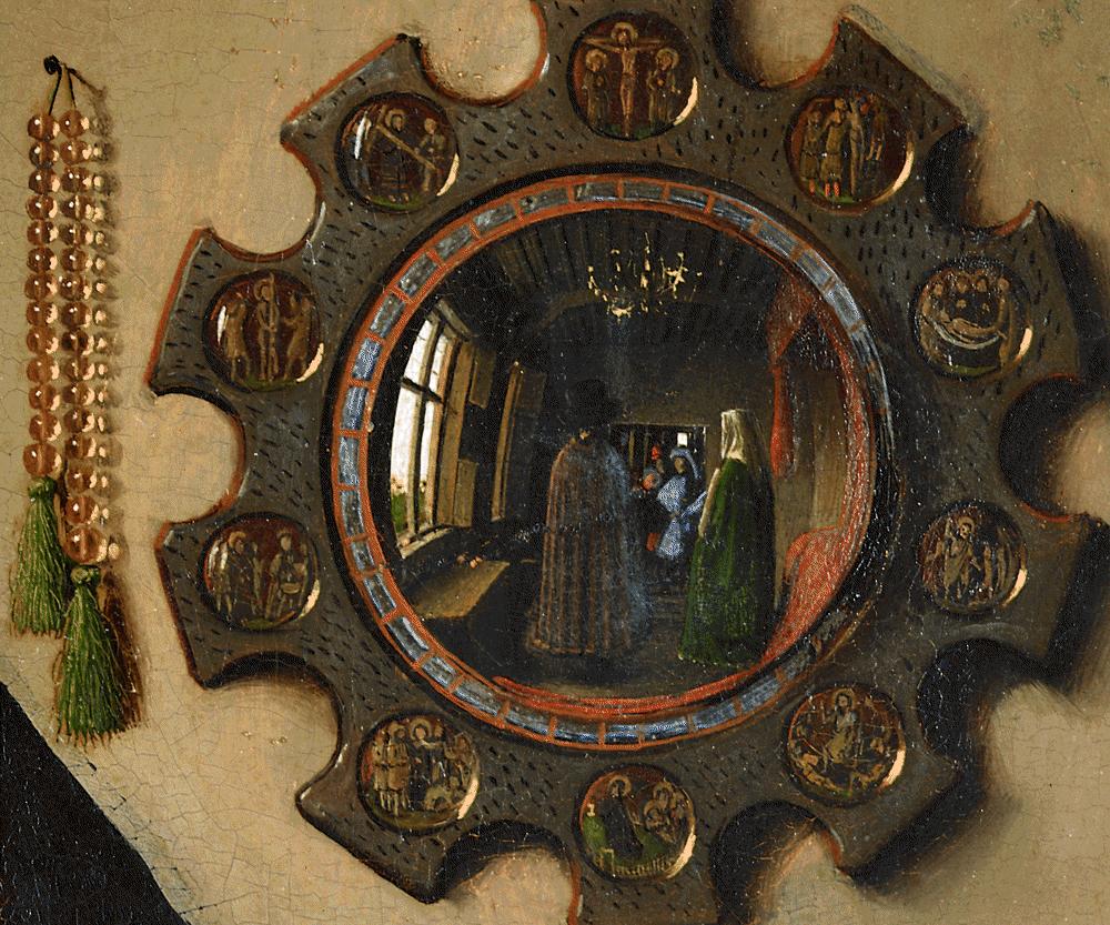
The whole painting is only about 32 inches high, so the mirror is about 3.5 inches high, and this figure is only a fraction of that, less than an inch high. Just above the mirror is a very ornate inscription, slightly different from that on the frame of the Man in the Red Turban. That one reads (in Latin), “Jan van Eyck Made Me, 1433, 21 October.” The inscription on the Arnolfini Portrait reads (again in Latin), “Jan van Eyck was here, 1434.” The inscription and the tiny image of the man in the mirror suggest that van Eyck was serving as a witness to the scene we see before us. If the man in the red turban is van Eyck, then of course van Eyck “was here” for its creation, and so the slight difference makes sense. In the Arnolfini Portrait, both inscription and image assert van Eyck’s presence. In The Man in the Red Turban, both instead assert his act of painting, and his remarkable skill.
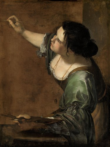
Artemisia Gentileschi, a prominent Italian Baroque painter elected to the Florentine Academy of Design at the early age of 23, also produced straightforward self-portraits and other paintings that contain “hidden” self-portraits. Hers, though, are more dramatic than van Eyck’s sly inclusions. In one painting, Gentileschi presents a self-portrait that is not concealed, but elevated into an Allegory of Painting (1638-1639 CE).
The image is quite unusual for a self-portrait, since it presents the figure from the side. This poses quite a challenge for an artist, living prior to the invention of photography. How could she ever have seen her profile from this angle in order to paint it? Perhaps she used a series of mirrors. The pose is a demonstration of her great virtuosity as a painter, a demonstration that she is a worthy model for the personification of Painting. Typical of her work, the image is dramatically lit with light streaming in from one side, striking the figure on the face and chest, and leaving her back in deep shadow. It is also rather asymmetrical, with the bulk of the figure right of the center of the painting, and only – and significantly – her hands and painter’s tools to the left.
Unlike Leyster’s self-portrait, where the painter is leaning back from her canvas, or Rembrandt’s self-portraits, where the painter is presented without the tools of his trade, Gentileschi paints herself vigorously at work, almost diving toward her blank canvas, as if eager – even compelled – to being a new work.
This painting, probably produced while Gentileschi was in England at the invitation of King Charles I, was based on Cesare Ripa’s Iconologia, a guidebook of subjects for painters. It describes the figure of Painting as:
a beautiful woman, with full black hair, disheveled, and twisted in various ways, with arched eyebrows that show imaginative thought, the mouth covered with a cloth tied behind her ears, with a chain of gold at her throat from which hangs a mask.[3]
Gentileschi’s image suits this description well, but for one very notable alteration: She has chosen to omit the gag in the mouth of Painting (intended by Ripa to suggest that painting is mute). Gentileschi was not to be silenced, as the next image demonstrates.
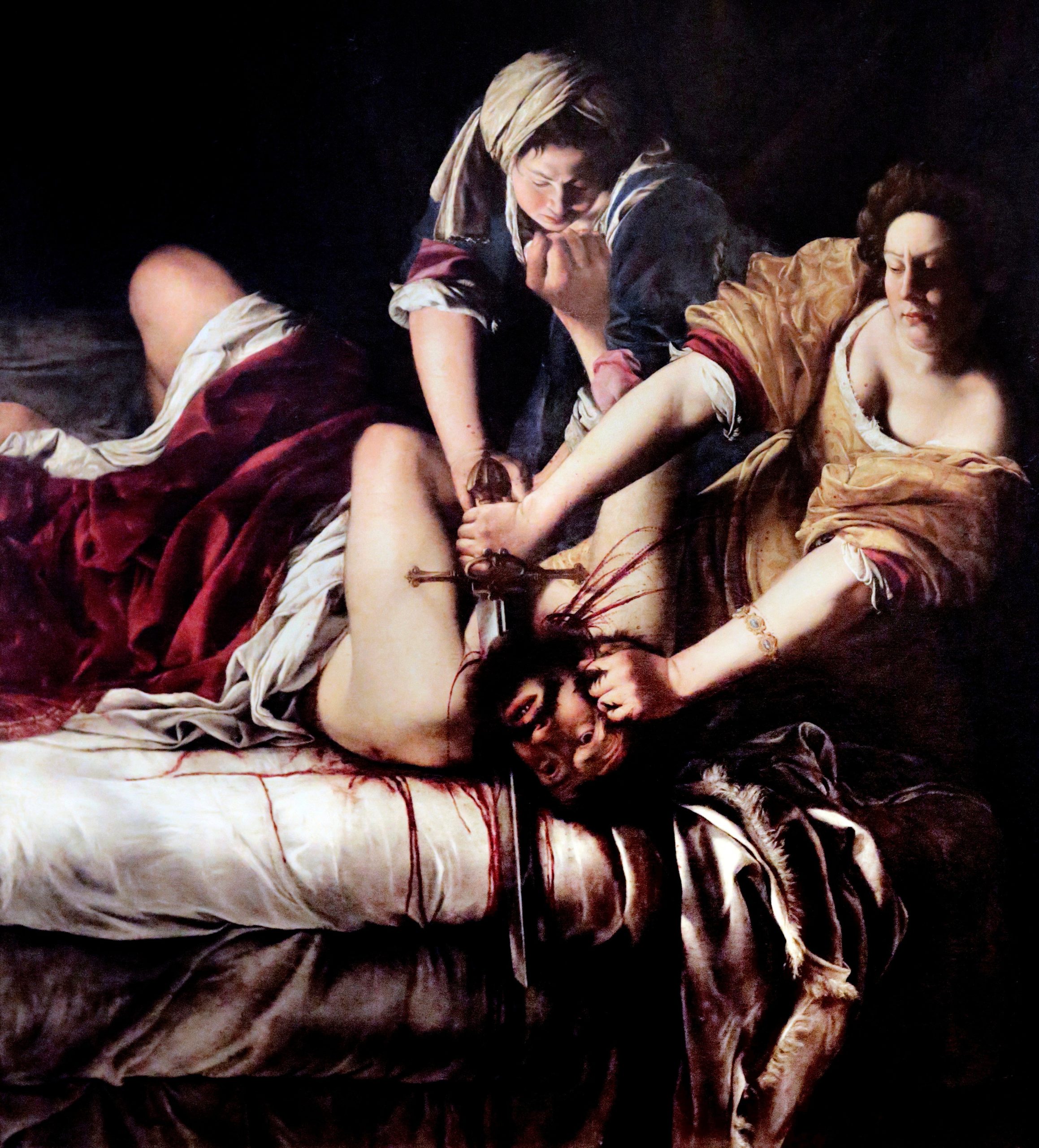
Gentileschi’s most famous works present the subject of Judith and Holofernes. These images, such as one painted in 1620-1621 CE, are powerful, violent scenes. Judith, according to the apocryphal – that is, unofficial or non-canonical – biblical Book of Judith, was a Jewish noblewoman who seduced and then beheaded an Assyrian general who was besieging the Israelites, thereby saving her people. The same subject had been painted by Michelangelo Merisi da Caravaggio (usually just called Caravaggio), who was the main influence on Gentileschi, but in comparison, his work is light and his Judith is delicate and distant from her grisly work.
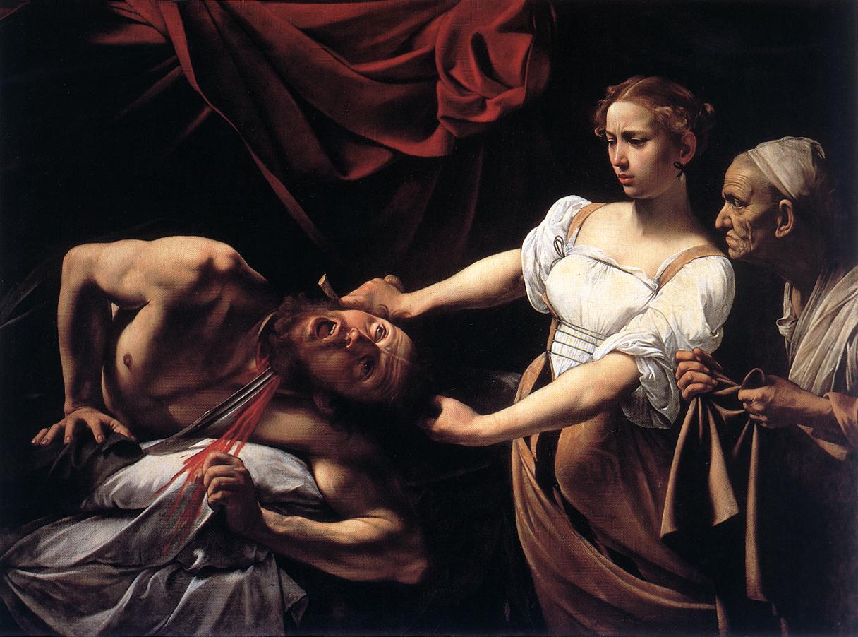
Caravaggio’s heroine looks confused by her actions. Gentileschi, on the other hand, has her heroine rolling up her sleeves and pressing hard both on Holofernes’ head and on the hilt of the sword with which she hacks it off. She shows no doubt or confusion. Blood spurts out of Holofernes’ neck in thick streams that seep into and run down the white bed sheets – a potent symbol, as will be clarified below – and spatter the hands and arms of Judith and her maidservant. Some drops of blood have even been flung as far up as Judith’s bodice and breasts. Judith’s expression is serious but not horrified – indeed, her lips, pursed together, almost seem to curve up, ever so slightly, into a smile.
The face should be familiar. Gentileschi has presented herself as Judith, here and in other paintings of the same subject. Why would she present herself in such a gruesome scene? While we can never be certain of the motives of artists in the distant past, we have striking evidence from Gentileschi’s life that seems highly relevant. When she was 19, her painting tutor (and a family friend), Agostino Tassi, sexually assaulted her – the blood on the sheets may imply the loss of virginity. Her father Orazio (also a painter) sued Tassi for his actions, and records of the seven-month-long trial survive, providing a grim look into seventeenth-century courtroom practice. In addition to having to bear Tassi’s denials and his accusations (which were so flagrant that Orazio also sued for perjury), Gentileschi was subjected to invasive gynecological exams and tortured with finger-bindings, since it was believed at the time that witnesses could only tell the truth under torture. In the end, Tassi was found guilty, and served a few months in prison.
In other works, Gentileschi presented herself as a martyr, and as Yael (a Jewish heroine who drove a tent spike through the head of Sisera, a Canaanite king who was at war with the Israelites). Gentileschi’s Sisera looks rather like her Holofernes, and both bear strong resemblance to descriptions that survive of Tassi. It seems that Gentlieschi, in multiple works, chose to depict herself achieving violent and bloody vengeance against Tassi for his crimes against her.
From Artist’s Subject to Artist
In 1971, The Metropolitan Museum of Art in New York City – the largest and most famous museum in the US – purchased a painting by the seventeenth-century Spanish painter Diego Rodríguez de Silva y Velázquez for the then-astounding sum of approximately $50 million (adjusted for inflation from 1971 to 2023). It has been one of the most iconic images in their massive collection ever since.
It had long been in a private collection in Europe, and had not been seen by most art historians. Tom Hoving, then the Director of The Met, described his first encounter with the work in a small, poorly-lit room at the auction house Christie’s:
The split-second impression was vivid. I thought I had seen a human being, alive and about to open his mouth to say something, coyly yet proudly gazing back at me I believed I had seen a film of sweat on his brow. The impression was shocking.[4]
The impression remains shocking more than half a century later. It has such vibrancy and presence, such immediacy. The figure is presented with such care and attention and individuality. Even elements of the sitter’s clothing are represented with lively and energetic brushstrokes.

And yet, for most of the fifty years since The Met acquired the painting, little attention was paid to who this man was. It has often be reproduced with the vague title of Portrait of a Man, those also with racializing titles like Portrait of a Moor – a term used by Europeans in from the late Middle Ages into the modern period used in unclear and ever-shifting ways to describe othered, exoticized groups in southern Europe (especially Spain), north Africa, and the Middle East, most especially dark-skinned Muslims.
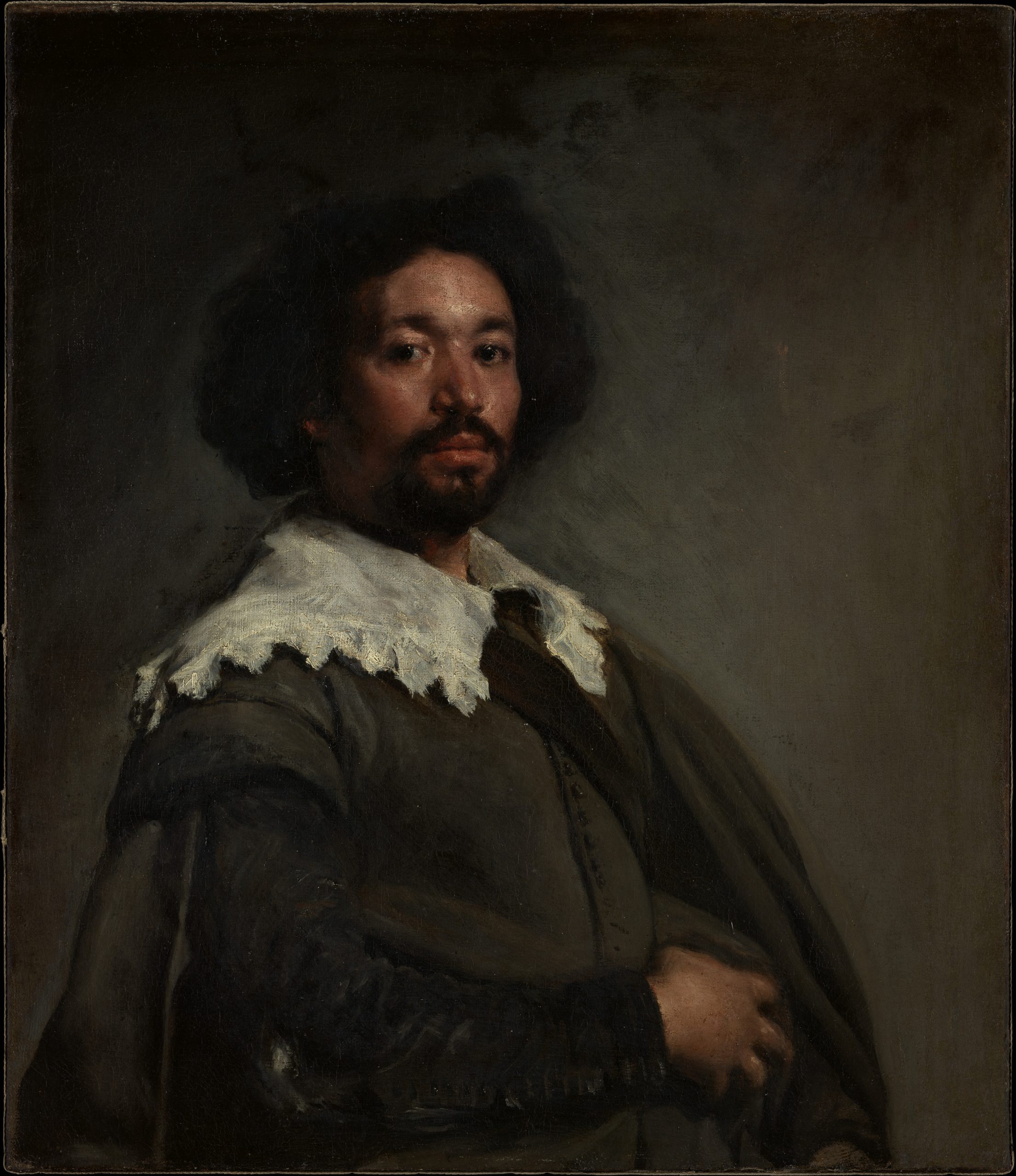
And yet, the name of the sitter – the subject of a portrait – has be known since it was painted. The man’s name was Juan de Pareja. He was from the town of Antequera in southern Spain and, though we don’t know the circumstances that led to this, he was enslaved to Velázquez.
Slavery was very common in seventeenth-century Spain, and in Velázquez’s home city of Seville, there were large populations of enslaved and formerly enslaved people of color, so this is in itself not remarkable, though slavery is a horror wherever, whenever, and in whatever form it exists.
Surprisingly, Pareja’s manumission document – “a binding contract, stating that this person will no longer be enslaved if they meet the following conditions”[5] – survives and was exhibited in front of the portrait at The Met as part of the first exhibition ever dedicated to him. The manumission came with a condition: Pareja had to continue his enslavement for four more years.
There is more of significance, here: even the earliest texts we have about Velázquez’s portrait, such as a biography of the artist written by his contemporary, Acislo Antonio Palomino de Castro y Velasco, note that Pareja was Velázquez’s “slave and a fine painter.”[6] Several of Pareja’s works survive, including his most famous, The Calling of Saint Matthew (1661), which is a massive canvas over ten and a half feet wide.
The image is relatively typical of seventieth-century Spanish religious paintings. We see Jesus to the right, followed by some of his earliest apostles (the first twelve followers he gathered, who became influential in spreading his messages). In this scene, he enters a tax collection office and tells one of them – Matthew, seated closes to Jesus, dressed in elaborate furs and gold jewelry. Matthew gestured toward himself with one hand and toward the riches he has collected with the other as if to ask, “How can you be calling me to this, when I am a tax collector?” This is a story that took place in the first century CE, but Pareja has located it in his own time and place. Only Jesus and the apostles are dressed in the clothing of ancient Rome. While some of the costumes are fanciful imaginings, others are quite ordinary outfits of prosperous Spanish men of the seventeenth century, especially the three figures at the left.
Perhaps you have already spotted that Pareja depicted himself at the left edge of the painting. He is immediately recognizable as the same man in the Velázquez portrait. His face, hair, and beard are all familiar, and he also appears in similar clothing and in a nearly identical pose. However, he has included one more detail to make sure that viewers not familiar with Velázquez’s already-famous image of him knew this was an image of the artist, himself. In his hand is a slip of paper that reads in Latin, “I made this painting.”[7]
This self-portrait is all the more remarkable because it is the only known self-portrait painted by an Afro-European artist of the era. Pareja made this painting after having been freed, and it might be seen as an assertion of his status as a free European. This was a necessary component of his acceptance as a professional painter. Here, he has placed himself not only in the context of wealth and status, but in direct proximity to the most important figure in the majority religion of seventeenth-century Spain: Jesus Christ.
Pareja’s gambit succeeded: he was a successful painter. However, he then spent centuries largely forgotten by art historians. He is only recently again receiving the acknowledgement that he clearly earned.
Rejecting Tradition
After these displays of artistic virtuosity by Leyster, Rembrandt, van Eyck and Gentileschi, it is worth a look at an artist who presents to us faces painted with deliberate simplicity, with willful rejection of such mannered skills. Jean Dubuffet was an iconoclast, striving to throw off conventions and happy to offend the general public. He described his approach as allowing himself “carte blanche,” that is, total freedom, “to paint in perfect liberty, and at top speed, without troubling to cast a critical gaze upon my work, and experimenting in all directions.” He collected the drawings of inmates of mental hospitals, and strove to make his work as raw and rough as possible.

Dubuffet changed styles many times over his career, so it is hard to identify a truly “typical” work, but Smiling Face (1948) captures many of his abiding concerns. The image is extremely rough and simple, childlike even. Dubuffet wanted to created art that would convey “the vision of an average and ordinary man without using techniques beyond the grasp of an ordinary man,” and in this he has probably succeeded.[8]
The lines are scratched heavily into the surface of the canvas, and look to have been produced rapidly, in colors are bold to the point of being lurid. The features are all abstracted, but this makes them sound more careful and formal than they are. They are the features of faces in children’s drawings, and deliberately so. How better to reject the artistic tradition?
And yet, how iconoclastic is this image? How wildly outside the artistic tradition? It is a bust portrait, in loosely naturalistic tones, at least for the skin of the figure, which is set against a dark, neutral background. It may be a grotesque parody of traditional works, but is also clearly their descendant. Wipe the smile from the face and smooth out the style, and how different would this be from a Rembrandt or van Eyck? Ironically, for all his efforts to be an “outsider” artist, Dubuffet has by now been thoroughly adopted into the art historical canon, appearing in textbooks (like this one) and collected by major museums throughout the world, where his paintings hang alongside the traditional artists he scorned.
SPOTLIGHT IMAGE II:
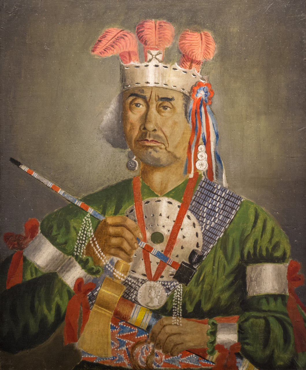
ZACHARIE VINCENT (1815-1896), SELF-PORTRAIT, 19th CENTURY
VIEWING QUESTIONS
- What portions of the portrait draw your eyes and why?
- What does the artist choose to include in the image? What does he exclude?
- How is this self-portrait similar to European self-portraits, like those by Leyster and Rembrandt?
- How is it different from European self-portraits?
- How much depth is in the image, and how does this effect our interaction with it?
- Who do you think this person is? Where do you assume he comes from and what might his role be?
INTRODUCTION: The “Last Huron”
Zacharie Vincent (1815-1896) was a member of the Wendat or Huron tribe, then living near Montreal, Canada. His Huron name was Telari-o-lin, meaning “unmixed.” Vincent presented himself as the last full-blooded Huron (though his father Ouenouadahronhé, who went by Gabriel, also claimed this title before him). In the late seventeenth century, the Huron had been chased from a region some 400 miles to the west by the Iroquois and, in their new home, came to be closely connected to European settlers. Many converted to Catholicism, and traded moccasins, snowshoes, canoes, and bags with settlers and with tourists, who came to their picturesque village in groups from Montreal. Their proximity and relative assimilation led to the Hurons becoming a favorite so-called “exotic” curiosity for European settler-colonizers. This eroticization has much in common with, and is ultimately based on, the sorts of Orientalist tropes discussed regarding Jean-Auguste Dominique Ingres’s odalisques in the Sex chapter, transferred to the Indigenous inhabitants of the Americas in part because the first Europeans to arrive on these continents mistook them for the “Orient,” for India. Many European artists painted portraits of members of the community. Vincent, though, chose to paint himself at least a dozen times, borrowing European painting styles but still choosing how he wanted to present himself.
VISUAL ELEMENTS: Borrowed Style
Vincent’s self-portrait is, in many ways, highly conventional. We see him likely seated, in a bust portrait – that is, from the midsection to the head. Rather than being posed either in full profile or fully frontally, the figure is slightly angled to his right, following European tradition. The backdrop is a neutral grey, which serves to focus our attention on the figure. Notice how Vincent, like Leyster, has lightened the area just around his head so that our eyes are drawn to it, and so that the darker shadows, particularly to his right, contrast more sharply against this background.
The composition, while balanced, is something of a jumble. There are so many items arranged across and in front of Vincent’s chest that some careful looking is needed to sort out what is attached to what. The white beads are attached to the pipe, and the small silver medal that covers them is hanging from the red cord around his neck. Similarly, the tassels from his headdress hang over three shining silver disks that are actually an earring. The limited amount of illusionistic space and the flattened nature of the painter’s style, especially in this part of the image, compresses these items into a nearly two-dimensional collage. It is not clear what is being emphasized or where our eyes should go. Do we look first at Vincent’s face? Probably, and the red “V” formed by the cord holding the medal does direct our eyes upward, if we instead start at the large, bright silver disk on his chest. There is movement, but it is not clearly ordered. Our eyes jump around the collection of items. This piling up of symbols of Huron culture might be seen as overplayed, but might instead be seen as Vincent’s attempt to capture as much of his dying culture as he could.
Ironically, though, the very choice of oil painting might be seen as undercutting this effort. The illusion of three-dimensionality, conveyed through light and shadow, is convincing, if imperfectly so. The left hand, in particular, flattens out, as does the too-narrow sleeve from which it emerges. The very medium used here, oil paint on canvas, is borrowed from the settlers in the region, many of whom dehumanized, exploited, and otherwise harmed Indigenous peoples.
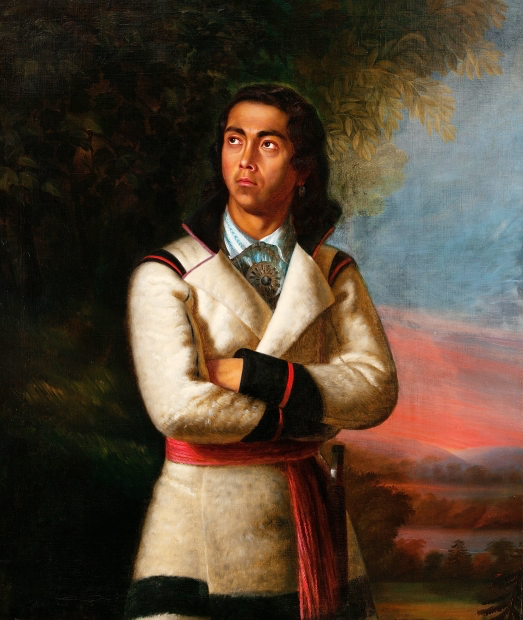
Vincent must have had some training in how to use oil paints, but would not have attended the sorts of art academies that trained aspiring Western painters. Perhaps his teacher was the painter Antoine Sébastien Palmondon, who was one of Canada’s most famous nineteenth-century portrait painters, and who lived in a neighboring town. Palmondon painted Vincent as a young man in a work titled The Last of the Hurons, which won a medal in 1838. The works are as striking for their differences as for their similarities. Both are oil paintings, both feature partial-length images of Vincent, and both have him gazing moodily off to his right. However, there the similarities end.
In both images, Vincent wears Huron clothes, though in Palmondon’s image they are far more subdued. As Palmondon presents him, Vincent looks like a dreamy poet, posed against the setting sun. The setting sun emphasizes the theme of the work, also conveyed by the title – this man is the last of his line, the end of a presumably ancient tribe of noble men. Vincent’s self-portrait plays with this same theme by emphasizing all of the attributes of his culture. In this self-portrait, as in many others, Vincent borrows Romantic tropes from European painters whose images of Native Americans focused on what Europeans saw as their “exotic” culture. Here, Vincent holds a tomahawk and pipe, wears an elaborate silver headdress crowned by three large plumes, and is draped in silver and wampum – shell beads used as decoration and as money. This is not merely incidental. Instead, Vincent has pilled on these stereotypical attributes of the Native American, as used by the Hurons, yes, but also as imagined by many Western writers and artists. Even his severe expression plays into assumptions about stoic tribesmen. Still, at the center of his chest, that smaller silver medal, which Vincent also wears in other self-portraits, is Western. It appears to be an image of a queen, likely a relic of British rule of Canada. Hanging proudly from his neck, it suggests a complex, hybrid identity at odds with his Huron name, Telari-o-lin (“unmixed”).
CULTURAL CONTEXT: The Last Huron
Vincent consciously adopted the title of the “last Huron.” His self-portraits, therefore, seem to be more than images of himself. What does it mean to be a representative of a group that is ceasing to exist as distinct? Perhaps this tension was what inspired Vincent to paint himself several times. We do not have records to indicate whether he was aware of other artists, like Rembrandt, who painted themselves numerous times over the course of decades. While, like Rembrandt’s self-portraits, Vincent’s allow us to watch him age, there is an additional dimension, here. Rembrandt’s approaching death was singular; as his body grew older, and his death nearer, he seems to have grown more reflective, to have dwelled more deeply on his mortality. As Vincent aged, though, his approaching death signified more than the loss of an individual life. As the self-declared “last-surviving full-blooded Huron” – indeed, as Telari-o-lin, that is, “Unmixed” – Vincent’s aging might be seen as standing in for the decline of his tribe, and his death as synonymous with the death of the tribe.
Of course, all of this talk of “pure blood” has as much to do with racist nineteenth-century European ideas about “racial purity” as it does with Huron beliefs about the purported value of “unmixed” bloodlines. This identity is, like Vincent’s choice of painting technique, and like the medal on his chest, a sign of his assimilation, despite his own efforts to resist the encroachment of European culture.

A photo taken by Louis-Prudent Vallee in the 1870s or 1880s gives us a curious view of the artist. He seems to sit in a photographer’s studio, with a blurry painted backdrop and a few sprigs of greenery scattered on the floor to suggest that the photograph was taken outdoors. Vincent’s pose and expression is quite similar to that in his self-portrait, but his clothing differs rather sharply with the clothing and accouterments he wears in his self-portrait, or in the very similar image he is painting (like Leyster) within the photograph.
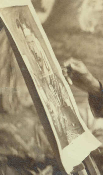
In his paintings, Vincent is richly and elaborately dressed in traditional Huron ceremonial fashion. In the photograph, he wears what looks perhaps to be an old army jacket, and both his jacket and pants are threadbare and quite literally coming apart at the seams. Perhaps Vincent wore such worn-out clothing only for painting, and perhaps not, but in either case, he presented himself not only in more “traditional” clothing but also in more formal and expensive clothing in his paintings, which are, of course, artificial images, constructed to present an image of Vincent and, through him, of the Huron he strove to embody.
The artist uses a traditionally Western medium (oil paint on canvas), style (naturalism) and subject (the bust-length portrait) to convey the nostalgic image of the “vanishing Indian.” In so doing, Vincent is appropriating – borrowing, repurposing, putting to his own ends – the tools of the very culture largely responsible for the decline of Native American civilizations, in order to convey that very loss. This is a complex and sophisticated move, signaled by the almost parodic profusion of Native attributes heaped over the figure in the painting. In Vallee’s photograph, we see a more or less standard “Painter at Work” image. Similarly, Vincent’s portraits seem to be classic “vanishing Indian” images. Still, such images are generally painted by Western artists, and are often condemned for their Romanticism. Vincent’s works, though, show the artist’s active engagement with this difficult moment in his personal and cultural history.
Comparisons and Connections II: Representing the Self without Representing Oneself
Borrowed Faces
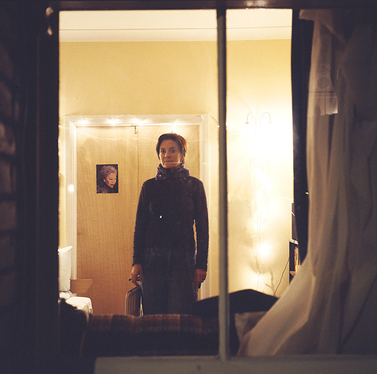
Most of the works of art discussed so far present the artist’s own face. Not all artists, though, want to be the main subject of their own work. Some prefer to try to capture something of the personality or character of other people. Many photographers, for example, photograph people around them, sometimes without even obtaining their subjects’ consent. Two photographers, though, Gillian Wearing and Shizuka Yokomizo, have played with the dynamic of collaboration with their subjects in interesting ways.
Yokomizo at first took photographs of people in their flats in London, using a telephoto lens. The subjects, like those of Yasmine Chatila, were unaware that they were becoming part of works of art. Yokomizo was understandably uncomfortable with the ethics of her actions, but also wanted more connection with her subjects, and wanted them to make eye contact with the camera. She therefore began writing anonymous letters stating her desire to take a photograph through a window, on a given date and time. The residents were able to ignore the letter or to draw their curtains, but several appeared at the appointed time, and met her gaze.
The photographs resulting from this curious form of anonymous collaboration, titled Dear Stranger, are striking (see here for images). In two examples, a woman and a young man stand in their own flats, spaces that are generally private, and stare out the window. They have chosen how to stand; his attitude is perhaps more defensive, with his chin raised and his shoulders not only squared to the plane of his window and the photographer but also seemingly rolled forward, and hers is more wary, with her body and head held at a slight angle, as if not quite comfortable with the process she has decided to join. The subjects’ of the photographs are choosing how they wish to present themselves to the photographer, lurking outside their windows in the dark.
In these photographs, the frames of the windows are clearly present. Yokomizo might have cropped the images more closely, hiding the frames, but instead chose to emphasize her position outside, and therefore her subjects’ positions within their own spaces.
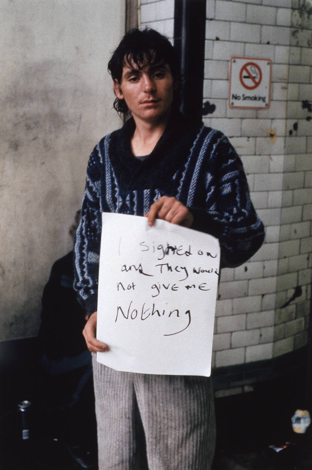
Gillian Wearing, also working in London, produced a series of photographs of people on the street that similarly pushes the boundaries of what it means to collaborate on a work of art. The series, taken in 1992-3, is collectively titled Signs that say what you want them to say and not Signs that say what someone else wants you to say (see here for images). She would approach strangers on the street, hand them paper and a marker, and ask them to write whatever they wished. She would then photograph them holding up their signs. As Wearing says”
In 1992, we were still being fed this line that British people are reserved and don’t like to express what they are feeling. The idea of Signs is that if you approached anyone they would have something interesting to say.[9]
She was clearly right, since many of the signs are revealing and some quite surprising. A somewhat disheveled man with a glazed expression, standing in what looks to be an Underground station, holds up a sign reading “I signed on and They Would not give me Nothing.” His appearance and location suggest that he may be homeless or otherwise down and out, and his attitude suggests that he is resentful. Who are “they”? Does he mean Wearing? This would make the work seem exploitive. Or does he mean a government agency, an aid organization, or someone else entirely?
A man with a facial tattoo of a snake and tattoos on each of his knuckles holds up a sign reading “I HAVE BEEN CERTIFIED AS MILDLY INSANE!” While his expression is somewhat ambiguous, he does seem more amused than hostile, and perhaps is relishing presenting himself as a fairly threatening character. Of course, it is possible his sign is a lie, chosen to make himself seem more dangerous.
Perhaps the most discordant pairing of image and sign – and therefore the most famous of these images – is one of a young blond man in a well-pressed business suit who looks like the very model of a confident junior executive, but holds up a sign on which he has written “I’M DESPERATE.” The power of this photograph comes not from Wearing’s technical skill, nor from careful posing of the model. It comes instead from the man’s choice to write this peculiar cry of desperation, at odds with his slight smirk. And yet he remains anonymous, and therefore uncredited. Wearing’s photographs look like snapshots. They are not lush, richly colored, and high in contrast, like those of Yokomizo, and yet, through Wearing’s interactions with her non-professional models, strangers chosen more or less at random, she has produced thought-provoking images that raise valuable questions about our assumptions about the people we pass on the streets, as well as about the process of producing art.
Self-Portraits without Portraits
Self-portraits are not the only ways that artists present aspects of themselves through their art. Indeed, some argue that all art is self-portraiture, in that it all bears evidence of its producer or producers. We may, as viewers, not always know how works of art reflect an artist’s life and personality, but we can be fairly confident that they do, as surely as artists’ signatures do.
Chinese calligraphy is an art form that bears the mark of the artist’s hand as surely as a signature, and traditionally has been considered an indication of the writer’s personality, morality, and education. Among the more emotional forms of script are caoshu, a simplified “cursive script” which came into use for informal, practical writing, since it is much quicker to write than other more formal scripts. The wildest forms of these scripts are known as kuang caoshu – “crazy cursive scripts” – popular among eccentrics, individualists, and even, purportedly, drunkard calligraphers. These “crazy” scripts, like that of Ming Dynasty calligrapher Xu Wei (sixteenth century), are valued precisely for their individuality, vitality, and illegibility.
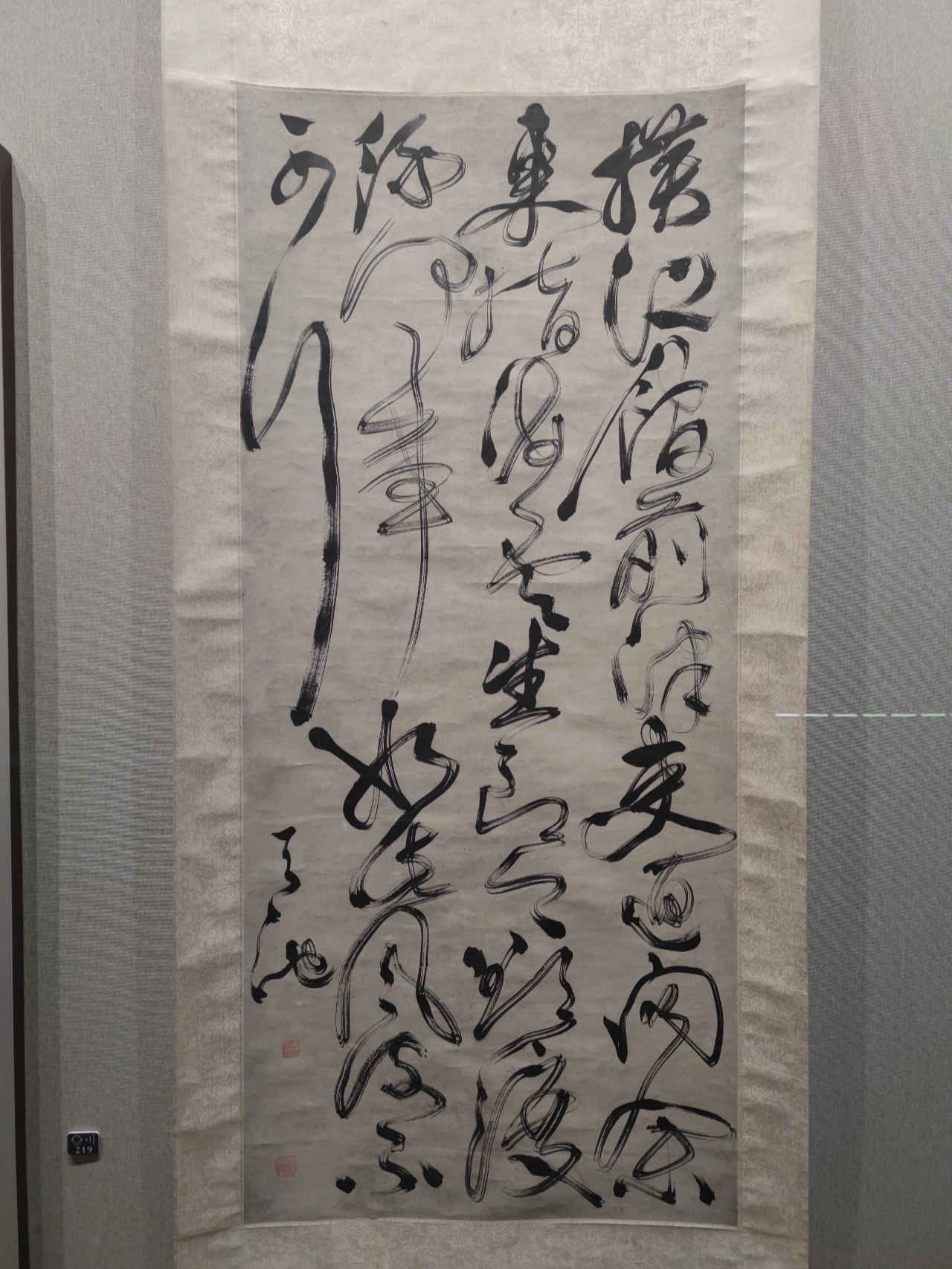
In a typical example, we see that the characters are painted with great energy, in rapid strokes. Xu Wei often allowed his brush to run dry as the ink was used up, rather than carefully redipping it to produce a consistent tone to the writing. Characters are reduced to curves and squiggles, since the calligrapher does not raise his brush carefully between each stroke, and whole characters are also connected together in Xu Wei’s rush to write with great speed and expression, most particularly in the leftmost column of this image. The goal was not to create an easily readable copy of this poem, but rather, to convey the individuality and emotion of the calligrapher. In this sense, Xu Wei’s act of production is as surely the subject of his scroll as Leyden’s is of her painting.
The kuang caoshu of the Ming Dynasty has much in common with modern Action Painting, a style of abstract art most often associated with Jackson Pollock. He would place large canvases on the floor of his studio and, with a variety of implements including brushes and sticks, would drip paint onto them. As he worked, ashes from and, at times, the butts of his cigarettes would fall into the paintings. Particularly in his larger works, his shoes would leave marks from where he stepped on the edges of the canvases. Occasionally, he would lean down, resting his hand in the wet paint to reach further forward, leaving a mark as direct as possible, as immediate a record of his presence as could be. His creation of art, his motion, his body might well be seen as the subject of these drip paintings. To fully appreciate this process, it is helpful to see Pollock in action.
In these documentaries, the artist not only describes his process, but also asserts that he is “in the painting” and that he wants to “express [his] feelings rather than illustrate them.” While the results may look haphazard and spontaneous, Pollock claims, “I can control the flow of the paint. There is no accident.” A second video shows in greater clarity Pollock’s process. Much like Xu Wei’s calligraphy, every seemingly accidental and incidental line is a reflection of the artist’s process of creation, and therefore is not incidental to the work of art. Rather, it is the work of art.
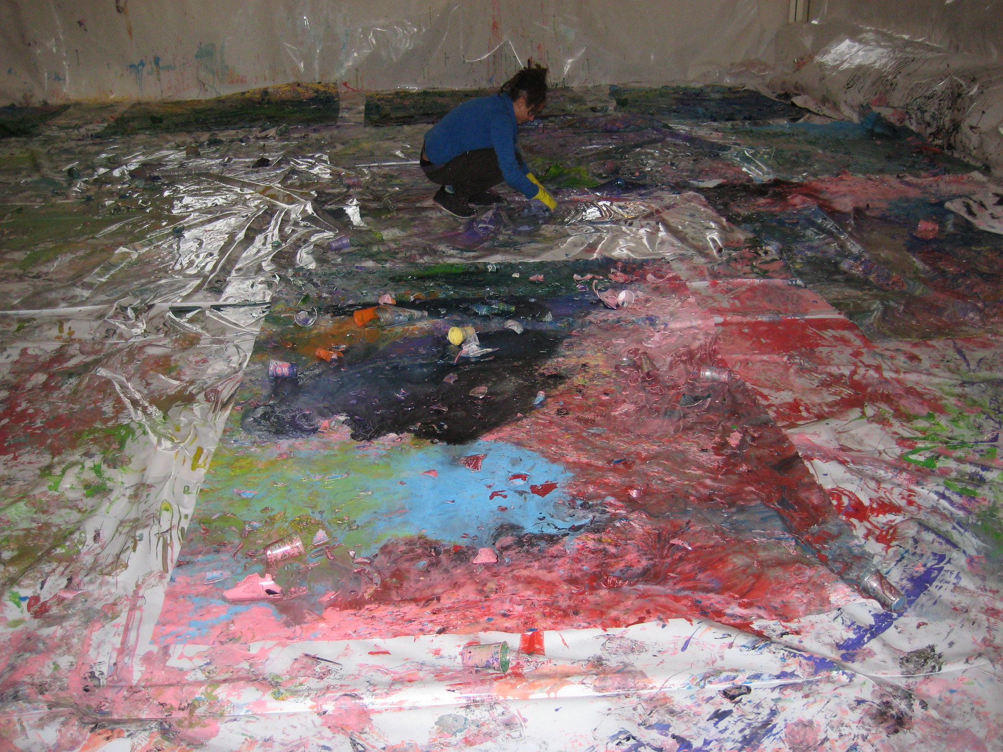
Shozo Shimamoto pursued a form of Action Painting yet more vigorous than Pollock. He was a member of the pioneering Japanese avant-garde Gutai (“Concrete”) Group, which argued that paintings should not represent nature or convey symbolism, but rather, should exist as what they are: paint on canvas, resulting from direct, even violent actions of the artist. Shimamoto experimented with slashing his paintings, but ultimately settled on a process in which he produces paintings by smashing bottles filled with paint above or onto his canvases.

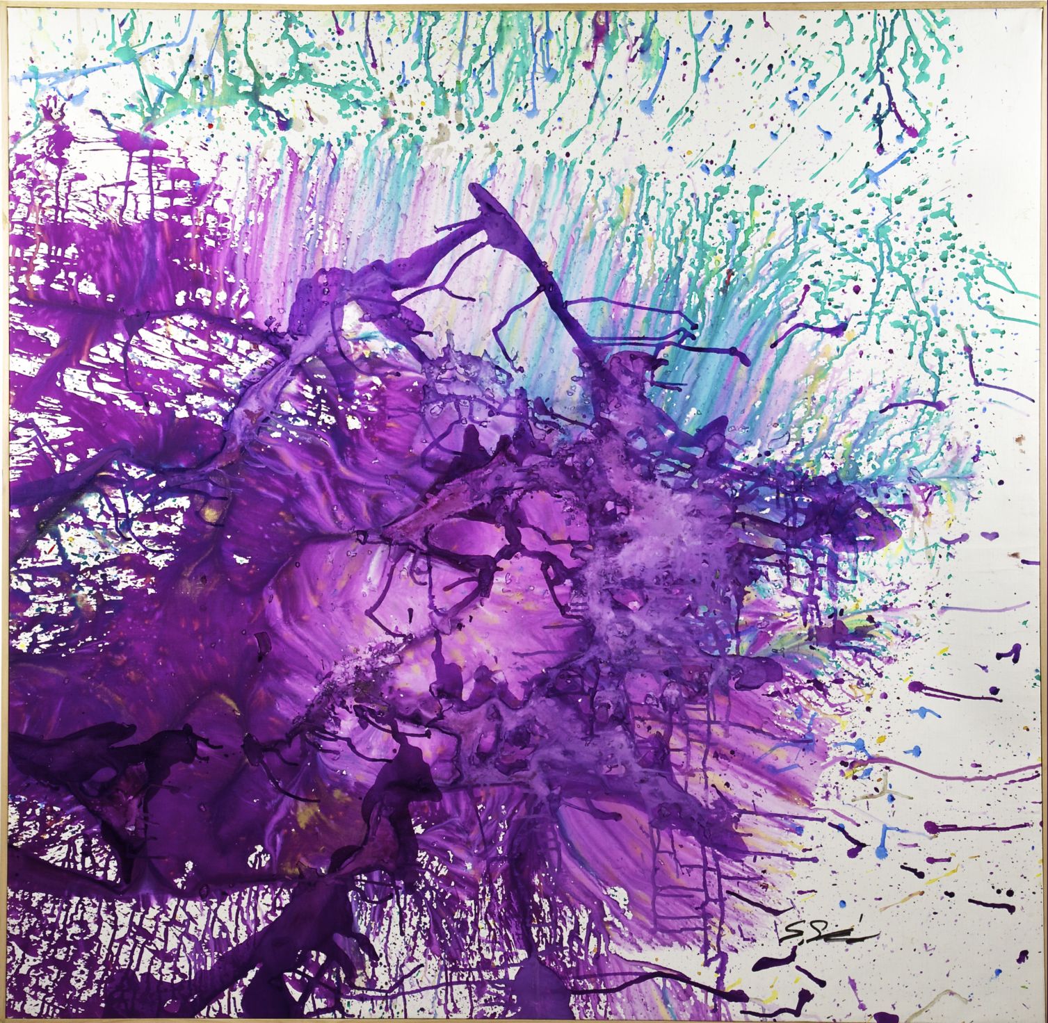
Shimamoto’s resulting paintings are far less controlled than Pollock claims his to have been, but are just as much a result of his direct, physical actions. Perhaps to stress the performative element of his art production, Shimamoto has had many of his acts of painting photographed and filmed, beginning with Hurling Colors, performed at the Second Gutai Exhibition in Tokyo (1956) and continuing through a performance in 2008 at the Ducal Palace in Genoa, Italy.
The painting he produced in his 1956 performance has been lost, but other early works survive. The paintings are often as clear a record of the action of their production as the photographs and videos of the artist at work are, with the explosions of color radiating out from where bottles seem to have hit, and then dripping down the surface of the work.
Bits of glass are embedded in the paint, also marking the process of the work’s production. Shimamoto has continued to produce works in related styles for half a century, at times becoming more extreme. He has had himself suspended from a crane to drop bottles of paint, and has also thrown them down from a helicopter. Still, it is his more direct works, where he hurls the bottles with great force, that most clearly bear the imprint of his act as the artist.
How far can we push the notion that any work conveys something of the self of the artist? Leyster and Rembrandt make this the subject of their works. Xu Wei, Pollock, and Shimamoto capture their presence and motion with every curve and splatter. Might we press further, all the way to Piet Mondrian? While a painter of total abstraction, like Pollock, Mondrian’s work seems comparatively mechanical. There are few apparent brushstrokes, little imprint of the artist’s emotion or the motions of his body. Still, in their cool austerity, surely Mondrian’s purely geometric canvases reveal important elements of his character and philosophy. They are not works embodying emotional turmoil, but this is not the only quality of the artist’s self a work can represent. The paintings do not even seem, at first look, to be works of artistic passion at all, but in their own way, they are as forceful a statement of the artist’s convictions as any in this chapter.
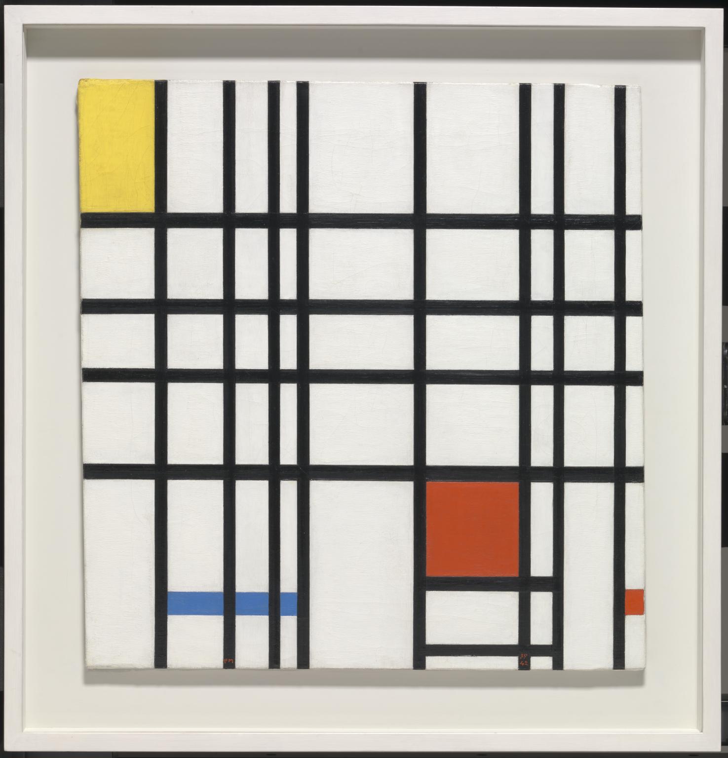
Composition with Yellow, Blue and Red, from 1937–42, is typical of Mondrian’s work. It is composed of purely geometric shapes, and these are exclusively formed out of vertical and horizontal lines in black, and filled in with white and the three subtractive primary colors (red, blue and yellow). The painting is asymmetrical, but loosely balanced, with the yellow rectangle at the upper left balanced by the red rectangles at the lower right, and so on. Mondrian’s formal elements are spartan, stripped-down to the artistic bare bones. Where, in this work, might we find the artist?
In 1918, Mondrian and a group of his artistic colleagues formed a new art magazine, De Stijl (Dutch for The Style). They inaugurated the magazine by publishing a manifesto – a mission statement – that describes a grand vision for a new art that would help usher in “a new consciousness of the age,” rejecting “tradition, dogmas and the predominance of the individual” in favor of “an international unity in life, art, and culture.”[10] It is hard to imagine loftier goals than the transformation of the life, art and culture of the entire world! One of the main tools by which Mondrian and his collaborators strove toward this was the explicit condemnation of just the sorts of images covered in this chapter.
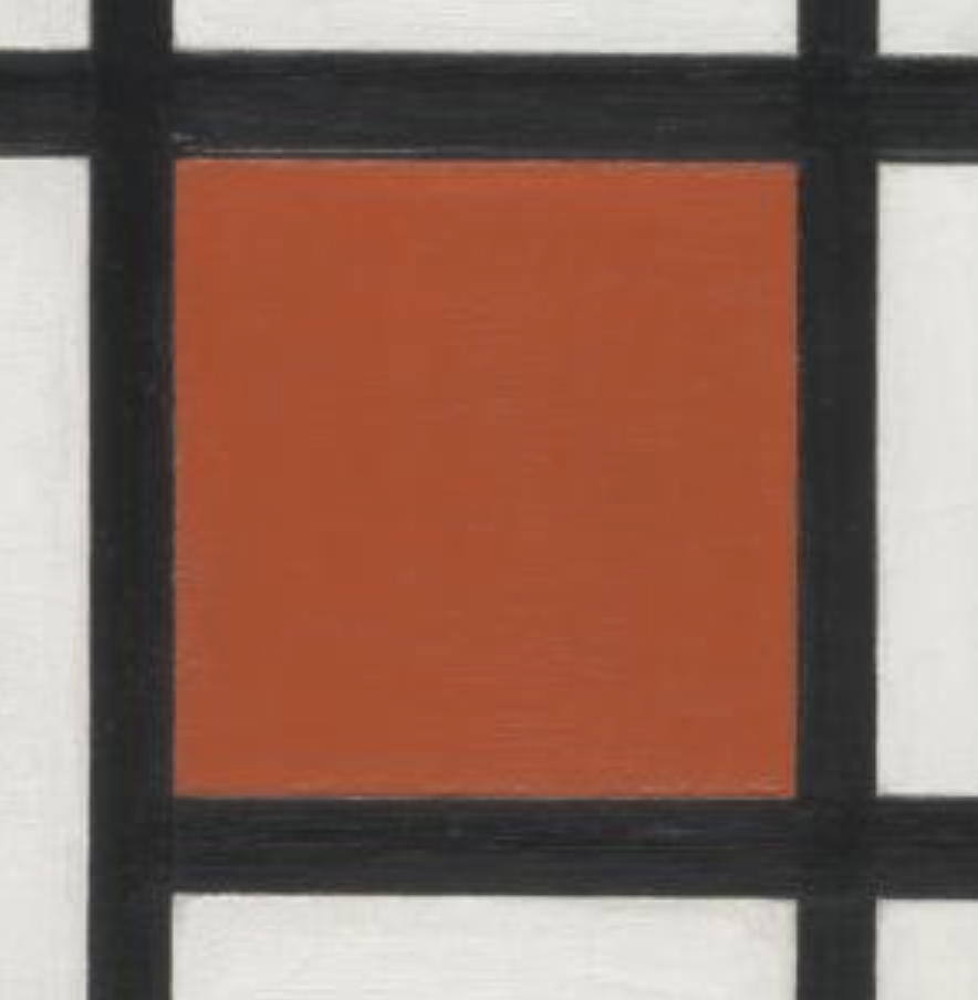
De Stijl’s manifesto argues that the “old consciousness … is directed toward the individual.”[11] Mondrian’s decision to reject the practices of the past was, in part, a denial of his individuality, and his art was an attempt to stamp out just those personal touches that make the works of art discussed above so engaging. And yet, tiny traces of Mondrian keep breaking through. We have to get right up to the surface of the image to see them, but there they are – brushstrokes, variations in the thicknesses of the black lines, small splatters and drips. As prominent art historian and critic James Elkins (who provides excellent several close-up images) writes:
You don’t see any of this from two or three feet away, and it’s clear Mondrian expected his viewers to stand back so they wouldn’t see things like the sloppy way he truncated the ends of his stripes. But you are aware of a richness, a shimmering effect, a depth. The paintings are three-dimensional. The paint has visible gestures, it is human, it moves. In the language of art history, it is painterly. It belongs to the tradition of Titian and Rembrandt …, and not just to the asceticism and idealism of the early twentieth century.[12]
It is very easy to generate fake Mondrians with digital painting programs that would eliminate the manual element, and therefore the traces of the artist’s body, but real Mondrians were made by hand – by Mondrian’s hand, to be precise – and so they not only bear witness to his passionately held intellectual convictions, as described in the De Stijl manifesto, but also to his actual, physical presence and process of artistic creation.
CONCLUSION
Many of the works of art in this chapter – in contrast with those in the Communities chapter – present individuals. We see their faces or traces in just about every mark on just about every work in this book. Through their choices of styles, compositions, subjects, and approaches, these artists work to convey something vital about themselves and their sense of self, or about their engagement with others. Some embrace this as a goal, others resist it, but all, one way or another, grapple with the complexity of representing not merely the surface appearance of people, but of representing something more fundamental about them.
SPOTLIGHT IMAGE III:
HAKUIN EKAKU, DARUMA, 18TH CENTURY, HANGING SCROLL; INK ON PAPER, 61 3/8 x 17 3/4 in, Dallas Museum of Art
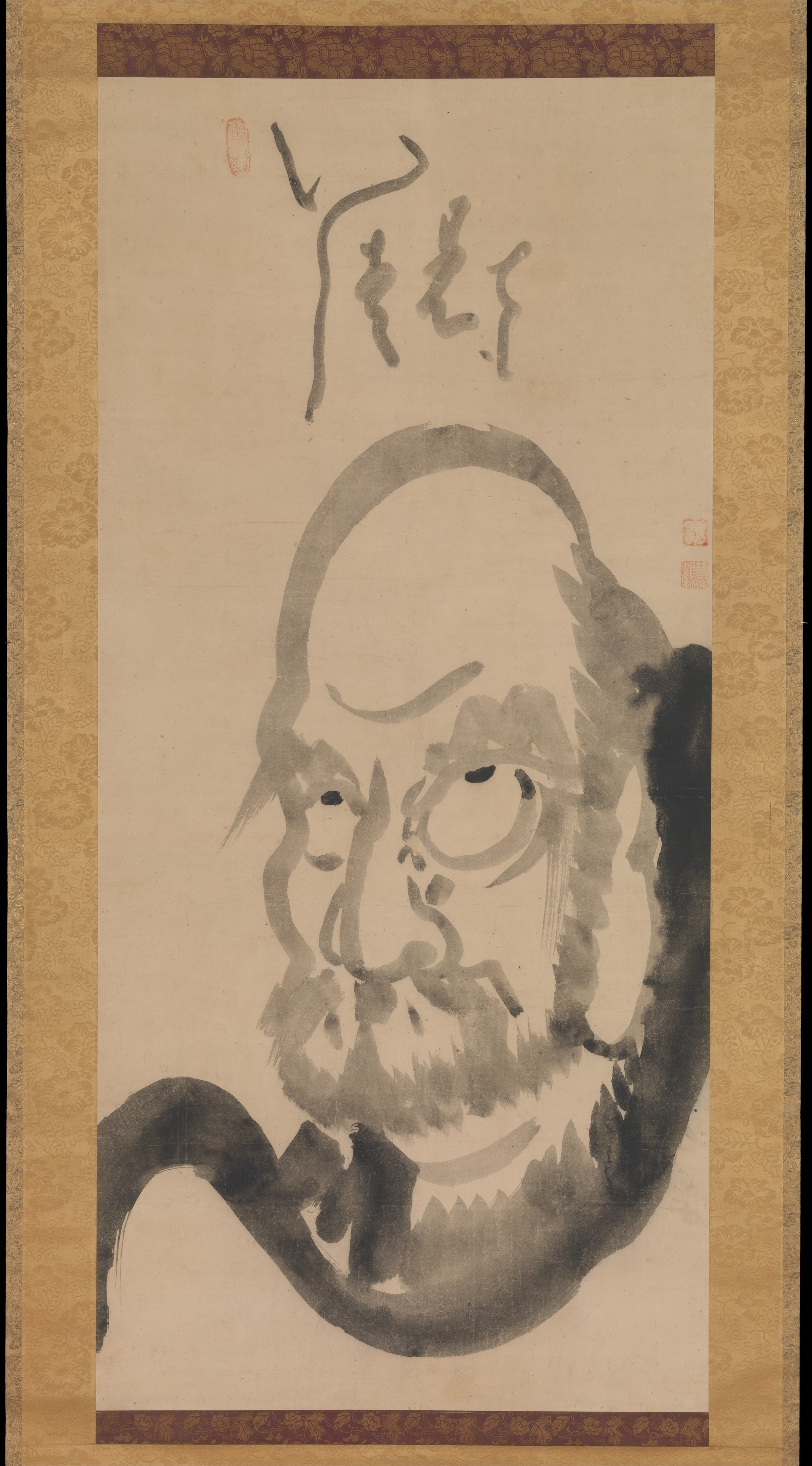
VIEWING QUESTIONS
- What features are emphasized?
- What does Ekaku include? What does he leave out?
- How does Ekaku use line to convey not only the appearance of the Zen Buddhist master Daruma, but also his personality?
- How do the Japanese characters above the figure relate to it visually?
- How does the variation in value of the ink guide your eyes?
- What sort of a person do you think Ekaku wants you to think Daruma was?
Media Attributions
- Pebble from Makapansgat cave in the Makapan Valley, South Africa, buried 3 million years ago. PhotoL: WikipSQ, CC BY-SA 4.0.
- Judith Leyster, Self-Portrait, oil on canvas, ca. 1630 (National Gallery of Art, Washington D.C.). Photo by Gandalf’s Gallery, CC BY-NC-SA 2.0.
- Judith Leyster, The Jolly Drinker, oil on canvas, 1629 (Rijksmuseum, Amsterdam). Photo by Roel Wijnants, CC BY-NC 2.0.
- Detail of artist’s signature, Judith Leyster, The Jolly Drinker, oil on canvas, 1629 (Rijksmuseum, Amsterdam). Photo by Roel Wijnants, CC BY-NC 2.0.
- Judith Leyster, Merry Trio, oil on canvas, 1629. Photo: Public Domain.
- Detail of sleeve, Judith Leyster, Self-Portrait, oil on canvas, ca. 1630.
- Rembrandt van Rijn, Self-Portrait, oil on canvas, ca. 1628 (Rijksmuseum, Amsterdam). Photo by Stuart Rankin, CC BY-NC 2.0.
- Rembrandt van Rijn, Self-Portrait at the Age of Thirty-Four, oil on canvas, 1640 (The National Gallery, London). Photo by Frans Vandewalle, CC BY-NC 2.0.
- Rembrandt van Rijn, Self-Portrait at the Age of Sixty-Three, oil on canvas, 1669 (The National Gallery, London). Photo by Frans Vandewalle, CC BY-NC 2.0.
- Jan van Eyck, The Man in the Red Turban (Self-Portrait?), oil on oak panel, 1433 (The National Gallery, London). Photo: The National Gallery, London, CC BY-NC-ND 4.0
- Detail, Jan van Eyck, The Man in the Red Turban (Self-Portrait?), oil on oak panel, 1433.
- Jan van Eyck, Portrait of Giovanni Arnolfini and his Wife, oil on oak panel, 1434 (The National Gallery, London). Photo: Public Domain.
- Jan van Eyck, Portrait of Giovanni Arnolfini and his Wife (Detail of Mirror), oil on oak panel, 1434 (The National Gallery, London). Photo by cea +, CC BY 2.0.
- Artemisia Gentileschi, Self-Portrait as the Allegory of Painting, oil on canvas, ca. 1638-1639 (Royal Collection Trust, London). Photo by David Short, CC BY 2.0.
- Artemisia Gentileschi, Judith Slaying Holofernes, oil on canvas, ca. 1612-13 (Museo e Real Bosco di Capodimonte, Naples). Photo by Jean Louis Mazieres, CC BY-NC-SA 2.0.
- Caravaggio, Judith and Holofernes, oil on canvas, 1598-1602 (Barberini Gallerie Corsini Nazionali, Rome). Photo: Public Domain.
- Velázquez (Diego Rodríguez de Silva y Velázquez), Portrait of Juan de Pareja, oil on canvas, Spanish, 1650. (The Metropolitan Museum of Art, purchase: Fletcher and Rogers Funds, and Bequest of Miss Adelaide Milton de Groot, by exchange, supplemented by gifts from friends of the Museum, 1971.). Photo: The Metropolitan Museum of Art, Public Domain.
- Velázquez (Diego Rodríguez de Silva y Velázquez), Portrait of Juan de Pareja (detail), oil on canvas, Spanish, 1650. (The Metropolitan Museum of Art, purchase: Fletcher and Rogers Funds, and Bequest of Miss Adelaide Milton de Groot, by exchange, supplemented by gifts from friends of the Museum, 1971.). Photo: Asa Mittman.
- Juan de Pareja, The Calling of Saint Matthew, 1661, oil on canvas (Museo del Prado). Photo: Museo del Prado, publicaciones sin fines de lucro, sitios web personales, blogs y medios sociales
- Juan de Pareja, The Calling of Saint Matthew, 1661 (detail). Photo: Museo del Prado, publicaciones sin fines de lucro, sitios web personales, blogs y medios sociales
- Jean Dubuffet, Smile, lithograph, 1962 (Museum of Modern Art, New York). Photo by Helena, CC BY 2.0.
- Zacharie Vincent, Self-Portrait, oil on canvas (Musée de la Civilisation, Quebec City). Photo by Wilfredor, CC BY-SA 4.0.
- Antoine Plamondon, Portrait of Zacharie Vincent, Last of the Hurons, oil on canvas, 1838. Photo: Public Domain.
- Louis-Prudent Vallée, Portrait of Zacharie Vincent, ca. 1875. Photo: Public Domain.
- Louis-Prudent Vallée, Portrait of Zacharie Vincent, ca. 1875 (detail). Photo: Public Domain.
- Xu Wei, Calligraphy scroll, 16th century CE. Photo: 陳寅恪, CC BY-SA 4.0
- Shozo Shimamoto, Artworks 1920-2000, East and West, 2011-12 (Palazzo Magnani, Reggia Emilia). Photo by Il Fatto Quotidiano, CC BY-NC-SA 2.0.
- Shozo Shimamoto, Artworks 1920-2000, East and West (Final Product), 2011-12 (Palazzo Magnani, Reggia Emilia). Photo by Il Fatto Quotidiano, CC BY-NC-SA 2.0.
- Shozo Shimamoto in Genoa, the day after. Photo: Marco Molinari, CC BY-NC-ND 2.0
- Piet Mondrian, Composition with Yellow, Blue and Red, 1937–42 (The Tate Modern). Photo: Tate Modern, CC-BY-NC-ND (3.0 Unported)
- Piet Mondrian, Composition with Yellow, Blue and Red, 1937–42 (detai).
- Hakuin Ekaku, Portrait of Bodhidharma, hanging scroll, ink on paper, mid-eighteenth century (Metropolitan Museum of Art, New York). Photo: Public Domain.Portrait of Daruma, Japan, Edo period (1615–1868) Hanging scroll; ink on paper; Image: 45 7/8 x 21 1/4 in. (116.5 x 54 cm) The Metropolitan Museum of Art, New York, Gift of Florence and Herbert Irving, 2015 (2015.500.9.3) http://www.metmuseum.org/Collections/search-the-collections/78145
- David Bomford, Art in the Making: Rembrandt (Washington, D.C.: National Gallery, 2006), 17. ↵
- Seymour Slive, "Art Historians and Art Critics-II: Huygens on Rembrandt," The Burlington Magazine 94:594 (September, 1952): 260-264, 263, online at https://www.jstor.org/stable/870922. ↵
- "Artemisia Gentileschi, Self-portrait as the Allegory of Painting (La Pittura), 1638-1639," Google Arts and Culture: https://artsandculture.google.com/asset/fAHok0QVLkyJXQ ↵
- Thomas Hoving, Making the Mummies Dance: Inside the Metropolitan Museum of Art (New York: Simon and Schuster, 1993), 256. ↵
- Audio Guide 636: Manumission Document, 1650, "Juan de Pareja, Afro-Hispanic Painter," The Metropolitan Museum of Art (2023): https://www.metmuseum.org/exhibitions/juan-de-pareja ↵
- Daviud Pullins, "Reframing the Age of Velázquez, in Juan de Pareja, Afro-Hispanic Painter in the Age of Velázquez, ed. Elisa Urbanelli (New York: The Metropolitan Museum of Art, 2023): 60-109, 88. Emphasis added ↵
- Audio Guide 638: Calling of Saint Matthew, Juan de Pareja, 1661, "Juan de Pareja, Afro-Hispanic Painter," The Metropolitan Museum of Art (2023): https://www.metmuseum.org/exhibitions/juan-de-pareja ↵
- Roger Cardinal, “Dubuffet, Jean,” Grove Art Online, Oxford Art Online: http://www.oxfordartonline.com/subscriber/article/grove/art/T023832. ↵
- Tim Adams, "Gillian Wearing: 'I've always been a bit of a listener,'" The Guardian (March 3, 2012): https://www.theguardian.com/artanddesign/2012/mar/04/gillian-wearing-whitechapel-gallery-feature ↵
- “‘De Stijl’: Manifesto I,” De Stijl, vol. II:1 (November 1918), 4. ↵
- “‘De Stijl’: Manifesto I,” De Stijl, vol. II:1 (November 1918), 4. ↵
- James Elkins, "How to Look at Mondrian," HuffPost (October 14, 1010; updated December 6, 2017): https://www.huffpost.com/entry/post_b_756669 ↵
art comprised of pre-existing, often ordinary or manufactured objects
images of known individuals, often drawn from life (that is, with the person posing for the portrait)
Images of objects, generally without human or animal figures
scenes from everyday life, usually with a focus on the lives of the lower or working classes
showing the front of a figure or object as fully facing the picture plane
showing brushstrokes
The middle class, especially the prosperous and materialistic middle class
an image of a person depicting the head, shoulders, and upper chest only
oil paints with little pigment in them
the subject of a portrait
In art, using of existing images by another artist or from another context within a new work of art, often in order to comment on the artist or culture of the original work
Colors from which all other colors can be made
a mission statement
