5 Power
How do artists work for and against power?
We all know that a painting of a flower is an artistic representation of nature, and that a depiction of the deity Shiva is a representation of religion. How, though, is power depicted in art, and, conversely, can an image represent a challenge to power? The focus of this chapter is the interpretation of images involving power and will feature works of art used by kings and emperors to establish, declare and maintain their power, as well as works created to protest such power – works used to fight against oppression and injustice. Because works of art that endure over time are necessarily made of expensive materials and require specialized skill, and because most works of art in the pre-modern world were created on commission (requiring wealthy patrons), most of the surviving art is that of the powerful, often flaunting their power in marble or gold. It is rare to find works of art that make strong protests against the powerful until relatively recent periods since the materials that are used would be of a less-enduring nature.
The first half of the chapter will examine art produced for the powerful. The second half of the chapter will look at art protesting power structures and hierarchies. While some of the works declaring the power of their patrons will be in the materials we might expect, like stone and bronze, others will be produced cheaply, in order to be more widely distributed. Some of the same visual elements used to convey power will be subverted to struggle against it. Many of these works were, at the time of their creation, controversial, and some remain so. The chapter considers works from the earliest historical period to the present, and from modern day Iran, Egypt, France, China, Korea, Nigeria, Cuba, Spain, Czechoslovakia, and the United States. These works of art all evoke strong emotional responses – positive and negative – and this demonstrates their own power, as well as those they represent and challenge.
SPOTLIGHT IMAGE I:
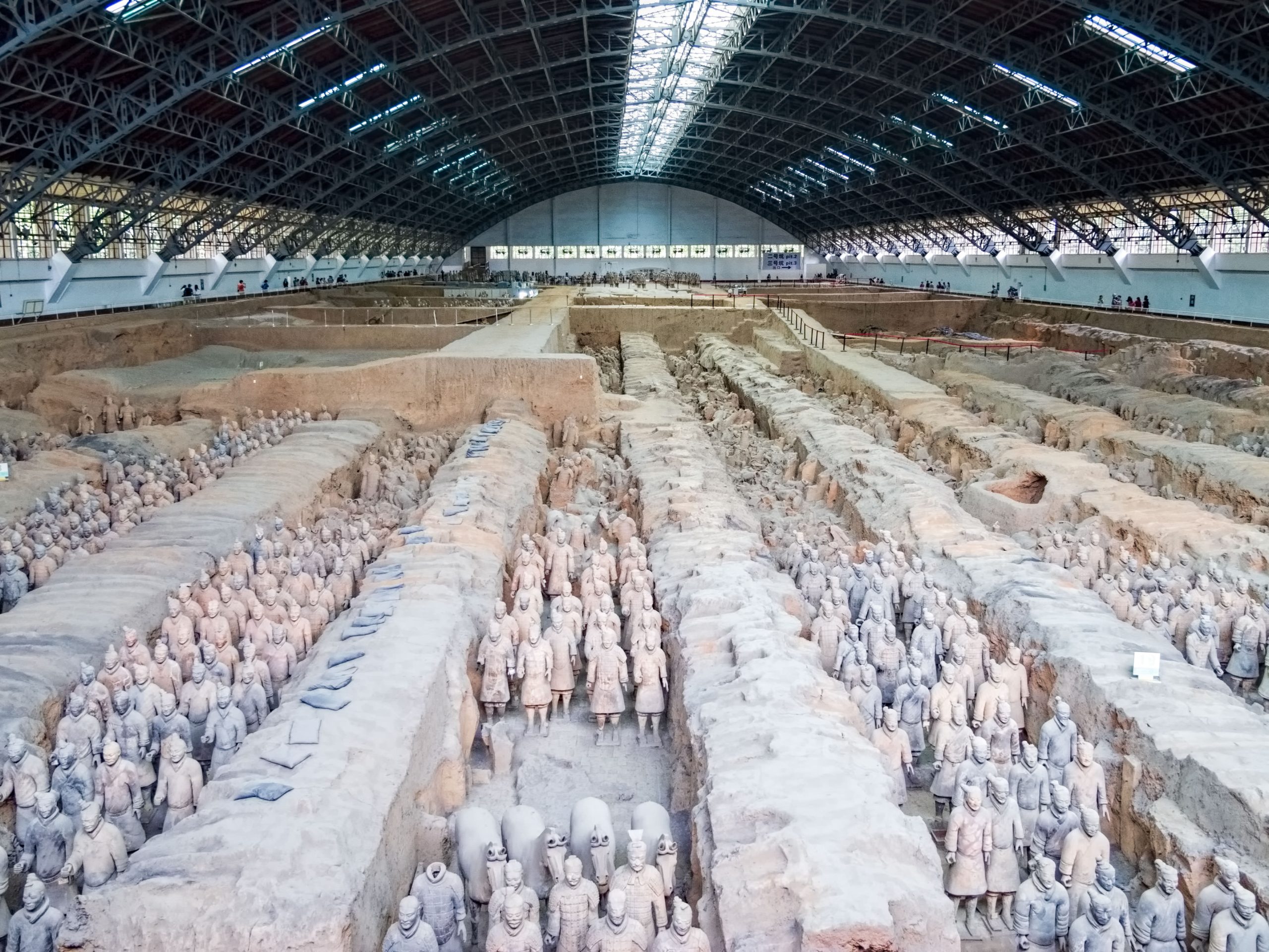
The Terracotta Army of Emperor Qin Shi Huangdi, Lintong, China, 246-208 BCE
VIEWING QUESTIONS
- How does scale work in the terracotta army?
- What are the dominant principles of composition?
- How does the use of naturalism affect the work?
- Look at the details of hairstyles, shoes, belt buckles and faces. How does the individualization of the soldiers affect your response to the work?
INTRODUCTION: The First Emperor China
Qin Shi Huangdi was the first emperor of China. In 247 BCE, he became king of the Qin (pronounced “Chin”) state at the age of thirteen, during a period of great conflict. Eventually he defeated the rulers of all the competing Chinese states, unifying China in 221 BCE and declaring himself Qin Shi Huangdi (“First Emperor of the Qin Dynasty”). As emperor, he was repressive, banning and burning Confucian books and executing the scholars who wrote and studied them. Not surprisingly, he was not universally adored – there were at least two attempts to assassinate him. He began the construction of his vast tomb as soon as he took the throne as king, and it took 38 years to finish, even with a reported 700,000 convicts laboring for the last 13 years of the construction. These great numbers are, themselves, displays of the tremendous power of the emperor, and the work clearly bears the imprint of their astounding labors.
VISUAL ELEMENTS: An Army Under the Ground
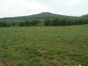
From the outside, Qin Shi Huangdi’s burial mound looks like a hill. When the tomb was complete, it was covered in grass and trees, so that it would appear like a natural part of the landscape. This explains how the huge tomb remained hidden until rural villagers digging a well in 1974 accidentally discovered it. It blended into its surroundings, looking like a foothill of the Li Mountains.

As the plan of the tomb complex shows, the tomb was part of a large burial site. The tomb itself was surrounded by a large number of other burials, including the three pits containing the terracotta warriors, but also a pit filled with the remains of exotic animals, and the graves of followers executed at the time of the burial.
So far, approximately 7,000 terracotta figures and 100 wooden chariots have been discovered in Pits 1, 2 and 3. When we look at the vast rows of the 6,000 soldiers of the army in Pit 1, the largest yet found, we get a view that was not available from the time that the tombs were sealed until the excavations of the 1970s. The figures were set into paved channels of earth, reinforced with wooden planks and then buried. They represent a very carefully planned program that would have been on view during the decades of construction of the burial, though afterward they were lost to view. This raises questions about audience: While reports of the soldiers were published once the tomb was sealed, they were likely not solely designed to impress the living.
As a whole, the layout and design of the army emphasizes pattern and repetition. The soldiers are all of very similar size – slightly larger than life-size – and are standing in repeated poses. They are arranged in consistent rows, which establishes a very regular pattern. It also creates a sense of unity, which is an ideal generally sought by real armies. These soldiers are clearly, through their unified appearances, collectively working to express, enforce, and protect the power of the emperor, even as he lies in his grave. There is, though, variety throughout the army, enlivening the whole with small, humanizing differences in features and costume.
The soldiers are arranged in battle formation, with a vanguard of archers surrounding the bulk of the army. The hands of the archers are now empty, but they originally held wooden bows, of which some traces survive. These wooden bows, along with bronze weapons held by other soldiers, would have given the soldiers a more naturalistic appearance.
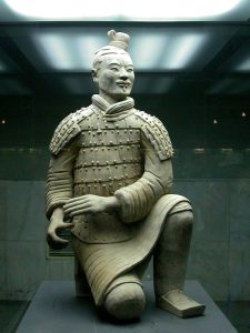
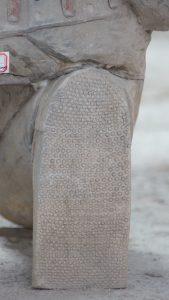
The scale of the project is hard to comprehend. This is not a token set of guards around the imperial tomb, but a complete army, from foot soldiers and cavalrymen to generals. To get a sense of these figures, we will look first at an archer from Pit 2. The archer, wearing a long robe and armor over his torso and shoulders, kneels on his right knee. He originally held a bronze crossbow, a weapon that shot heavier arrows faster and farther than bows. His armor is quite detailed. The immensity of the labor required to produce the thousands of figures is stressed by viewing the figure from the back, revealing the attention paid even to the soul of his shoe. It bears three different patterns in the tread, differentiating the heal, center and toe. The care taken over such a minor detail emphasizes the power of the patron, and the vastness of his wealth.
Still, while there is great attention to detail, which suggests the individuality of the figures, there are also techniques used to grant the whole composition its consistent and impressive unity. The most obvious method used to create a sense of unity is the depiction of the soldiers’ armor: since they are an army, they are dressed in very consistent uniforms.
There are subtle techniques used to suggest that the figures are not actually individual portraits but slightly differentiated versions of a generalized, idealized soldier. The folds of the archer’s clothing, for example, are stylized: we know that the heavy cuts into the surface of the terracotta represent folds in heavy cloth, but they do so in a generalized way, rather than seeming like each was carefully copied from reality.
The figure’s face is also at once individualized and slightly abstracted. Its sense of individuality does not come from intense verism, from the rendering of every wrinkle and imperfection, but from the lively and alert expression. All of the features are smoothed out, made angular. Some of the figures bear bushy moustaches and beards or thick eyebrows, but this figure’s features are all more minimally presented. The halves of his moustache are flat planes, and his eyebrows are smooth ridges. All of the artist’s efforts here seem to be focused on his watchful state. The figure, like all of the thousands at the site, is idealized. The archer appears to be youthful and strong. His face is highly symmetrical, though this is humanized by his off-center top-knot of hair. He, like all those around him, is an ideal soldier to serve in the emperor’s imposing army.
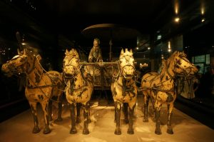
Equally impressive are the great chariots, including the war chariot. These were found just outside the actual burial of Qin Shi Huangdi, which remains unexcavated at this time. Two bronze chariots were found, one considered a war chariot and the other a peace chariot. Both chariots were found in fragments but have been restored. They are about half life-size, and intricately designed. The war chariot contains gold and silver embellishments on the canopy pole and the horses’ bridles, as well as other parts of their tack.
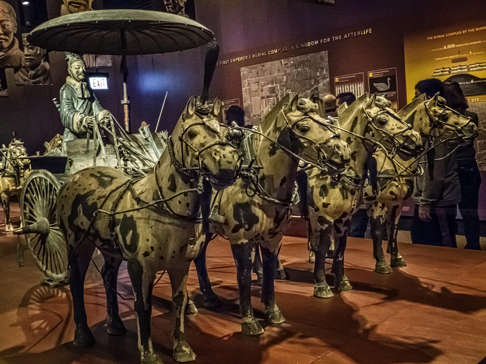
The horses are depicted in much the same style as the terracotta figures, with a delicate balance between naturalism and stylization. Their heads and bodies are somewhat generalized, so that we do not see veins or tendons standing out beneath the hide, for example, and yet they are still quite lively. Their ears are perked up as if with attention, their heads tossing as they bite their bits. They were originally painted white, with red tongues, which would have granted them an even more lively appearance. The horses, like the soldiers, are each individualized, and yet clearly all part of a cohesive team. They are all of the same size, and wear similar gear, but they differ in subtleties of the nostrils and eyes, for example.
A crossbow hangs within easy reach of the driver, elaborately decorated with patterns. A quiver containing 54 bronze arrows of two different types – diamond-shaped and flat tipped – was found hanging from the inside of the chariot’s rail. This intense level of detail and precision suggests that these arrows were not merely for decoration, but rather, were seen as being of potential use.
CULTURAL CONTEXT: Warring in the Afterlife
The burial of Qin Shi Huangdi straddles the divide between the previous and present chapters, reflecting through religious burial practices the worldly power of the emperor. In order to understand what the use might have been for all of these figures and their carefully produced armor and weapons, it is necessary to describe the context for their production. In ancient China, very elaborate burials were standard features of imperial court practice, and were copied by lesser members of the aristocracy, as well.
In the Shang Dynasty (ca. sixteenth-eleventh century BCE), rulers were buried with lavish possessions, as well as with their servants. Human sacrifices were common in the Shang Dynasty, and continued through successive periods. By the time that Qin Shi Huangdi commissioned his elaborate tomb, these practices were already ancient, and set the precedent for his ritual specialists to follow. Sima Qian’s Shiji (Historical Records) provides an account of the tomb. Sima Qian is considered to be the first major historian of China, and his text was written in the second century BCE, during the Han Dynasty that succeeded the Qin. He tells us:
The tomb vault was dug through three underground streams and the coffins were cast in copper. Palaces were built within the burial mound and the burial chamber itself was a rich repository full of precious and rare treasures. Artisans were commanded to contrive gadgets controlling hidden arrows so that if tomb robbers approached they would be bound to touch the gadgets and so trigger the arrows. On the floor of the vault mercury representing the rivers and seas was kept flowing by mechanical devices. The dome of the vault was decorated with the sun, moon and stars, and the ground depicted the nine regions and five mountains of China.… At the entombment the Second Emperor decreed that it was not fitting that the childless concubines of the First Emperor should be allowed to leave the imperial palace and should all be buried with the Emperor. Thus the number of those who died was very great.[1]
This account attests to the continued practice of human sacrifices, as well as to the great measures taken to secure the tomb against raiders seeking its riches. Indeed, like most imperial burials in China, Qin Shi Huangdi’s burial chamber, itself, remains sealed, so this account of its vaults and surroundings has not yet been confirmed. However, there are heavy concentrations of mercury in the soil around it, which suggests at least some accuracy.
But why would an emperor wish to be buried with a terracotta army, with bronze chariots and teams of horses, and even with his concubines? In ancient China, death was seen not as the complete end to an individual but rather, a new stage in his life. Therefore, the army was intended not only to demonstrate the emperor’s power in this life, but also to extend that same power into the world of the dead. Admittedly biased Confucian historians of later dynasties describe Qin Shi Huangdi as paranoid, though the two documented attempts on his life suggest that some fear would have been rational. Desiring to preserve his power eternally, he had the ideal army constructed, and placed to the east of his tomb – the direction of his enemies in life. This massive project should be seen in the context of Qin Shi Huangdi’s other efforts, including the beginning of the Great Wall of China, built to keep out northern invaders in the world of the living. He gained unified control over China through military force, censorship of information and ideas, and defense against outside forces. Having accomplished this, he then worked to ensure that he would continue to hold such worldly power, even after his death.
Comparisons and Connections I: Rulers
The tomb of Qin Shi Huangdi uses repetition and unity to convey the sense that the emperor’s power was nearly limitless. The rows and rows of larger-than-life soldiers were designed to protect him and to allow him to continue waging battles for dominance even in death. The use of slight variations within an otherwise repetitive composition gives the impression that he commanded vast numbers of ideal warriors. Some scholars have noted among the divisions of soldiers facial types associated in the period with different regions of China, so the army even conveyed the geographical scope of the new empire. Still, for all of its impressive size, quality and richness of detail, it was hidden from view after his death, though accounts of it survived, like that quoted above.
God-Kings
From the earliest of history to the modern period, works of art and architecture have been designed to convey the power of rulers. While the following examples will often rely on a shared visual vocabulary to suggest power – including expensive materials, large size and hieratic scale – each example draws on its own culture for the most basic idea of what it means to be powerful, and each will express these ideas in its own fashion. In one culture, violence might be the hallmark of power, whereas in another support from the masses might be more important. The earliest written records to survive come from the Ancient Near East, a term used to refer to the region extending from Turkey in the east to Israel in the west, and centered on a series of civilizations that flourished in what are now Iran and Iraq from the fourth through the first millennium BCE.
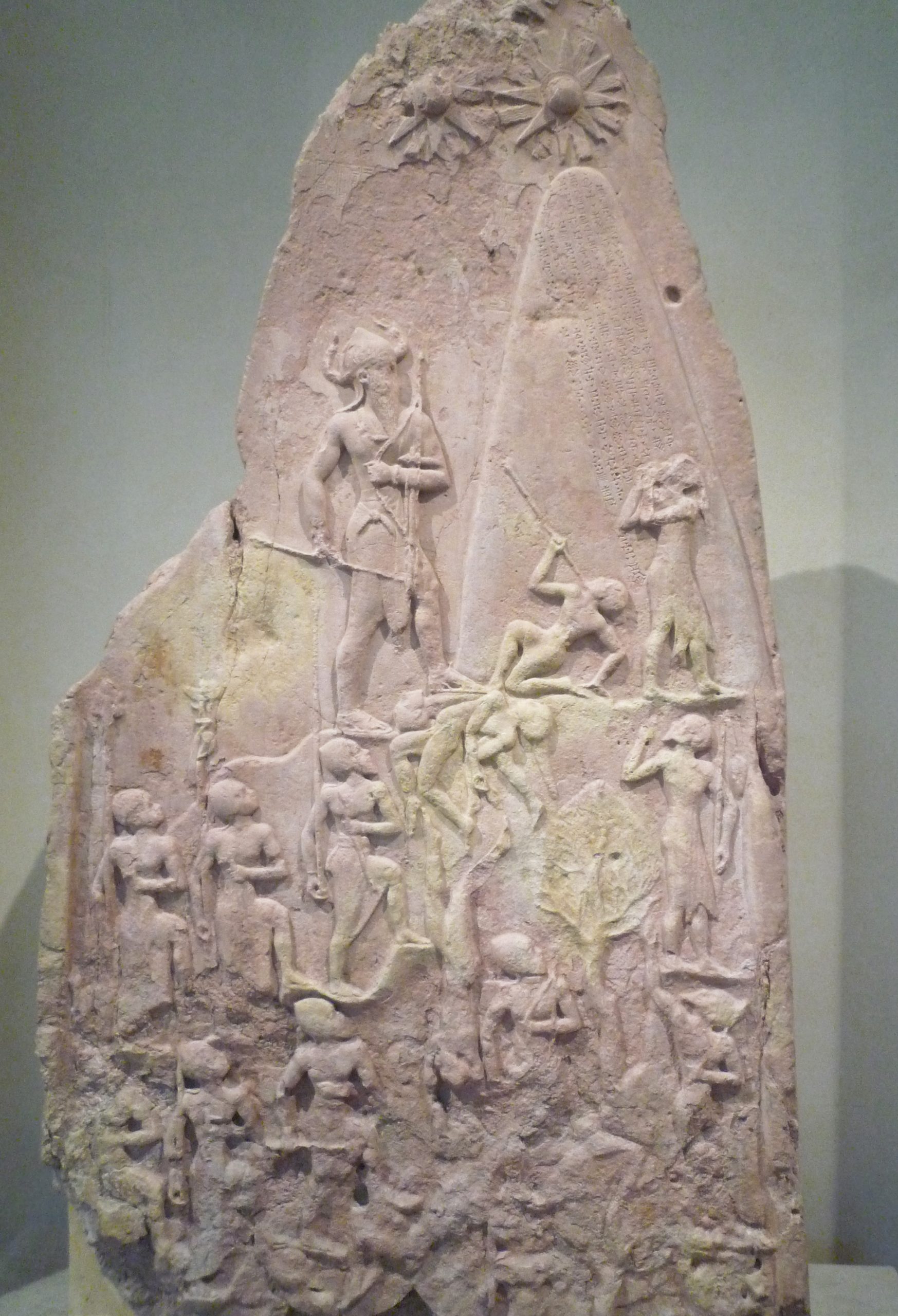
One of the period’s earliest empires was established by Naram-Sin, who inherited the throne of the city-state of Akkad in 2254 BCE and ruled until 2218 BCE. While the city of Akkad has not yet been found, archeologists believe it was in the area of Baghdad. Naram-Sin’s grandfather Sargon I was purportedly the illegitimate son of a high priestess and sent down the Euphrates river in a basket (a common trope in ancient myth) before being rescued and raised by a gardener. He founded his own city and established dominance in the region through military success. Naram-Sin continued to seek power through force, extending Akkad’s range of control and influence. In order to maintain this control, though, Naram-Sin had to frequently crush rebellions.
The Victory Stele of Naram-Sin commemorates his defeat of the Lullubi. The stele – an upright stone marker – makes a strong visual statement about the power of Naram-Sin. The composition is arranged in loose registers, angling up from the lower left to the upper right. The main figure is easy to spot, here: Naram-Sin is represented in hieratic scale, so that he towers over all the figures around him. He is also the highest figure on this large stele, which is over six and a half feet tall. He is also surrounded by more negative space than the other figures, who in contrast are crowded together in a jumble.
The space around the king is empty, so that he stands out clearly. This, though, merely draws our attention to him. His power is shown through his actions and the symbols on and around him. Just in front of him, a figure clutches a spear that Naram-Sin has thrust through his neck. The king carries other spears, a bow and arrows, and a battle-axe, as if a one-man army. Unlike Qin Shi Huangdi, who demonstrated his military power through images of his thousands of soldiers, Naram-Sin had himself presented as the most powerful member of his army, displaying a god-like ability to slaughter his enemies.
In addition to the dying figure bending backward before Naram-Sin, there are two more corpses splayed out in a heap beneath his left foot. Another falls vertically down the stele, breaking through the registers. Additional figures raise their hands to plead for their lives as they flee – note how the torso and face of figure in front of Naram-Sin is facing the conquering king, while his feet clearly point in the opposite direction. The massive and aggressive figure of Naram-Sin is capped with a horned helmet, an attribute that prior to this image was only depicted on gods and that therefore suggests that he has been deified – considered to be a god. Inscriptions tell us that he was known by the title “god of Akkad,” and here the power of this mighty god-king seems infinite. As he ascends the mountain, he moves closer to the three suns (one now mostly lost) at the apex of the image. These are symbols of the gods of the Akkadians, guiding Naram-Sin to victory and suggesting his own divinity.
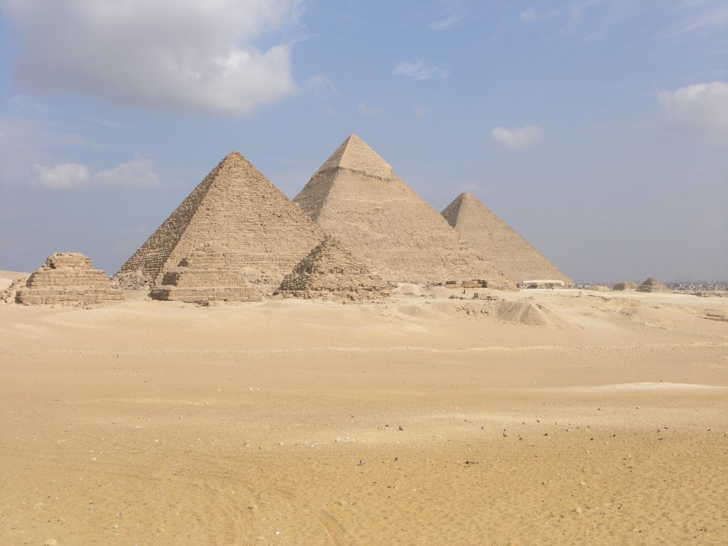
Representations of power in the ancient world reached their peak with the art and architecture of the Egyptian kings, or pharaohs, particularly in the Great Pyramids of Giza (2575-2450 BCE). Built by the pharaohs Menkaure, Khafre, and Khufu, they remain the most monumental works of architecture in the world – no more massive buildings have ever been built. These are the only surviving works of the so-called Seven Wonders of the Ancient World, a group of marvels described in ancient Greece to acknowledge what were considered to be the most remarkable works of art and architecture known at the time, and their survival is due to their massive style of construction. As the focal points within a necropolis, or city of the dead, they dominate the landscape.
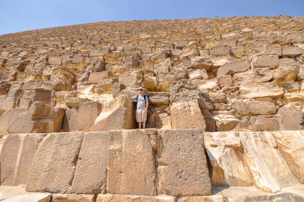
The Pyramid of Khufu is the oldest and largest. It was originally nearly 500 feet tall at the apex, and the base is approximately 750 feet long on each side, covering thirteen acres. These numbers are so large that they are hard to grasp, but a detail photograph showing the size of the individual blocks helps convey the pyramid’s remarkable size.
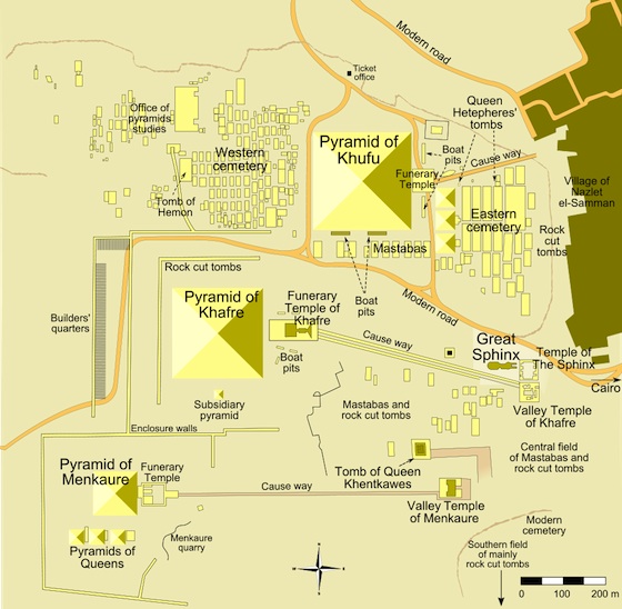
The size of the pyramids is not all that conveys the power of their patrons. The style also impacts this impression. They are not only large, and radially symmetrical, but also almost completely unadorned. Originally, the surfaces were covered with smooth blocks that would have given them perfectly straight sides, rather than the stepped sides they now have. They would therefore have presented the viewer with a structure so unified that each might even seem to be a single object on the grandest possible scale.
While Qin Shi Huangdi was also buried beneath a mound, his low hill was carefully concealed from view beneath grass and trees. In strong contrast, these works are literally human-made mountains rising over the flat planes of Giza, dominating the landscape and dwarfing all surrounding structures. As such, they were very clear statements of the power of the god-kings buried within them.
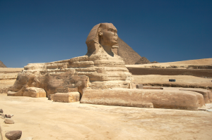
The pharaohs commissioned numerous images of themselves, many of which were created for the spaces inside and around the pyramids. Perhaps most well known of these is the Great Sphinx, guarding the entrance to the Pyramid of Khafre. It sits at the entrance to the long causeway that leads to a funerary temple and then to the pyramid. This figure, 65 feet tall and almost 190 feet in length, has the body of a lion but is capped by an image of the head of the pharaoh, wearing the royal cobra headdress. The Sphinx sits upright and alert, in formal symmetry. The figure was not assembled out of blocks, as the pyramids were, but rather, was carved out of “living rock” – stone still connected to the earth – though there are some additions to this.
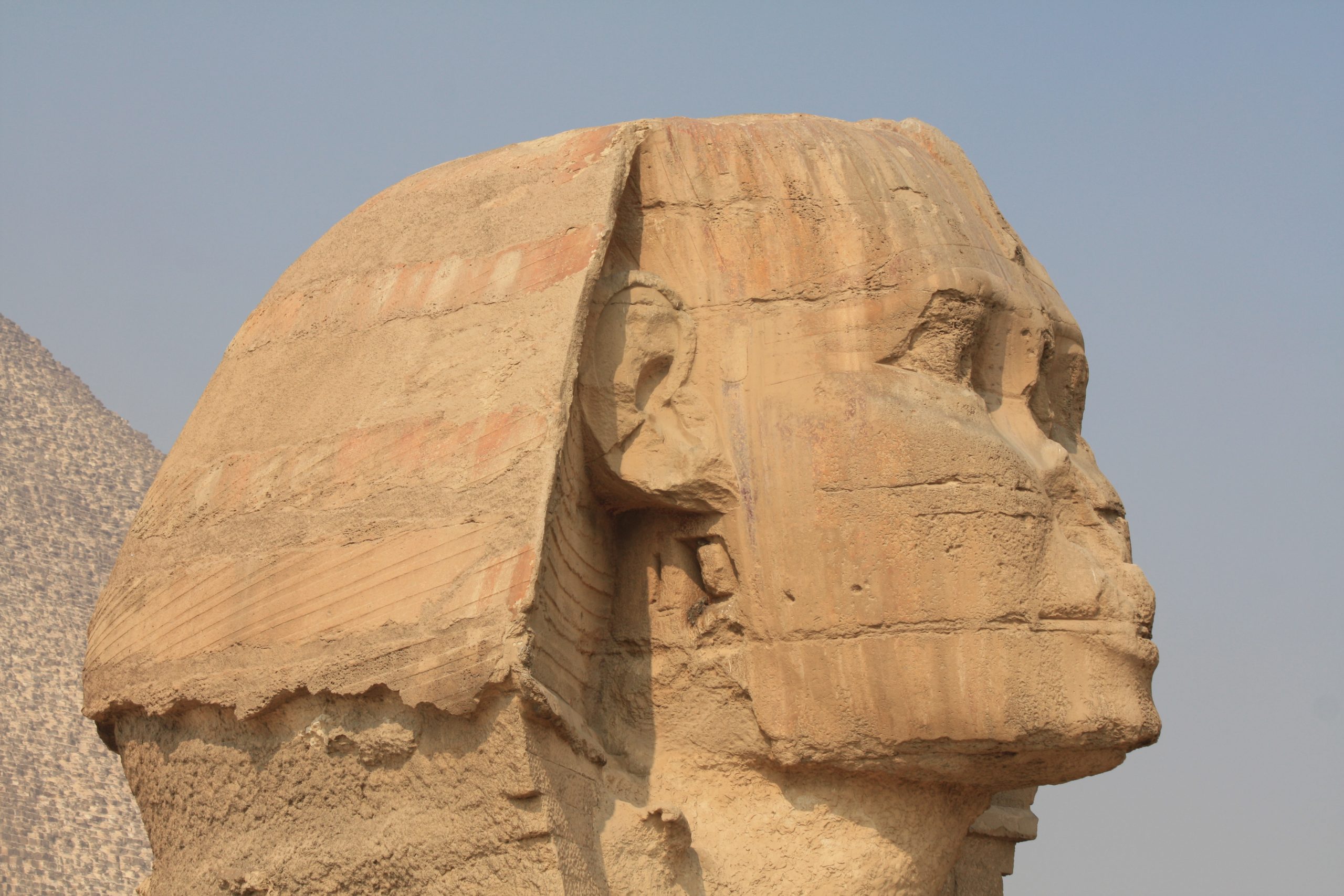
The image suggests the pharaoh’s tremendous power, since it is not only colossal but also merges him with the most respected predator of Africa: the lion. The Sphinx has unusually large eyes, and this emphasis serves to suggest that this powerful creature is a most watchful guardian. Qin Shi Huangdi entrusted his protection in the afterlife to his vigilant soldiers. Khafre, on the other hand, seems to guard himself.
Markers of Authority
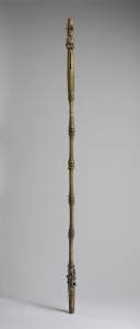
Large, watchful eyes can be found in thousands of images of gods and rulers, giving the viewer the sense that these absent individuals are nonetheless scrutinizing us. The portrait style common in the art of the Benin kingdom of the eighteenth century is highly abstract, with features of importance enlarged for emphasis. In this way, scale is manipulated to draw the viewer’s attention to key elements, like the eyes. Here, we see a rattle staff, called an ukhurhe, made for a powerful oba, or king (see also Altar Group, Oba Ewuake in Visual Analysis 2: The Principles of Composition).
Oba Akenzua I ruled Benin in the early eighteenth century. The oba’s staff is capped with an image of himself, holding a simpler ukhurhe. This staff was probably used as a public political statement of power, unlike more traditional ukhurhe, which were carved in wood. Akenzua’s great, wide-set eyes would have been directed both at his ancestors – the source of his power and authority – and at his subjects.
![Rattle Staff: Oba Akenzua I Standing on an Elephant (Ukhurhe) [Detail of Top], bronze, copper, iron, ca. 1725-1750 (Metropolitan Museum of Art, New York). Photo: Public Domain.](https://pressbooks.calstate.edu/app/uploads/sites/5/2023/07/3.14-Rattle-Staff-Top-Detail-1.jpg)
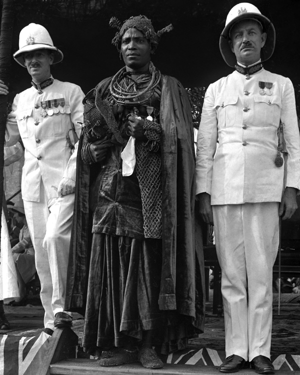
The staff, over five feet tall, has a hollow segment near the top, with narrow slits along its length, which rattles when shaken during prayers. This example is brass, which means it was a high-status item. As with Qin Shi Huangdi’s burial, there is a balance in this work between worldly and spiritual power. The oba is shown dressed for a ceremony in elaborate royal garb, much of which would be made of valuable materials. As shown on the image on the ukhurhe, his headdress, the rings around his neck, and the panels on his chest would be made of coral and his armbands would be of ivory. This costly costume would declare to the viewer that the figure is no ordinary man. In a photograph of his descendant, Akenzua II (ruled 1933-1978), we can see an oba in a similar costume, giving a sense of how Akenzua II would have appeared in life.
The figure’s importance is declared by his placement at the top of this luxury item, and his symmetry gives him a stable, solid, dignified appearance. His enlarged eyes declare his watchful nature. While the image of Akenzua I, itself, is small – only about six inches in height – hieratic scale is used to demonstrate his importance: he stands on the back of an elephant, an animal associated with rulership, and is more than twice its height. The elephant’s trunk ends in a human hand. This may be a reference to Iyase n’Ode, believed to be able to transform into an elephant, who led a rebellion against Akenzua. Placing Akenzua atop the elephant makes a strong statement about Iyase n’Ode’s defeat and the oba’s triumph. The elephant is also hemmed in on both sides by leopards, symbols of the oba’s power. The elaborate nature of the depiction of the oba is the result of the centrality of the king to the art of Benin. The oba was both the main subject of the art, and also its most important patron. This forceful depiction of Akenzua’s power is fitting, as he was the ruler of a kingdom that had ruled the region since the fifteenth century. In this case, therefore, the iconography – the series of signs and symbols in the art of a culture – works with the principles of composition to create a strong statement of the oba’s authority.
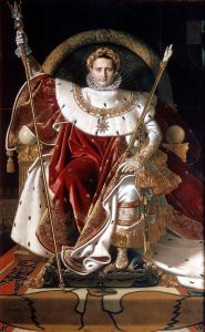
We again confront the direct gaze of the ruler when we stand before Jean-Auguste Dominique Ingres’s large oil painting of Napoleon on his Imperial Throne (1806). This is a work that tries very hard to capture some of the majesty of earlier images of rulers through composition, technique and symbolism. The recently crowned emperor is shown centered in a highly symmetrical composition, seated on a gilded throne that frames his head like a halo, suggesting his divinity. The semi-circle of the white ermine fur cape draped over his shoulders visually completes the semi-circle of the back of the throne. The circles are carefully aligned to seem to be continuations of one another, thereby doubly framing Napoleon’s head.
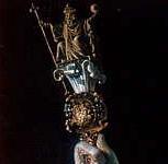
Napoleon’s clothing and accessories could not be more sumptuous: fur, velvet in red – the color that has symbolized imperial power since Ancient Rome – and gold. The staff he holds in his right hand is topped with an image of Charlemagne, the revered medieval French king who was the first to be crowned emperor of the Holy Roman Empire. This great predecessor (Charlemagne is French for “Charles the Great”) is posed quite similarly to Napoleon, suggesting a strong connection between these two French rulers, each of whom was the first in his era to be declared emperor.
Like the image of Akenzua on his ukhurhe, holding an ukhurhe, here the small image of Charlemagne atop Napoleon’s staff also holds in his right hand a staff, this one capped with the fleur-de-lis, the symbol of the French monarchy. The staff in Napoleon’s left hand was believed at the time to have belonged to Charlemagne, and the sword he bears is that of his precursor, as well.
As Qin Shi Huangdi used ancient burial practices to connect himself to the tradition of his ancestors, Napoleon used these medieval treasures to connect himself with the past of France. He also bears the golden laurel wreath crown of the Roman emperors, and the arms of his golden throne contain the image of the Roman eagle. Ingres paints all of these elements with extreme precision, so that we can see each gem and jewel, and with such attention to the texture of the materials that is seems almost as if we can feel them beneath our fingers as we look at the image. This lavish portrait was an attempt by Napoleon to demonstrate his great power, and also to argue that, although he had created a new empire, he was continuing the tradition of Charlemagne, and of the great Roman emperors of Antiquity.
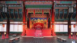
In the portrait of Napoleon, we see a representation of a fairly lavish throne, but it pales in comparison to the actual Throne Room of Gyeongbokgung Palace in Seoul, South Korea. This was the primary palace of the Joseon Dynasty, originally completed in 1395 CE, but burned down in 1592 during the Japanese invasion of Korea, and largely rebuilt in the mid-nineteenth century.
Unlike roughly contemporary cities in China and Japan, Korean cities and palace compounds were not traditionally organized symmetrically. Instead, they followed natural features in an effort to achieve pungsu (feng shui). This makes the layout of the building and throne, itself, all the more striking. Geunjeongjeon Hall (“Hall of Diligent Rule”) is a large, rigidly symmetrical structure, based on Chinese models, with two tiers of roofs that curve gently upward at the corners. It is set at the top of a platform with three tiers, requiring that the visitor climb more than a dozen steps before entering the hall.
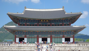
The building contains a single cavernous room, centered on the throne, which sits again atop a platform, elevating the king within this already-elevated palace. Behind the throne are wooden screens, and then a painted backdrop with five mountains, the sun, and the moon, all exclusive symbols of the king. A canopy with images of two dragons hangs over the throne, also symbols of the king. This image faces the inside of the throne chamber, and is therefore only visible to the king, himself, while he is seated on his throne. The king, seated on a throne on a platform, in a palace on a platform, would appear superior to all those beneath him.
Ironically, the Joseon Dynasty, following neo-Confucian ideas (based on the Confucian writings banned and burned by Qin Shi Huangdi), believed that the king’s power and authority came from his fairness, and so, compared to other royal palaces of the region, Gyeongbokgung is relatively simple. Still, it is clear that despite rhetoric about equality, the king was no ordinary citizen. Like Napoleon on his throne, Khafre in his pyramid and as the giant sphinx, Naram-Sin atop his mountain, and Qin Shi Huangdi in his tomb, the Joseon king relied on art and architecture to convey his great power and to elevate him, quite literally, above his people.
It is important to note that the use of art to convey the power of rulers is not an ancient phenomenon. It continues in the modern world, though often on a more modest scale than in Ancient Egypt and China. For a more recent example, we turn to a statue of Saddam Hussein, former dictator of Iraq, which once stood in Firdos Square, Baghdad.
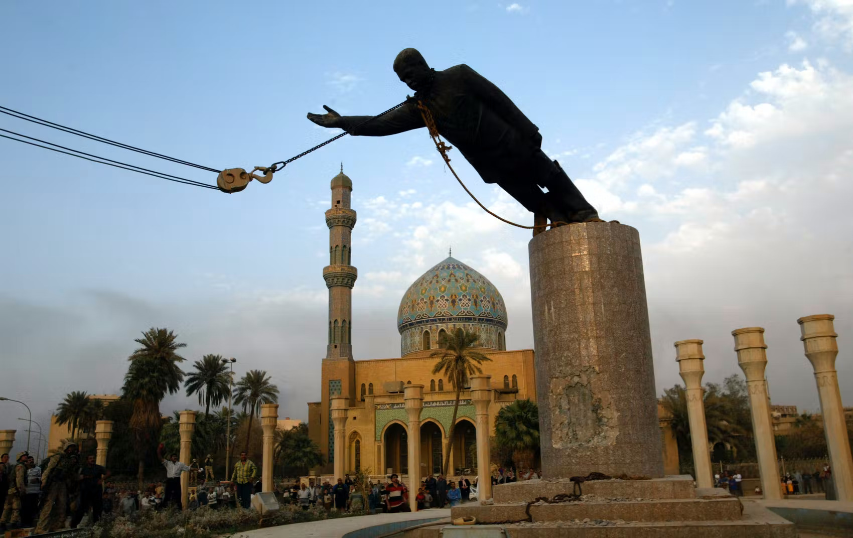
This statue was one of thousands of images of Hussein, and was produced as many of the images in this chapter were, at the orders of a powerful patron. It was a monumental bronze sculpture, set on a tall pedestal. Hussein appeared in a business suit, with a hand raised as if he were greeting a large crowd of supporters. This image became famous throughout the world just a month after the United States led invasion of Iraq began, and serves as a reminder that symbols of power can be used against those they are created to glorify. On April 9, 2003, a battalion of US marines secured central Baghdad and arrived in Firdos Square, in front of the Palestine Hotel, where over two hundred reporters were staying. The presence of so many reporters meant that, as the marines assisted a group of Iraqis in toppling the statue, the event was broadcast live throughout the world.
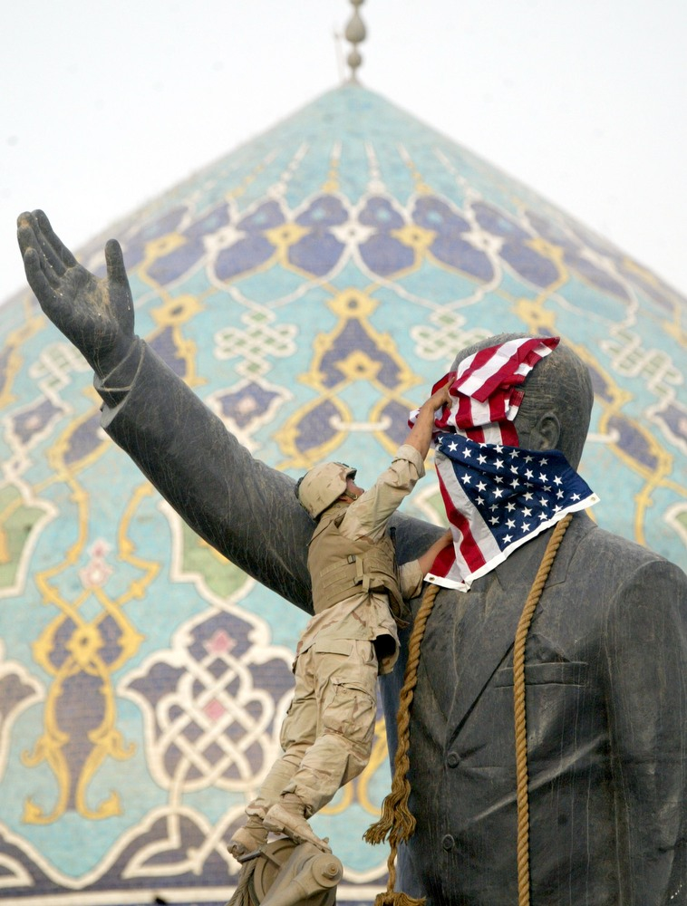
The statue was created under Hussein, to celebrate and declare his power, but in the aftermath of the invasion, its toppling became a more complicated symbol of his fall from power. According to the most detailed account available, a US marine instigated the small crowd of Iraqis, and provided them a sledgehammer and rope. When it was clear this was not sufficient to pull down the statue, the marines sought and received authorization to use a large tow truck to topple it. While a corporal was hooking up a chain to the statue’s head, he was handed a US flag, which the wind then whipped across the face of the image of Hussein. He spread it more fully across the face and, seconds later, took it down.
This brief moment was photographed, filmed, and broadcast, becoming a central image of the invasion. Had the Iraqis pulled down the statue without help of the truck, images would have appeared to show a spontaneous act by a joyously liberated populace, though this would have been false. Had the statue been toppled without the flag, the images would appear to show cooperation between the Iraqi people and the US military. The ultimate image, though it was not really staged as such, looked like a deliberate statement by a conquering occupier. In this way, a work of propaganda for a powerful, autocratic ruler became a symbol of his defeat at the hands of an invading military.
Propaganda
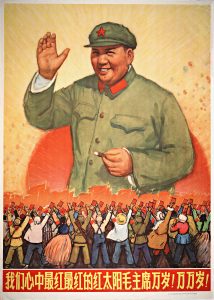
The final image in this section is a propaganda poster from China entitled Chairman Mao is the reddest red sun in our hearts, produced by the Lu Xun Art College Artists in 1967. In 1966, the Chinese Communist Party Chairman Mao Zedong began the Great Proletarian Cultural Revolution. The movement was intended to address growing class inequality. When the People’s Republic of China was founded in 1949, one of its founders’ goals was to decrease the economic divide between the rich and poor, but in the following decades, as Mao saw it, the government had moved away from this principle.
In this image, we see Chairman Mao rising out of the center of the red sun, smiling and radiant. Beneath him is an army of loyal supporters. These figures stand in for the 20 million youths who joined the Red Guard in order to route out “class enemies.” They hold aloft copies of Mao’s Little Red Book, which contains a list of sayings to encourage the masses to fight against class oppression. For example:
In class society, everyone lives as a member of a particular class, and every kind of thinking, without exception, is stamped with the brand of a class.
It is up to us to organize the people. As for the reactionaries in China, it is up to us to organize the people to overthrow them. Everything reactionary is the same; if you do not hit it, it will not fall. This is also like sweeping the floor; as a rule, where the broom does not reach, the dust will not vanish of itself.[2]
The poster relies on broad use of a number of visual elements and principles of composition. Like most propaganda, it is not intended to be subtle; it is supposed to make a clear and dramatic point. The placement of Mao, centered at the top of the image, declares his importance, which is reinforced by the seemingly infinite crowd beneath him. Like the soldiers of Qin Shi Huangdi, they are nearly identical in dress, conveying their common purpose, but are slightly differentiated to give a sense of the individuality of the volunteers, united behind Mao.
The horizon line is located behind the figures, approximately at the eye-level of the young women in the front row. This effectively places the viewer within the crowd, as if we are marching along with them. It also has the effect, as the figures recede into the distance, of dissolving the crowd into a sea of hands, all holding up the Little Red Book toward the giant image of Mao. The red books and the red flags behind them seem as if they are being formed out of the rays that emanate from the red sun behind Mao. Like a sun god, Mao shines his message down onto his followers, who receive it with great joy. If any ambiguity were left, the large red characters at the base of the image read, “Chairman Mao is the reddest reddest red sun in our hearts.”
The woodcut technique used here – in which a series of blocks is carved out to create the image, covered with ink, and then pressed to the page – has become since the 1960s a staple of political imagery. Is it an inexpensive way of producing a large number of images. Unlike the impressive and expensive works discussed above, this poster achieved its effect through large-scale distribution. The high contrast and large, flat panels of color common in woodcuts make this technique well suited to carrying clear messages to the masses. The following section will consider works that resist the sorts of power dynamics presented by the works discusses so far, many of which rely on similar visual techniques, but were created by artists working to achieve a greater measure of equality. Mao is an interesting figure with which to make the transition, since he was both a revolutionary leader of a populist movement and, later, an autocratic and repressive ruler. In this image, he is shown fighting against entrenched powers, but also as a clear source of power, himself. In the next spotlight image, we will see the works of an artist who relies on some of the same techniques to challenge not only particular rulers and policies, but also they very strategies through which they visually convey them.
SPOTLIGHT IMAGE II:
Barbara Kruger, Rage + Women = Power, cover for Ms. Magazine, January/February 1992
VIEWING QUESTIONS
- What techniques does Kruger use to create emphasis?
- How do words and images interact in these works?
- How do the color choices affect the images?
- How does contrast affect the images?
INTRODUCTION: From Graphic Design to Art
Barbara Kruger, who studied briefly in the fine arts program at Parsons School of Design, began her professional career in graphic design. She was the chief designer for the fashion magazine Mademoiselle in the 1960s, and cites this experience as central to her career as an artist. As she writes, “I learned to deal with an economy of image and text which beckoned and fixed the spectator.”[3] Indeed, her work strikes out with a sharpness and clarity that is perhaps more often seen in advertising than in art. Kruger was also deeply influenced by the feminist movement that began in the 1970s, and much of her art responds to it and furthers its message. While issues of gender inequality are central to her work, though, she also uses the tools feminism developed to discuss other imbalances of power.
VISUAL ELEMENTS: Powerful Words, Powerful Images
This Spotlight will consider four related works by Barbara Kruger, all of which rely on the same visual language to convey related messages about power. While not formally part of a series, they are all part of Kruger’s overarching project of highlighting inequalities in society and the methods used by the powerful to maintain them. These images all contain grainy, high contrast black and white images with bold slogan-like texts placed across them. Her cover for Ms. magazine from 1992 recalls the poster of Chairman Mao in its use of pattern and repetition to create a sense that a mass of people are united behind a common cause, and in the use of bold text to tell the viewer what this cause is. Whereas Mao’s poster informs the reader that “Chairman Mao is the reddest reddest red sun in our hearts,” Kruger’s image tells us that “RAGE + WOMEN = POWER.” The text is highlighted through the use of bright red as a background, and through use of large, capitalized, italicized letters in the Futura Bold Oblique font, a very clear, clean, no-frills font appropriate to her pithy statements. There is nothing subtle about this equation, but that is the point. Like those to be discussed below, it speaks boldly and directly to the viewer.
Kruger’s juxtaposition of text and image creates interesting contrasts. Kruger does not identify the source of her images, but the figures here seem to be girls dressed in gym uniforms and bearing hoops for hoop-rolling. They are therefore presented as obedient, wearing what they are told to, and gathered together in large numbers merely to engage in a trivial and lighthearted activity. Kruger’s text, though, implies that such groups, animated by their frustration with subjugation, could bring about change. Stepping back, these figures might well be (or might grow up to become) feminists marching in support of women’s rights. They are, like Qin Shi Huangdi’s army, nearly identical figures, all dressed in matching white shirts and black shorts and carrying objects. However, unlike the emperor’s soldiers, the text here suggests that these women should be fighting for themselves. Since this is a cover for a magazine directed at female readers, the work is not a threat, as it might seem to be in another context, but rather, a bold encouragement for women to rise up to achieve more power. The back cover, also designed by Kruger, shows a series of what appear to be doll’s eyeballs on a wire rack, and reads in white on red, “WE WILL NOT LONGER BE SEEN AND NOT HEARD.”
These issues are also central to Kruger’s work that reads “Your comfort is my silence,” though this work uses a very different approach to achieve a related message (see here for an image). Here, size is important. Unlike the small magazine cover, this is a large work, five feet tall, which makes it a much more confrontational image than it might otherwise be. The nearly faceless man is shadowed by his fedora, a hat associated with gangsters and cops in film noir, and has his eyes blocked out with text, recalling the black bars used by tabloids in half-hearted attempts to conceal the identity of the subjects of photographs.
The figure, much larger than life, becomes ominous as he looms up before us, out of the darkness, his finger to his lips in a gesture directed at the viewer. Who is Kruger referring to with her pronouns, here? “Your” suggests both the shady figure in the photograph and the viewer, particularly the male viewer. It is perhaps then Kruger’s silence, and by association, the silence of women in the face of oppression, that is the necessary condition for the comfort of those in power. These are confrontational works that, through their juxtaposition of text and image and use of pronouns, seek to elicit strong responses from viewers.
These themes appear in what is perhaps her most well known work, “Your body is a battleground,” a poster designed to advertise a march on Washington on April 9, 1989 in support, as the poster reads, of “Legal Abortion/Birth Control/and Women’s Rights” (see here for an image). This image presents a close-up photograph of a woman’s face in frontal view, divided down the exact center, with half of the image printed as a positive and the other half as a negative. The grainy quality of the image and the use of high contrast creates the sense that this is not an original photograph, but rather, an image of an image of an image, as if reduced in quality by being photocopied multiple times. This makes for a more stark and striking image, and also suggests that the image is standard and pervasive, as if standing in for any number of media images of women like those that appear in advertisements in fashion magazines.
The text is again in bold white lettering, now alternating between black and red backgrounds. Again, the text seems to directly address the viewer: “Your body” is at issue, here. This, coupled with the woman’s very direct gaze, implicates us, involves us in the issues of the march, reminding the viewer that it is her body that would be affected by the Supreme Court ruling on Roe vs. Wade, the landmark decision legalizing abortion in the United States (and overturned in June 2022 in Dobbs v. Jackson Women’s Health Organization).
The centered text and the image, precisely divided by the line separating the positive and negative sides of the image, aggressively seek the attention of the viewer. There is, though, a possible ambiguity in the image. “Your” might refer not to the viewer but to the woman in the image. The highly polarized issue of abortion rights divides the public into “Pro-Choice” and “Pro-Life” camps. The use of terms like “you” and “your,” “me” and “mine,” throughout Kruger’s work constantly suggests power dynamics between the viewer and the image.
The sorts of dynamics emphasized in Kruger’s works are at play throughout the history of art, as was the case with the terracotta army, sphinx, and staff discussed above, for example. However, Kruger brings these issues to the surface of her images, so that the power dynamics are not merely at work in her art, but the primary focus of it. The final work considered in this Spotlight features a woman’s profile, with text that reads, “Your gaze hits the side of my face” (see here for an image). Again, Kruger relies on high contrast black and white imagery and text that generates a relationship with the viewer. The text alternates between black on white and white on black, working like the positive and negative halves of “Your body is a battleground.” On the present image, she might have written “His gaze hits the side of her face,” or perhaps, “A man’s gaze hits the side of a woman’s face,” but neither of these would have quite the power of her phrasing, since they do not speak directly to the spectator.
Still, as with the previous image, there are multiple ways to read the work. Which words do we emphasize in reading the image? “Your gaze hits the side of my face”? “Your gaze hits”? Or perhaps “side”? Does the image focus on the fact that a gaze – a term used in feminist literature underpinning Kruger’s work to mean “a sexually charged, empowered stare of a man at a woman” – can be, in and of itself, an act of violence? Or on the fact that it is the viewer doing the gazing? Or, on the other hand, if we read the stress on “side,” is her point perhaps that the so-called empowered male gaze merely glances ineffectually off the side of the figure’s face?
Returning to the image of the woman, we can see that it is not actually a photograph of a woman. It is a photograph of a plaster sculpture of a woman’s head, which emerges from a hard-edged square block. This is not a soft or fragile image of an imperiled woman, but a stony, impassive image, staring straight ahead of herself as if we, and our gaze, mean nothing to her.
CULTURAL CONTEXT: “Global Etiquettes of Power”
Feminism is a contentious subject, largely because it is often misconstrued in American media culture. Rebecca West (the pen name of Cicely Isabel Fairfield), prominent author and critic, succinctly defined feminism as “the radical idea that women are people,” a slogan that has remained at the center of the movement.[4] Kruger’s art grew out of a group of feminist authors and artists who argue that gender – the way that people act out their physical sex, as opposed to their biological state – is not a natural condition. Instead, they maintain, gender was the result of cultural and political forces. One might well be born female, but it is society that dictates what is feminine.
Much of Kruger’s art pushes back against our culture’s received ideas about what it means to be male or female, masculine or feminine. Her poster for the March on Washington, for example, highlights the ways that the female body is contested, fought over by political parties and social movements. While Roe v. Wade, which established the legality of abortion in the United Stated, was decided by the Supreme Court in 1973, it remained controversial from that point until 2022, when Dobbs v. Jackson Women’s Health Organization overturned the previous ruling. This, though, did not end the controversy. Indeed, the debate about abortion rights is as active as ever, and remains a central point of political campaigns.
In her “Your body is a battleground” poster, Kruger tries to convince the (female) viewer that this is not a distant or abstract political or legal issue, but a personal, physical issue. “Your” body is the “battleground,” a metaphor that implies violence as well as conflict. This poster was in response to Webster v. Reproductive Health Services, a Supreme Court case in 1989 that, following the course of a few previous decisions, decreased federal and state funding for abortion services. The poster is an attempt to make these legal cases, generally difficult for the general public to follow, relevant and important to the viewer.
Kruger’s cover for Ms. Magazine is a strong feminist statement about the potential of women to enact change. She is resisting popular, media-supported images of women as docile and passive. Such images form the ironic backgrounds for many of her works, like the hoop rollers in her Ms. Magazine cover, but here she presents a more powerful image. While the left side of the image might be from an advertisement for lipstick, the right side of the image, with its blazing white eye, suggests perhaps the rage Kruger calls for in the cover, simmering beneath the placid surface of the model’s face.
Kruger’s work, though, is not strictly limited to feminism or to debates about gender. Instead, her work explores what one critic has called “the global etiquettes of power,” that is, the subtle, seemingly polite and quiet ways that cultures enforce hierarchies.[5] Kruger might focus on images of tanks and bombs, of murders and rapes (and such imagery does appear, though infrequently, in her work), but instead she returns again and again to media images that are such common and normal parts of our world that we barely notice them when we see them on billboards, in magazine ads, on television.
“Your comfort is my silence,” for example, might well be seen as referring to issues of gender, but it does not do so explicitly. We could therefore read into it any number of concerns about the powerful and about the silence of the powerless. We could interpret it as being about the rich and the poor, about corporations and exploited workers, about the military-industrial complex (the “conjunction of an immense military establishment and a large arms industry,” as coined and defined by President Dwight D. Eisenhower in his farewell address in 1961[6]) and the general populace. On the other hand, the work could be about a power imbalance between any two individuals in a relationship. The work might address vast issues, national or global in scope, or personal, private issues between two people. The main target is the method, rather than the content, of the oppression.
The following section will contain a range of images that examine, explore, and challenge power dynamics. Some will speak with a visual vocabulary as direct and forceful as Kruger’s, while others will raise these issues through subtler means. Many will be linked in a lineage of protest imagery centered on the iconic image of Ernesto “Che” Guevara, often considered to be the most widely reproduced photograph in the world. The images will, like those of Kruger, challenge specific ideologies but will also work to reveal the ways that works of art produced for the powerful try to convince us to accept their messages.
Comparisons and Connections II: Art of Revolution
Che, a Global Icon
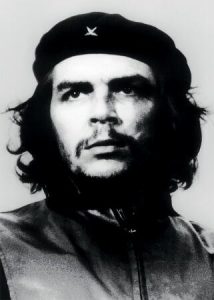
Perhaps the most well-known image of resistance and revolution is the ubiquitous, stylized silkscreened portrait of Argentinian doctor-turned-revolutionary Che Guevara, but before turning to this image, we will look at the photograph on which it was based. This image, through several formal visual elements, turns the figure of Guevara from an individual into an icon.
The photograph was shot while Guevara was working in Cuba with Fidel Castro to establish a communist regime to replace the government of the dictator they had overthrown. The photograph was taken from slightly below the level of Guevara’s eyes, so that he seems to rise above us. The subject gazes off into the distance with a smoldering intensity, emphasized by our position beneath him, and his upturned eyes seem to suggest that he is steadfastly facing the challenges ahead.
The photograph is printed in high contrast, so that the background behind Guevara is almost pure white, and his revolutionary’s beret, with its gold star at the center (indicating his position as Commandante, second in command only to Castro), and his hair, beard and collar combine to form a nearly black oval frame around his face. Because of the high contrast, most of his face is nearly white, but the whites of his eyes shine yet more brightly.
The photographer was Alberto “Korda” Díaz Gutiérrez, a Cuban photojournalist and friend of Castro who worked to document the revolution. This image, titled Guerrillero Heroico [Heroic Guerrilla] (Version I) (1960), is perhaps his most enduring. It was taken during a speech by Castro commemorating the victims of a sunken ship – believed by Castro to have been blown up by the American CIA – that had been attempting to transport French arms to the revolutionaries. Guevara appeared on the stage for a few seconds, just enough time for Korda to take two photographs.
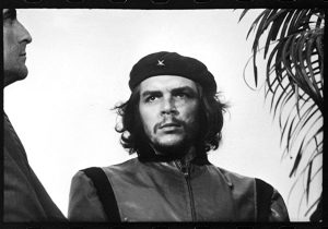
This highly popular photograph, circulated around the world, is actually a cropped version of a larger image. Looking at the uncropped version allows us to see how the cropping enhances the image. By removing the distracting profile of the man to the left and the busy fronds of the plant to the right, Korda isolates his subject against the blank backdrop of the sky. The image of Guevara also therefore takes up the majority of the image. This contributes to the tone of the image not as a photojournalistic record of a particular moment in time and space, but instead as an icon – a timeless image of an individual or, indeed, a movement, belief, or philosophy. The image does not seem merely to show us Guevara on that day in May of 1960, but rather, seems to embody his fury and the spirit of revolution.
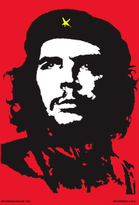
The photograph itself, though, is not as widely known and reproduced as a silkscreened print based on it. Irish artist Jim Fitzpatrick published the print and distributed it freely and widely, just after Guevara’s death in 1968. This sort of mass distribution has also been central to Kruger’s art, as well as images of Mao’s Cultural Revolution. While the original photograph is in high contrast, the silkscreened image is in stark black-and-white or, as in the version reproduced here, black-and-white-and-red (using the same palette of colors as Kruger), with the exception of the bright yellow of the star on Guevara’s beret. Unlike the photograph, the print contains no shades of grey. As a result, it appears yet more iconic, presenting Guevara as the very essence of Revolution, not only of the Cuban Revolution, but of all revolutions and revolutionary impulses. Now, the image – highly commodified in ways that would have disturbed the socialist Guevara – has come to stand in for any sort of rebellion against any authority. Its visual elements allowed it to become an icon, first detached from the single moment when the original photograph was shot and then from the entire context of the Cuban revolution, as it is rendered more abstract and therefore more universal through the silkscreened image.
A Giant Phenomenon
The American artist Shepard Fairey has more recently exaggerated this phenomenon. He gained prominence in the street art community through his Obey Giant sticker campaign (and then gained more wide acclaim after the publication of his popular “Hope” poster of then presidential candidate Barack Obama). In 1989, Fairey began to make stickers bearing images of World Wrestling Federation star André René Roussimoff, better known as André the Giant, juxtaposed with cryptic text.
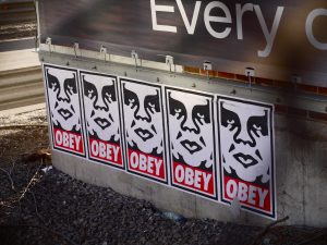
While Guevara and Korda were fighting to violently overthrow specific capitalist governments, Fairey more playfully critiques capitalist consumerism and the desires of those who strive to achieve social acceptance through buying the “right” things. As he writes, “From the beginning, Obey Giant opened my eyes to many facets of capitalism and consumer-trend psychology.” He is amused by those who would say, “I want a sticker because my rebellious friends have it,” and who thereby – like those who would buy a t-shirt of Fitpatrick’s image of Guevara without any understanding of the Cuban revolution – “reflect the complex irony of conforming to an image of rebellion to gain acceptance.”[7]
Fairey’s silkscreen print, like that produced by Fitzpatrick, is black and white, but the text style clearly borrows from Kruger, with its bold, italicized capital letters in white on red. In all of these cases, the artists are working to create images that will have strong, immediate impacts on the viewer, and they rely on very high contrast and bold, rich reds. The stylized close-up of André the Giant’s face is aggressive and slightly threatening. The cropping works very well here: since the image is cropped very closely around the figure’s face, the “giant” seems larger, as if he cannot be contained by the frame around him. This effect works well on large posters but also on the small stickers that can be found pasted on lampposts and buildings throughout the world by Fairey and his fans.
When taken with the large, glowering face of the Giant, the text reading “OBEY” becomes a command. But who or what, exactly, are we supposed to obey? Like Kruger’s aggressive texts, this command engages us directly, demanding our interaction. However, Fairey does not tell us the point. His work is more ambiguous, and therefore able to attack a broader range of economic, social, and political ideologies. Indeed, the target of his Obey Giant campaign is more about the method than the message. It is an advertising campaign without a product, a social campaign without a cause, a political campaign without a candidate. Through the intentionally absurd pairing of one face and one word, repeated again and again on images that range from 3 inch stickers to billboards, the images sum up the collective message of all advertising: “Obey!”
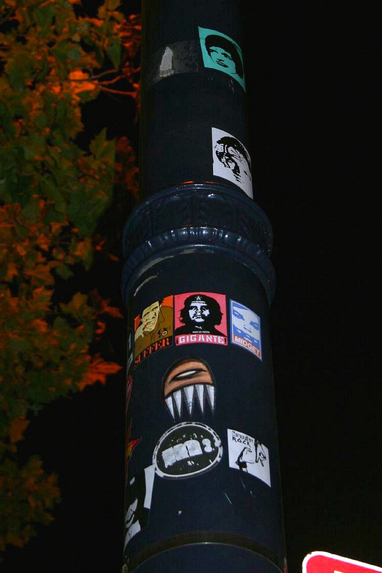
Fairey directly engages the Fitzpatrick’s iconic image of Guevara with his Gigante print. As Fairey writes:
The Che Guevara photo, taken by Alberto Korda in 1960, is probably the most clichéd image of rebellion worldwide. I stole it not so much to endorse what Che was about or what he did, but to demonstrate that symbols become easy to manipulate after they have a life beyond their real history. I see lots of kids with Che t-shirts who probably know nothing about him besides his rebel status.[8]
Fairey borrowed the red background, the pose, hair, beard and clothes, but altered the face – in place of Guevara’s passionate features, he gives us the heavier face of André the Giant. The replacement is meaningless, in that while Guevara stood for a cause, the image of the wrestler stands for nothing. Fairey is instead using it to comment on the methods by which causes are advocated. The image is also full of insider references to Fairey’s work, so that those familiar with his previous Obey Giant images can feel that they are insiders. “Gigante” is Spanish for “giant.” The small text below André’s face, “viva la posse,” refers to Fairey’s earliest Giant images, which read, “Andre the Giant has a posse,” and the star on his hat – originally a reference to Guevara’s high military rank – bears another image of the Giant, yet more stylized, which has become the logo of Fairey’s business. The image self-consciously references itself and the willfully absurd image campaign, as a whole. Just as this image is not “about” anything, it argues that the too-often reproduced and commodified image of Guevara is also, at this point, emptied of its original meaning.
Art Against Power
While Fairey has been arrested over a dozen times for distributing his works – “street art” to Fairey and his fans, “vandalism” to law enforcement agencies – the risks he has taken pale in comparison to those of artists working within authoritarian countries or protesting violent regimes. There are many dramatic examples of artists protesting the powerful and thereby placing themselves in danger. John Heartfield used photomontages – collages made out of photographs, in this case usually from popular newspapers and magazines, like the images used by Kruger – to protest the Nazi party before and during World War II. His anti-Nazi images, often published in magazines, led to his persecution by the Gestapo – the German secret police – and in 1933, he escaped capture by climbing out of his window while the police were at his door. He fled to Czechoslovakia and then to England, and continued to publish his anti-Nazi photomontages. As Kruger once used Ms. magazine to distribute her work, Heartfield frequently used the journal AIZ. In addition to his official publications, Heartfield also created anti-Nazi postcards, which he then mailed to Nazi officials.
One troubling, prophetic image, published in AIZ before the German death camps began operation, shows a large hand using a knife to spread a man onto a piece of bread (see here of image). The headline at the top reads, “Goebbles Recipe Against the Food Shortage in Germany,” and the caption at the bottom reads, “What? Your meals are lacking lard and butter? You can eat your Jews!” The satirical headline refers to Joseph Goebbels, one of Adolph Hitler’s most zealous followers, head of the Nazi propaganda efforts, and one of the chief architects of the so-called “Final Solution,” the systematic execution of Jews, Rroma (Gypsies), and others who fell outside of Hitler’s vision of a “pure race.”
Heartfield’s captions turn what might be an amusing and absurd image into a disturbing one. Through the tools of photomontage, he combines two photographs to create one new, striking composite. The vast differences in scale create much of the interest in the image. The photograph of the man, looking disheveled and alarmed, is on a dramatically smaller scale than that of the hand holding the knife. This gives the impression that the conflict is highly asymmetrical, with one side vastly more powerful than the other. With this work, and a great many more, Heartfield tried to reveal the racism and violence behind the Nazi rhetoric of nationalism.
More recently, several Chinese artists have gained prominence by challenging the authoritarian Communist Party, though the government frequently works to censor artists that officials consider too critical. Studios have been leveled and artists have been arrested and beaten, so the production of these works, even when they seem lighthearted or amusing, requires great courage. The Gao Brothers (Zhen and Qiang), for example, return over an over to images of Chairman Mao, generally off-limits for any form of criticism. As a result, they have had exhibitions closed by the police and have had to hold underground exhibitions. Their Mao’s Guilt (2010, for images see here, here, and here) stands in sharp contrast to Chairman Mao is the reddest reddest red sun in our hearts.
The Gao Brothers’ sculpture, cast in bronze and slightly over life size, has the feel of a monumental image celebrating the glory of a ruler. However, they present Mao as he never appeared in public, nor in official images: on his knees, his hand raised to his chest. The smiling, radiant face of Mao in the poster is replaced with a face drawn in on itself, wracked with sorrow and regret. The naturalism of the image is the standard for public monuments of leaders, but the usual sense of grandeur and triumph is replaced with a personal tone, as if we have caught the leader of the Great Proletarian Cultural Revolution in a private moment of remorse. This sculpture is quite controversial, and the head is removable so that, officially, it is an anonymous and therefore safe work to exhibit. The head, kept in a secret location, is only placed atop the body on occasion. Still, there must be some sense of impish joy for the brothers, each time they decapitate the image of Mao, whose policies have been estimated to be responsible for the deaths of as many as 40,000,000 people.
The Gao Brothers’ Execution of Christ (2010, for images see here and here), at times displayed with Mao’s Guilt, is similar in style and subject, but achieves its impact through slightly different imagery and references. The brothers rely here on the figure of Jesus, stripped of all clothing but a swath of fabric around his waist, to stand in for the Chinese populace, for the millions persecuted and executed under Mao’s rule. In the Gao Brothers’ viewpoint, and as suggested by the poster of Mao as the sun, the Chairman worked to set himself up as a god, to replace other religions with himself. The surreal image of six identical Maos shooting Jesus presents Mao as hostile to religion, to the defenseless, and perhaps also to the West. In Gao Zhen’s words:
When Chairman Mao stood at Tiananmen and proclaimed the Founding of the People’s Republic of China, when he proclaimed that China had stood up, it was really he who stood up while the people bowed down. It was him saying Mao Zhudu Wan Sui (long live Chairman Mao).[9]
In Execution of Christ, the seventh figure, standing behind the rest, depicts Mao as a sad old man, with the waist of his pants too high, stooped with a sense of defeat; he holds a massive rifle that looks too large for him. Like the figure in Mao’s Guilt, this figure seems to be caught in a moment of introspection and regret, though this does nothing to halt to violence occurring beside him. While the figures are bronze, the bayonets of the rifles are shining steel, a reminder that the violence was (and is) quite real. The repetition of the figures of Mao recalls the terracotta warriors of Qin Shi Huangdi. This resonance is supported by the high level of detail in the figures, and the real weapons (the bayonets) in their hands. However, while the terracotta warriors supporting the emperor are each individualized, and in the propaganda poster of Mao the differentiated masses rise to support their leader, in Execution of Christ, each soldier is merely Mao, again and again. He, the image seems to suggest, is supporting himself, first and foremost. The image also seems to place the blame for the violence of the Cultural Revolution squarely on Mao’s shoulders.
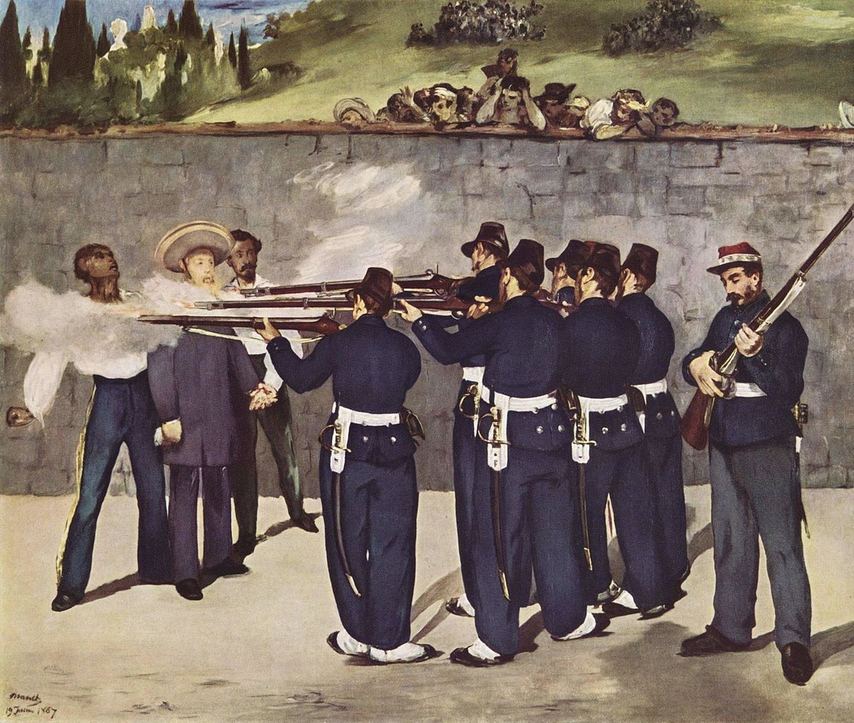
Execution of Christ references other works of art created to protest acts of state-sponsored violence. It borrows the composition of Edouard Manet’s Execution of Maximilian (1867), in turn based on the famous Third of May, 1808 (The Shootings at Mount Principio Outside Madrid) (1814) by Francisco José de Goya y Lucientes.
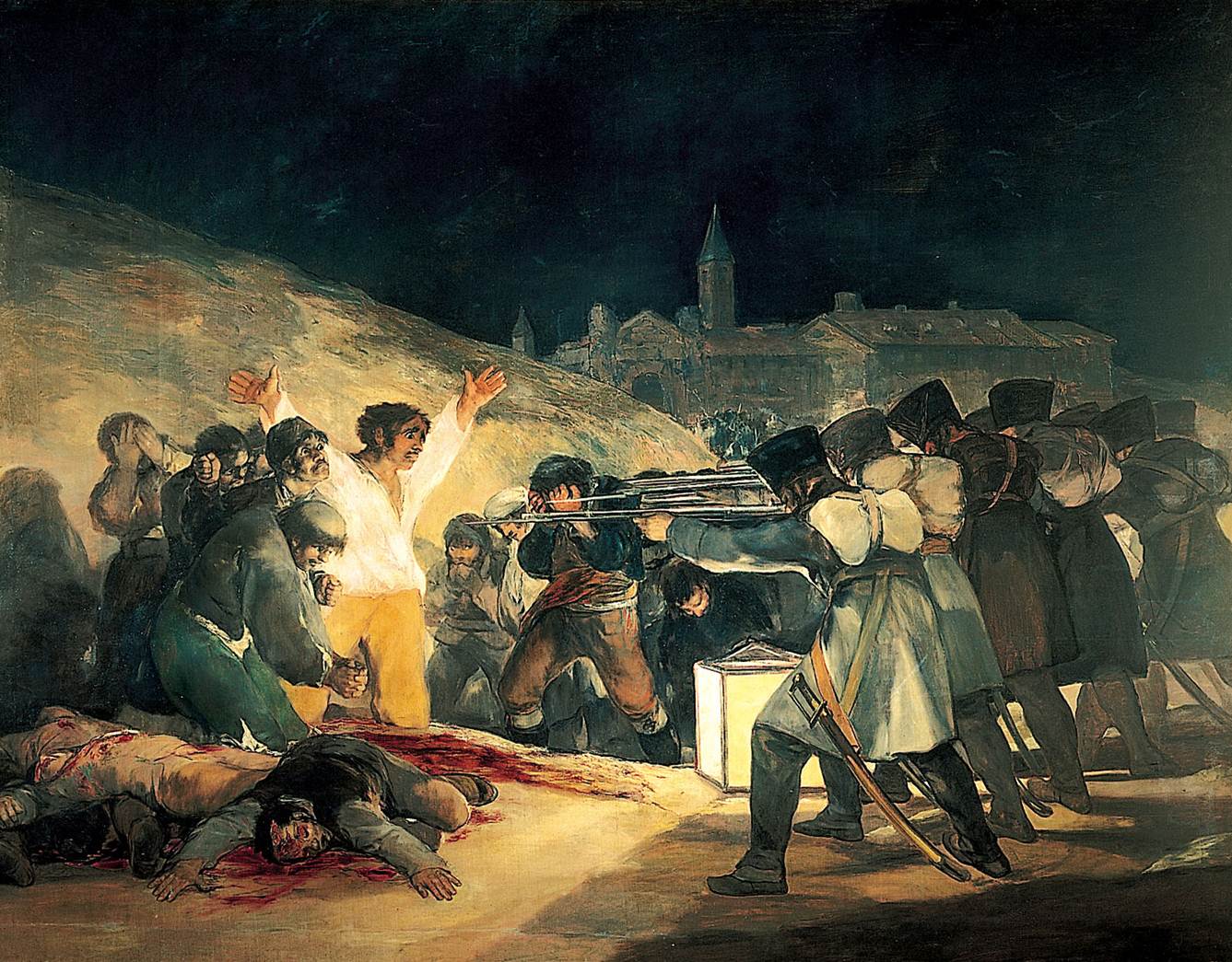
Goya’s work has been deeply influential, providing the inspiration of many works of protesting the violence used by governments to establish and maintain their power, and so it will be the final work discussed here. This work is essentially a history painting documenting an atrocity. Goya lived under the Spanish monarchy in the nineteenth century. He was one of a group of liberal intellectuals who looked to France, with its growing Enlightenment philosophy, as a beacon of hope for their future. French Emperor Napoleon (discussed above) conquered Spain and placed his brother on the throne. Liberal intellectuals like Goya were delighted, believing that this would begin an era of liberal thought, of more openness and greater freedom, but the result was instead a repressive government.
On the third of May, 1808, a rumor spread among the populous that the French were going to execute the deposed Spanish royal family. Though these were the very same rulers that had oppressed them, the populace of Madrid rose up in the streets in their defense. In return, the French army herded hundreds of people into the church shown in the background of Goya’s painting, and then in the predawn hours of the third of May, executed them one by one by firing squad. This was doubly tragic for Goya, who was horrified to see both sides of this equation – the Spanish rising up to defend their former oppressors, and the French turning out to be just as oppressive.
To the right, the soldiers are depicted all in a line, their backs to us, faceless and similarly posed, so that they seem to be a single unit, a group of automatons rather than individuals. This mechanical uniformity is enhanced by the Gao Brothers, who make the soldiers perfectly identical figures. In Goya’s painting, the focal point is the man in white. He is emphasized primarily through line and contrast. The sharp, aggressive lines formed by the soldiers’ rifles drive us toward him. He is also strikingly lit by the rectangular lantern on the ground in front of the soldiers, but he almost appears to be glowing from within. His arms are out-stretched, so that he is transformed from a victim into a martyr – a person killed for beliefs. Goya intends us to associate the figure with images of Christ, hung on the cross. Unlike the soldiers, he has a face; he is an individual. We see depicted in Goya’s emotional brush strokes, in his very lose and painterly technique, the swelling emotion in the figure, the desperation in his eyes. The viewer cannot help but identify with him instead of with the faceless automatons committing this atrocity. The Gao Brothers again are more literal: rather than a Christ-like figure, they depict Christ, himself.
What are we to make of this image of the execution of Christ by seven cloned Maos? It would at first seem like a straightforward critique of Mao and the violence he utilized to gain and maintain power, but the juxtaposition of the image of Christ, who seems (like the overall composition) to have been borrowed from a European painting, is incongruous. Finally, the transformation of Goya’s composition from painting to sculpture allows the viewer to become part of the scene in a more complete way. We can walk around it, viewing the frozen scene from the perspective of any of the figures. Goya’s work is very straightforward (if quite manipulative) in its imagery, while the Gao Brothers’ work contains a greater degree of ambiguity.
CONCLUSION
The works of art presented here strive to empower rulers, but also to challenge rulers, groups, and corporations. Some work to challenge the very means by which they assert, advertise and enforce their power. Artists on both sides – those employed by the powerful and those who are their critics – rely on both high-status materials like cast metals, and on wide distribution through non-traditional, popular channels. Mao used woodblock print posters, but so too, Kruger used Ms. Magazine, Heartfield used AIZ, Fitzpatrick used screen-printed posters, and Fairey uses posters and stickers. These mass distributions are, as in an arms race, an effort to keep pace with the volume of advertising and propaganda distributed by and for the authorities these artists challenge. Others, like Goya and the Gao Brothers, borrow the durable materials and monumental scale typical of official imagery to parody and problematize it. Perhaps the most complex of these images are those that have been used to support both sides of conflicts. Mao was a popular hero before becoming a repressive autocrat. Guevara was a revolutionary outsider before working as a political insider. Their iconic images have outlived the individuals and their causes, but continue to be used in contests of power – substantial and minor – throughout the world.
Spotlight Image III:
Hyacinthe Rigaud, Portrait of Louis XIV, France, 1701 CE
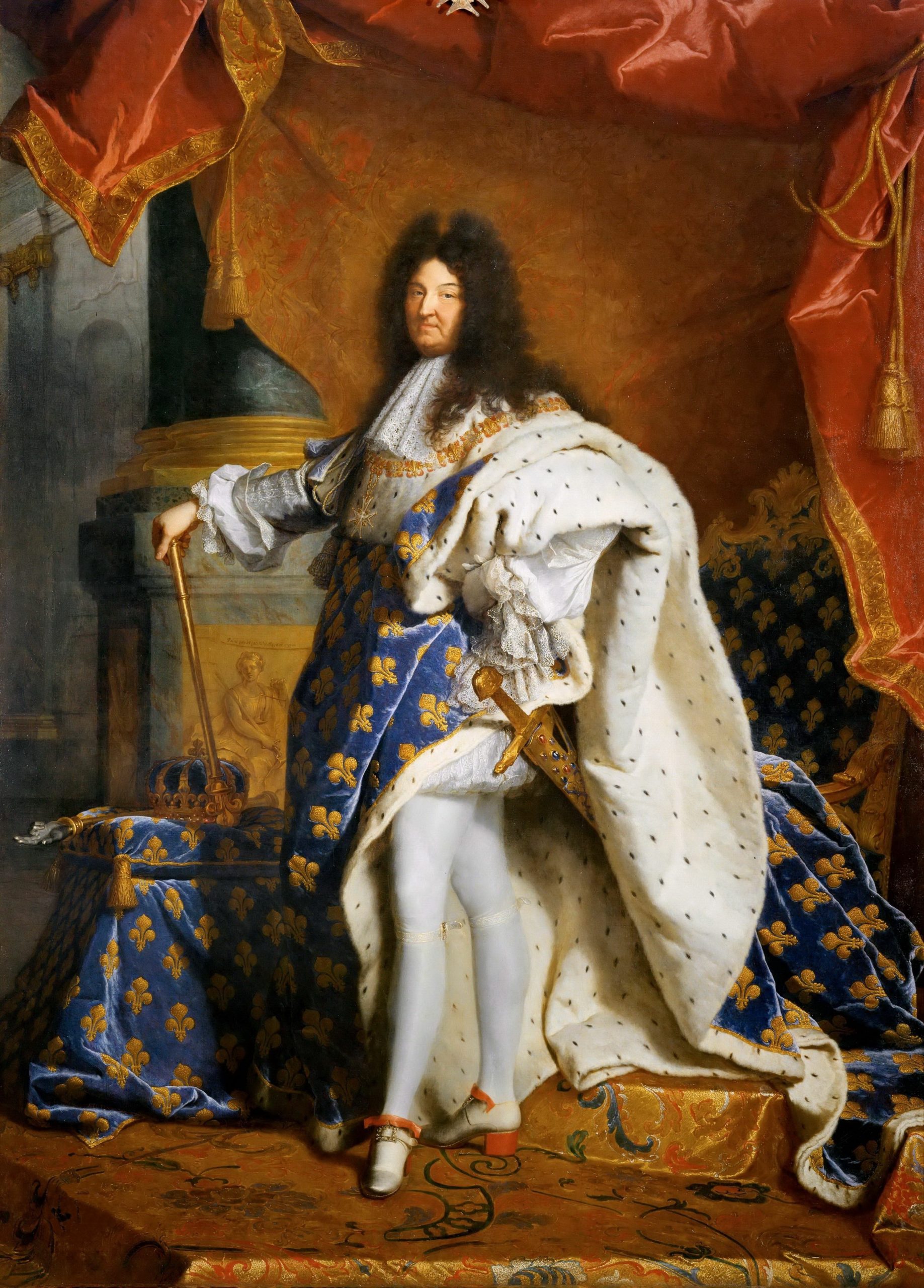
VIEWING QUESTIONS
- What does the king’s pose convey?
- How do the items around the king – his crown, scepters, sword, throne, and so on – contribute to the display of power?
- How does the horizon line impact our relation to the image of the king?
- What do the materials and the illusion of their textures add to the image?
Media Attributions
- Mausoleum of Emperor Qin Shi Huangdi (Pit 1 Overview), 246-208 B.C.E. (Xi’an, China). Photo by Dan Lundberg, CC BY-SA 2.0.
- Mausoleum of Emperor Qin Shi Huangdi (Exterior), 246-208 B.C.E. (Xi’an, China). Photo by 申威隆, CC BY-SA 3.0.
- Plan of the Mausoleum of Qin Shi Huangdis. Image: Kigsz, CC BY-SA 3.0.
- Mausoleum of Emperor Qin Shi Huangdi (Kneeling Archer), 246-208 B.C.E. (Xi’an, China). Photo by Slices of Light, CC BY-NC-ND 2.0.
- Mausoleum of Emperor Qin Shi Huangdi (Kneeling Archer Shoe), 246-208 B.C.E. (Xi’an, China). Photo by Julian Mason, CC BY 2.0.
- Mausoleum of Emperor Qin Shi Huangdi (War Chariot), 246-208 B.C.E. (Xi’an, China). Photo by tefl Search, CC BY 2.0.
- Mausoleum of Emperor Qin Shi Huangdi (War Chariot), 246-208 B.C.E. (Xi’an, China). Photo by Mary Harrsch, CC BY-NC-SA 2.0.
- Victory Stele of Naram-Sin, pink limestone, 2254-2218 B.C.E. (Musée du Louvre, Paris). Photo by Steven Zucker, CC BY-NC-SA 2.0.
- Great Pyramids of Giza, limestone, granite, basalt, brick, ca. 2575-2450 B.C.E. (Giza, Egypt). Photo: by Darren, CC BY-NC 2.0.
- Great Pyramids of Giza (Detail of stones), limestone, granite, basalt, brick, ca. 2570-2450 B.C.E. (Giza, Egypt). Photo by Jorge Láscar, CC BY 2.0.
- Plan of the Great Pyramids of Egypt. Photo by Steven Zucker, CC BY-NC-SA 2.0.
- The Great Sphinx of Giza, limestone, ca. 2500 B.C.E. (Giza, Egypt). Photo by Barcex, CC BY-SA 3.0.
- The Great Sphinx (Detail of Face), limestone, ca. 2500 B.C.E. (Giza, Egypt). Photo by Michael Lusk, CC BY-NC 2.0.
- Rattle Staff: Oba Akenzua I Standing on an Elephant (Ukhurhe), bronze, copper, iron, ca. 1725-1750 (Metropolitan Museum of Art, New York). Photo: Public Domain.
- Rattle Staff: Oba Akenzua I Standing on an Elephant (Ukhurhe) [Detail of Top], bronze, copper, iron, ca. 1725-1750 (Metropolitan Museum of Art, New York). Photo: Public Domain.
- Oba Akenzua II with Earl of Plymouth and Sir John Macpherson, Governor-General of Nigeria, 1935. Photo: Public Domain.,_Governor-General_of_Nigeria
- Jean-Auguste Dominique Ingres, Napoleon on his Imperial Throne, oil on canvas, 1806 (Musée de l’Armée, Paris). Photo by Institutnationaldhistoiredelart, CC BY 2.0.
- Jean-Auguste Dominique Ingres, Napoleon on his Imperial Throne (Detail of Staff), oil on canvas, 1806 (Musée de l’Armée, Paris). Photo by Institutnationaldhistoiredelart, CC BY 2.0.
- Gyeongbokgung Palace (Throne Room), 1395 (Seoul, South Korea). Photo by schizoform, CC BY 2.0.
- Geunjeongjeon Hall, 1395 (Gyeongbokgung Palace, Seoul). Photo by Spike, CC BY-SA 4.0.
- Photograph of Toppling of Statue of Saddam Hussein, 2003 (Firdos Square, Baghdad). Photo: Public Domain.
- Photograph of Toppling of Statue of Saddam Hussein with U.S. Flag, 2003 (Firdos Square, Baghdad). Photo by Gerard Van der Leun, CC BY-NC-ND 2.0.
- Long Live Chairman Mao, the Reddest Sun in Our Hearts, 1967 (Thomas Fisher Rare Book Library, Toronto). Photo by Thomas Fisher, CC BY 2.0.
- Alberto Korda, Guerillero Heroico (Detail of Ché Guevara), 1960. Photo by cheewai.lai, CC BY NC-ND 2.0.
- Alberto Korda, Guerillero Heroico, 1960. Photo: Public Domain.
- Jim Fitzpatrick, Che Guevara, 1968 (The Little Museum of Dublin, Dublin). Photo by Donguijote, CC BY-SA 4.0.
- Shepard Fairey, Obey Giant, 2009 (Boston, Massachusetts). Photo by Steve Garfield, CC BY-NC-SA 2.0.
- Shepard Fairey’s Gigante sticker among other stickers on a lamp post. Photo: Caffeinatrix, CC BY-NC-ND 2.0.
- Édouard Manet, The Execution of Emperor Maximilian (1868–1869). Oil on canvas, 252 × 305 cm. Kunsthalle Mannheim. Photo: The Yorck Project, Public Domain
- Francisco Goya, The Third of May 1808 in Madrid or “The Executions”, oil on canvas, 1814 (Museo del Prado, Madrid). Photo by KCC246F, CC BY-ND 2.0.
- Hyacinthe Rigaud, Louis XIV, oil on canvas, 1701 (Musée du Louvre, Paris). Photo by FDRMRZUSA, Public Domain.(by_Hyacinthe_Rigaud)_-_Louvre_Museum
- Zhang Wenli, The Qin Terracotta Army: Treasures of Lintong (London: Scala Books, 1996), 14-16. ↵
- Mao Zedong, Little Red Book, 1964, available at: http://www.marxists.org/reference/archive/mao/works/red-book/ch02.htm ↵
- Kate Linker, Love for Sale: The Words and Pictures of Barbara Kruger (New York: Harry N. Abrams, 1990), 14. ↵
- Steven Schroeder, Between Freedom and Necessity: An Essay on the Place of Value (Atlanta: Rodopi B.V., 2021), 67. ↵
- Kate Linker, Love for Sale: The Words and Pictures of Barbara Kruger (New York: Harry N. Abrams, 1990), 18. ↵
- Dwight D. Eisenhower, “The Farewell Address,” Dwight D. Eisenhower Presidential Library & Museum website (no date): https://www.eisenhowerlibrary.gov/research/online-documents/farewell-address. ↵
- Shepard Fairey, “Introduction,” in Obey Supply & Demand: The Art of Shepard Fairey, Shepard Fairey, et al (Berkeley: Ginko Press, 2006), 1. ↵
- Shepard Fairey, “Introduction,” in Obey Supply & Demand: The Art of Shepard Fairey, Shepard Fairey, et al (Berkeley: Ginko Press, 2006), 95. ↵
- Interview with Frank Marx, “Tea with the Gao Brothers: The Gao Brothers reflect on the 60th Anniversary of the PRC and the gentrification of the Factory 798 Art District,” Modern Art Asia, 2 (February 2010) <http://modernartasia.com/>. ↵
an order for a specific work of art to be main according to the desires of the patron (the person making the commission)
a person commissioning a work of art to be made and paying for it
Based on or following Confucius, highly influential Chinese philosopher, 550-479 BCE
The highest degree of naturalism
A type of scale based on relative importance, in which more important figures are represented as larger than less important figures around them
the region extending from Turkey in the east to Israel in the west, and centered on a series of civilizations that flourished in what are now Iran and Iraq from the fourth through the first millennium BCE
in the ancient world, an independent political unit consisting of a city and the agricultural land immediately around it
an upright stone marker
Horizontal bands of imagery or decoration
the empty area around a form or forms in a work of art
turned into a god
large, massive
literally, "city of the dead," a district set aside for burials
definition
Literally "picture-writing," the recognizable forms in images, often with symbolic meanings. Also used to describe the study of such images and their meanings
covered in gold
definition
The ancient past, especially ancient Egypt, Greece, and Rome
literally "wind and water" in Korean, the Korean adaptation of the Daoist Chinese concept of feng shui, an approach to the location, orientation, and design of architectural forms to facilitate the positive flow of qi [energy]
a printmaking process were a negative image is carved into a wooden block which is then inked and pressed onto a surface, usually paper, to create a positive image
definition
Placing images, texts, or other content side-by-side in order to generate comparisons and contrasts
film genre, esp. of the 1930s, 1940s, and 1950s, shot in black and white, characterized by a gritty or even harsh mood and cynical characters, often involving complex crime stories
in traditional photography, an image made from a negative, reversing the reversal of the negative so that the image matches the appearance of the original scene photographed
in traditional photography, an intermediate stage where an image is captured with colors and shades reversed. This is then reversed again to produce a positive print of the image matches the appearance of the original scene photographed
in art, based on feminist theory: a specific, gendered, sexualizing look from a straight man at a woman, conveying an imbalance of power
the performance of characteristics culturally associated with male and female sexes; increasingly acknowledged as a fluid spectrum rather than a fixed binary
produced with a printing technique in which the negative of an image transferred to a fine screen, through which ink is forced to produce positive image
cut down, often to shift or increase emphasis
Designed according to the principles of a particular style rather than being beholden to the way things look in “the real world.”
collages made out of photographs, often from popular newspapers and magazines
paintings that show grand events from history
showing brushstrokes
