8 Pleasure
Is art a pleasure? Is there pleasure in art?
Many students come to their first course on art appreciation or art history expecting to suffer, to be subjected to an endless, undifferentiated stream of dull slides. Thankfully, such expectations are often defied by the glorious and often delightful images projected throughout a semester. Art is designed for a great many purposes, as discussed throughout this book, but much art, whatever its justification, is also or exclusively designed to provide and reflect pleasure. A palace might be intended to display the power and wealth of a ruler, but is also intended to provide that ruler with a pleasurable home. A soaring and glorious religious structure may be justified as a tool to help a worshipper understand their deity, but the method to achieve this is, at least in part, pleasure. Erotic imagery, which is common throughout the world’s art forms, is explicitly about pleasure, and often depicts moments of pleasure, while it is also intended to inspire pleasure in the viewer.
Pleasure takes many forms. There are quiet pleasures, like peaceful walks along the seashore, and clamorous pleasures, like parties and carnivals. There are solitary pleasures, like reading by a fireside, and shared pleasures, like sex. There are friendly, cheerful pleasures, like a child playing with a pet dog, and there are more subversive or even self-destructive pleasures, like the use of hard drugs. Artists work to capture, convey, and provide all of these forms of pleasure. Some cultures make the pleasure of the viewer is a central concern of artists, while others see pleasure as worthy of condemnation.
This chapter first consider gardens, which are spaces designed to provide pleasing, immersive environments. While not always included in discussions of art, gardens are carefully and precisely planned based on the same sorts of concerns and formal elements that artists and architects apply to all the forms of art throughout this book. Indeed, wealthy patrons, like kings and emperors, often commission prominent artists and architects to design their gardens. Contemplative monks work on their own gardens as part of their worship. Governments and civic organizations design gardens for the public to enjoy.
The first Spotlight Image is a prominent Chinese garden. The second is a northern European image of a wild garden of pleasure that contains a critique of such enjoyments. Between these two Spotlight Images, the chapter considers a range of garden types and images of gardens. The final set of images in the chapter depicts pleasures, and critiques of them. Through all of these works, we examine the very notion of pleasure that is at the heart of so much of the world’s art.
SPOTLIGHT IMAGE I:
GARDEN OF THE UNSUCCESSFUL POLITICIAN (ZHUOZHENG YUAN), WANG XIANCHEN, MING DYNASTY, CA. 1506-1521 CE
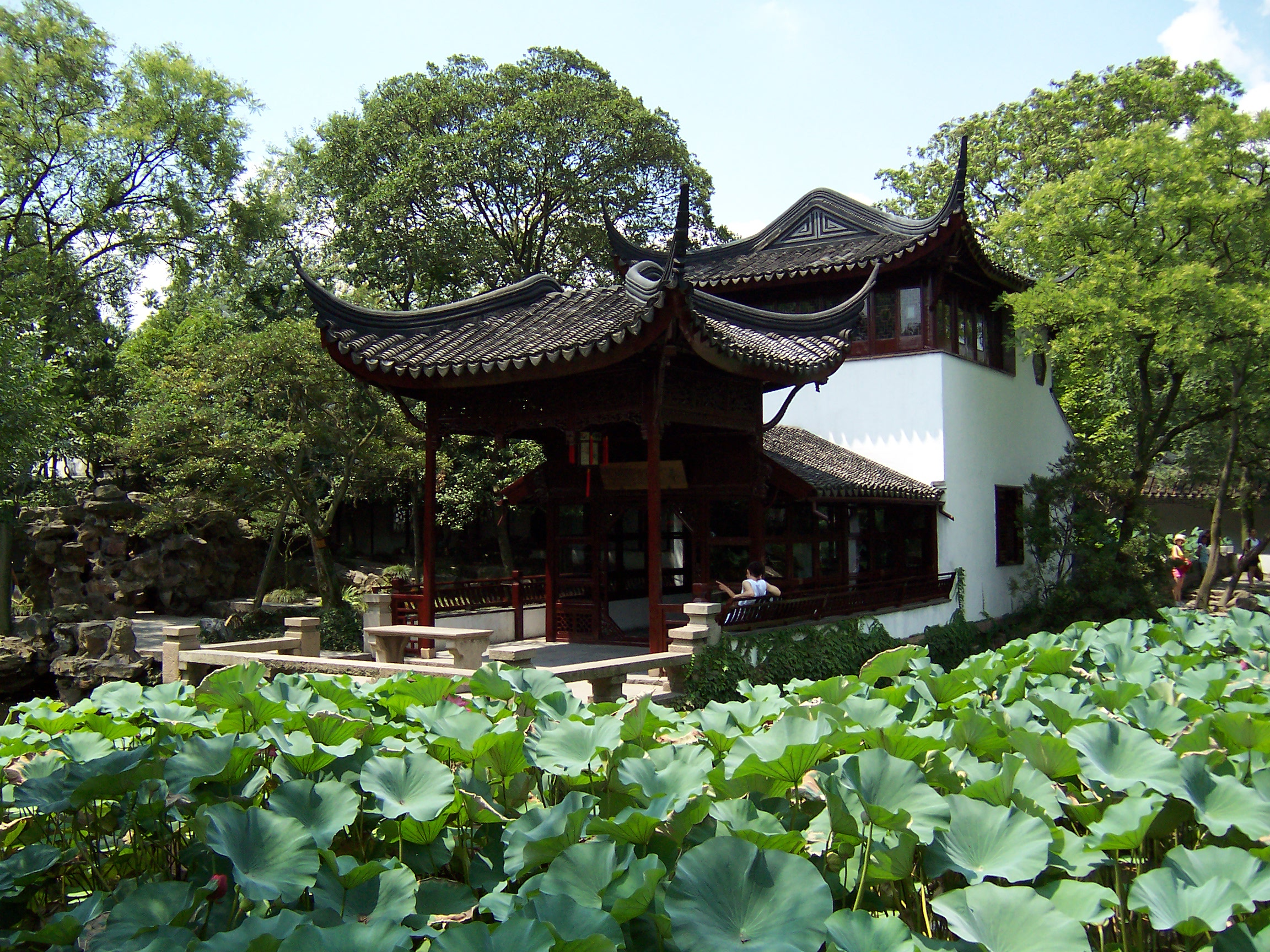
VIEWING QUESTIONS
- What sorts of lines and forms dominate the garden?
- Does the garden have symmetry or balance?
- How are the forms of rocks, waters and plants related to each other?
- How do the buildings relate to the natural elements?
- How did the designer of the garden create emphasis?
- Which is stressed, variety, unity, or both?
- Is this “nature”? If so (or if not), why?
INTRODUCTION: The Scholar’s Garden
Extensive gardens are recorded in China from the third century BCE, onward. The “scholar’s garden” is often considered the most complete expression of the Chinese garden, especially in the late Ming (1573-1644 CE) and Qing Dynasties (1616-1911 CE). These gardens maintain a delicate balance between the cultivated and the natural, seeking to convey the effect of a wild landscape through the very careful and deliberate manipulation of every one of its elements. They are, therefore, a result of ideas about nature, rather than of nature itself.
Unlike some other garden types we will see, the scholar’s garden is not organized around a geometrical pattern or idealized, totalizing plan. Instead, the viewer’s personal experience is the guiding principle. As a scholar of Chinese art writes:
[A] Chinese garden in the broadest sense is a landscape for man’s pleasure. Place a pavilion where he stops, pave a path where he roams, span a bridge where he crosses, erect a hut where he rests … and a garden is born.[1]
The scale of the garden, and all its elements, is quite human, designed to be comfortable, intriguing and pleasing at every turn.
VISUAL ELEMENTS: Restful Variety

Everywhere the eye turns, it meets craggy shapes, strange, asymmetrical heaps of rock and willfully bent plantings. The manmade ponds and sculpted streams are all irregular, organic, and meandering. Fantastic rock forms jut out here and there, like natural growths, twisting and pitted with deep recesses. One such rock rises above the viewer, so riddled with holes that we can see out through it to the plants and sky beyond. Scale is hard to judge from a distance – this might be a small stone or a massive mountain – and this is part of the play of the design, which replicates in miniature far grander landscapes, as well as popular forms of landscape painting.
The garden has no clear principle of organization, no symmetry or axial layout, for example. Instead, ponds and paths bend around one another in a seemingly haphazard manner. Still, every view was carefully considered. The goal was not to create a rigidly structured layout that might be viewed from a distance, but instead, to create a seemingly endless variety of views and vistas that can only be appreciated by a person moving through the garden, walking along its many covered pathways, resting on a stone balustrade, or sitting within an open pavilion.
The paths are as curvilinear as the natural forms around them. Even bridges, like the Winding Path under Willow Shade, bend and twist across the garden. They do not provide the quickest route between sites, but instead encourage the viewer to stroll contemplatively, to wander, to slowly gaze upon his surroundings from constantly shifting angles. Small structures are scattered throughout the garden to invite viewers to pause, to sit and take in particularly scenic views. Similarly, bridges arch to structurally unnecessary heights over small streams, providing new vantage points.
At the heart of the garden is an artificial pond, and in the middle of the pond is a constructed island, which is then in turn bisected by a stream, so there is water within land within water within land. Plants are heaped and draped over many surfaces, including even the surface of the waters, such as we see in the lotus ponds. Jutting into the pond are small structures that are little more than a raised platforms with benches and a roof. They have no walls, only thin columns at the corners, so a viewer sitting within it, perhaps taking shelter from sun or rain, can comfortably contemplate the garden arrayed around.
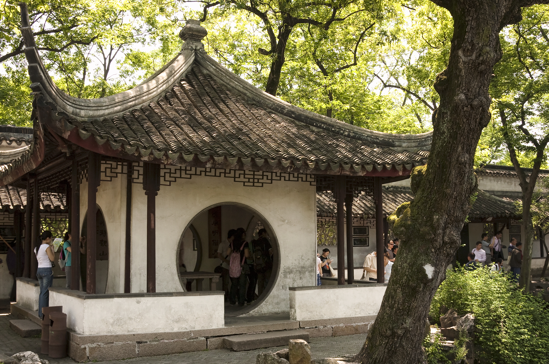
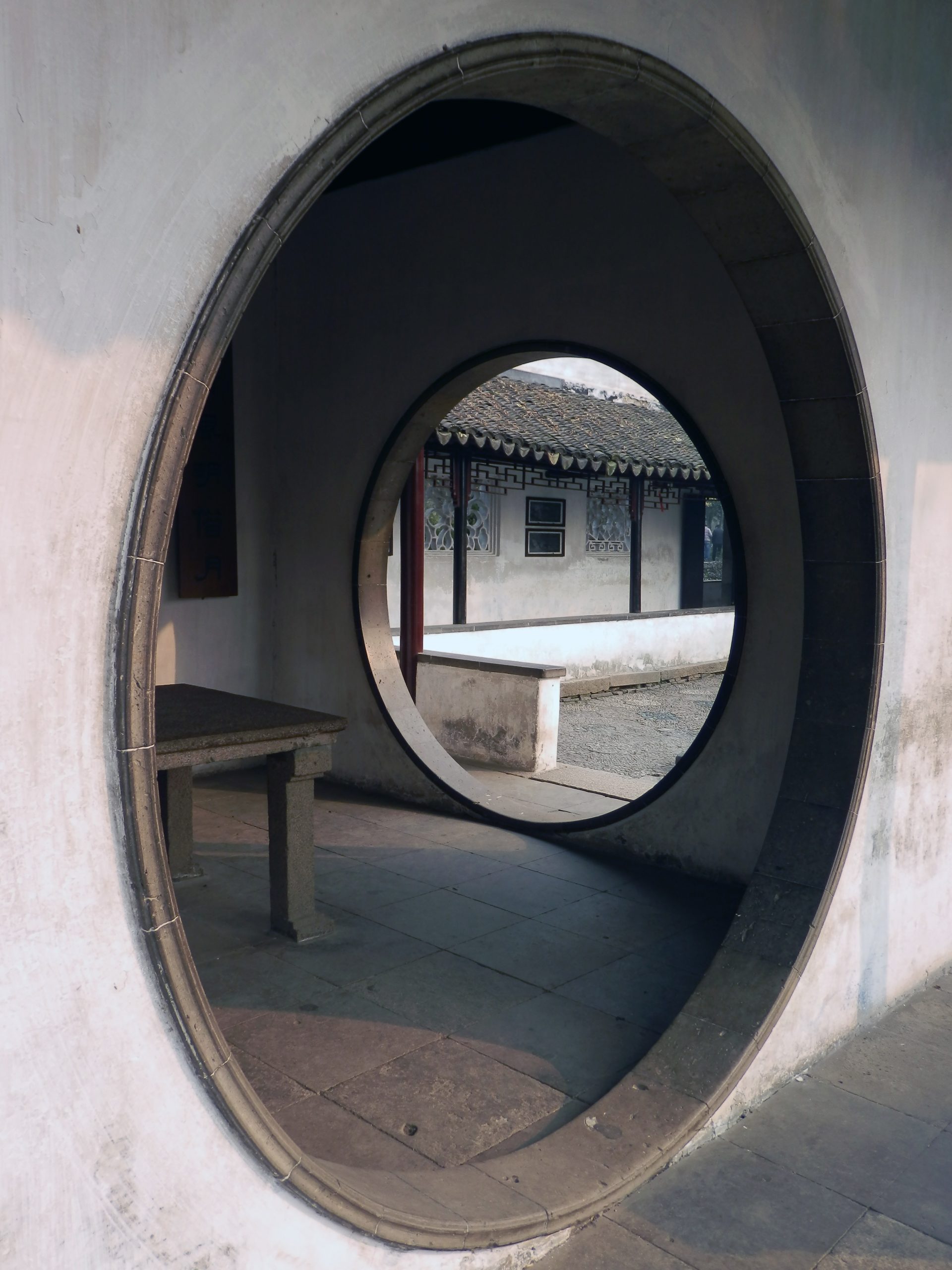
The overwhelmingly organic nature of the garden is offset by the linear and geometric structures. Garden houses, or yian qi, were seen as essential components of a garden, activating the space by implying a human presence and providing vantage points from which to view the carefully orchestrated scenery. The small but dramatic Secluded Pavilion Among Parasol and Bamboo, for example, is in essence a white cube, capped by a traditional sloping and flared roof. A great moon door – a fully circular doorway/window through which viewers can contemplate the peaceful scenery beyond – dominates each side.
These round openings call particular attention to the landscape, and emphasize the partial nature of any view of a garden. The frames of the doorways dramatically crop our views of the rocks, trees, ponds, and other structures, inviting us to focus on the fragments we can see. The effect is layered, with plants, rocks, paths, water, other buildings, open sky, and, at times, elements of the larger landscape beyond the garden’s walls.
CULTURAL CONTEXT: A Ming Dynasty Retreat
The guiding principles of classical Chinese garden design are rooted in Daoism, a Chinese religion and philosophy inspired by Laozi’s Daodejing (“Classic of the Way of Power”), which argues that there is a profound and imperceptible force, Dao, that guides and shapes the world, that keeps in balance Something (you) and Nothing (wu). The rocks of the gardens might be seen as symbols of the mountain homes of immortal Daoist sages, of tortoises carrying their islands through the seas, of rain-bringing dragons, and other important Daoist symbols. There are few fixed and certain symbols in these gardens, just as there are few obvious organizational elements. In the Ming Dynasty, a period of very powerful imperial rule that emphasized rigid hierarchies and order, the loose, organic nature of a garden was a respite for intellectuals, a place of open and free contemplation and reflection.
Daoism holds that rocks are the bones of the earth, and as such they feature very prominently in garden designs. As Tu Wan, a twelfth-century author and apparent stone collector wrote in his Catalogue of Rocks and the Forest of Clouds, “All things which are the core, the summation of heaven and earth, are linked together in the rocks.”[2] Still, waters are seen as the blood of the earth, and so are similarly important in the conception of a garden space.
The humorously named Garden of the Unsuccessful Politician was created by Wang Xianchen, a retired minor Ming Dynasty official. He was, as the title he gave his garden indicates, unsuccessful in politics, and fell out of favor with the emperor. He returned to his home village, and his retreat into a quite retirement was marked by self-deprecating humor. He named his garden after line in an essay by a much more successful official, Pan Yue, who lived during the Jin Dynasty (265-420 CE). Pan Yue mocked unsuccessful politicians by saying that they might as well live a “free and happy existence,” and grow vegetables. Wang Xianchen quoted this passage in explaining his desire to build his garden:
It is my wish for fleeing happiness to build a house and plant trees and to lead a free and happy existence of idleness; let there be a pond to fish from … let me water the garden and sell the vegetables in order to provide for my daily meals, let me tend the sheep and sell the milk in order to pay the expenses in hot summer and cold winter … that is how a humble person administers his domain.[3]
This passage is an expression of humility, but also celebrates the virtues of simple country life over the power-hungry politics of the capital. The site Wang Xianchen chose for his garden had originally been a temple, and he preserved the peaceful tone in his private garden. It was renovated and expanded several times in the following centuries, but the core elements largely reflect the original intent.
Gardens were the subject of paintings, poems and books, including accounts like “The Garden that is Not Around” by the Ming hermit Liu Yuhua, which describe fantasy gardens at great length. Gardens particularly influenced Chinese landscape paintings, while landscape paintings in turn influenced garden design.
Many Chinese painters of the Ming Dynasty generated images bursting with similar forms, though often on a grander scale. While a garden might have an interesting and irregular rock as a central feature of contemplation, a landscape painting might feature a mountain. The scale is radically different, but the effect is largely the same, and the figures of poets and philosophers that populate such images serve as models for the viewer, encouraging them toward contemplative reflection.
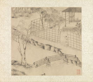
Artists also celebrated gardens in their paintings. Wen Zhengming, an important painter, scholar, and calligrapher, left Beijing to live in Suzhou, and had a studio in the Garden of the Unsuccessful Politician. The full work is a long series of poems about and paintings of the garden. In this detail, we see many of the important elements of the garden, including a stream with rocky banks, a gently bending bridge, carefully arranged clusters of trees, open fences, and an inviting pavilion. We also see a figure in the landscape, standing beneath the arched doorway of the fence, seeming to gaze into the distance. Wen may have helped to design the Garden of the Unsuccessful Politician and certainly appreciated it, as his detailed scroll focuses on its many nooks and bends, though it has since been altered so many times that it is generally not possible to locate the particular sites that he painted in the present garden.
The gardens were, of course, not only visual. The first building a visitor enters in the Garden of the Unsuccessful Politician is the Hall of Drifting Fragrance, located next to a lotus pond and filled with the delicate sent of the blossoms. Wen wrote this poem on his painting”
The Bank of Many Fragrances
Various kinds of flowers are planted next to the thatched hall,
Purple luxuriance and red beauty in random array;
The spring radiance and brilliance embroiders them with a thousand artifices,
In the good air and scented mist a hundred fragrances mix.
I love the smells that fill my bosom and sleeves,
I do not let the wind and dew wet my clothes,
My thoughts fly high beyond the flowery world.
Quietly, I watch the bees dance up and down.[4]
There is also a Listening to the Rain Pavilion, inviting the visitor to consider the sounds of the garden, which would be a mix of the burbling of the streams, rustling of wind through leaves, birdcalls and, of course at times, rain falling on rooftops, pathways, trees, and ponds. All senses are engaged in the pursuit of calm, reflective pleasure.
Comparisons and Connections I: Gardens and Garden Paintings
The Garden of the Unsuccessful Politician is a space carefully constructed to provide pleasure upon pleasure for its owner, and for any guests he might choose to invite into its winding paths. It memorialization by a leading painter of the period indicates its success. Each vantage point was considered, each perspective carefully orchestrated to achieve the most beauty. Many other cultures also created gardens as spaces of pleasure. Indeed, the modern English word “paradise” is based on an ancient Avestan word for “garden.” Each culture designs its gardens in its own fashion, reflecting different notions of beauty and different concepts of pleasure. This section begins with a consideration of very noteworthy gardens in medieval Japan, twentieth-century England, and seventeenth-century France. It then considers images of gardens, designed to reflect the pleasure actual gardens inspire.
Idealized Nature
As many choices need to be made in the layout of a garden as in the design of any complex work of art or architecture, and each one reflects the values and goals of its designer. Many Japanese gardens bear strong influence from Chinese gardens, but one form is particularly characteristic of Japan, the kare-sansui – the dry garden – that was fully developed in the Muromachi period (1333–1568). Elements of the dry garden can be found in Japanese culture dating back over a thousand years earlier, but it was in the Muromachi period that the form came into its own. Kare-sansui can be literally translated as “withered mountain-water,” and the closely related kare-sensui as “dried-up mountain-waterscape.”[5] These gardens, influenced by Zen Buddhism imported from China, are “gardens” only in a loose sense, as some contain little or no greenery.
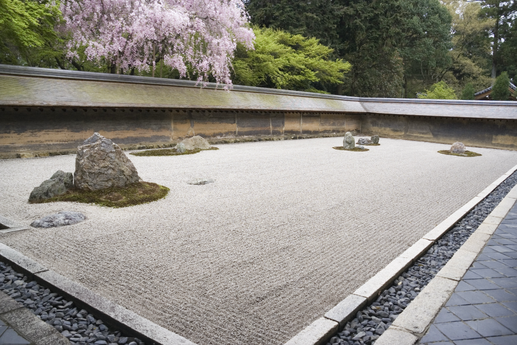
The most famous dry garden is Ryoan-ji, the “Temple of the Peaceful Dragon,” in northwest Tokyo. The current garden was established in 1488 by Hosokawa Masamoto, a powerful clan leader, after an earlier temple on the site burned down, though it is unknown who actually designed it. The design is startlingly simple. Like the Chinese scholar’s gardens, there is a focus on dramatic rocks, but just about every other element has been removed. The result is stark and open, with far more negative space than positive: the garden, enclosed by a rectangle of walls and with a viewing platform along two sides, consists of fifteen rocks, arranged into three clusters. These rocks, like those chosen for the Garden of the Unsuccessful Politician, are individualized, craggy, irregular masses of stone. It seems that originally visitors were able to walk through the garden, treading on the gravel around the rocks, though now they are restricted to the platform.
The rocks float like islands in a sea of gravel. Like the elements of a Chinese scholar’s garden, the rocks are not arranged with symmetry but still possess a very careful balance between close and far, large and small, and few and many. Many symbolic readings have been offered of the rocks – they are a constellation of stars, islands of the ocean, even a group of tiger cubs swimming – but the bare simplicity of the garden seems to push back against such readings. The moss clinging to their bases is the only plant life in the garden. The dominant element, here, is open space, which is appropriate for a Zen monastery. The garden was designed to provide a site for contemplation, in the hope that the viewer might, though such contemplation, achieve enlightenment. While the garden at Ryoan-ji is not lush or lavish, its quite, gentle balance provides a peaceful environment in which the Buddhist devotee can strive toward freedom from suffering.
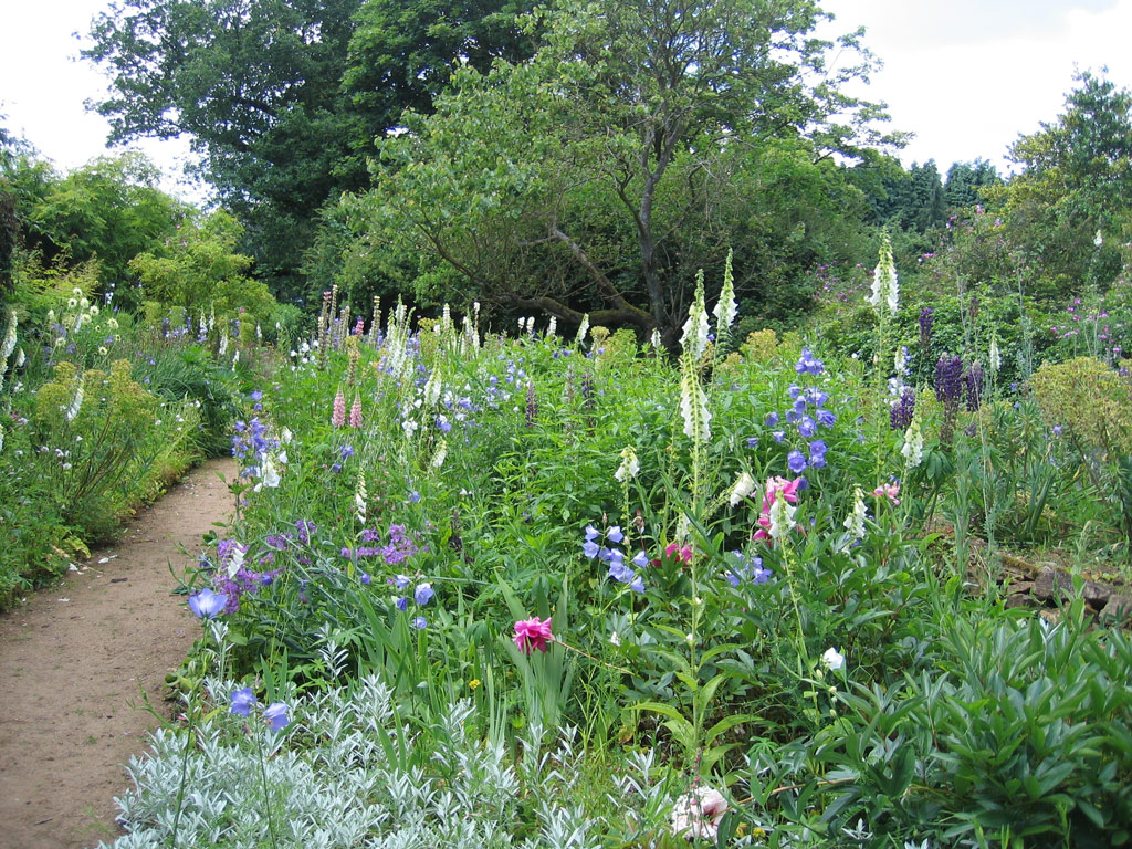
Traveling to England, we find a rather different approach. The typical aesthetic of the English country garden is bountiful chaos. At Munstead Wood, the home of Gertrude Jekyll, we see great heaps of wildflowers, not quite wild but not arranged in any rigid or overly clear way, either. Jekyll, “the grand old lady of English gardening”[6] is considered to be the strongest influence on the development of the English country garden. She grew up in the small, picturesque village of Bramley, with aspirations to be a painter, and she practiced a remarkable array of arts, from metalwork and carpentry to embroidery and wallpaper design, before ultimately focusing her efforts on gardens. All her earlier explorations of the arts were part of her development as a gardener, and she considered her gardens to be works of visual art, writing to an artist friend that she was “doing some rigorous landscape gardening … doing living pictures with land and trees and flowers.”[7]
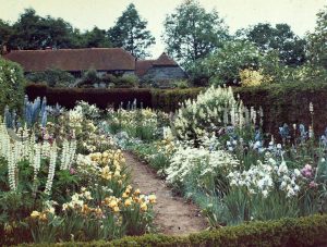
Remarkably, some autochromes – early color photographs – survive from 1912, providing us with a sense not only of the design and layout of her garden, but also the rich use of colors that made her famous. Rather than organizing her gardens into neat bands of carefully trimmed and manicured plants, Jekyll cultivated a carefully controlled chaos, a riot of wildflowers loosely grouped into bands and borders by color and height.
The overall effect seems, at first glance – like that of the Garden of the Unsuccessful Politician and Ryoan-ji – to be casually arranged, tossed together, but in all of these gardens, the effect was the result of great care. Indeed, Jekyll completed the plan for her garden before she even began to plan the house around which it was arranged. The garden and the eventual home at its center were carefully integrated, such that the house provided pleasing views of the garden, and the gardens provided pleasing views of the house. As Jekyll wrote, “My own little new-built house is so restful, so satisfying [and] so kindly sympathetic.”[8] The overall goal, then, was to provide the occupant and her guests with comfort and pleasure at every turn.
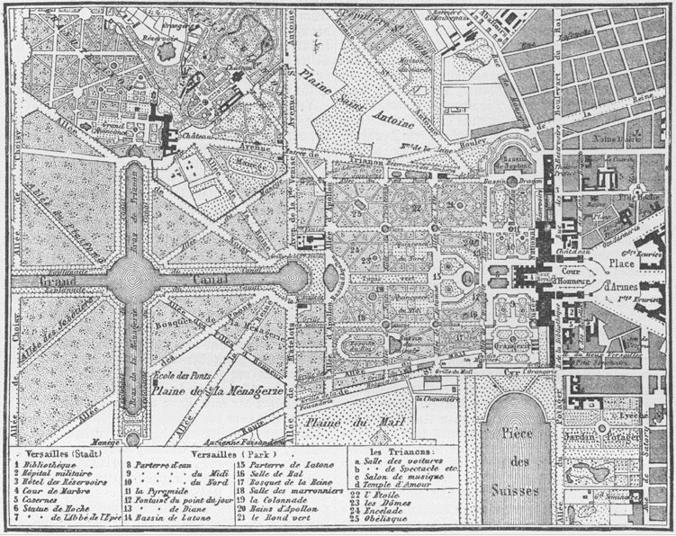
The gardens of eighteenth-century France, in contrast, are among the most rigid and powerful styles. At the massive Palace of Versailles, the garden became another expression of the might of the king. Its plan encapsulates its principles of design. Unlike the Chinese scholar’s garden, the Japanese dry garden, and the English country garden, the French royal garden is both axial and symmetrical. Indeed, the plan contains a series of symmetrical arrangements of symmetrical elements.
The main section of the gardens behind the palace (just right of the center of the plan), for example, consists of a nearly square grid of squares, each of which in turn is divided by paths and hedges and planting beds into complex but predominately symmetrical designs. These squares are all arrayed around the large path that defines the central access and leads to the large reflecting pool.
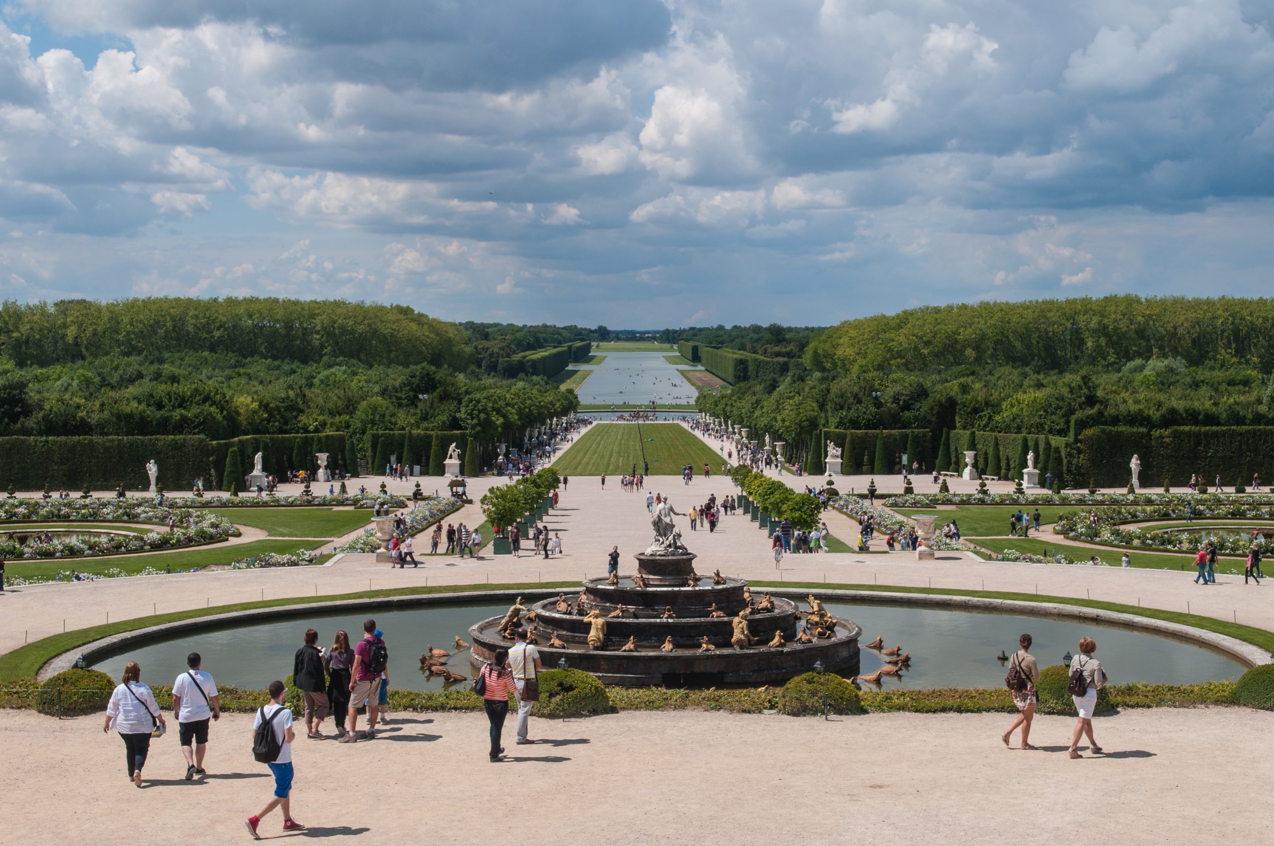
While, unlike the garden at Ryoan-ji, plant life is everywhere we turn, nature itself seems to have been brought under the absolute control of the king. In the English garden, like the Chinese scholar’s garden, the design gives the impression that nature has simply been allowed to run its course – though this is a carefully constructed illusion. At Versailles, not only are the plants laid out in geometric patterns. Even the plants, themselves, are not permitted to take their natural, irregular shapes, but are instead shaped into geometrical forms – cones, rectangles, and spheres. The overall effect is pleasurable – stunning, beautiful and impressive – but also formal and stiff.
The gardens were commissioned in 1661 by Louis XIV, known as the Sun King, a so-called absolute monarch – that is, a king with total power within his kingdom. His palace and gardens at Versailles were an expression and extension of his power. The gardens took decades to complete, thorough the collaboration of several designers, including André Le Nôtre, who was their primary designer, Jean-Baptiste Colbert, Superintendent of the King’s Buildings, Charles Le Brun, First Painter of the King, and Jules Hardouin-Mansart, an architect. The king himself was also highly involved in the creation of the gardens, keeping an eye on all aspects of their design. In addition, an army of men, or at least, regiments of the French army, were employed to bring in plants from all over France.
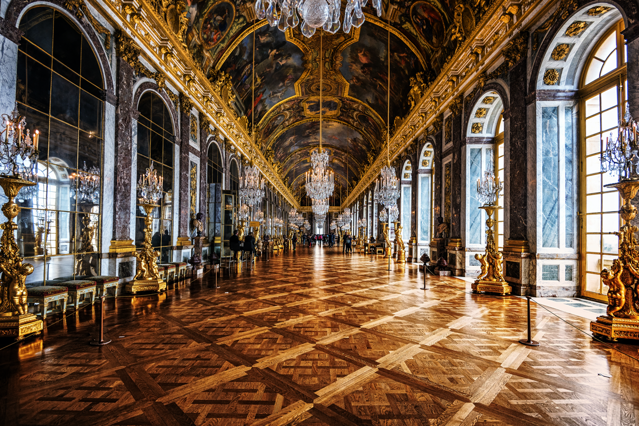
The king considered his gardens not only as important as the palace, but as an important part of the palace. Interior and exterior spaces were connected by large windows, and also by carefully designed plays of light and shadow. The large reflecting pools, for example, are aligned to reflect the sun up and into the long Grande Galerie, or Hall of Mirrors, where it would be reflected and refracted in the 357 mirrors that line the wall opposite the row of windows overlooking the gardens. The sunlight, sparkling on the surfaces of the pools and fountains, and twinkling along the Hall’s mirrors, would embody the power and grandeur of Louis the Sun King. They would also, though, provide pleasure for the king and his court. Indeed, the two are tied together. The ability of the king to command the creation of such a sublimely pleasurable space was a demonstration of his absolute power.
Representing Spaces of Pleasure

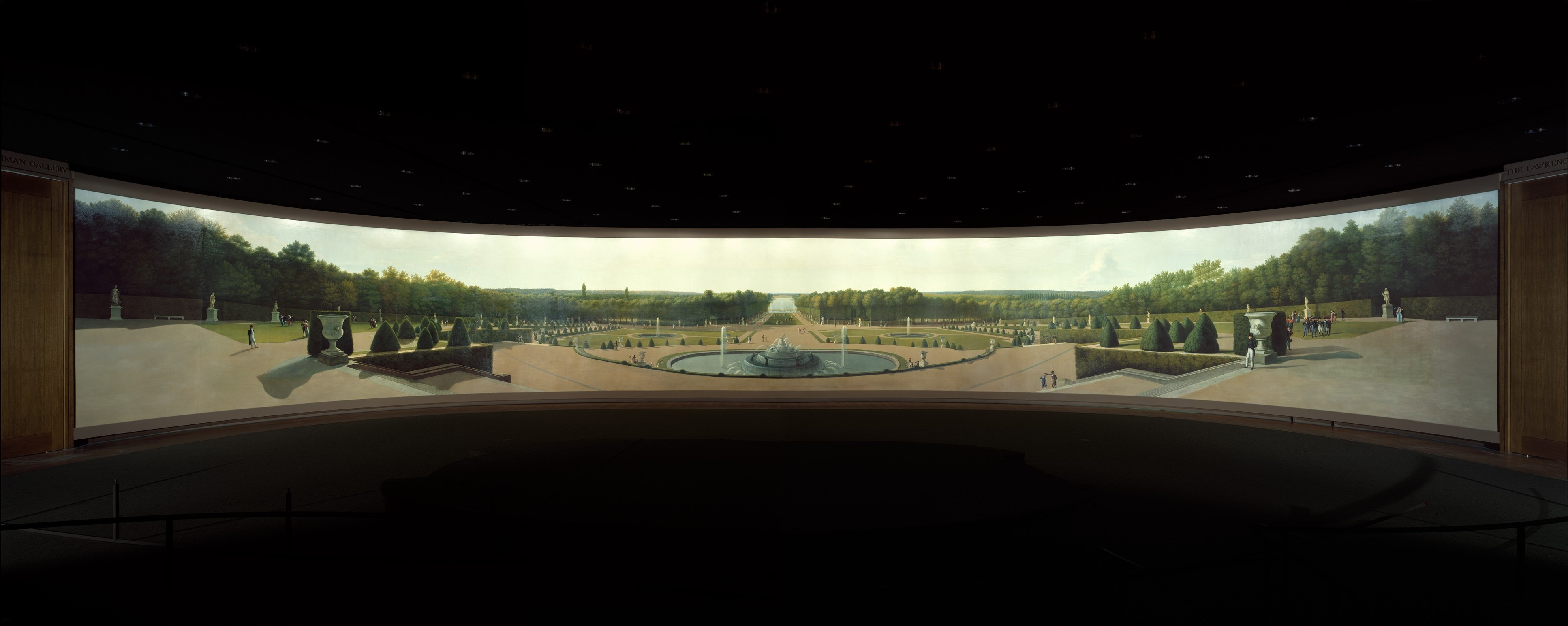
The previous section considered actual spaces of pleasure. This section will consider representations of such spaces, starting with John Vanderlyn’s Panoramic View of the Palace and Gardens of Versailles (1818-1819). This giant painting is one of only a few to have survived from an American fad for panoramas in the late-eighteenth and early-nineteenth centuries. The panorama bends into a circle 12 feet tall and 165 feet long and was originally displayed in a round building. Now housed in a round gallery in the Metropolitan Museum of Art in New York, it remains an immersive environment. Such panoramas provided a sort of virtual travel in a period when only the very wealthy might travel from the U.S. to France. For a small fee, visitors could enter the darkened room containing the Panoramic View of the Palace and Gardens of Versailles and imagine that they were at the grand palace of Louie XIV, something like when we now view 360° tours and virtual reality tours of distant sites.
When viewed as if a flat painting, the image is stretched and distorted, but when viewed in a 360° space, the illusion is startlingly good. The horizon line is set to roughly the eye level of an expected viewer, which means that when we look out toward the horizon, we seem to be standing naturally in the landscape. As we focus on any detail of the image, we see out of the corners of our eyes more and more of the scene. The effect was, in essence, the nineteenth-century equivalent of our Imax screens – the largest, grandest and most impressive false image available. It was a spectacle designed to make visitors gape and gasp with pleasure.
The layout of the landscape painting emphasizes the formal layout of the garden, the geometrical, symmetrical organization. By placing the viewer precisely at the center of the main axis, aligning the viewer’s eyes with the pinnacle of the fountain, Vanderlyn calls attention to the careful design of the gardens, but also elevates the visitor. By placing his virtual tourists – not able to travel to Versailles but able to afford the admission to the panorama – at the center of the gardens, Vanderlyn allows the viewer to momentarily feel not merely like a tourist, but to enjoy the pleasure of the fleeting fantasy of being the French king, himself, or at least a member of his royal court.
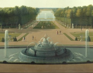
The centerpiece of the image features a vast vista, punctuated with water. First, we see a giant fountain, cascading downward like the tiers of a wedding cake. Then, there is an open gravel path, a grassy sward, another fountain, a reflecting pool so large as to appear to be a lake, and beyond, more grass and trees. Turning to the left or right, we can see the steps that lead downward, inviting us to imagine walking down to the next plateau, joining the well-dressed couples populating the scene – men with cravats and women with parasols – and onward, out toward the horizon.
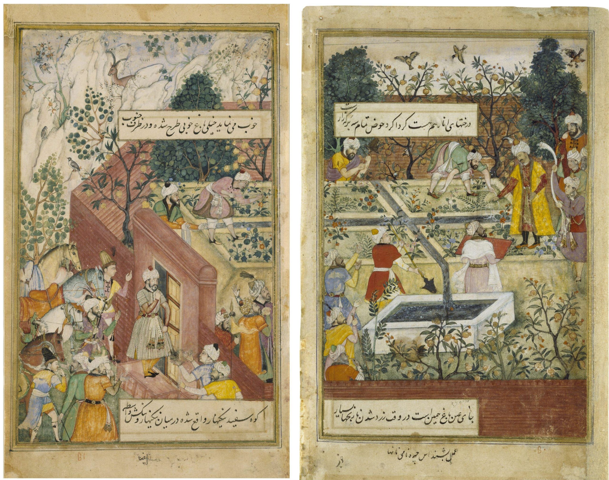
The Baburnama, the personal memoirs of Babur, founder of the South Asian Mughal Empire (ruled 1526-30 CE), contains a grand image of the process of laying out the Bagh-i-Wafa (Garden of Fidelity), the first garden that Babur commissioned. This copy of the Baburnama was created for Babur’s grandson, Emperor Akbar. Babur was very interested in gardens, and focused his artistic patronage on their creation. He was particularly fond of the chār-bāgh – a garden divided into four quadrants by water.
After conquering Kabul (in modern-day Afghanistan), Babur built numerous gardens there, as well as throughout his territory, which included much of what is now India. These gardens were not only pleasurable; they were built to house pleasurable activities, including parties, dinners, and poetry readings. In an image of the planting of the garden, we see Babur at the far right, clothed in flowing yellow robes and a white turban, personally overseeing its planting. In front of him, just behind a water basin, the architect holds up the grid plan for the garden. This suggests the highly organized and rational nature of the garden, echoed in the raised planting beds before him. The architect turns to look at Babur, who seems to be taking a personal interest in the plantings at his feet.
Outside of the walls of the garden, the natural landscape provides strong contrast. In the upper left, in the background, are a series of craggy mountains, inhabited by animals. Scraggly trees rise out of the barren rock, whereas within the garden, trees hang heavy with yellow fruits that echo the robes of Babur, suggesting that his wealth and bounty is the source of the garden’s fertility.
Babur wrote critically of the disordered landscape of the region, and his formal gardens may have been a response to this perceived chaos. In place of asymmetry and organic shapes, his garden is depicted as a symmetrical arrangement of rectangular planting beds.
In an image of Babur from another manuscript (see here for image), we see the great founding emperor in one of his gardens. Babur reclines beneath a tree, seated on an ornate carpet laid with dishes. He is fanned by one servant and offered more refreshment by others. Musicians play and dancers twirl around a fountain. Filling all available space between the figures are the plants of the garden. This is a beautiful and lavish image, dominated by rich, saturated colors, evoking the pleasurable paradise of the gardens.
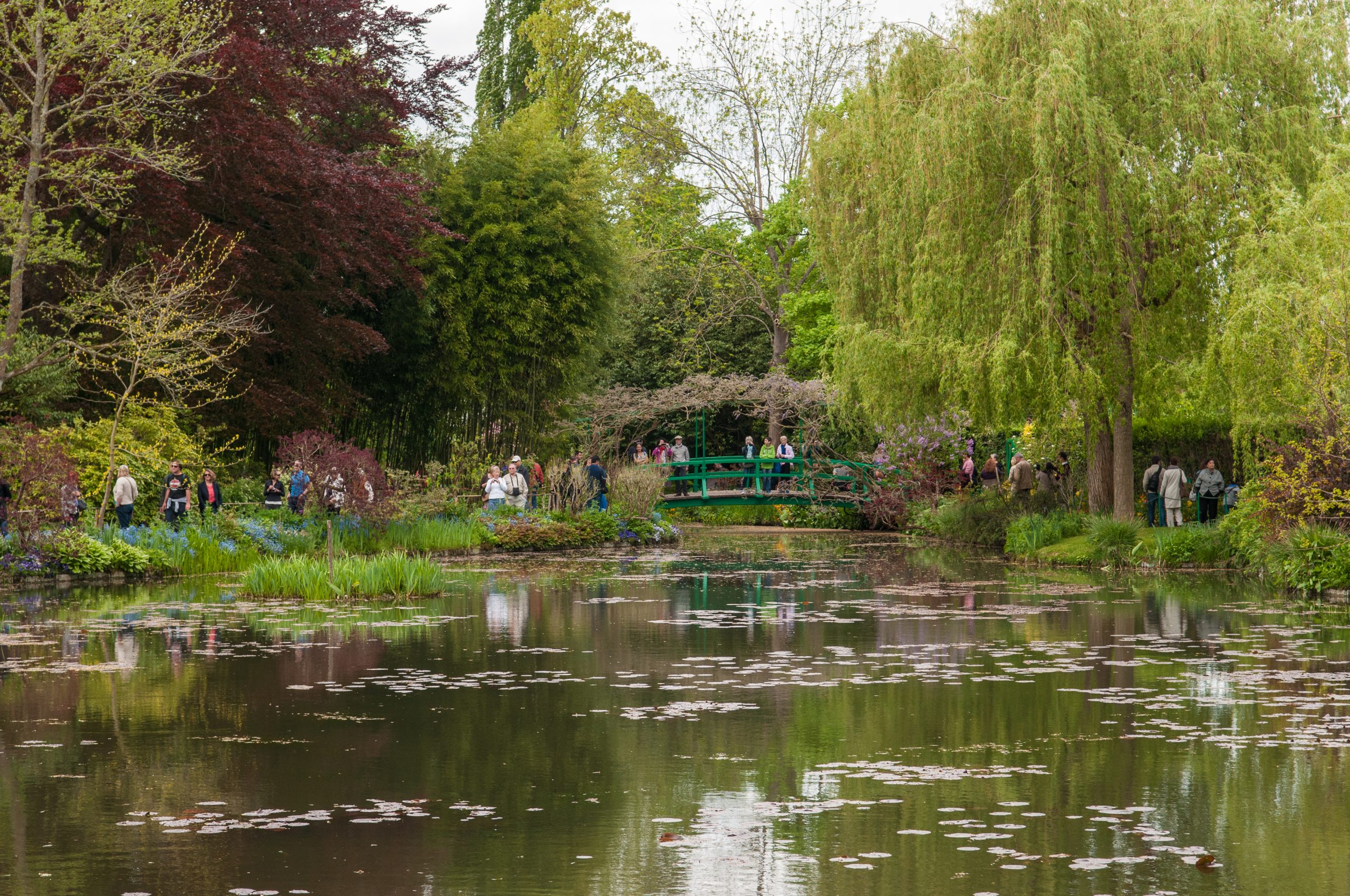
In Claude Monet’s famous gardens at Giverny, in northern France, many of the threads of this discussion come together. This garden was in part inspired by Japanese gardens (in turn inspired by Chinese gardens), and was designed not only to provide pleasure but also to serve as the basis for Monet’s own paintings. Monet was a collector of Japanese prints, and from them learned to favor the asymmetry of Asian gardens over the symmetry of traditional French gardens, like those at Versailles. In a particularly picturesque section of the garden, he constructed an arching bridge like those found in Chinese and Japanese gardens, over a pond filled with water lilies. The pond is surrounded by heavy plantings, weeping willows that hang low over the water, Japanese maples with rich red leaves, and other plants. The waters are, in season, filled with the water lilies that Monet loved to paint.
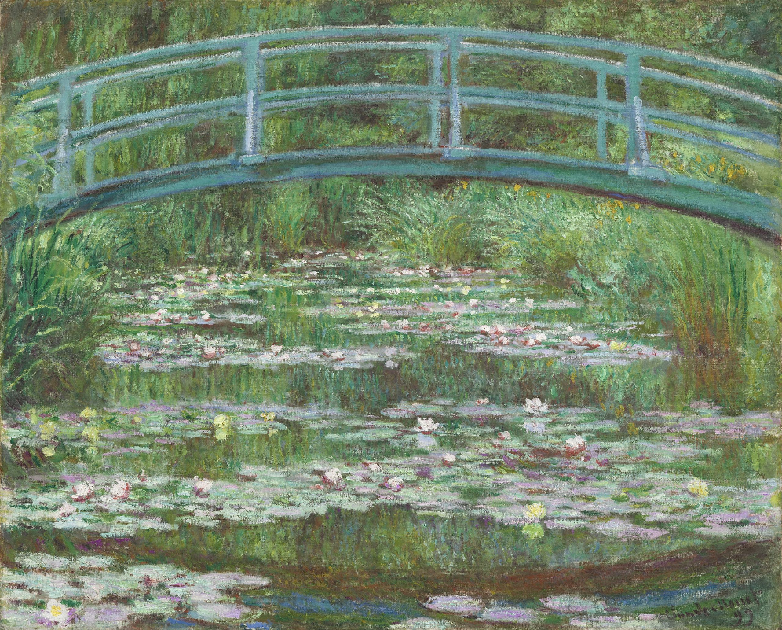
Turning to Monet’s Water Lilies and Japanese Bridge (1896-1899), we see nearly the same view as in the modern photograph of his garden. The scene is familiar, though the arch of the bridge is slightly exaggerated for effect. The colors are pastel, bright and cheerful. The light – which is a major focus of Monet’s work – is strong, as if it is a sunny summer day conveyed by bright whitish highlights throughout. The brushwork is very loose, with each stroke visible on the surface of the canvas. The result is not a precise botanical illustration, but rather, a gentle image that conveys the pleasant atmosphere of the garden.
Though the gardens themselves are asymmetrical, Monet follows European painting conventions by framing the bridge in such a way as to create a symmetrical image, enlivened by small differences in the plants around the bridge, and in the shadows that fall more heavily on the right side of the image than on the left. The symmetry helps the desired effect: everything in the garden, and in the painting of it, speaks of calm, restful beauty. Monet’s paintings of his garden at Giverny are among the most popular works of art in the world, frequently reproduced as posters that are common in college dorm rooms. Similarly, the gardens themselves attract over half a million tourists a year, drawn by the beautiful views, and by their experience of them through Monet’s paintings.
SPOTLIGHT IMAGE II:
HIERONYMUS BOSCH, THE GARDEN OF EARTHLY DELIGHT, 1500-1505
VIEWING QUESTIONS
- How is the image organized?
- What colors dominate three panels of the triptych?
- What is the focal point of the image, and why choose that scene?
- How does the horizon line function?
- What is the role of scale?
- How does Bosch encourage the viewer to look closely at his painting?
- How does Bosch incorporate time into his painting?
- What is the message of the triptych?
INTRODUCTION: A Pleasure Garden?
We again begin with a garden. However, this garden is so vast and rich as to enclose within it many forms of pleasure not generally associated with pleasant strolls in gardens. Hieronymus Bosch is a painter of the Northern Renaissance – the fifteenth and sixteenth century in Northern Europe, centered on cultural centers in Flanders and the Lowlands, now Belgium, Holland, Luxemburg, and Northern France.
Bosch was born into a family of painters who had emigrated to the Netherlands. His family name was van Aken, as his family had come from Aachen, Germany, but he instead used an abbreviated form of the name of the Dutch town where he was born, and where his seems to have lived throughout his life, ’s-Hertogenbosch. He married a wealthy woman twenty-five years older than he was, and lived in her large estate. He was among the wealthiest residents of ’s-Hertogenbosch, and did not need any income from his painting. This may explain his usual subjects – since he did not have to sell paintings to live, he did not have to meet the desires of patrons. While Bosch has been the subject of wild speculations – he has been called a cult member, a free-love advocate, a student of magic, alchemy, or witchcraft, and on – it seems far more likely that he was a serious and even sour member of the religious orthodoxy. While his methods for encouraging moral behavior were somewhat unusual, his stance on morality and on the evils of pleasure, were well within the mainstream.
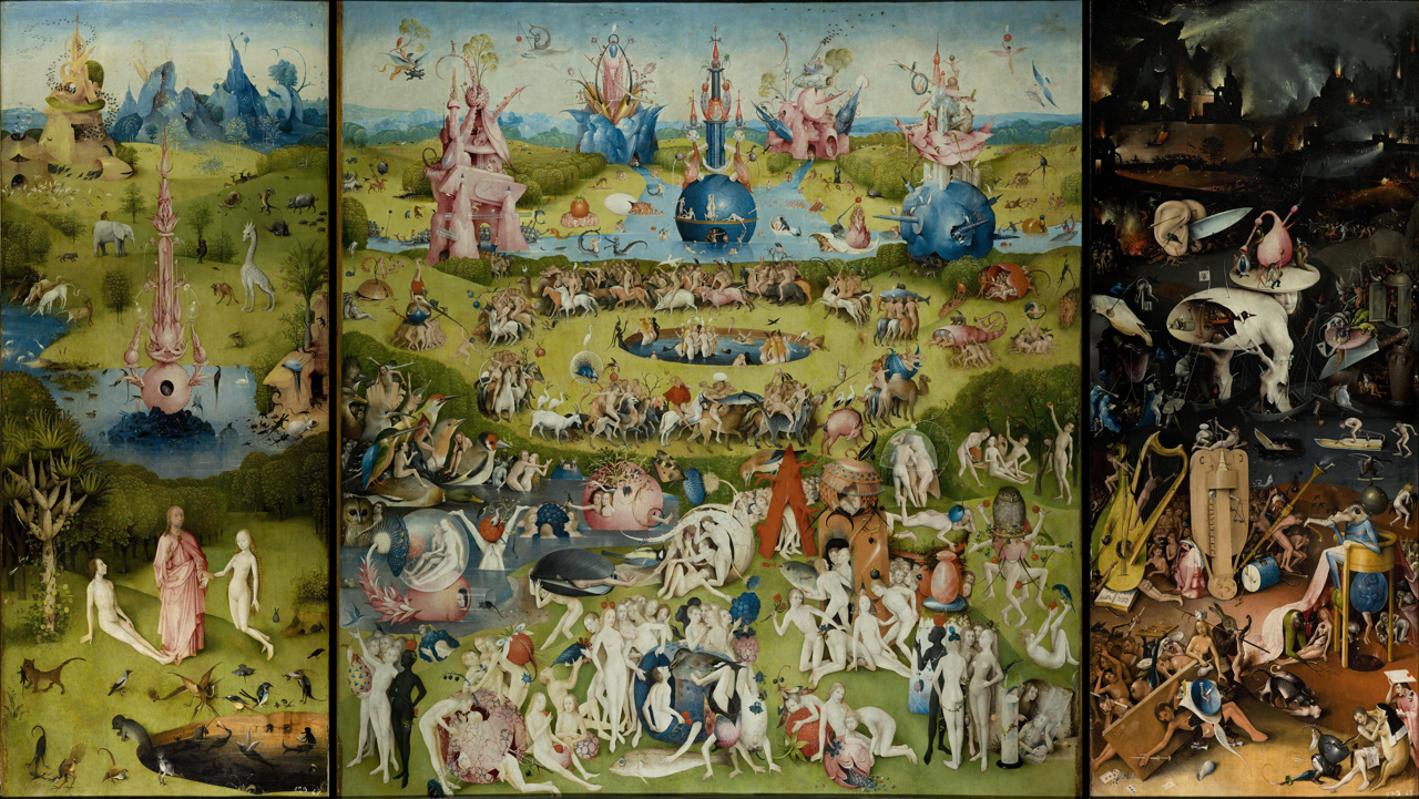
The Garden of Earthy Delights is Bosch’s most famous work, and justly so (see here for a very high resolution image). It is massive, riddled with an almost impossible-seeming level of detail, all painted in luminous colors. The work is a triptych – a painting with three panels, hinged together so that the outer panels, or wings, can be closed over the central panel. The left wing presents the Garden of Eden – the place in Jewish, Christian, and Islamic mythology where God creates humanity – and the right shows Hell – a place of punishment in the afterlife for those who live sinfully. The subject of the center panel, though, is less clear. This panel shows the Garden of Earthly Delight itself, a fantasy riot of bizarre imagery, of giant animals, monsters cobbled together out of bits and pieces of other creatures, of all sorts of sexual escapades and gluttonies. What was Bosch saying about these pleasures? How are we to interpret the triptych, as a whole?
VISUAL ELEMENTS: Sustained Creativity
The entire triptych forms a continuous landscape, indicated by the common horizon line. From a distance, the soft greens of the grasses and trees, the gentle blues of the waters and sky, and the points of bright pink punctuating the left and center panels give the impression of a lovely spring day. The work invites us closer with its seemingly innocent palette and, due to the small scale of the figures, its promise of rich details. However, as we approach the center of this large work – over twelve and a half feet in width – we find the tiny images that fill so much of the composition are rather startling! There are hundreds of figures, almost all of whom are entirely naked. They dance and cavort, embrace and contort; they not only ride but also caress and cuddle fantastic beasts. They grab gluttonously – or lustfully? – impossibly large fruits and berries. And, above all, at least at first glance, they seem to be having a very good time.
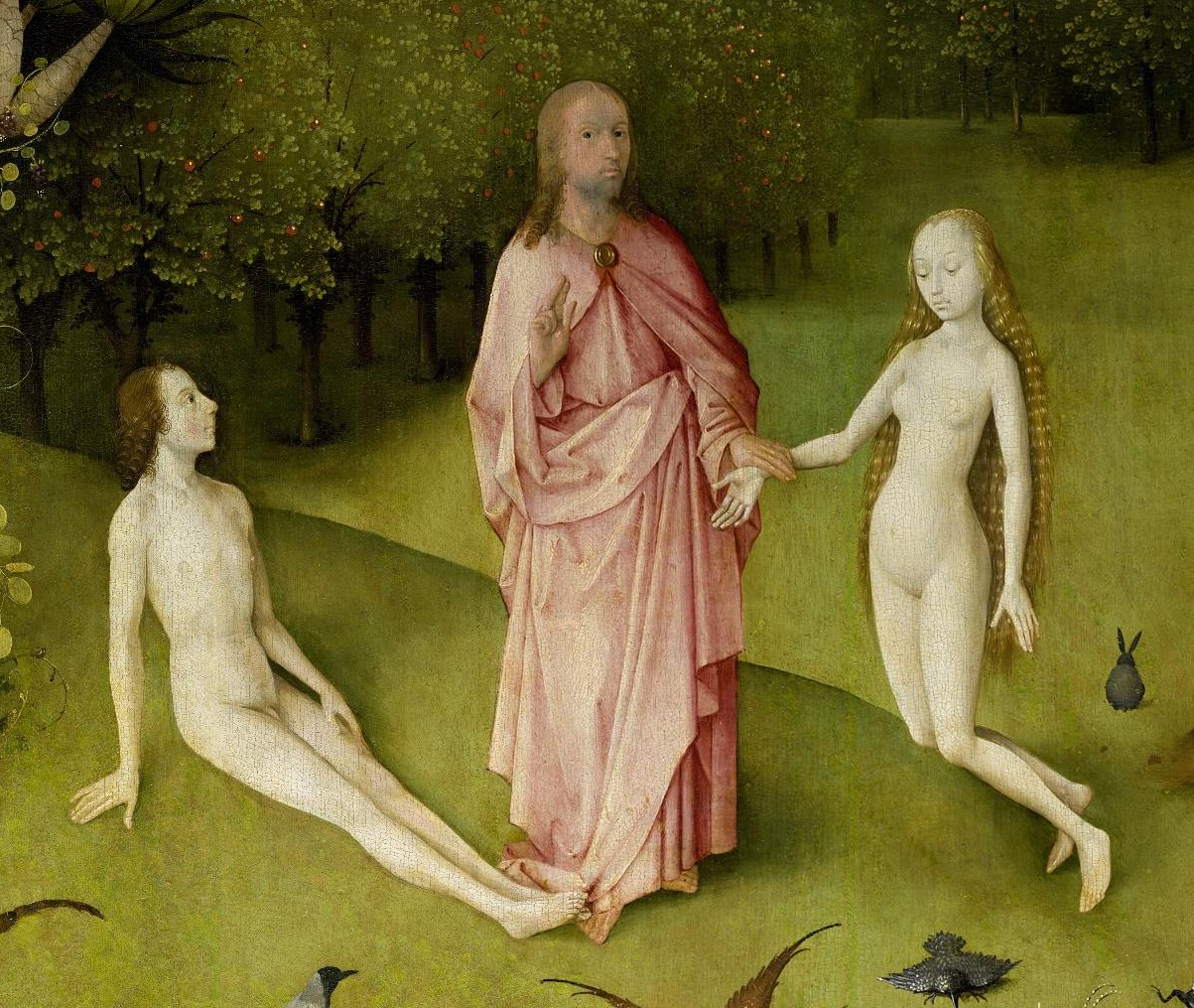
To the left, we see the Garden of Eden, where Adam and Eve are being introduced to one another by a figure that seems to be Jesus, though it would normally be God the Father at this point in the story. Adam reclines calmly on the grass while Eve, framed by the shining gold mandorla of her hair, falls to her knees in front of him. The image is roughly symmetrical, with the figure of Jesus/God just to the right of center, beneath a strange fountain that is the same shade of pink has his robes. Again, at a glance, all looks relatively normal. As is typical, the Garden is shown as a bountiful land, overflowing with abundance.
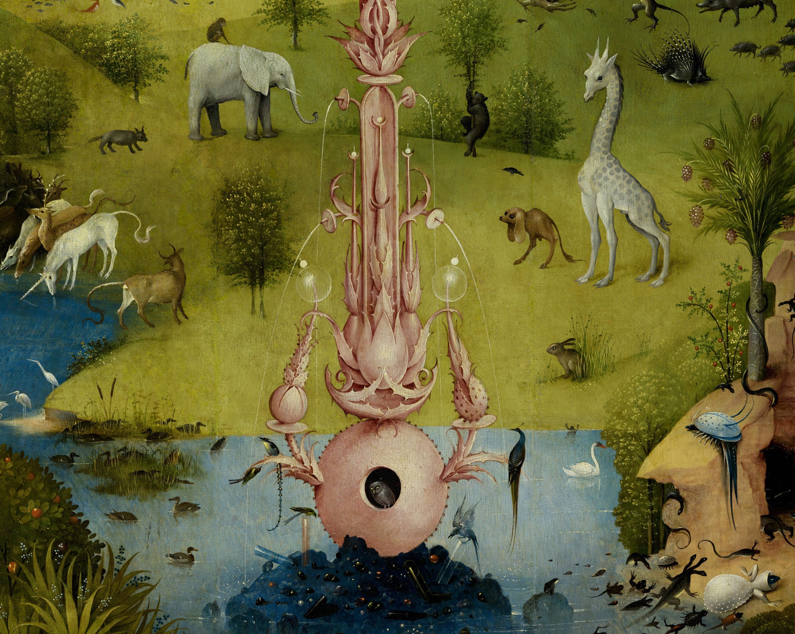
However, the choice of animals is somewhat peculiar. In addition to the bears, stags, horses, cows, porcupines, boars, and birds, there are many animals from distant lands, or from realms of fantasy: an elephant with a monkey on its back, a giraffe, a unicorn drinking from the lake to the left, and a whole host of other unidentifiable fantasy creatures. A three-headed lizard crawls out of the main pond, toward the right edge of the panel. A three-headed bird hangs over the murky pool in the foreground (see image below), perhaps trying to catch the sea-unicorn or spoonbill-fish swimming before it. While we recognize the giraffe as a real animal, and we consider the two-legged dog in front of it and the rearing dragon just above it as fictitious monsters, early sixteenth-century viewers would have perhaps found them equally fantastic – or equally real. They would most likely not have seen any African or Asian animals in person, and would only have seen them or read about them in the same sources where they would have read about dragons and unicorns.
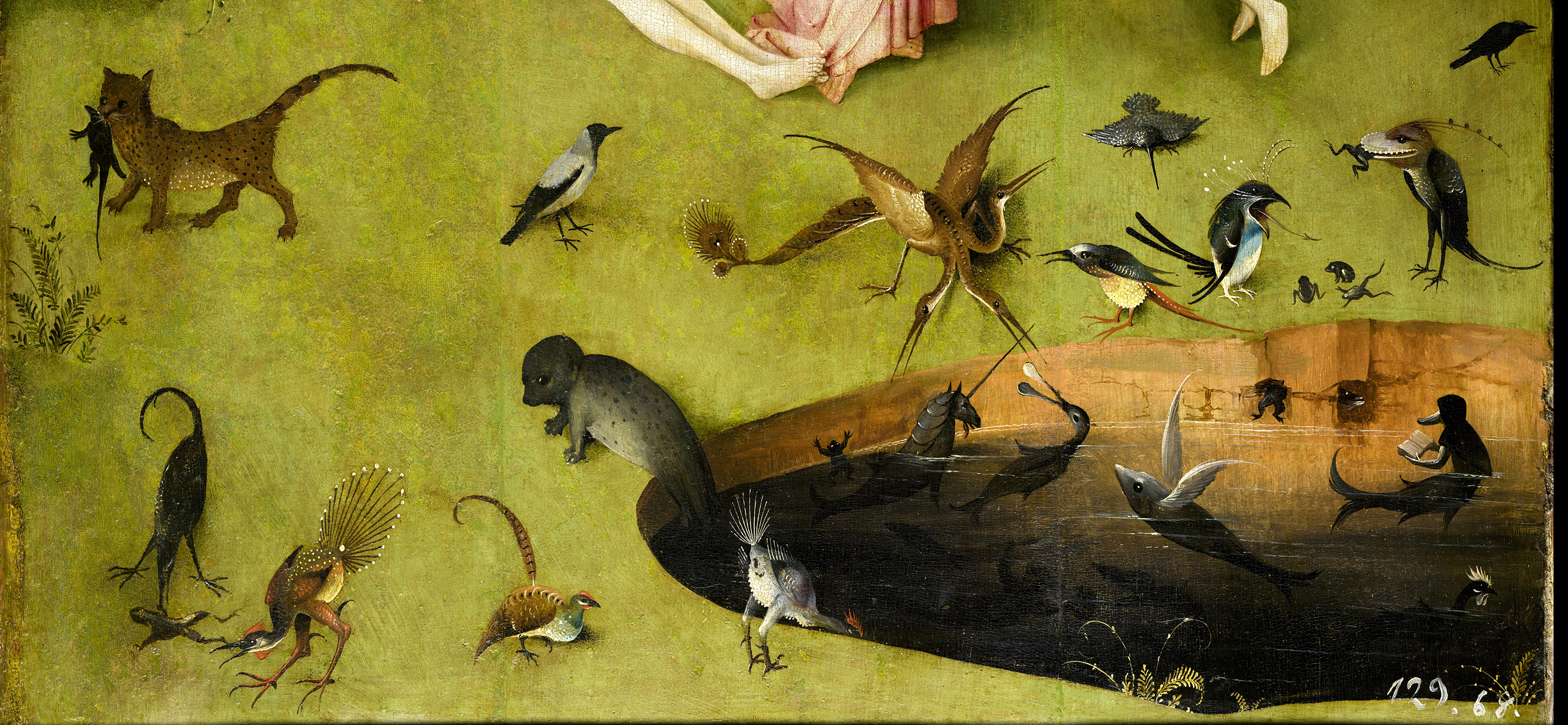
While Eden is often depicted as the one place where “the wolf will live with the lamb, the leopard will lie down with the goat, the calf and the lion and the yearling together,”[9] in Bosch’s Garden, in the upper right, the lion is devouring a deer or antelope. As if balancing this, to the lower left, a cat has caught a dark, unidentifiable creature, perhaps a rat, perhaps a lizard, perhaps a creature that is both at once. The cheerful palette, calm, symmetrical composition, and careful, linear forms all belie the troubling nature of the details throughout the image.
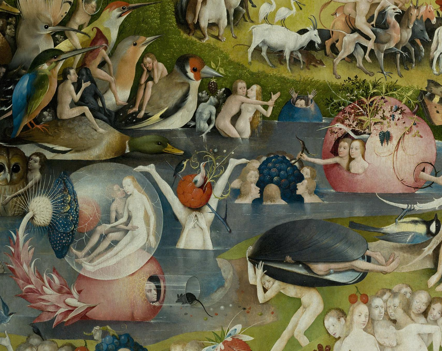
The horizon in all three panels is quite high, almost at the top of the image, which gives the viewer a bird’s-eye perspective on the scenes. This elevated perspective gives us a bit of distance from the wild cavorting in the center image, and also from the odd forms of torture in the Hell scene. We are floating above the fray, rather than walking among the hundreds of naked figures. The central Garden panel is divided into three sections, foreground, middle ground and background. The foreground contains the greatest level of detail. The pond to the left contains some of the most remarkable of vignettes, including a couple embracing within what seems to be a giant bubble of a berry. The shine of light off of the surface of the bubble is rendered with great care, partially obscuring our view of whatever is happening within. To the left, a man embraces a giant owl, while above them men and women ride a wonderfully detailed group of birds, all recognizable as specific species, such as the mallard duck, kingfisher, and hoopoe, with its great beige crest.
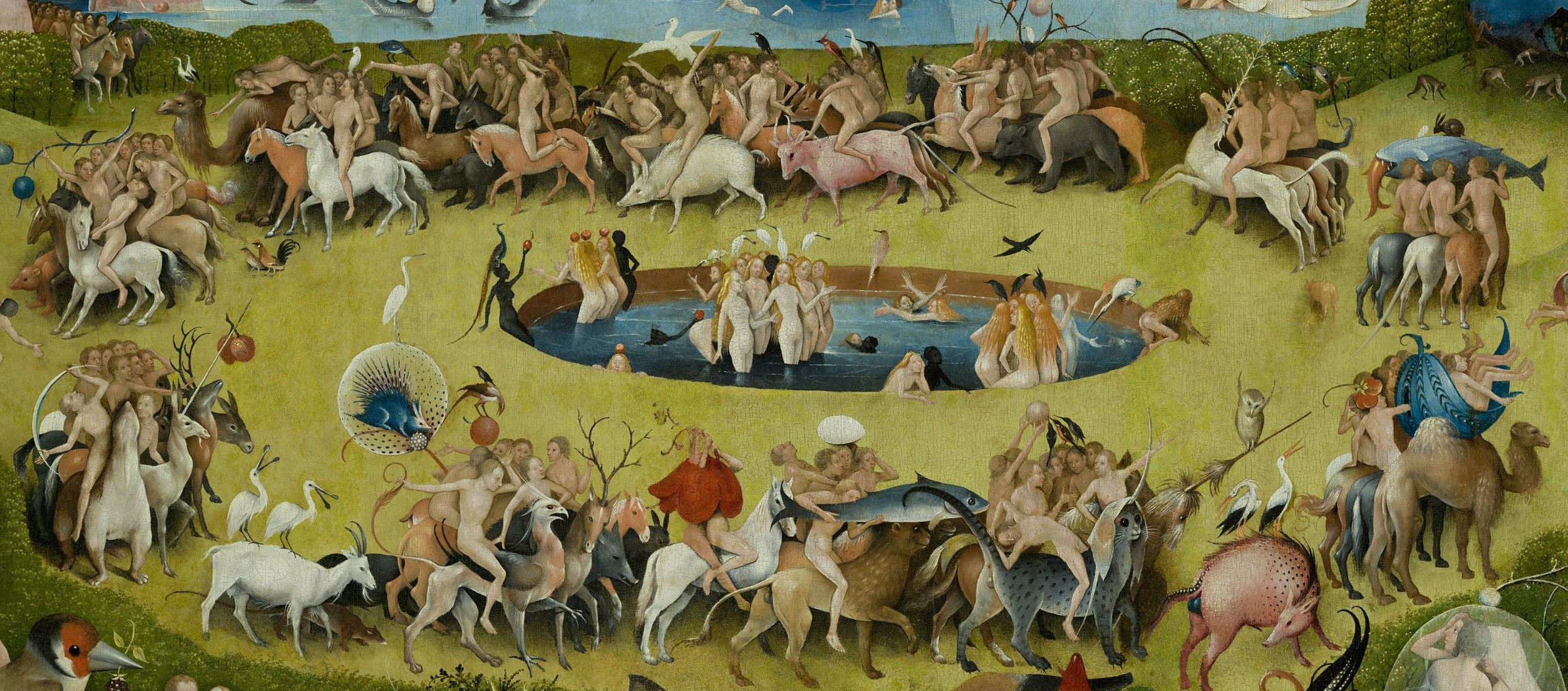
The focal point of the entire triptych, in so far as this dizzying composition has one, is the so-called Pool of the Maidens. It is just above center, aligned on the vertical axis of the center panel and therefore of the entire work. Here, a group of naked young women swim and cavort. Some bear red fruits on their heads and one, toward the center of the pool, bends forward and balances such a fruit at the base of her spine, where she seems to also have a fish tail. Several of the women seem to gaze outward, and if we follow the implied lines of their gazes and gestures, we realize that they are looking at the wild procession that surrounds them. Naked men ride a fabulous menagerie of animals – horses, camels and cows, but also a griffin, a lion, and a unicorn-cat, among many others. Perhaps all of the couples and groups throughout the painting began at this pool before pairing up and finding semi-secluded nooks in which to embrace – a giant lobster tail, the shell of a giant mussel, the interior of a giant fruit, and so on.
The red fruits that appear on the heads and bodies of the figures in the pool, and all throughout the central panel, are madronhos. This fruit is famous in some areas of Europe not for its vibrant color but because it can be distilled into a very potent liquor of 70% alcohol by volume, which is 140 proof. Bearing this in mind, it is possible that several of the figures are lusting not for one another but for the madronhos and the alcohol that was made from them. This might account for the somewhat vacant expressions that some figures bear.[10]
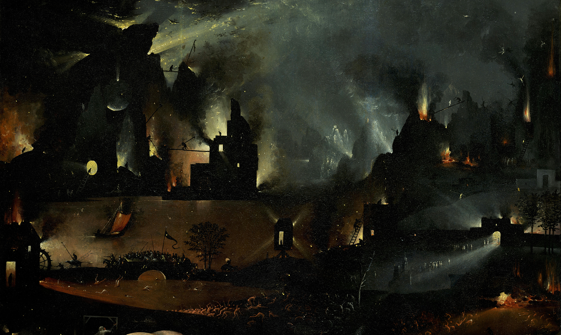
This leaves the right panel; here, everything changes except, importantly, the continuous horizon line. The colors are much darker, with all the tints of the Gardens of Eden and Earthly Delight giving way to the dusky shades of Hell. The rich, verdant fields are replaced with hard, bare earth. The warm and inviting blue pools are replaced with a grey and black lake of ice.
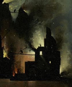
The strange pink and blue architecture, populated with animals, birds, and seemingly joyful people are replaced with jagged buildings that seem to be at once in the process of being built and of burning down. The light that blasts out of their windows and doors illuminates a sky choked with smoke, in contrast with the fresh blue skies of the Gardens. It is important, though, that the horizon line carries over, to remind us that these highly disparate scenes are directly and intimately connected.
Throughout all the panels, the scale is vital. These are all large panels, over seven feet tall, but the figures are quite small. Bosch’s sustained creativity is astonishing; he created a painting with hundreds of figures, each of which is entertaining, curious, or downright bizarre. This is a work that rewards very close looking, and invites our gaze to linger at great length over its detailed and fascinating surface.
CULTURAL CONTEXT: The Road to Hell
Bosch lived in highly moralizing times, in a culture that condemned most or all bodily pleasures as sinful. He was a member of a religious confraternity called the Brotherhood of Our Lady, dedicated to the worship of the Virgin Mary, and not only completed five paintings for the group but was also the only artist to be a member of a group that otherwise consisted of Christian clergy and scholars, suggesting both his strong dedication to the group, and their approval of his work. How do we reconcile this with a painting like the Garden of Earthly Delights, which depicts such a seemingly free and fun series of pleasures?
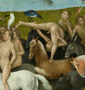
The Pool of the Maidens at the visual heart of the image seems to be what sets the whole orgy in motion. The men seem to be doing their best to impress the women, displaying themselves and balancing objects – mostly suggestive of sexuality and fertility, like eggs and fruit – on their heads. One even performs an impressive bit of circus-riding, balancing on one foot on the back of a horse while bending over to grasp his calf and look upward at his genitals, and at the bird that seems to be poking its long beak into his anus. The general chaos of the Garden, though, is so extreme that nobody in the image seems to be paying him any attention.
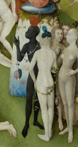
It is worth noting that there are several African figures in the pool and throughout the image. In the early sixteenth century, there would not have been many African people in the Netherlands, and it is to be expected that vast majority of the figures are pale-skinned and light-haired. What are these figures, like the one that poses with a madronho on his head at the lower right, doing here? It seems likely that they are part of the effort to represent an “exotic” scene, to include the variety within humanity just as Bosch has included the variety within the animal kingdom. There are also bluish grey figures that may be intended to represent “Moors” – North-African and Spanish Muslims, who are often depicted in similar shades (see the discussion of Juan de Pareja and race in the Selves chapter). There are even a few hirsute figures – figures whose whole bodies are covered with hair or fur, such as the woman standing in the same cluster as the African figure with the madronho on his head. Her body is entirely covered in glistening, golden hair, except for her face, hands and feet – and, notably, her breasts. She and the other figures like her may be “wild women,” a popular subject in the period, standing in for the freedoms represented by the forest, idealized as untainted by the culture of the city, living in a state something like that of Adam and Eve in the Garden of Eden.
Rogier van der Weyden, The Last Judgement, oil on oak panel, ca. 1445-1450 (Hôtel-Dieu Museum – Hospices de Beaune, Beaune). Photo: Public Domain.The pleasures of the Garden are clearly not only sexual, but more broadly sensual. Some figures are engaging in sexual behavior, others may be drunk on madronho liquor, and yet others are eating impossibly large foods. Many seem to simply be dancing, cavorting, and otherwise delighting in their apparent physical freedom. We must not forget, though, the right panel, the Hell scene tied to the Gardens of Eden and Earthly Delight by the horizon line. This triptych is in many ways similar to common images of the Last Judgment, such as Rogier van der Weyden’s The Last Judgment from 1443-1451, but there is a vital difference.

Last Judgments, like van der Weyden’s painting, generally present Hell at the right and the Judgment of the souls in the center – with many small, naked figures moving across the landscape. The difference is in what is presented on the left. For van der Weyden and most other artists of the period, this is not the Garden of Eden but Heaven. The difference is highly meaningful. Last Judgments present the moment in Christian mythology when Jesus judges all the souls of the dead at the end of time, sending some to Heaven and some to Hell for all eternity. This is what we see in the van der Weyden, where the leftmost panel of this complex polyptych – a painting with many panels – shows an angel showing the saved the way through the gates of Heaven. At the front of the group os a monk, identifiable by his tonsure – a hairstyle where the top of the head is shaved as a marker of having taken the vows of a Christian monk. The gates of Heaven are literally golden here, covered in actual gold.
Bosch substitutes the Garden of Eden for Heaven (and does the same in his own Last Judgment triptych). This alters the dynamic by adding in the element of time. In biblical mythology, the human story begins in the Garden of Eden with the creation of Adam and Eve. Therefore, this scene cannot serve as the opposite of the Hell panel in the way that an image of Heaven can. Instead, it turns the entire panel into a narrative, a story that moves – as we now read and as and they then read – from left to right. For Bosch, humanity begins in the Garden of Eden, which already bears signs of corruption (the strange monsters, the animals eating one another), moves through the Garden of Earthly Delight, which seems to be his representation of his own world, and therefore ends – inevitably and for all people – in Hell. The pleasures of the Garden are extensive, richly invented, and depicted in great detail, but for Bosch, they bear strong consequences.
While the Garden of Earthly Delights is, as a whole, a strong condemnation of sensual pleasures, the work is nonetheless unquestionably pleasurable to contemplate. Its shocking variety and ingenuity gives the viewer cause to dally at length before it, seeking out more and more oddities, more ingenious hybrids, more unusual sexual unions. Was Bosch unaware that his masterpiece was, in a sense, working against its very goals, providing the viewer seemingly endless diversion? Or was he perhaps instead mocking his viewers, tricking them into engaging in a range of pleasurable sins at the same moment that he was instructing them that such sins led to the fires of Hell?
Comparisons and Connections II: Images of Pleasure, Pleasurable Images
In his rich, visionary images, Bosch presents scenes of pleasure and inspires pleasure in his viewers, but also undercuts that pleasure by arguing that it bears dire consequences. It is, though, possible for artists to simply celebrate pleasures without such moralizing condemnation. In this series of comparisons and connections, we look at works of art presenting quiet and solitary pleasures, shared pleasures, private, and public pleasures, but also works that present potentially false pleasures. These create a more complete sense of the role of pleasure in art.
Quiet Pleasures
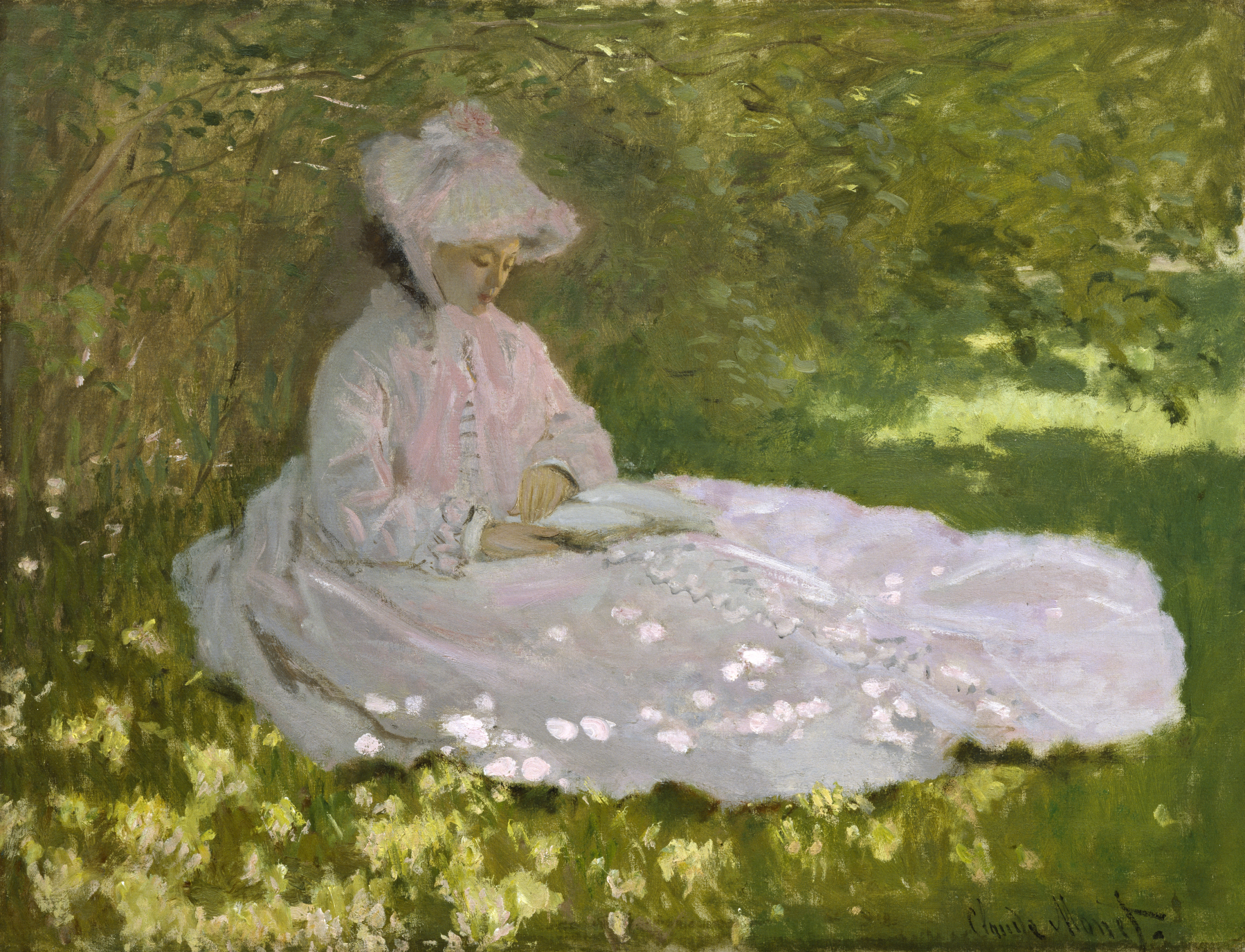
There is, it seems, an entire genre of paintings of women reading. To twenty-first century viewers, this may seem an unusual subject to attract such interest, but in the eighteenth and nineteenth centuries, reading was seen as an ideal pastime for young women. These paintings generally are intended to be positive images of the quite, solitary pleasure of reading. Claude Monet’s Springtime (1872) is a typical example. Monet was a leading painted in a group known as the Impressionists, who attempted to capture the overall feeling of a scene, the impression it creates, rather than the fine details thereof. This technique is very different from that used by Northern Renaissance painters like Bosch and van der Weyden. As with Monet’s image of his garden at Giverny, even from a distance, we can see the loose, large brushstrokes clearly visible on the canvas. The emphasis here is on the gentle, pleasant mood of the relaxed woman sitting in the shade of a tree, her pale pink dress and the grass around her dappled with bright sunlight. These dots, in very bright value, give us the sense that it is a spring or summer day, and while the woman is largely in the shade, indicated by the use of darker shades contrasting with the splashes of sunlit tints, there is nothing remotely gloomy about the scene. Everything is lovely, peaceful and pleasant.
There is, though, another way to view this. This lovely, peaceful and pleasant scene presents the woman as perhaps equivalent to the pink flowers in the grass, to the cheery green grass, itself, to the sunlight that falls on them all. This is to say, the unnamed woman, in her frilly pink dress and her frilly pink hat, is reduced to a decoration, a passive object really not designed to convey her own pleasure, but for her to serve as a source of pleasure for the (presumably straight male) viewer.
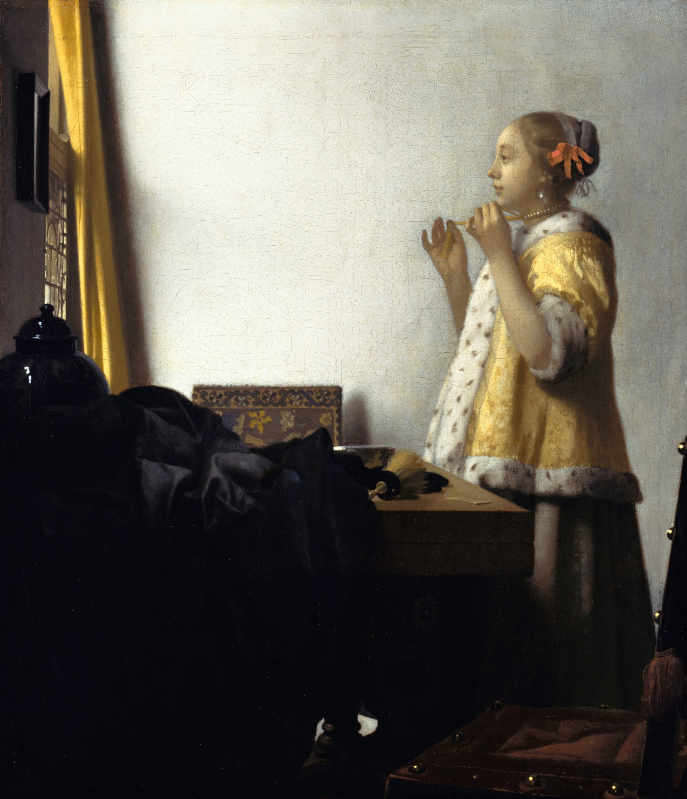
Monet was participating in a longstanding tradition of quiet images of quiet women, perhaps most typified by Johannes Vermeer. Many of his images present young women in moments of quiet reflection by a window. They read, play musical instruments, and examine their jewels. In Young Woman with a Pearl Necklace, c. 1662, for example, he presents a woman alone in a room, facing the gentle light streaming in through her window.
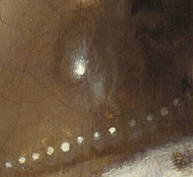
There is almost no movement in this piece – as in most of Vermeer’s paintings. The scene seems suspended in amber, frozen in the soft light that falls on the woman, illuminating her, and drawing attention first to the figure as a whole, and then to her rich, fur-lined clothes, and finally inward to her shining pearl necklace and earrings. From a distance, each pearl shines with opalescence; viewed very closely. they are barely more than dabs of yellow and white.
The foreground is a dark mass of furniture, cloth, and objects, serving as if to separate the woman from us, to preserve her solitude. We might expect to find her gazing into a mirror to see how she looks as she ties the necklace on with a yellow ribbon, but instead, she gazes out the window. Her eyes seem somewhat unfocused, and she gives the impression less of looking at the scene in front of her than of thinking about something else – perhaps about the person who gave her the pearls, perhaps about whatever event she is dressing for? Vermeer’s works tend to have an introspective feel to them, and they invite us to imagine the interior lives of their subjects. We do not know what she thinks about, but we do get a sense of the pleasure she takes in whatever her private thoughts might be.
Shared Pleasures
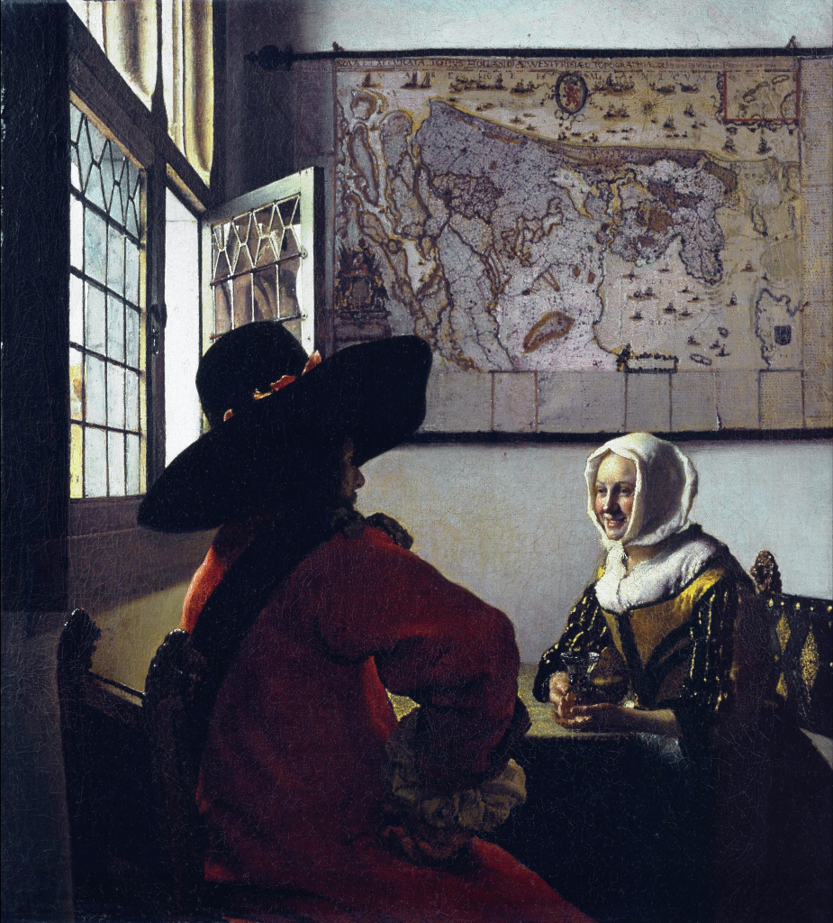
In his Officer and Laughing Girl, c. 1657, Vermeer presents a similar scene. Again, we have a well-dressed young woman in front of an open window, by a desk. Again, she smiles, but this time, we can see the source of her happiness: sitting with her at the table is a fashionable man in a rich, red coat and a broad-brimmed hat, his hand jauntily resting on his hip. Looking back and forth between the images, it could perhaps be the same woman as in Young Woman with a Pearl Necklace, though it is also possible that this is simply Vermeer’s notion of idealized female beauty.
The layout of the composition gives us a sense of the intended audience: we are aligned much more closely with the man in the image than with the woman. We lean in over his shoulder to look at the smiling woman, and can therefore easily imagine ourselves in his place, taking a seat at the table with her. This allows us to share in his pleasure at her cheerful response to him, as if it is the viewer rather than the officer in red who inspires her happiness. This work, then, not only depicts a shared form of pleasure and intimacy between the two figures within the painting, but also draws us in, allowing us to partake of the mood of the work.
Yasmine Chatila plays with the tensions of intimacy and display, privacy and public expression in her photographic series Stolen Moments. The series, somewhat like Shizuka Yokomizo’s photographs discussed in the Selves chapter, consists of photographs taken through apartment windows. Some of these feature couples, as in The Kiss, Lower East Side, Sunday, 11:37pm, from 2007 (see here for an image, and here for more from this series). This image has much in common with Vermeer’s Officer and Laughing Girl. The angle has been shifted so that we are now outside the window, looking in, but again, we have an intimate scene taking place in a private space that the artists has made visible to the public. Here, two men embrace tightly and kiss passionately. The contrast between the dark wall and the white window frame and light within focuses our attention on the interior, even though it is located off-center to the right. Inside this frame-within-the-frame, one man’s light arms stand out in contrast with the other man’s dark shirt, intensifying our sense of the pleasure they are taking in their embrace.
A cat sits like a sentry across the windowsill like the lion in Albrecht Dürer’s Saint Jerome in his Study, as if to block our access to this private moment that has publicly displayed. The photograph has a grainy texture, the result of it having been taken in low light. The dark exterior of the building suggests that it is nighttime. The granular texture and a slight bit of apparent motion blur – also the result of low light and a correspondingly slow shutter speed – obscures the figures’ faces, so we cannot identify them. This not only preserves their privacy – unlike Yokomizo, Chatila does not seek permission for her photographs – but also allows viewers to step into their places, as we step into the place of the officer in Vermeer’s painting.
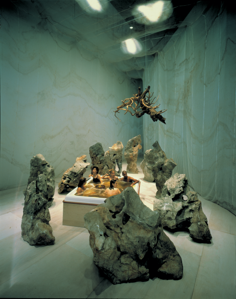
New York-based Chinese artist Cai Gou-Qiang pushes the boundaries between private pleasures and public displays further in his Cultural Melting Bath: Projects for the 20th Century, an installation originally housed at the Queens Museum of Art in New York in 1997. The instillation consists of a large bathtub, surrounded by large, dramatically shaped and pitted limestone rocks of the type used in the Chinese gardens discussed above. A twisted branch hangs over the bath, and the whole assemblage is surrounded by Chinese fishing nets. Visitors were invited to climb into the tub, to enjoy the warm water, the scent of the Chinese herbs floating on its surface and, perhaps most of all, the company of the other bathers. The original setting of the work was crucial to its success at creating a “Cultural Melting Bath”; Queens is the most diverse county in the US, providing the cultural diversity required for the melting-pot association to function. In a sense, the installation was more successful there than when it was included as part of his show called “Hanging Out at a Museum,” housed at the Fine Arts Museum in Taipei, Taiwan. Still, in both settings, the work was designed to provide pleasure. As Cai Gou-Qiang explains, “People say you can hang out with a pretty girl or hang out at an Internet café. In essence, the term ‘hang out’ means to enjoy something.”[11] Art museums are certainly sites of pleasure – or at least, they can be – but not usual pleasures of this sort. For the bathers, there is the sensual pleasure of the bath, and for other visitors, there is the voyeuristic pleasure, like that witnessed in the Pool of the Maidens of the Garden of Earthly Delight, of viewing the bathers as they soak comfortably.
Pure Fun?
While much art is quite serious, even dour, there are artists who make works that just make us smile as soon as we see them. In some cases, a pleasurable surface conceals greater depth within, though in other cases it may not. Jeff Koons’s Balloon Dog (Yellow) (1994), one of a large number of balloon animal sculptures he created, is just delightful (see here for an image). The work is pleasing in several ways. It recalls a childhood joy, but instead of simulating the powdery surface of actual balloons, Koons has these sculptures – which despite their light and airy appearance, are cast in steel – covered in colored chrome finishes. The surfaces are so polished and perfect (see here for a detail image) that they invite us to touch them, though in the context of the art museum, we are not allowed to do so. They also reflect our images back at ourselves, distorted into goofy, funhouse shapes by the deep curves of the dog. As it was installed on the rooftop gallery of the Metropolitan Museum of Art in New York, this yellow Balloon Dog also reflected back the beautiful view of Central Park and the city’s iconic skyline beyond it. The scale of the work is also cause for amusement. By blowing up the work to ten feet tall, Koons takes a small, fleeting carnival amusement and turns it into a monumental and enduring work of art. As Koons writes, his art can help viewers recapture something lost from childhood: the sheer, uncomplicated pleasure of looking at something:
One of the things that I enjoy so much about childhood is just how open and nonjudgmental you can be. You just accept the color blue for its blueness—and turquoise for just being turquoise. You can enjoy plastic—just a great piece of plastic—for its color, or even the cereal box that you can look at forever. And so I always enjoy making reference to that.[12]
While there is a serious backstory to the series – Koons was seeking, in an indirect way, to communicate with his son, who had moved with Koons’s ex-wife to her native Italy – this is further beneath the gleaming surface than the steel interior is beneath the chromed, mirror finish. This work is not a comment on the false joys of youth, or any such thing. Instead, it is an attempt to conjure the very real joys of childhood.
Takashi Murakami also makes slick, repeated images as part of his “Superflat” series, including Flowerball Pink, from 2007 (see here for an image). In this circular image, twenty-eight inches in diameter, Murakami presents an explosion of smiling flowers in a range of bright, cheerful colors. There is no shading at all, here. Every segment of the image is outlined clearly and the filled in with a solid block of color. Even the flowers that are clearly behind those that overlap them are not shadowed at all.
The viewer can hardly help but smile when viewing this work. It is so self-evidently joyful that it becomes a parody of happiness. Indeed, Murakami’s “Superflat” movement is intended to demonstrate and embody the overlap in Japan of manga – Japanese comic books – pop culture, graphic design, marketing, and fine arts. He sands down his canvasses to produce surfaces that are nearly as smooth and slick as a mass-produced poster.
At a glance, the Flowerball is delightful. When considered more carefully, especially when exhibited alongside a number of other works from the series, its relentless, aggressive happiness takes on a desperate tone and a surface shallowness that is stressed by the almost perfect surfaces of the work. This effect is apparent in his larger installations of works that tend to take over whole rooms with the manic joy of his smiling flower faces, as in his Takashi Murakami: Stepping on the Tail of a Rainbow at The Broad Museum in Los Angeles in 2022 (see here for images). Here, entire walls are are papered in an overwhelming profusion of smiling flowers like those on his small Flowerball, and they break out of two-dimensional space into the three-dimensional world. The overall effect is as disturbing as it is cheerful, at once pleasurable and off-putting.
A Smile of Comfort and Desperation
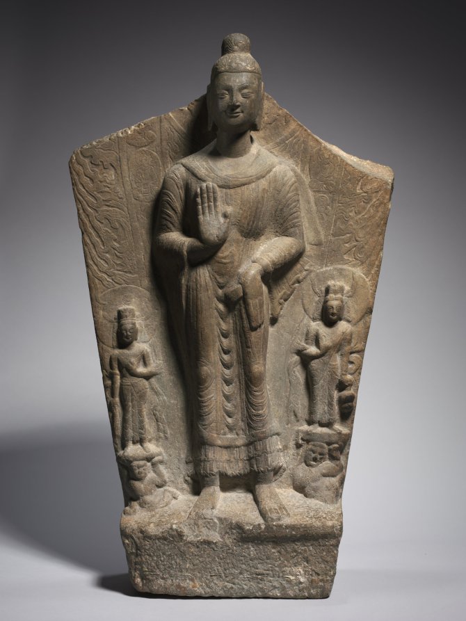
In Buddhism, a bodhisattva is a figure who is able to enter Nirvana – the Buddhist afterlife which represents escape from all earthly suffering – but chooses to remain behind to help other people on their journey toward Nirvana. They are compassionate figures and, like the Buddha, are often shown smiling out at the viewer. There are many different bodhisattvas, and some images present thousands, but even in this crowd, the bodhisattva Maitreya stands out. His name means “Loving-Kindness,” and he was the first bodhisattva to be represented in the visual arts. Maitreya is also the only figure who is both a bodhisattva (in this world) and a buddha (in the next).
An early sculpture of Maitreya survives from the second-century in the Kushan Empire, which originally stretched across parts of what are now Northern India, Pakistan, Afghanistan and western China. The figure raises a hand and smiles broadly at us. The sculpture was originally painted, so his eyes would not have been blank, but instead would have looked directly at us. According to Buddhist belief, Maitreya is a savior who will return to the world to bring all its people to enlightenment. He can see the future, and so his calm smile is comforting to the viewer. His body is gently idealized, and softly naturalistic. It is not muscular and threatening, like many images of ancient gods, nor judgmental and condemnatory, like many other images of gods. Instead, it is warm and reassuring.
Contemporary Chinese artist Yue Minjun, who draws on various figures from Chinese history in his work, turns this smile inside out, and robs it of its joy (see here for an image). Like Murakami’s Flowerball, there is something willfully overdone in the figures’ frantic smiles, repeated again and again in throughout the artist’s work. Yue has cited images of Maitreya as a source for his famous smile. The face throughout Yue’s work, always his own, appears again and again, sometimes in a solo image like Salute from 2005 (see here for an image), and sometimes in great clusters, like his playful satire of the Terracotta Army of Emperor Qin Shi Huangdi (see here for an image).
In Yue’s paintings and sculptures, again and again, the same face leers manically. In Salute, the colors are bright and cheerful, but perhaps slightly too bright. Yue’s smile is stretched far too wide for comfort, and the skin of his face appears taught and shining. He has too many teeth stretching across his impossibly broad grin. In some works, like his Contemporary Terracotta Army, the repetition is internal within the work. In other works, like Salute, the repetition is between works. In either case, the impact is the same.
Underneath this grin, borrowed from Maitreya but grotesquely exaggerated, Yue conveys a sense of disillusionment with the Chinese government’s standard sources of pride: the government and army, and China’s remarkable and lengthy history. Salute seems to echo – and mock – the ever-smiling figures in images of the Cultural Revolution, like Chairman Mao is the reddest reddest red sun in our hearts (see the Power chapter). In his Backyard Garden (2005) and related paintings (see here for an image), we see the same sort of pitted limestone blocks that featured in the Garden of the Unsuccessful Politician, and again in Cai Gou-Qiang’s Cultural Melting Bath: Projects for the 20th Century. However, instead of serving as a source of beauty and pride in Chinese art and history, the rocks are like a sort of trap, clutching at the figures’ naked bodies with their jagged edges. Unlike Bosch’s figures, who seem unaware of their fate, Yue and his image within his works seem all too conscious of his art’s past, and his culture’s present. Again, he grins frantically, like a lunatic, like a man with a gun to his head, forced to smile despite his oppression.
The Joy of Life
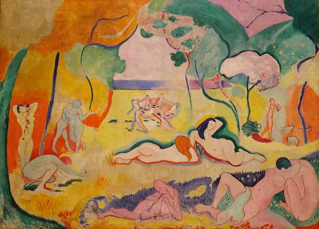
Henri Matisse’s Le bonheur de vivre (The Joy of Life), from 1905-1906, provides perhaps the most direct contrast with Bosch’s Garden. Again, we have a warm and inviting image – in this case almost solely composed of warm colors – and loose, curvilinear lines. Matisse’s wild color choices intensify the scene. As in Bosch’s painting, we have a circle of dancing figures in the middle ground, and naked figures embrace, kiss, play music, and otherwise lounge languidly in the foreground. There are even a few animals strolling about.
It seems possible that Matisse was thinking of Bosch’s triptych when he conceived of this scene. Where they differ, though, is in Matisse’s total rejection of the condemnation of this scene of pleasure. Unlike Bosch, and several other artists presented in this chapter, Matisse offers no critique of joy, no judgment, no Hell scene where these figures are made to suffer in return for the pleasures they experience in their garden of earthly delight. The work is an image of delight, aimed at generating yet more pleasure in the viewer, without moralization or denunciation. It is an unadulterated celebration of the Joy of Life.
CONCLUSION
Art is often a source of joy and excitement. It is just as often, though, a critique of these emotions. It is often a source of pleasures, and just as often a criticism of pleasures. Art uses pleasure – of the subject of a work, of the viewer of the work, or both – as a focus, and also as a technique to convey other notions and ideas. Hopefully, images from throughout this book provide you with various forms of pleasure! If a work of art can accomplish that, then it can often do a great deal more.
SPOTLIGHT IMAGE III:
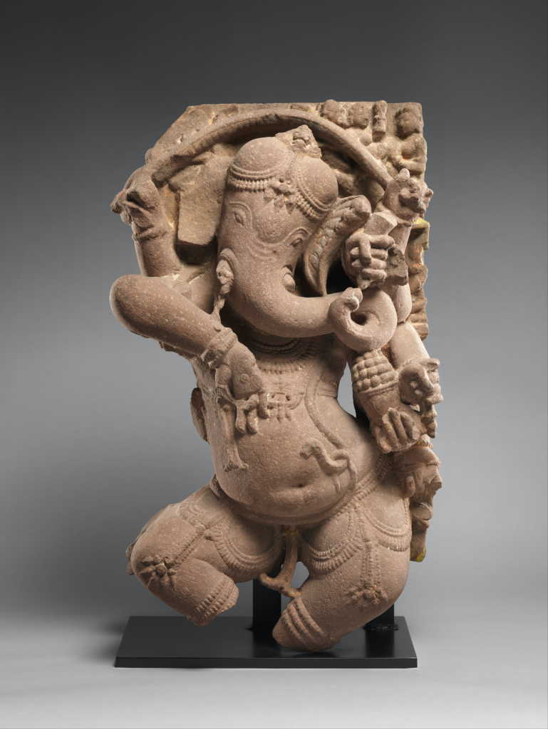
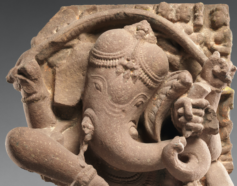
DANCING GANESHA, INDIA (MADHYA PRADESH), 10TH CENTURY
VIEWING QUESTIONS
- How does the artist create a sense of the god’s dancing movement?
- What mood does the figure’s pose convey?
- What does the figure’s body shape suggest?
- How is Ganesha adorned?
- In what ways is this image of a god different from (or similar to) other images of gods?
- How does Ganesha’s pleasure relate to the pleasure of the viewer?
Media Attributions
- Garden of the Unsuccessful Politician (Distant Fragrance Hall), ca. 1500-1535 (Suzhou, China). Photo by 外史公, CC BY-SA 3.0.
- Garden of the Unsuccessful Politician (Rock Formation), ca. 1500-1535 (Suzhou, China). Photo by Caitriana Nicholson, CC BY-SA 2.0.
- Garden of the Unsuccessful Politician (Artificial Pond), ca. 1500-1535 (Suzhou, China). Photo: Caitriona Nicholson, CC BY-SA 2.0
- Garden of the Unsuccessful Politician (Pavilion with Moon Doors), ca. 1500-1535 (Suzhou, China). Photo by Jonathan, CC BY-NC-ND 2.0.
- Garden of the Unsuccessful Politician (Moon Door Detail), ca. 1500-1535 (Suzhou, China). Photo by Marco Capitanio, CC BY-NC-ND 2.0.
- Wen Zhengming, Garden of the Inept Administrator, ink on paper, 1551 (Metropolitan Museum of Art, New York). Photo: Public Domain.
- Ryoan-ji, 1450/1488 (Kyoto, Japan). Photo by Cquest, CC BY-SA 2.5.
- Gertrude Jekyll, Munstead Wood, 1896-7 (Surrey, England). Photo by Sarah, CC BY 2.0.
- Gertrude Jekyll’s garden at Munstead Wood, Surrey, autochrome photograph by Country Life Garden Editor Herbert Cowley, 1912. Photo: Public Domain.
- Versaille Garden Plans, ca. 1912. Photo: Public Domain.
- André Le Nôtre, Gardens of Versailles (Center View), ca. 1661 (Versailles, France). Photo Anna and Michal, CC BY 2.0.
- Jules Hardouin-Mansart, Hall of Mirrors, 1678-84 (Versailles, France). Photo Justin Mier, CC BY-NC-SA 2.0.
- John Vanderlyn, Panoramic View of The Palace and Gardens of Versailles, oil on canvas, 1818-19 (Metropolitan Museum of Art, New York). Photo: Public Domain.
- John Vanderlyn, Panoramic View of The Palace and Gardens of Versailles, oil on canvas, 1818-19 (Metropolitan Museum of Art, New York). Photo: Public Domain.
- John Vanderlyn, Panoramic View of The Palace and Gardens of Versailles (detail), oil on canvas, 1818-19 (Metropolitan Museum of Art, New York). Photo: Public Domain.
- Bishndas, Babur Supervising the Laying Out of the Garden of Fidelity, ink and color on paper, ca. 1590 (Victoria and Albert Museum, London). Photo: Public Domain.
- Claude Monet, Monet’s Garden, 1883 (Giverny, France). Photo: Public Domain.
- Claude Monet, The Japanese Footbridge, oil on canvas, 1899 (National Gallery of Art, Washington D.C.). Photo by Gandalf’s Gallery, CC BY-NC-SA 2.0.
- Hieronymus Bosch, The Garden of Earthly Delights, oil on oak plank, 1500-05 (Museo Nacional del Prado, Madrid). Photo: Public Domain.
- Hieronymus Bosch, The Garden of Earthly Delights (Detail of Adam and Eve), oil on oak plank, 1500-05 (Museo Nacional del Prado, Madrid). Photo: Public Domain.
- Hieronymus Bosch, The Garden of Earthly Delights (Detail of Animals), oil on oak plank, 1500-05 (Museo Nacional del Prado, Madrid). Photo: Public Domain.
- Hieronymus Bosch, The Garden of Earthly Delights (Detail of Pond), oil on oak plank, 1500-05 (Museo Nacional del Prado, Madrid). Photo: Public Domain.
- Hieronymus Bosch, The Garden of Earthly Delights (Detail of Fruit), oil on oak plank, 1500-05 (Museo Nacional del Prado, Madrid). Photo: Public Domain.
- Hieronymus Bosch, The Garden of Earthly Delights (Detail of Pool), oil on oak plank, 1500-05 (Museo Nacional del Prado, Madrid). Photo: Public Domain.
- Hieronymus Bosch, The Garden of Earthly Delights (Detail of Buildings in Hell), oil on oak plank, 1500-05 (Museo Nacional del Prado, Madrid). Photo: Public Domain.
- Hieronymus Bosch, The Garden of Earthly Delights (Detail of Buildings in Hell), oil on oak plank, 1500-05 (Museo Nacional del Prado, Madrid). Photo: Public Domain.
- Hieronymus Bosch, The Garden of Earthly Delights (Detail of Acrobatic Rider), oil on oak plank, 1500-05 (Museo Nacional del Prado, Madrid). Photo: Public Domain.
- Hieronymus Bosch, The Garden of Earthly Delights (Detail of Man), oil on oak plank, 1500-05 (Museo Nacional del Prado, Madrid). Photo: Public Domain.
- Rogier van der Weyden, The Last Judgement, oil on oak panel, ca. 1445-1450 (Hôtel-Dieu Museum – Hospices de Beaune, Beaune). Photo: Public Domain.
- Rogier van der Weyden, The Last Judgement (Detail of Gates of Heaven), oil on oak panel, ca. 1445-1450 (Hôtel-Dieu Museum – Hospices de Beaune, Beaune). Photo: Public Domain.
- Claude Monet, Springtime, oil on canvas, 1872 (Walters Art Museum, Baltimore). Photo by Gandalf’s Gallery, CC BY-NC-SA 2.0.
- Johannes Vermeer, Young Woman with a Pearl Necklace, oil on canvas, 1662-64 (Gemäldegalerie, Berlin). Photo by Gandalf’s Gallery, CC BY-NC-SA 2.0.
- Johannes Vermeer, Young Woman with a Pearl Necklace (Detail of Pearls), oil on canvas, 1662-64 (Gemäldegalerie, Berlin). Photo by Gandalf’s Gallery, CC BY-NC-SA 2.0.
- Johannes Vermeer, Officer and Laughing Girl, oil on canvas, 1657 (The Frick Collection, New York). Photo: Public Domain.
- Cai Guo-Qiang (b. 1957, Quanzhou, China; lives in New York) Cultural Melting Bath: Project for the 20th Century, 1997, 18 Taihu rocks, hot tub with hydrotherapy jets, bathwater infused with herbs, and pine trees, Installation dimensions variable, Collection of Musée d’art contemporain de Lyon, Installation view at Queens Museum of Art, New York, 1997. Photo by Hiro Ihara, courtesy Cai Studio
- Stele with Maitreya and Attendants, grey limestone, ca. 500 (The Cleveland Museum of Art, Cleveland). Photo: Public Domain.
- Henri Matisse, Le Bonheur de Vivre, oil on canvas, 1905-06 (Barnes Collection, Philadelphia). Photo by Regan Vercruysse, CC BY-NC-ND 2.0.
- Dancing Ganesha, red sandstone, ca. tenth century (Metropolitan Museum of Art, New York). Photo: Public Domain.
- Dancing Ganesha (Detail of Head), red sandstone, ca. tenth century (Metropolitan Museum of Art, New York). Photo: Public Domain.
- Wango H. C. Weng, Gardens in Chinese Art from Private and Museum Collections (New York: China Institute in America, 1968), i. ↵
- Dusan Ogrin, The World Heritage of Gardens (London: Thames and Hudson, 1993), 168. ↵
- Liu Dun-Zhen, Chinese Classical Gardens of Suzhou, trans. Chen Lixian (New York: McGraw-Hill, 1993), 95. ↵
- "Wen Zhengming, Garden of the Inept Administrator, 1551," The Collection of the Metropolitan Museum of Art: https://www.metmuseum.org/art/collection/search/39654 ↵
- Günter Nitschke, The Architecture of the Japanese Garden: Right Angle and Natural Form (Taschen, 1991), 99. ↵
- Judith B. Tankard, Gertrude Jekyll and the Country House Garden (New York: Rizzoli, 2011), 9. ↵
- Judith B. Tankard, Gertrude Jekyll and the Country House Garden (New York: Rizzoli, 2011), 11. ↵
- Judith B. Tankard, Gertrude Jekyll and the Country House Garden (New York: Rizzoli, 2011), 21. ↵
- The Bible, Isaiah 11:6, New International Version. ↵
- Simon Carr, "3. The Mystery of the Other Forbidden Fruit," The Garden of Earthly Delights substack: https://ged051.substack.com/p/3-the-mystery-of-the-other-forbidden ↵
- “Hanging Out at a Museum: Cai Guo-Qiang in Taipei,” Artmag (December 2009): http://db-artmag.de/en/58/on-view/hanging-out-at-a-museum-cai-guo-qiang-in-taipei/ ↵
- “Balloon Dog (Red)” (1994-2000), PBS: http://www.pbs.org/art21/images/jeff-koons/balloon-dog-red-1994-2000, site not longer active but archived at: https://web.archive.org/web/20141231084232/http://www.pbs.org/art21/images/jeff-koons/balloon-dog-red-1994-2000 ↵
General term for two ancient Iranian languages, OId and Younger Avestan
literally "dried-up mountain-waterscape," a form of Japanese rock garden
literally "withered mountain-water," a form of Japanese rock garden
the empty area around a form or forms in a work of art
sections of works of art occupied by forms and shapes
Usually used to describe bilateral symmetry, which is a mirroring of two halves of a work, or radial symmetry, where an image is symmetrical around a central point or axis, like a sunflower viewed head-on
An even use of elements throughout a work
early color photographs
line running down the center of a figure
A handmade, hand-written book
the fifteenth and sixteenth century in Northern Europe, centered on cultural centers in Flanders and the Lowlands, now Belgium, Holland, Luxemburg, and Northern France
a painting with three panels, hinged together so that the outer panels, or wings, can be closed over the central panel
The divide in an image between sky and land or sea
a full-body halo
Value produced by adding white to a hue
Value produced by adding black to a hue
a painting with many panels
a hairstyle where the top of the head is shaved as a marker of having taken the vows of a Christian monk
a story
The degree of lightness or darkness of a color
In Buddhism, a figure who is able to enter Nirvana, the Buddhist afterlife which represents escape from all earthly suffering, but chooses to remain behind to help other people on their journey toward Nirvana

